In the bustling orchestra of global brands, Samsung stands out as a maestro of innovation. From sleek smartphones to cutting-edge appliances, the company’s products have become synonymous with technological advancement.
But the story of Samsung’s success extends beyond its devices; it begins with an iconic logo that acts as a silent symphony of shapes, subtly conveying the brand values.
By embarking on a journey to decode the Samsung logo, we’ll not only discover the philosophy behind its design but also glean valuable insights to create a logo for your own brand’s visual symphony.
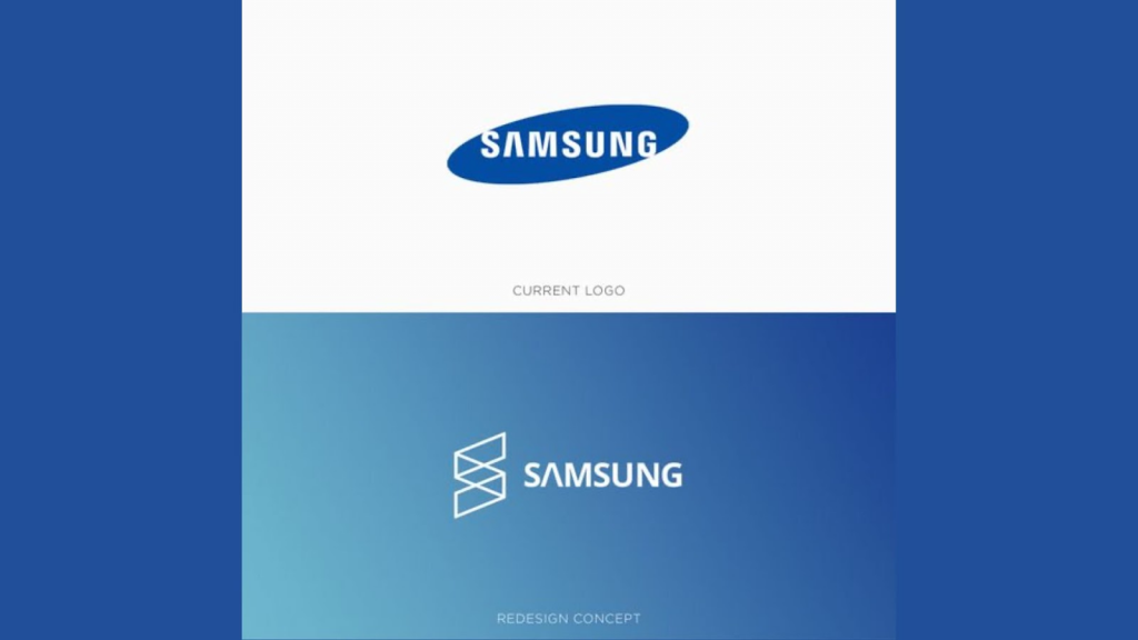
Samsung’s visual identity has become one of the most recognizable branding systems in the technology industry. Whether on smartphones, televisions, wearable devices, or household appliances, the Samsung logo consistently communicates innovation, reliability, and modern simplicity. Few tech companies have managed to maintain such a globally recognizable logo while continuously evolving their products and services.
The power of the Samsung logo lies in its balance between simplicity and meaning. While many modern technology brands pursue aggressive redesigns to stay relevant, Samsung has maintained a strong sense of continuity. This consistency strengthens customer trust and reinforces long-term brand recognition across international markets.
Dissecting the Samsung Logo
The Samsung logo isn’t merely a visual identifier; it’s a carefully orchestrated composition with a deeper meaning. Here’s a breakdown of its key elements and the notes they play in the brand’s overall message:
The Elliptical Shape
The logo’s core element is an ellipse, a shape that exudes a sense of dynamism and movement. It evokes a feeling of continuous progress and forward momentum, perfectly aligning with Samsung’s commitment to innovation.
The oval shape also symbolizes global reach. The slightly tilted ellipse creates visual momentum, giving the impression that the brand is constantly moving forward. This subtle sense of motion helps position Samsung as a future-focused company rather than a static corporate institution.
The Play of Colors
The blue color palette used in the logo is a well-considered choice. Blue is universally associated with trust, reliability, and stability – qualities crucial for a brand that thrives on pushing technological boundaries.
Blue is also frequently used in technology branding because it conveys professionalism and intelligence. Samsung’s particular shade of blue strikes a balance between corporate authority and consumer friendliness, helping the brand appeal to both enterprise customers and everyday users.
The Power of Simplicity
Just like a well-composed piece of music, the logo is refreshingly simple. The minimalist design allows for instant recognition across various platforms, ensuring the brand’s melody resonates globally.
This simplicity is especially important in today’s digital world, where logos must adapt seamlessly across:
- Mobile apps
- Smart TVs
- Product packaging
- Social media
- Websites
- Wearable devices
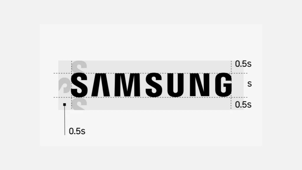
Samsung’s clean typography and uncluttered structure ensure high visibility at every scale.
Many globally recognized minimalist tech brands also follow similar visual principles, as explored in this future of logo design analysis.
Samsung proves that restraint often creates stronger memorability.
The Upward Tilt
Look closely at the ellipse; it has a subtle upward tilt. This subtle detail subtly conveys a sense of ambition and growth, hinting at Samsung’s relentless pursuit of technological excellence.
Even small design choices like angle and spacing can significantly influence how audiences perceive a brand. The Samsung logo demonstrates how subtle adjustments create psychological impact without overwhelming the viewer.
From Symphony to Strategy: How to Create a Brand’s Visual Identity
The Samsung logo serves as a powerful score for crafting your own brand’s visual identity. Here are some key takeaways to incorporate into your logo design:
Know Your Brand’s Song
Before diving into design tools, identify your brand’s core values and personality. What kind of emotion do you want to evoke? Are you a reliable tech startup or a playful design agency? Understanding your brand’s essence will be the harmony you build upon.
Strong logos are not created randomly. They emerge from a clear understanding of:
- Audience expectations
- Industry positioning
- Emotional tone
- Brand mission
- Long-term vision
Samsung’s logo works because it consistently aligns with the company’s reputation for innovation and reliability.
Minimalism as Your Melody
Let the Samsung logo be your inspiration. Embrace the power of simplicity. A clear, concise logo that effectively communicates your brand identity is far more impactful than a cluttered design. Think of it as your brand’s sonic signature – it should be instantly recognizable.
Many modern startups make the mistake of overcomplicating their branding with:
- Excessive gradients
- Complex symbols
- Tiny details
- Trend-heavy visuals
Samsung proves that restraint often creates stronger memorability.
Color Psychology 101
Just like music evokes emotions, colors do too. Research the psychology of color and choose a color palette that resonates with your brand’s message. Blue for trust, red for energy, green for growth – choose colors that set the tone for your brand symphony.
Color choices influence:
- Customer trust
- Purchase behavior
- Emotional connection
- Brand perception
This is why successful global companies invest heavily in color consistency across all branding materials.
Subtlety Can Be Powerful
Don’t underestimate the power of subtle details, just like the upward tilt in the Samsung logo. Consider incorporating a discreet element that hints at your brand’s unique story or aspirations.
Small design elements often become the most memorable aspects of iconic logos.
Orchestrating Your Inner Logo Maestro Utilizing AI Logo Maker Sites
Creating a logo from scratch can feel like facing a creative block, a melody stuck on repeat. But fear not, aspiring logo designers. The magic of AI logo makers and generators comes to your aid.
Think of these online tools as your creative collaborators. Simply feed them keywords that reflect your brand values and desired visual identity. These AI tools will then, through their digital alchemy, generate a multitude of logo variations, sparking ideas and providing a springboard for your creativity.
Modern AI-powered platforms such as Logomakerr.ai allow entrepreneurs, startups, and creators to experiment with typography, icons, colors, and layouts without requiring advanced graphic design expertise.
As AI design technology continues evolving, logo creation has become significantly more accessible to small businesses and independent creators worldwide.
Conquering the Blank Canvas
AI tools take away the daunting task of starting from scratch by offering pre-designed elements and layouts. You can finally break through the creative block and start composing with a solid foundation.
Experimentation Made Easy
Quickly test different color combinations, fonts, and shapes to see what resonates with your brand’s message. Think of it as a practice session before finalizing your brand’s musical arrangement.
Accessibility for All Musicians
AI logo creation tools are user-friendly and affordable, making logo design accessible to everyone, regardless of budget or design expertise. Even if your brand doesn’t have a dedicated in-house designer, you can still craft a logo that sings.
Beyond the Logo: Building a Complete Brand Identity
The logo is just the first note in composing a powerful brand symphony. Here are some additional tips to ensure your brand’s melody resonates with your audience:
Craft a Compelling Brand Story
Create a narrative that captures the essence of your brand. Just like a captivating song, it should evoke emotions and connect with your audience on a deeper level.
Samsung’s story is not simply about electronics. It’s about innovation, connectivity, and improving everyday life through technology.
Cohesive is the Name of the Game
Maintain visual consistency across all your brand touchpoints. From social media graphics to website design, ensure your brand colors, fonts, and overall aesthetic flow seamlessly, creating a unified and recognizable brand identity.
Consistency increases trust and improves long-term brand recall.
Companies that successfully maintain strong branding across digital platforms often rely on clear visual systems similar to those discussed in this logo design trends guide.
Content is (Still) King
Visual storytelling remains one of the strongest branding tools available today. High-quality graphics, videos, and photography strengthen the emotional connection between brands and consumers.
Embrace Brand Voice
Develop a unique brand voice that shines through all your communications. Is it warm and friendly, or bold and innovative? A consistent voice ensures your brand resonates on a human level.
The Power of Community
Build a community around your brand. Foster engagement through social media interaction, loyalty programs, and events. Remember, a brand isn’t just a melody; it’s a full orchestra of voices, and your audience plays a crucial role.
Create Yours Today
By learning from the musicality of the Samsung logo, you can craft a logo that isn’t just aesthetically pleasing but also a potent symbol that embodies your brand’s core values. Utilize AI tools to explore your creative options, refine your design with the help of online design communities, and remember, the power of your logo lies not just in its visual appeal but in the symphony it plays within the grand orchestra of your brand identity.
Modern entrepreneurs also increasingly use AI-powered tools to streamline branding workflows, especially when experimenting with typography and scalable visual identity systems using an AI logo generator.
So, grab your metaphorical paintbrushes, equip yourselves with the lessons learned, and embark on your own logo design journey. Remember, the perfect logo is just one harmonious note away, waiting to be composed.
With a dash of creativity, a sprinkle of brand strategy, the guidance of the Samsung logo, and the innovation of Logomakerr.ai, you can craft a logo that resonates with your audience and propels your brand towards a future filled with innovation and success.
The stage is yours, maestro — let your brand’s symphony begin.