
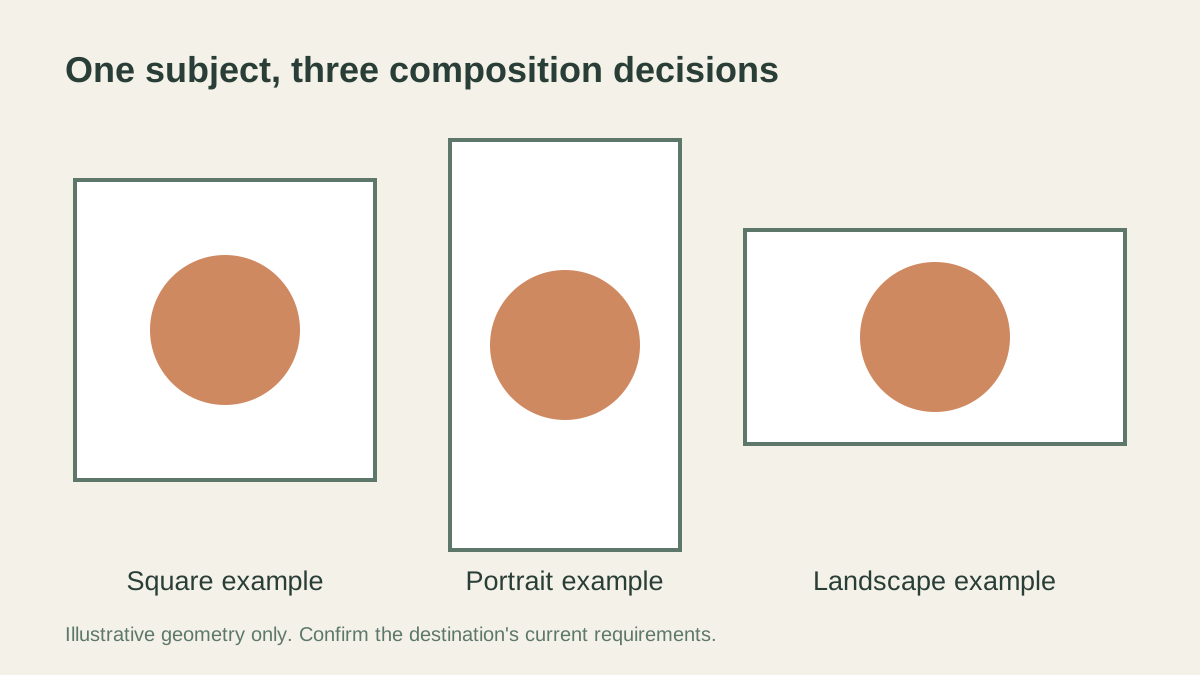
Create a separate composition for each intended social placement. Keep the subject and essential message visible in that placement's actual preview, then resize and export the approved crop. A square, tall frame, and wide frame remove different parts of the source; one automatic centre crop rarely answers every design question.
Start with the placements you will actually use
List the destinations for the visual before editing: a feed post, story-style placement, profile image, or another specific surface. Record the current requirements shown by the destination's own publisher or upload interface. Platform requirements can change, and different surfaces within the same service may use different previews.
The frame examples in this guide illustrate square, portrait, and landscape geometry. They are not a current specification sheet for any social network. Use them to reason about composition, then confirm your actual destination before preparing the final export.
An AI image editor can support image preparation. Keep the placement planning, layout work, and publication review explicit in your workflow; do not assume that an AI edit automatically produces every required social format.
Decide which details must survive every version
Identify the visual's essential content. That could be a person's face, a product outline, a piece of lettering, or a brand mark. Mark what the viewer must understand at a glance and what can be reduced or omitted.
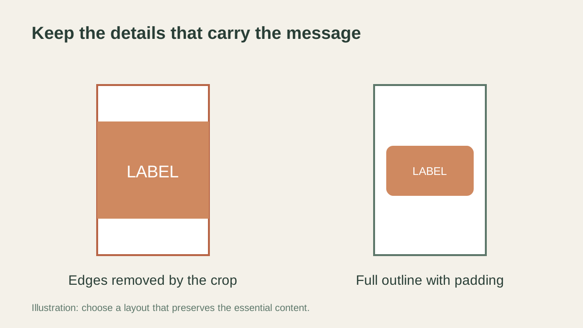
A portrait with a decorative background gives you different options from a product photograph with text near the edges. If the essential content is spread across the whole source, a narrow crop may be a poor solution. A separate layout with padding or repositioned text can preserve the message better.
Write a short priority note before creating variants. For example: keep the entire item visible, retain the approved logo, and show the short headline without hiding the subject. These are design constraints, not a promise that an automatic crop will fulfil them.
Separate cropping from resizing
Cropping selects which part of the source remains visible. Resizing changes the dimensions of the selected image. If you resize an awkward crop, the composition remains awkward; if you crop after adding a headline, you may remove part of the wording.
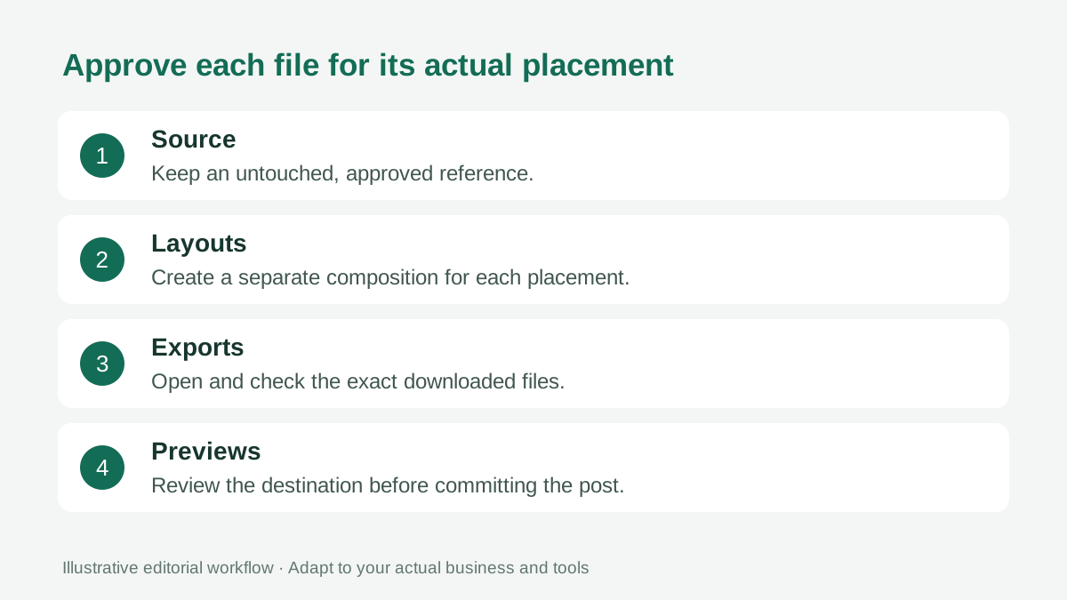
Choose the frame and compose the visible content first. Then prepare the output dimensions for the actual destination. Keep an untouched source so that a later placement can use a different selection without repeatedly editing a reduced export.
The guide to PNG, SVG and JPG addresses a different decision: the format that carries the finished artwork. File type and frame shape should both serve the intended use.
Use a shared subject, not an identical layout
A campaign can remain recognizable while its layouts change. Keep the approved subject, colour direction, and message consistent, but allow the spacing and text position to respond to each frame.
In a square layout, a central subject may leave room for a short heading above it. A tall layout may need more vertical separation. A wide layout may place the subject on one side and the message on the other. These are illustrative arrangements to test, not rules for every photograph.
Where a layout needs more background than the source contains, evaluate the available options honestly. Padding, a different crop, or a separate source photograph may be more suitable than generating a scene that changes the meaning of the image.
Review the actual details after any AI edit
Compare the edited visual with the approved source. Check visible wording, recognizable features, product details, and any brand mark. A result that looks polished at thumbnail size may still contain a material change.
Do not stretch the subject to fill a new aspect ratio. Distorted faces, products, or logos can look subtly wrong even when the frame is technically filled. Adjust the surrounding composition or choose another source instead.
For merchandise, the product photo review guide provides a separate accuracy pass. Complete that review before treating an edited photograph as the approved source for social variants.
Keep text and logos away from uncertain edges
Use the destination's actual preview to evaluate overlays and cropping. Interface controls, captions, profile elements, or alternate previews may cover different parts of an image. A central guide can be a useful working aid, but it is not a universal safe-area guarantee.
Read the headline at the size a viewer is likely to encounter. A sentence that fits in the design file may become too small after export or in the mobile preview. Reduce the message before shrinking every word.
When adding a logo, use an approved file suitable for the background. The older transparent logo guide explains why a logo without an unwanted rectangular background can be useful. Confirm that the logo remains legible and proportionate in each final layout.
Make one review sheet for the set
Place the candidate variants side by side in your layout tool or a simple review document. Compare the subject's prominence, the wording, colour treatment, and brand placement. A consistent set should feel related without forcing every frame into an identical arrangement.
Ask a reviewer to state the intended message without seeing the brief. If one variant suggests a different offer or hides an essential detail, revise that composition. Test the longest headline and the least forgiving crop rather than approving only the easiest example.
Keep a small record of which source and layout produced each approved file. This can be an ordinary note alongside your exports; it is not a claim about built-in version history. Our brand consistency guide gives broader context for keeping a set coherent.
For a recurring campaign, keep the placement requirements in the review note alongside the approved files. Date the check so a later editor can see which upload interface was reviewed. Before reusing the layout months later, confirm the destination again and test the new content inside it.
Approve the exported file, then preview the placement
Open each downloaded file. Confirm its dimensions, appearance, filename, and readability. Check that the export contains the approved layout rather than a previous draft or an accidentally hidden layer.
Give files names that identify the campaign, intended placement, and approved version. Avoid relying on filenames such as final2 or new-image when several people are publishing the set. Keep the source and approved exports separate.
Finally, use the destination's preview before committing the post. Check the image on a phone where practical, including any visible alternate crop. If the preview changes the message, return to the composition rather than accepting a technically successful upload.
People also ask
Frequently asked questions
Can one image work for every social placement?
One source can support several designs, but each placement should be reviewed separately. Different frame shapes, previews and interface overlays may require a different crop or layout.
Should I crop before resizing?
Establish the intended composition and frame first, then prepare the final output dimensions. Keep the full source so another placement can use a different composition.
Is the centre of an image always safe?
No universal centre area guarantees visibility across every placement. Use the destination's current preview and requirements to check essential details and overlays.
Should AI generate a missing product detail to fit the crop?
Do not treat generated detail as evidence of the real product. Choose a better source, use padding, or revise the composition, then review any edit against the verified original.