NVIDIA is a company that has been making waves in the technology industry for over two decades. Founded in 1993, the company is known for its strong trading market and commitment to excellence in terms of computer graphics – we bet your computer is even using one of its products!
However, NVIDIA’s technology is just the starting point. This company is known for its digital marketing strategies, trending social media profiles, and the famous NVIDIA logo.
Now, the logo of NVIDIA has turned over a new leaf after undergoing a minor change in 2006. Thanks to the ring of change the company did to its brand, the NVIDIA logo is one of the most popular logos of our time.
What is the current NVIDIA logo?
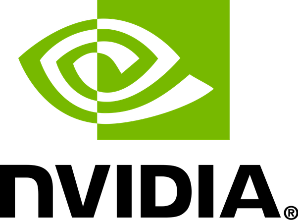
Photo credit: Quora
Everyone is head over heels in love with the NVIDIA logo because it symbolizes the human eye. Many believe that the company designed its logo like this to suggest themes of vision, insight, and perception. NVIDIA’s primary intention is to represent its innovation, precision, and technological prowess.
But do you want to know the real reason behind the NVIDIA logo?
At first, you might think that the NVIDIA logo is shallow and represents only a mere meaning of the business’s identity. But if you look and study closely, it’s a basic visual metaphor that means ‘an eye that sees everything.’
As a matter of fact, the NVIDIA logo generally symbolizes the eye of God. So contextually, it means the company sees everything, and it was chosen to perceive the entirety (of the internet).
The Early Days of NVIDIA logo and its company
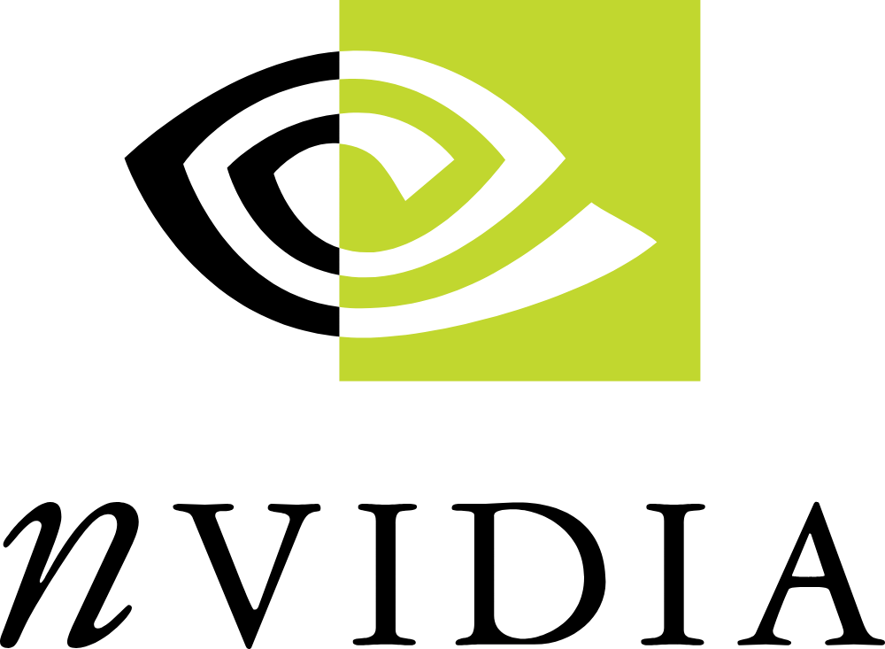
Photo credit: Logopedia
The first ever NVIDIA logo features a black and green theme. Founded by good friends Jensen Huang, Chris Malachowsky, and Curtis Priem, NVIDIA’s first-ever products are graphics processing units for multimedia or gaming applications.
With so much going on (as usual in the tech industry), the founders picked a unique logo design for NVIDIA.
The brand name NVIDIA was split into a font pairing combination, and the symbol is black, white, and yellow-green. As you can see, the letter “n” is in italics and lowercase, while the remaining letters “vidia” are in the upper case of the Handel Gothic font.
Also, half of the ‘eye symbol’ depicts a square yellow green box which stands as a standalone graphic element that emphasizes the company’s commitment to ‘thinking out of the box’.
What we like most about the NVIDIA logo
As a team that handles AI logo generators, we are fond of doing logo analysis to expand our knowledge on how logos and their meanings work. What we like most about the NVIDIA logo is it features two different typefaces – kind of like knowing how to do a split font logo changes.
We are also true fans of the meaning behind the NVIDIA logo – particularly the ‘eye design’ and its cultural explanation.
Logomakerr.ai allows you to choose from thousands of logo templates, and we push the boundaries of what is possible—kind of like what NVIDIA is doing despite only changing its logos twice.
The Tech Effect of NVIDIA logo to the industry
We could see the tech effect of the NVIDIA logo on the industry in an eye-to-eye fashion. There are many reasons behind this, including:
1. Visual representation of advancement – The NVIDIA logo screams their commitment pushing the boundaries of what is possible in graphics processing, artificial intelligence, and other computing fields. Also, even if computers are invented in 1822, the first ever hardware was not built until 1991 and NVIDIA is founded in 1993 – you can really see the resemblance of the company. Talk about standing the test of time, right?
2. Brand recognition – Of course, without being instantly recognizable by many users, NVIDIA logo will not be in sync of what’s new and trending in the technological industry. Their commitment to quality and reliability made it easier to their audience and big business partnerships to remember their brand.
To support this view fully, some of NVIDIA’s business partners are Google, Microsoft, Shopify, Slack, and so much more.
3. Influence on gaming culture – We absolutely agree if someone said that NVIDIA plays a major influence on gaming culture. Many popular brands (and so millions of gamers) favored NVIDIA’s GeForce Graphics because of their performance and visual fidelity.
To proudly showcase the brand, the NVIDIA logo is often placed and displayed in many marketing materials and gaming hardware.
If you think these three are just the tech effects of NVIDIA logo, you’re barking up the wrong tree. On the other hand, if we keep on going, you might have to read this article for as long as you can. Still, the tech effect of NVIDIA logo is definitely something we can see on how the company is standing strong – especially in the trading market against other S&P 500 companies.
Create your own tech logo with this AI logo generator
If you want to symbolize new tech leadership, creating a hot tech logo will give you the upper hand and drive your business to success. Doing this with an AI logo generator will not just make you look like an expert in the field but can also be a good value.
For as low as $29, Logomakerr.ai is an AI logo generator that features thousands of logo templates, including technology logo designs. The tool generates hundreds of unique logos with little input in seconds, and you can customize the symbols, icons, typography, and color of your logo.
Here’s a short step-by-step process to use Logo Maker AI.
- Visit the Website: Go to the Logo Maker AI website to access the platform.
- Choose Your Style: Select your preferred logo style from our pre-designed templates. Or if you want to fully customize it, just click ‘create a logo’ from the landing page.
- Enter Important Details: Input your team name, slogan, colors, and your preferred font.
- Browse Design Elements: Explore the library of design elements, including symbols, shapes, fonts, and colors, to customize your logo.
- Customize Your Logo: Experiment with different combinations of design elements to create a unique logo that reflects your brand identity.
- Preview and Refine: Use the preview feature to see how your logo will appear in various contexts, making any necessary adjustments.
- Download Your Logo: Once satisfied with your design, download your logo in high-resolution format.
- Share Your Logo: Share your logo with your team members, fans, and supporters to generate excitement and unity!
Also, wait until Logomakerr.ai produces real-life mockups for your product and online identity. This will help you see the bigger picture before you decide to spend a lot of money on printing the logo.