Lowercase vs Uppercase Logo: Are you ready to unravel the secret behind impactful branding?
When it comes to creating a logo design for your business, every design decision matters.
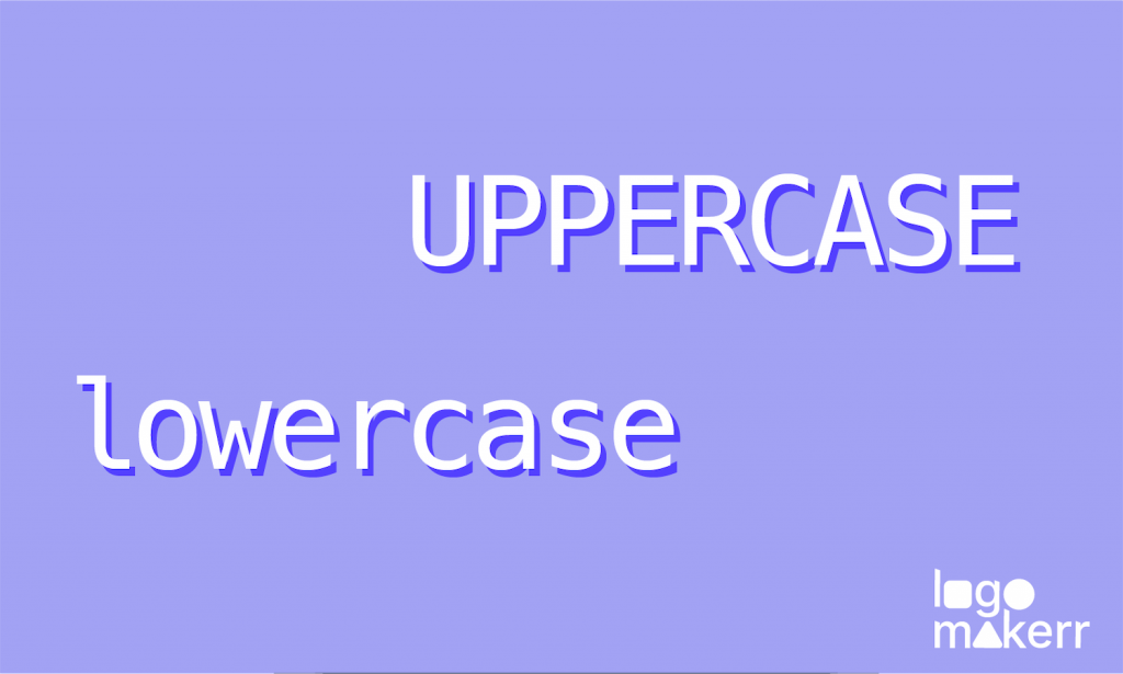
One crucial choice often arises using lowercase or uppercase letters in your logo. While both options have their merits, it’s essential to understand the impact each style can have on your brand identity and overall perception.
In this blog post, we’ll explore the strengths and weaknesses of lowercase and uppercase logos, helping you make an informed decision that aligns with your brand’s goals.
Get ready to discover which works better for your brand, and let’s embark on this typographical adventure together!
Lowercase Lettermark Logo: The Casual Charm
In this captivating world of branding, lowercase logos are all about embracing a casual charm that speaks volumes. Unlike their uppercase counterparts, lowercase logos feature letters that are smaller and more relaxed in appearance.
Think of them as the rebels of the logo world, breaking free from the traditional conventions and making a statement with their unassuming yet captivating presence. They create a warm and welcoming vibe, like that friendly neighbor who always greets you with a smile.
An all-lowercase logo style resonates with industries that strive for innovation, creativity, and a forward-thinking image.
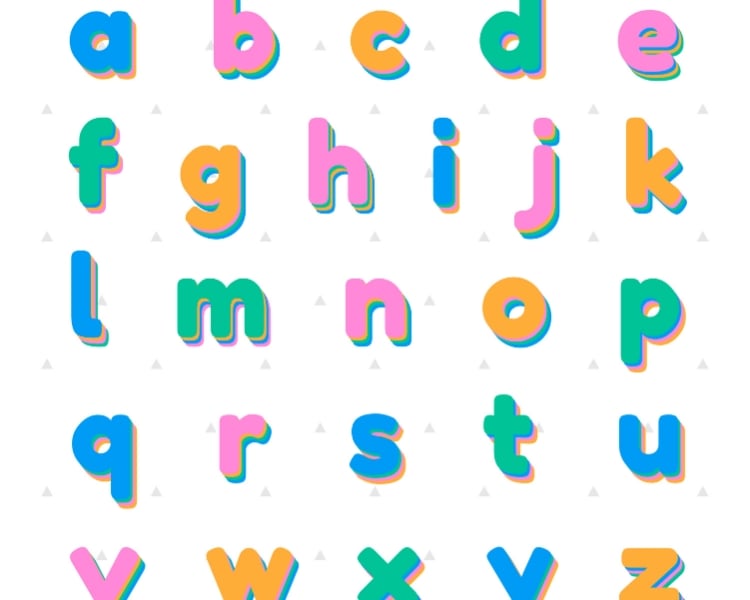
One of the incredible strengths of lowercase logos is their versatility and flexibility. The smaller letterforms allow for seamless integration with other design elements, giving you the freedom to create visually captivating compositions.
You can pair your lowercase logo with complementary graphics, symbols, or taglines and watch them blend harmoniously to form a cohesive brand identity. And let’s not forget about scalability.
Lowercase logos scale down effortlessly, ensuring they remain legible and recognizable even on small screens or when printed in smaller sizes. This adaptability makes lowercase logos an intelligent choice for businesses that want their brand to shine across various platforms and touchpoints.
With lowercase letters, you can play around with different typography styles, letter spacing, and even customizations. It’s your chance to let your brand’s unique voice and story shine through!
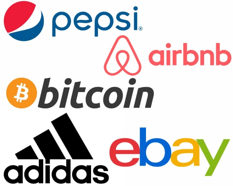
Real-Life Examples of Lowercase Logos
Here are the collection of brands that have embraced the casual charm and modern appeal of lowercase letterforms in their logo designs.
Uppercase Lettermark Logo: The Bold Authority
In the competitive world of branding, projecting authority and professionalism is crucial. And only some logo styles can match the impact of uppercase letters in achieving this goal.
The bold and assertive nature of uppercase typography instantly demands attention and conveys a sense of confidence and credibility. Not only do uppercase logos exude authority, but they also boast superior clarity and legibility.
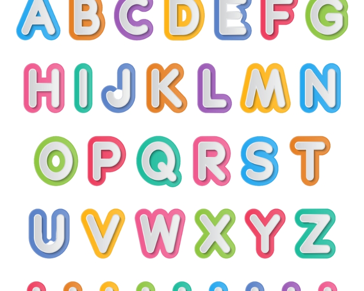
The distinct shapes and larger letterforms of uppercase letters make them easily recognizable, even from a distance or at smaller sizes. This ensures your brand name or initials are clear and easily readable across various platforms and mediums.
But it’s not just about visibility – all capital letters-logotypes leave a lasting impact. The bold and impactful nature of uppercase letters creates a visual statement that lingers in the minds of consumers. Hence, it’ll have a commanding presence that captures attention and reinforces brand recall.
With their strong presence and unwavering confidence, uppercase letterforms have the power to captivate and leave a lasting impression.
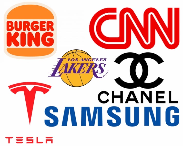
Real-Life Examples of Uppercase Logos
From global giants to innovative startups, these brands have mastered the art of commanding attention and standing out with their bold and unforgettable uppercase logos.
Choosing the Right Brand’s Logo Style!
In the world of logo design, choosing between lowercase and uppercase letter marks can significantly impact how your brand is perceived. Lowercase logos convey a sense of approachability and modernity, while uppercase logos command authority and professionalism.
But if you need clarification on whether to use lowercase, uppercase, or an initial capital letter-type lettermark only, consider the following brand values to guide your decision-making process.
Brand Identity and Target Audience
Consider your brand’s personality, values, and the feelings you want people to have when they see your logo.
Do you want your brand to be relaxed and friendly, creating a sense of approachability and ease? Or are you aiming for a more serious, professional image that exudes authority and expertise?
Understanding what your audience prefers and expects from your brand is also crucial. This knowledge will help you pick a logo style that really connects with them.
Industry Analysis and Competition Differentiation
Look closely at your industry and what your competitors are doing with their logos. Study how other brands use lowercase and uppercase letter marks, and find ways to make your logo stand out while still fitting in with your overall brand style.
You can also check out what’s hot and not within the market, consider whether you want to align with or differentiate from them, and identify opportunities to stand out while maintaining a cohesive brand image.
Coherence and Consistency
When deciding between lowercase and uppercase letter marks, ensure the style matches the typography, colors, and overall look and feel you’ve chosen for your brand.
Aim for a cohesive and unified look across all your brand assets, including your website, marketing materials, and social media profiles. And when everything looks consistent, it helps people recognize and remember your brand more easily and reinforces the message you want to convey.
And if you’re looking for a user-friendly AI logo maker to bring your vision to life, LogoMaker.AI empowers you to create a stunning logo that perfectly represents your brand.
Whether you’re a seasoned designer or a beginner with no design experience, LogoMaker.AI provides a seamless and enjoyable logo design process. From selecting the right font to customizing colors and symbols, you’ll have complete control over every aspect of your logo design.
Testing, Feedback, and Iteration
To ensure you’re on the right track, don’t hesitate to contact people you trust, like your colleagues, friends, or even focus groups. Their opinions and insights can give you valuable perspectives on how your chosen style resonates with them and aligns with your brand identity.
Take their feedback to heart and use it to refine and improve your logo design. The goal is to create a final choice that genuinely captures the essence of your brand and effectively connects with your target audience. So, feel free to iterate and make adjustments along the way to create a great logo that captures the attention of your prospects.
Lowercase vs Uppercase Logo
It’s essential to understand that there is no one-size-fits-all solution. Each brand’s unique personality and values should guide the decision-making process.
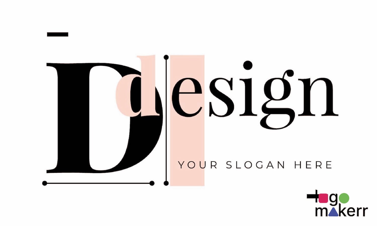
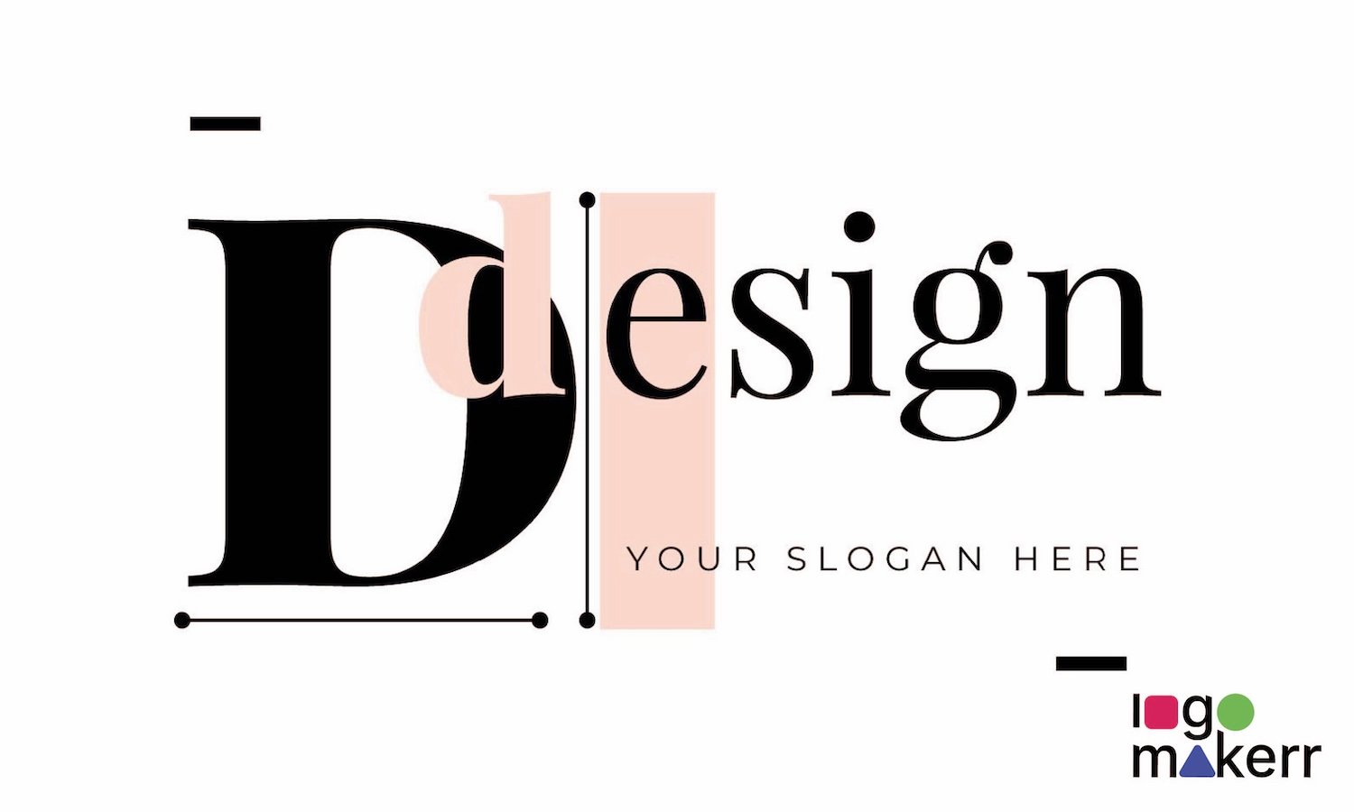
Lowercase lettering can create a friendly and approachable vibe, while uppercase lettering exudes authority and professionalism. Conventional lettering or a mixture of both, which can also be first letter capitalization style, may offer a classic and timeless appeal.
Remember that the ultimate goal is to create a good logo that captures attention, establishes a strong brand presence, and connects emotionally with your audience. Embrace the process, unleash your creativity, and craft a new logo that embodies your brand’s identity and values!
Don’t be afraid to experiment, gather feedback, and iterate until you find the perfect lettermark balance that reflects your brand’s values and resonates with your audience. Ultimately, the right approach will emerge, setting the stage for your brand’s success and leaving a lasting impression on all who encounter it.
