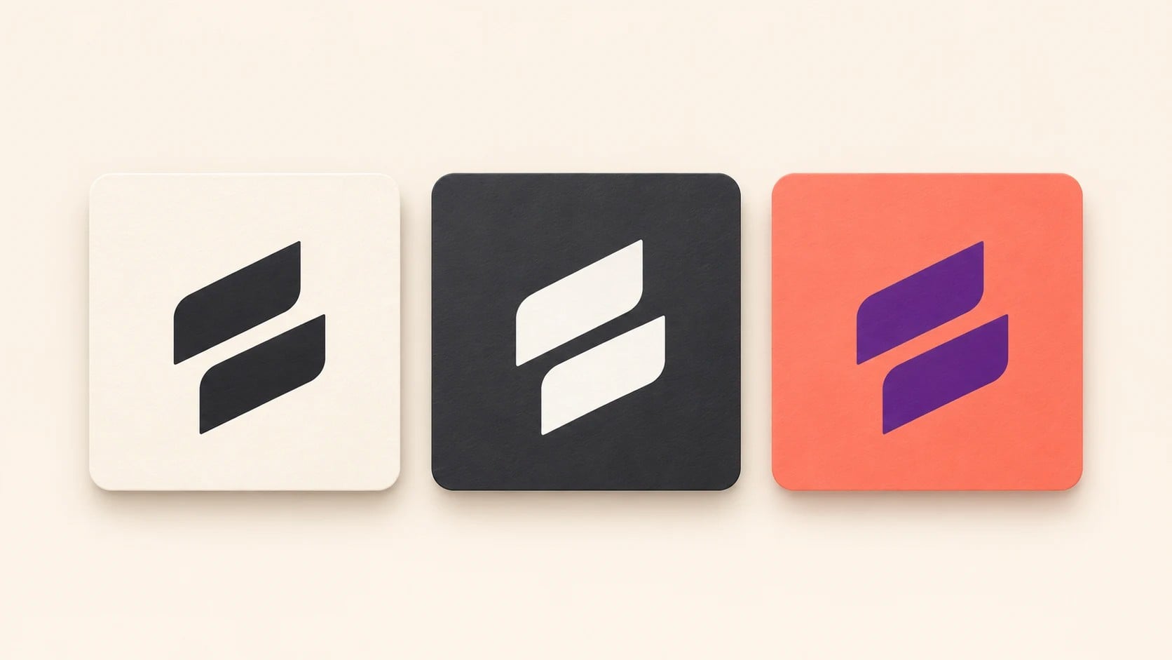
A professional logo handoff should give the next person the right file for every real placement without making them guess. The final package needs editable vector masters, transparent raster exports, approved variations, print-ready color versions, web-friendly files, social assets, and a short usage note. An AI logo maker can help create the mark, but the handoff is what turns a design into a dependable brand asset.
This checklist is designed for founders, designers, agencies, and marketing teams preparing a logo for printers, web developers, social media managers, sign makers, and future collaborators. The goal is not to create dozens of duplicate files. It is to supply a compact, clearly named system that covers normal production needs.
What should a complete logo handoff include?
Start with one approved master and a small family of controlled exports. A practical delivery normally contains the primary full-color logo, a reversed version for dark backgrounds, a one-color version, a symbol-only mark when needed, and horizontal or stacked layouts that have been tested. Every variation should preserve the approved geometry and spacing.
- Editable vector masters: SVG, EPS, or PDF files that can scale without losing quality.
- Transparent raster files: PNG exports at useful sizes for office, web, and social use.
- Print versions: CMYK or spot-color artwork prepared for physical production.
- Screen versions: RGB or sRGB files optimized for browsers, apps, and presentations.
- Usage guidance: a brief document explaining which file to use, minimum size, clear space, and prohibited changes.
Keep a vector master as the source of truth
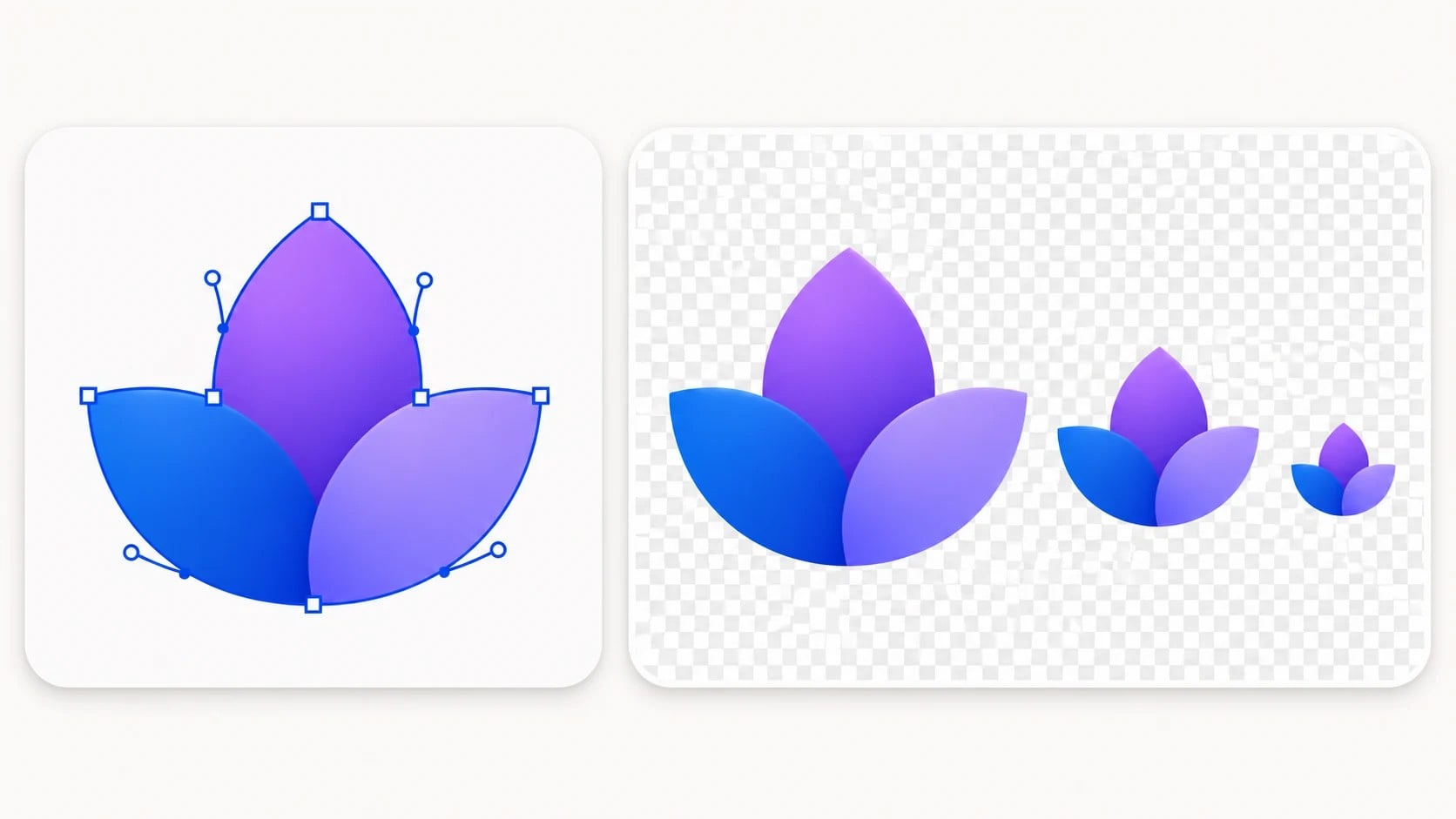
Vector artwork is essential because it can be enlarged for signs, packaging, vehicles, uniforms, or trade-show graphics without becoming blurry. Keep an editable master in a format the production team can open, and include a widely compatible SVG or PDF export for teams that do not use the original design software.
Outline fonts only in the production copy when required, while retaining a separate editable source with live type. Confirm that strokes, masks, gradients, and transparency survive export. Open the exported file independently instead of assuming that a successful save means the artwork is correct.
Do not make a small JPEG the only surviving source. A raster preview may look fine in an email but it cannot reliably support large-format print or future edits. Store the original master in a clearly labeled folder and treat all PNG and JPG files as derived exports.
Provide transparent PNG files at useful sizes
PNG is the most practical format for people who need to place a logo in a document, slide, website, email signature, or social graphic. Export the logo with a transparent background and enough resolution for the intended use. A few deliberate sizes are easier to manage than a folder containing dozens of nearly identical files.
Check the visible artwork bounds before delivery. Excess transparent padding can make a logo look smaller than other elements even when the image dimensions are correct. Test the PNG on both a light and a dark background to catch white edges, missing reversed artwork, or accidental background pixels.
Include only approved logo variations
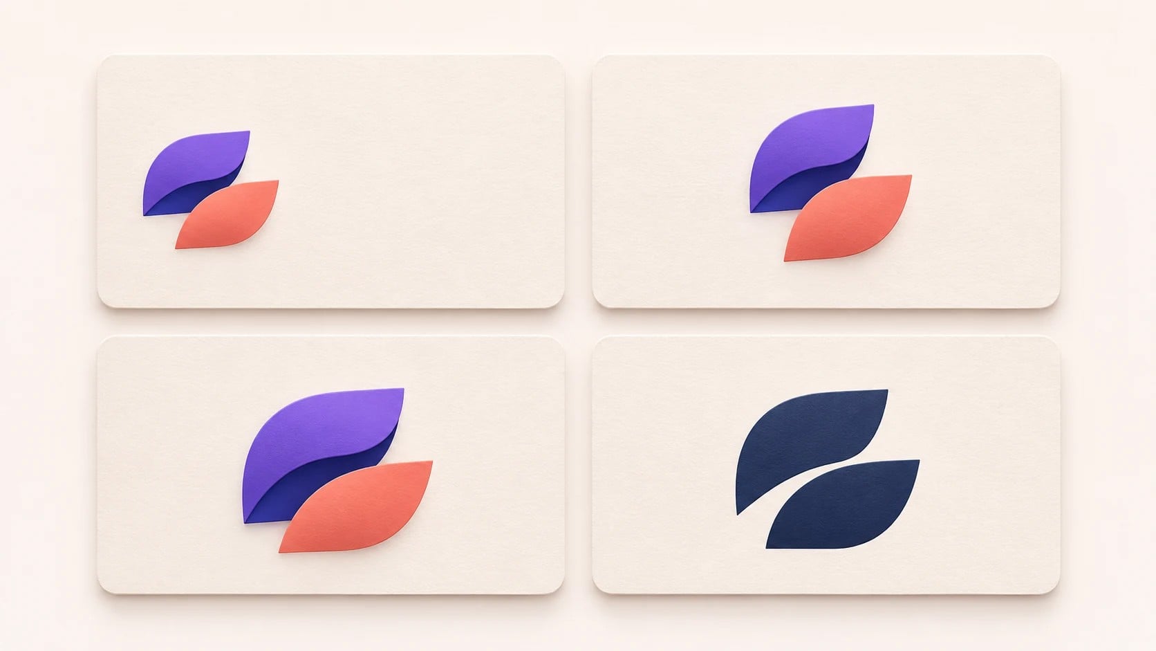
A handoff should prevent improvisation. Include the primary logo, approved horizontal and stacked arrangements, the standalone symbol where appropriate, and controlled full-color, reversed, and one-color treatments. The logo variations guide explains how each version serves a different placement while keeping the identity consistent.
Avoid exporting speculative versions simply because they are easy to generate. Every file in the delivery can be mistaken for an approved asset. If a layout or color treatment has not passed review, keep it out of the final package.
Separate print files from screen files
Printing and screens use different color systems. Digital work normally uses RGB or sRGB, while commercial print may require CMYK or named spot colors. Put these files in separate folders so that a social media manager does not accidentally use a CMYK asset online and a printer does not receive an unverified screen export.
For print, include vector artwork and document the approved process colors, spot colors, or black-only treatment. Ask important suppliers about accepted formats, minimum line weight, and any requirements for embroidery, engraving, vinyl cutting, or foil. A proof from the real process remains more reliable than a monitor preview.
For web and app work, favor lightweight SVG when the destination supports it and PNG where a raster file is safer. Remove unnecessary metadata, confirm responsive scaling, and verify that the logo remains clear at the actual header or icon size.
Prepare web and social media assets deliberately
Social platforms may crop square images into circles, while website headers usually need a wide, shallow mark. Provide an avatar-safe symbol with enough internal breathing room and a horizontal logo for navigation or footer use. Test the crop instead of relying on the full artboard preview.
Deliver both light-background and dark-background options for websites that use multiple themes. The clear-space and minimum-size guide can help define when the full wordmark becomes too small and a simpler symbol should replace it.

Use a file naming system people can understand
File names should describe the asset without requiring the recipient to open every file. Use a consistent sequence such as brand, layout, color, background, color mode, and format. For example, brand-horizontal-full-color-rgb.svg or brand-stacked-reversed-dark-background.png is more useful than logo-final-v7-new.png.
Keep folder names equally simple: 01 Master, 02 Print, 03 Web, 04 Social, and 05 Guidelines. The logo file naming and brand folder guide provides a repeatable system for teams managing more than one brand or campaign.
Add a one-page usage note
A concise guide can prevent more mistakes than another folder of exports. Show each approved variation on its intended background and state when it should be used. Record the minimum tested size, clear-space rule, color values, and a few prohibited treatments such as stretching, rotating, adding shadows, changing colors, or placing the mark on a busy image.
Include a contact or decision owner if the organization has one. When an unusual production request appears, recipients should know who can approve an exception instead of creating an unofficial version.
Verify the package before delivery
Open every important export in a different application, zoom in, and inspect transparent edges. Print a basic proof, test the smallest intended web size, and place reversed artwork on a dark background. Confirm that links and fonts are not missing and that color labels match the actual files.
Then ask someone who did not prepare the package to find the correct file for a website header, a black-and-white invoice, and a printed banner. If that person hesitates, improve the folder structure or names. A successful handoff is measured by how easily another person can use it correctly.
Frequently asked questions
Which logo file should I send to a printer?
Send an approved vector file such as PDF, EPS, or SVG and ask the printer which format and color mode they prefer. For specialty work, also confirm spot colors, minimum detail, and proof requirements.
Do I need both SVG and PNG files?
Usually yes. SVG is ideal for scalable digital use when supported, while transparent PNG is widely compatible with presentations, documents, email, and many social tools.
Should fonts be included in a logo handoff?
Include font names and licensing information in the usage note, but do not distribute font files unless the license allows it. Supply outlined production artwork so recipients can reproduce the logo without missing-font errors.
How many logo sizes should I export?
Export a small set based on real destinations rather than dozens of arbitrary dimensions. Keep the vector master for any new size and provide tested PNG sizes for common office, web, and social placements.
What is the biggest logo handoff mistake?
The most common mistake is delivering unlabeled files without explaining their intended use. Clear names, controlled variants, and a one-page guide prevent accidental recoloring, distortion, and use of the wrong color mode.