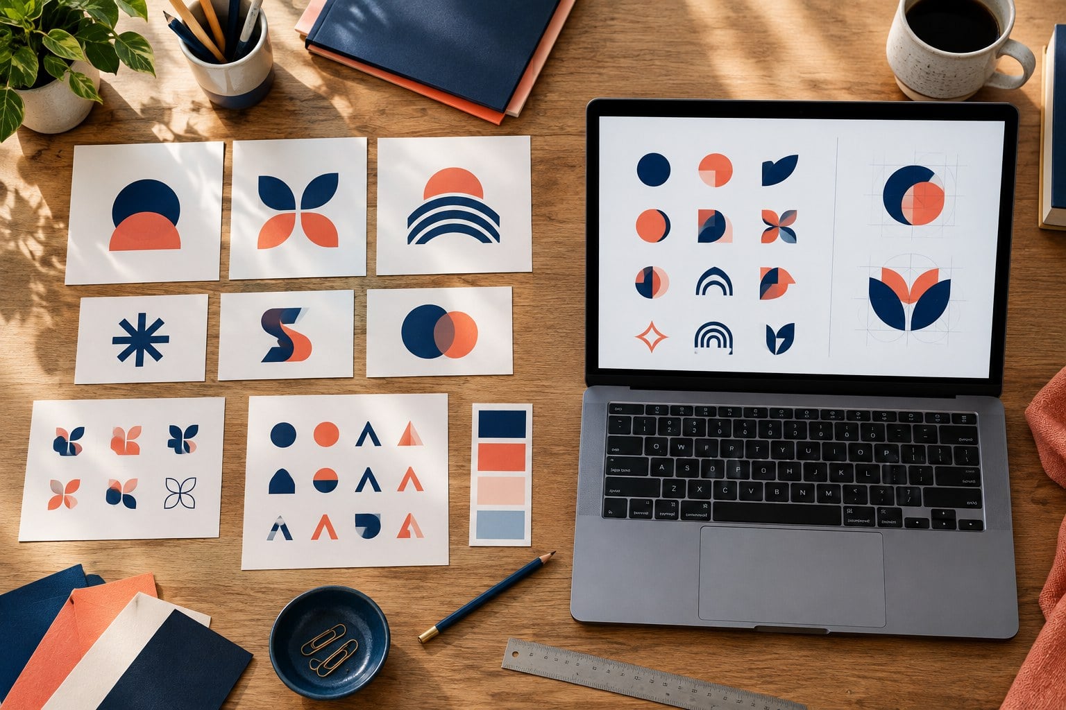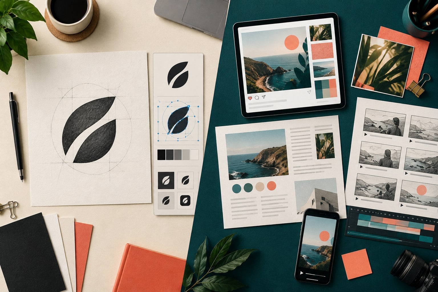
A practical logo system is more than one artwork file. It defines a small set of approved variations—usually a primary lockup, a stacked or compact lockup, a symbol, and one-colour versions—so a team can place the same identity across wide headers, square profiles, small icons, print, merchandise, and difficult backgrounds without improvising a new logo each time.
The goal is not to create as many versions as possible. It is to create the fewest versions needed for the brand’s real applications, test each one, and document when it should be used.
Start with the applications, not a variation checklist
List the places where the logo must work during the next year. Typical examples include a website header, mobile navigation, social avatar, email signature, proposal, invoice, storefront, packaging, uniforms, presentation slides, and a one-colour stamp. Add the approximate shape, smallest size, likely background, and production method for each application.
This inventory prevents two common mistakes. The first is approving only a horizontal logo and discovering that it becomes unreadable in a square profile image. The second is creating a large bundle of variations that nobody can distinguish or maintain.
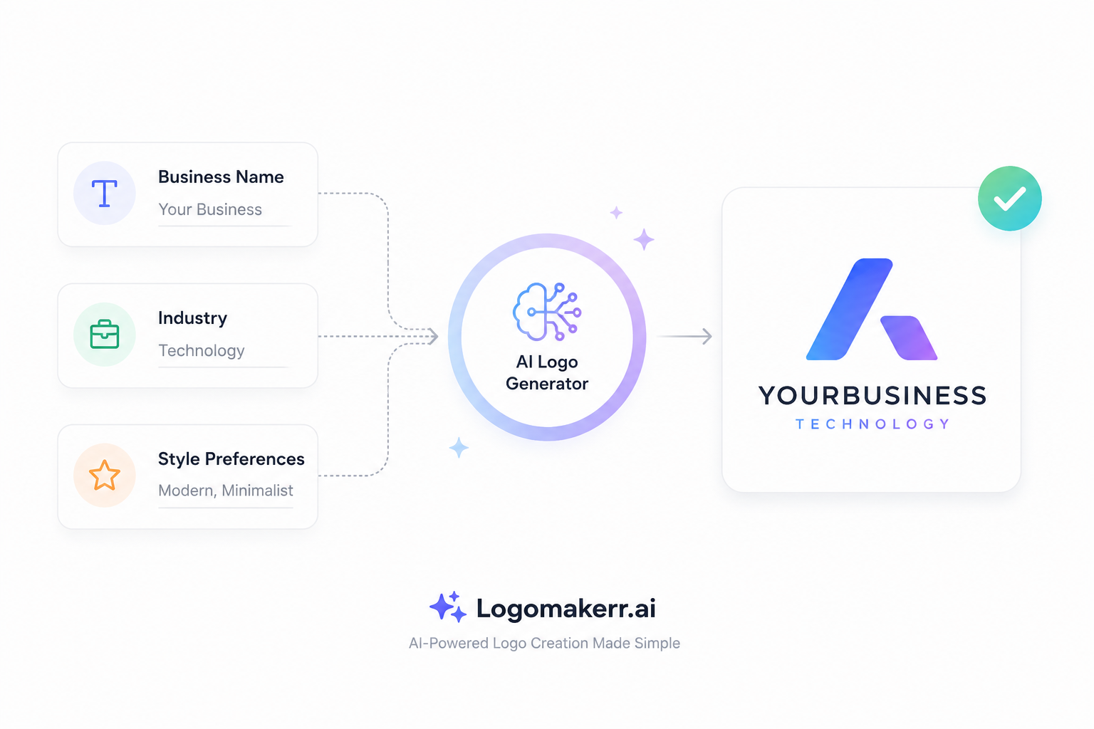
An AI logo maker can help you explore and edit a direction, but the variation system still needs human decisions about use, legibility, consistency, and handoff. Treat the generated design as source artwork for a controlled system, not permission to keep generating unrelated alternatives.
Define the primary logo first
The primary logo is the standard expression of the identity. It normally combines the full wordmark with the main symbol in the preferred relationship. Choose it only after reviewing spelling, proportions, colour, distinctiveness, and likely legal or trademark questions in the relevant markets.
Record exactly what belongs to the primary lockup. A tagline may be optional rather than permanent. A symbol may be attached to the left of the name rather than floating freely. If those relationships are not defined, users will rebuild the arrangement in slide software and gradually create inconsistent versions.
Test the primary logo on light and dark backgrounds, at the smallest realistic digital and print sizes, and in the widest expected header. The process in our logo testing checklist helps separate an attractive preview from a mark that survives actual use.
Add a compact or stacked lockup only when space requires it
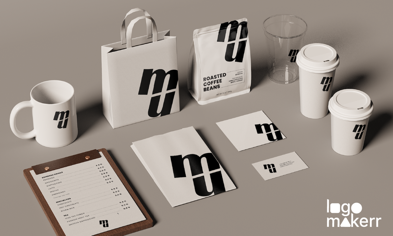
A stacked lockup rearranges the same approved elements into a taller or more square composition. It can work well on packaging fronts, presentation covers, social graphics, badges, and centered layouts where the horizontal primary logo leaves too much empty space.
Do not create the stacked version by squeezing or stretching the primary artwork. Rebalance the symbol, wordmark, spacing, and tagline deliberately while keeping the same visual language. The compact lockup should still feel like the same identity when placed beside the primary version.
Define the conditions that justify the alternate. For example: use the primary lockup whenever the available area is wider than it is tall; use the stacked lockup when the area is close to square and the full name remains legible. A simple rule is easier to follow than “use whichever looks best.”
Use stacked lockup
Use approved symbol
Use monochrome artwork
Never compress, redraw, or remove elements ad hoc. Move to the next approved variation instead.
Treat the symbol as a separate asset, not a shortcut
A symbol-only mark can be useful for browser icons, app icons, social profiles, favicons, stickers, and other very small spaces. It should be approved only if people can connect it with the brand in the intended context. A new business may need to use the full name more often until the symbol becomes familiar.
Simplify detail when necessary rather than shrinking the full illustration indefinitely. Fine lines, counters, and internal gaps can disappear at icon sizes. Produce a specific small-size version only when testing proves that the standard symbol fails; document the change so it is not confused with the master artwork.
Never assume that every decorative element from the primary logo should become an icon. Test the symbol at 16, 24, 32, 64, and 128 pixels, and on both standard and high-density screens. Compare it with neighbouring icons rather than judging it alone on a large canvas.
Create one-colour and reversed versions for production
A one-colour logo is not simply a greyscale screenshot. It is approved artwork that reproduces in one solid ink or colour. It matters for stamps, engraving, embroidery, vinyl cutting, invoices, economical printing, and any process where gradients or multiple colours are unavailable.
Check whether overlapping shapes merge when colour differences disappear. Confirm that negative spaces remain open and that small details do not fill in. If the main artwork relies on a gradient, create a flat treatment that preserves the intended hierarchy without pretending every effect will survive production.
A reversed version is usually light artwork intended for a dark field. Do not place the ordinary dark logo on a dark photograph and add an improvised shadow. Supply the correct light artwork and specify when a solid background panel or quiet image area is required. The companion guide to clear space and minimum size explains how to protect each variation from crowding and loss of detail.
Build a small approval matrix
| Variation | Best use | Do not use when | Minimum test |
|---|---|---|---|
| Primary lockup | Website headers, proposals, signage | The full name becomes too small | Wide and narrow headers, light and dark fields |
| Stacked lockup | Square packaging, covers, centered layouts | It creates unnecessary height | Square crop and common print sizes |
| Symbol | Avatar, favicon, small badge | The audience needs the full name | 16–128 px and neighbouring-icon comparison |
| One-colour | Stamp, engraving, single-ink print | Shapes merge or details fill | Black, white, and the real production method |
This table is a starting point. Replace the examples with your actual applications and tested limits. Every approved version should have a named master file, a defined purpose, and a responsible owner.
Test every variation in context
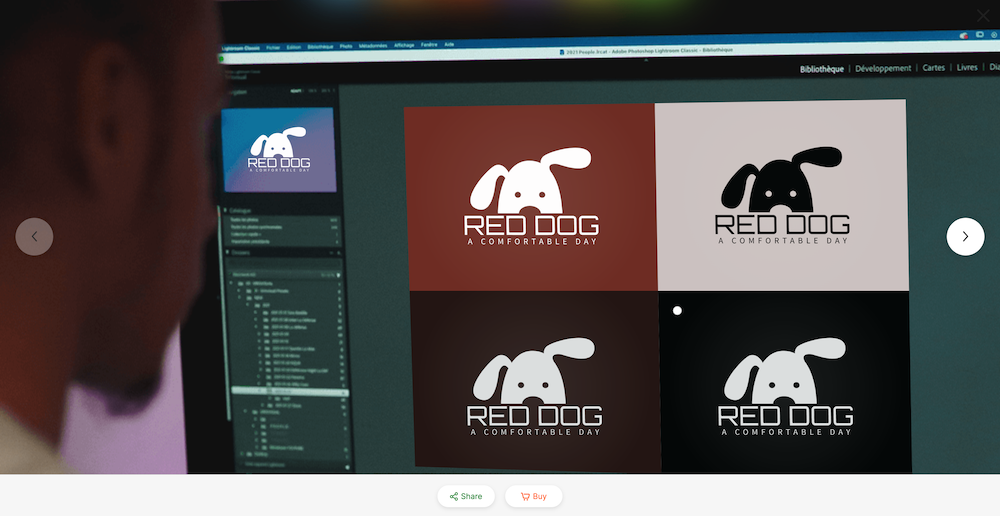
Use real-size mockups rather than placing every version on a blank artboard. Put the primary logo in the actual website header, the symbol beside other social avatars, the one-colour mark on a sample invoice, and the stacked lockup on the package or sign it is meant to support.
Review from normal viewing distance. Check legibility, contrast, spacing, reproduction, and whether the variation still feels connected to the master identity. Ask a small group of reviewers to identify the business and intended tone without explaining the design first.
Keep notes about failures. If a tagline disappears below a certain size, either set a minimum or remove it in an approved small version. If the symbol is mistaken for another object, revisit the shape before making dozens of exports.
Package and name the final files clearly
Separate approved files from working drafts. Organize by variation, colour treatment, and file type, then include a short usage guide with thumbnails and examples. Vector files are useful for scalable production, while transparent PNG files are practical for many digital uses. Confirm what each vendor needs rather than sending the entire folder.
Use descriptive names such as northstar-primary-dark.svg, northstar-stacked-light.png, and northstar-symbol-one-colour.pdf. Avoid “final-final-2.” The logo file naming guide provides a fuller handoff structure.
Version the package when approved artwork changes. Do not silently replace master files in a shared folder, because old presentations, printer files, and website assets may still depend on the previous release.
Frequently asked questions
How many logo variations does a small business need?
Most small businesses can begin with a primary lockup, one compact or stacked lockup, a tested symbol, and one-colour light and dark treatments. Add another variation only when a real application cannot use the existing set.
Is a logo variation the same as a different logo?
No. A variation preserves the same identity while adapting approved elements to a specific shape, size, background, or production method. A different symbol, typeface, or visual idea is usually a new direction rather than a variation.
Should the symbol be used without the company name?
Only when the audience and context make identification reliable. New or less familiar brands often need the full name more frequently, while a symbol can serve small interface and profile spaces.
What files should be included in the handoff?
Include the approved variations in the vector and raster formats required by real uses, plus light, dark, and one-colour treatments, a usage guide, file naming rules, and the release date. Do not promise a format you have not checked or tested.