A logo needs two different safeguards: clear space around it and a minimum size below which it should not be used. Clear space protects the mark from competing text, images and edges. Minimum size protects recognition and legibility. Define both through repeatable measurements and real placement tests rather than copying another brand’s numbers.
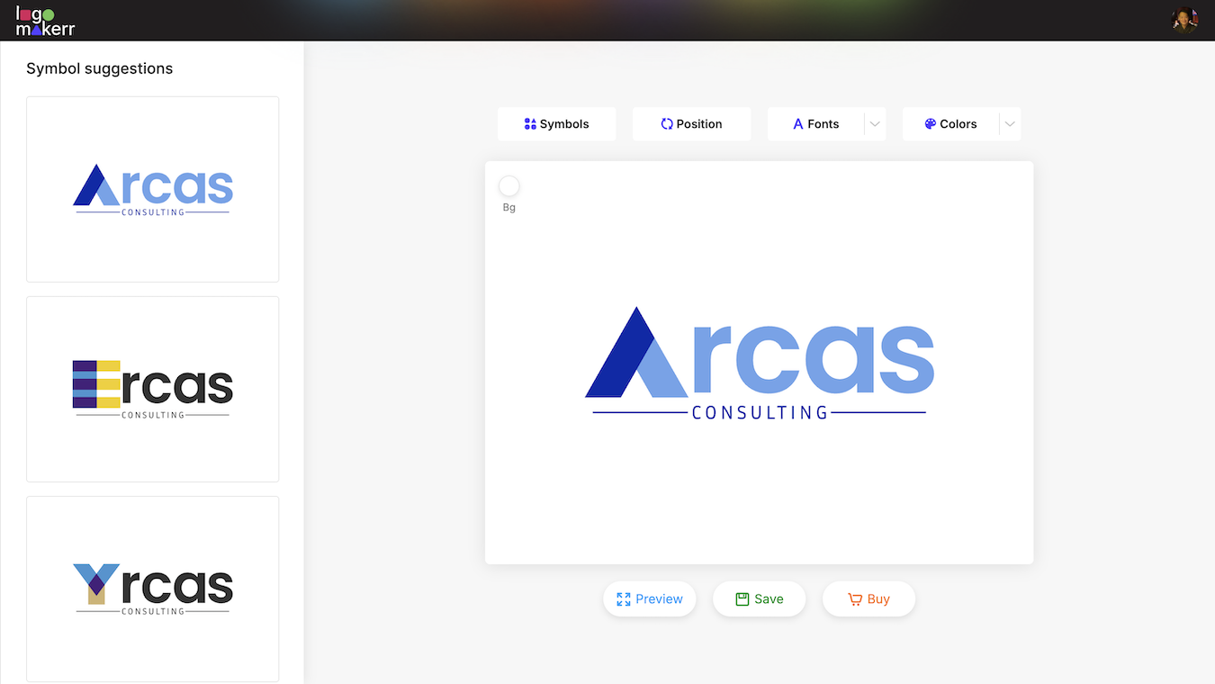
An AI logo maker can help you explore and edit a logo direction. After choosing the artwork, your team still needs to test how that exact design behaves in a website header, social profile, document, sign, package or printed item. This guide describes that manual review and documentation process.
Understand the difference between clear space and minimum size
Clear space is the empty area that should remain around a logo. It creates separation from headlines, body copy, photographs, patterns, borders and the edge of a layout. The rule should identify both the protected boundary and the unit used to measure it.
Minimum size is the smallest approved reproduction for a particular logo variation and use. It may be expressed as a digital width, a print width or another dimension that the team can verify. It is not the same as clear space: a small logo can have plenty of empty area and still become unreadable.
Test the two rules together. A mark that remains recognizable at a small size may still look crowded beside a large headline. A layout can respect the spacing rule while using the logo so small that a wordmark, tagline or fine detail disappears.
Choose a clear-space unit from the logo itself
Use a stable feature of the approved artwork as the measuring unit. That might be the height of a prominent letter, the width of a simple shape, or a documented fraction of the logo’s height. The feature should scale with the logo and remain present in the relevant variation.
Draw a bounding box around the complete approved lockup, including any symbol, wordmark and tagline that belong to it. Measure outward from that box. Do not measure from an arbitrary point inside an irregular symbol, because different users may reach different conclusions.
Name the unit in the guideline and show it in a diagram. A rule such as “keep one x of space on every side” is useful only when the diagram identifies x. If vertical and horizontal spacing differ, document both explicitly rather than expecting users to infer the relationship.
Test the rule against realistic layouts
Place the logo beside the elements it will encounter: a navigation label, page title, product photograph, sponsor mark, card edge and background pattern. Start with the proposed spacing, then look at the layout at its real viewing size. The protected area should make the identity distinct without forcing impractical gaps.
Test light and dark logo variations separately. A busy photograph can create visual competition even when the measured distance is correct. In that case, the solution may be a quieter image area, a solid holding shape or a different approved logo treatment—not merely a larger margin.
Review partner and sponsor layouts with particular care. Clear space is not a claim that the brands have equal prominence. Alignment, relative scale and contractual placement rules are separate decisions that should be documented for the specific application.
Set minimum size by testing the actual artwork
Export the approved logo and reduce it in a controlled series. Review the symbol outline, letter counters, fine strokes, punctuation and any tagline. Stop before the design merely survives; choose a size at which it remains comfortably recognizable and readable in the intended context.
Do not assume one number works for every variation. A symbol-only mark may remain useful at an avatar size while a full wordmark or tagline needs more width. Record a separate minimum for each approved arrangement that people are allowed to use.
Digital testing should use the real browser or application where practical. Check standard and high-density screens, but describe the delivered asset by its actual dimensions and intended placement. Avoid claiming that one pixel width guarantees the same physical appearance on every device.
For print, produce a physical proof through the intended process and substrate. Ink spread, paper texture, embroidery, engraving and small-format production can affect detail differently. Ask the supplier for applicable artwork requirements and test the result rather than converting a web number directly into a print rule.
Check whether the tagline needs its own cutoff
A small tagline is often the first part of a lockup to fail. If it cannot be read at the planned size, do not enlarge only the tagline inside the artwork or redraw the spacing without approval. Use an approved logo variation without the tagline where one exists.
Document the transition clearly: above a tested width, the full lockup may be used; below it, use the simplified variation; below the simplified mark’s own minimum, choose another brand treatment. This gives a designer a decision path instead of a warning with no alternative.
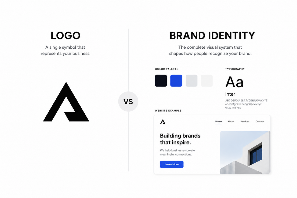
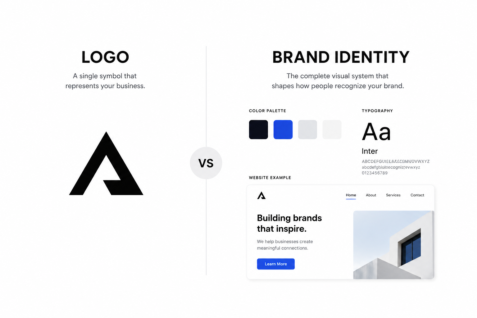
Keep the relationship between the symbol and wordmark intact. The article explaining the difference between a logo and brand identity provides useful context: the logo is one controlled asset within a broader visual system, not a collection of pieces that should be rearranged for every layout.
Test common failure cases
Place the smallest approved logo in a website header, mobile menu, social avatar, presentation footer, invoice, email signature and representative printed item. Use only applications your organization actually needs. Check whether the logo becomes confused with interface icons, surrounding copy or another mark.
Review cropping. A social platform may display an uploaded square inside a circle, while a document template may trim close to an edge. The file can contain transparent padding, but the visible result still needs checking in the destination preview.
Check background contrast independently from size. A perfectly spaced logo can disappear when its color is too close to the background. Provide approved light, dark or single-color variations rather than asking users to add an outline or shadow.
Create a one-page rule people can follow
Show the primary logo inside its measured clear-space boundary. Label the measuring unit. Add the digital and print minimums that were actually tested, and include simplified variations with their own limits. Keep the page visual and place detailed production notes elsewhere.
Include a small set of incorrect examples: text entering the protected area, the logo touching an edge, use below minimum size, an unapproved rearrangement, poor contrast and distortion. Explain the problem instead of covering the page with prohibition symbols.
Name the exact files that follow the rule. A clear diagram is undermined when the shared folder contains several unlabeled logo versions. The guide to building a usable logo file folder explains how approval, variations, formats and release names can support the handoff.
Keep file format separate from usage limits
Vector artwork can scale without the pixelation associated with enlarging a small raster file, but vector format does not remove the minimum-size rule. Fine lines and small type can still become hard to reproduce or read. A scalable file and a legible design answer different questions.
Provide formats appropriate to the intended workflows and preserve the real extension. The guide to common image file formats explains the practical differences among raster, vector and document formats. Confirm that each delivered file matches its label.
For digital delivery, keep a high-quality source and approved exports. Do not repeatedly resize and recompress one small image. For print, give the supplier the appropriate approved artwork and verify the proof against the guideline.
Review the rule when the logo or use changes
A new tagline, revised symbol, different lockup or new small-format application can invalidate the earlier test. Record the guideline version and date, then repeat the relevant spacing and size checks when the artwork changes.
Ask someone who did not create the guideline to apply it to one website layout and one document. If they cannot identify the measuring unit, minimum size or correct variation, revise the instruction. The test of a brand rule is whether another person can reach the intended result.
Frequently asked questions
How much clear space should a logo have?
Define a repeatable unit from the approved logo and test it in realistic layouts. There is no universal measurement that suits every mark and application.
Should the symbol and full wordmark have the same minimum size?
Not necessarily. Test each approved variation separately because a simple symbol may remain usable at a size where a wordmark or tagline becomes unreadable.
Does an SVG logo need a minimum size?
Yes. SVG artwork can scale cleanly, but fine details and small lettering can still become difficult to recognize or reproduce.
When should clear-space rules be updated?
Review them when the artwork, lockup, tagline or intended applications change, and whenever real use reveals that another person cannot apply the current rule consistently.