Despite the many AI logo generators and professional logo designers today, Google – one of the most profitable and famous companies in the world, has chosen to remain loyal to its logo and its color scheme over the years. In fact, one thing that has remained constant is their use of geometric shapes – making the Google logo the best logo out there.
Now, if you love design, branding, and effective logo design, let us fascinate you with what makes the Google Logo geometrically correct. So please sit back, relax, and let’s crack the code behind this logo!
Reviewing the Google Logo: History
Like any great logo, the Google Logo has had its own fair and square transformations since its foundation in the late 1990s. In fact, the earliest version of the Google Logo features a simple, playful font where each letter is in a different color. The first Google logo version reflected the founders’ (Larry Page, Sergey Brin) vision of inclusivity, diversity, and expansion of all its services.
Meanwhile, in 1999, a more refined Google logo was introduced – with the famous blue, red, yellow, and green colors we are familiar with today. Over the years, Google offered us something, especially for aspiring logo designers who wish to adopt a forward-thinking approach and three-dimensional effects in designing. It’s truly a magical existence.
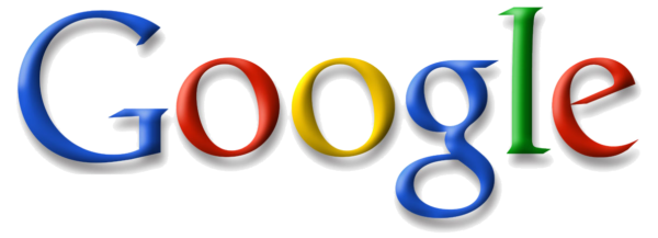
Photo Credit: Looka
Then comes the year 2010 when Google decided to add a subtle gradient to their logo, giving the letters an “always ready to fit in” no matter the context.
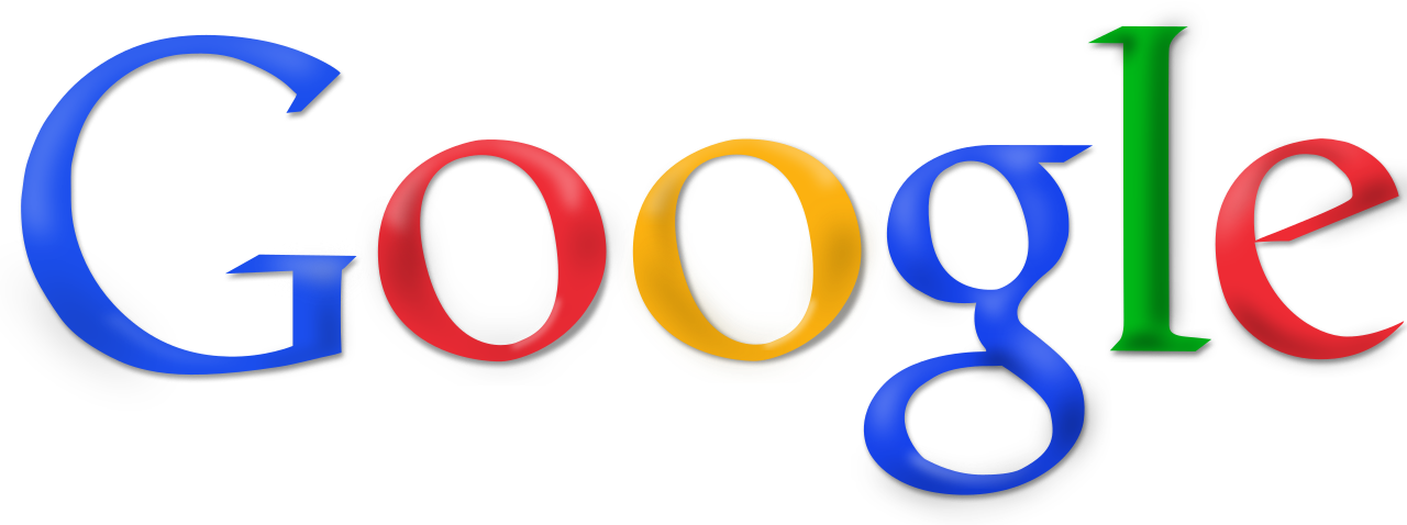
Photo Credit: Wikimedia Commons
Finally, in 2015, a major redesign of the Google logo introduced a more modern and streamlined version. But what truly sets the Google logo apart is its playful nature. As many of you might know, Google sometimes adds a quirky twist to its logo, known as a Google Doodle.
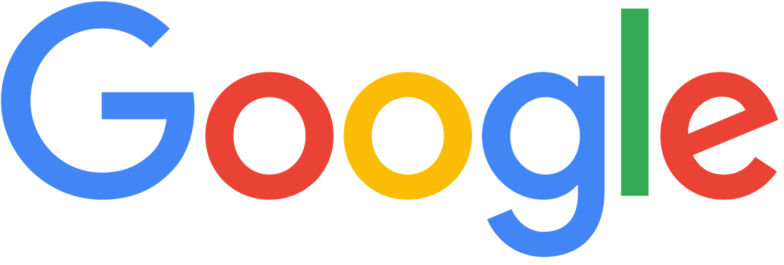
Photo Credit: Wikipedia
Google Doodles are creative illustrations that celebrate notable events, individuals, and important anniversaries in human history. They add an additional element of surprise to the Google experience!
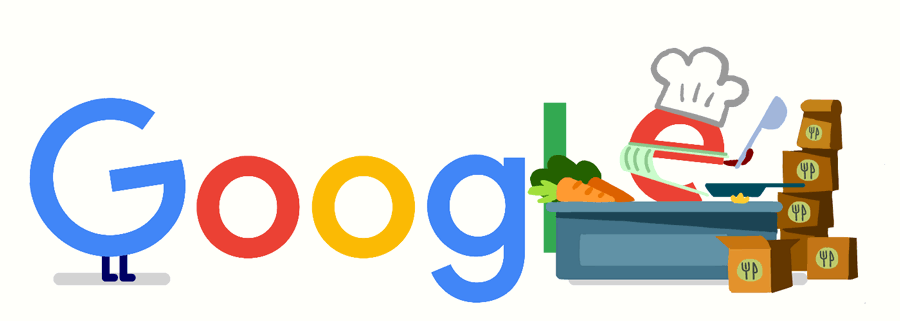
Photo Credit: Artnet News
Analyzing the Google Logo: Shape
Have you noticed the shape of the Google logo? If you take a look closer, you’ll notice that each letter is formed by a combination of circles and curves. But Google uses this kind of method not only to add a touch of whimsy but also to convey different meanings.
For instance, the circle represents inclusivity and connection, which caters to everyone’s internet needs. But what makes it truly remarkable is the use of geometric shapes to form the letters. The “G” in Google, for example, is a perfect circular shape with a slightly tilted angle, giving it a sense of dynamism and movement. In fact, its right-angle triangle is very visually pleasing and has a well-proportioned letterform.
Photo Credit: HubSpot Blog
Now, if you check out the “o’s”, it showcases geometric precision representing infinite possibilities and the ever-expanding nature of knowledge. It is also echoed in the rounded curves of the adjacent letters, creating a professional yet interesting visual flow.
The “l” and “e” are formed using straight lines and sharp angles, conveying a sense of clarity and efficiency.
Beyond the individual letters, the overall arrangement of the logo is extremely important. The letters are evenly spaced and aligned, which then creates a sense of order and balance.
In a nutshell, what we love about the Google logo and what makes it geometrically correct is the company’s commitment to organizing – not only their top-of-the-line, world-renowned logo but also the world’s information.
Critiquing the Google Logo: Color
Photo Credit: Iconfinder
We can all agree that, at this point, the Google logo is truly an iconic symbol that is known and recognized worldwide. But apart from showcasing the most geometrically correct shapes, the Google logo has the best combination of colors. Here are they:
Blue – This color is known to evoke feelings of trust, reliability, and intelligence. Blue reflects Google’s commitment to providing the best search results and trustworthy information. No wonder why a lot of technological companies integrate Google products – no question.
Red – Red, on the other hand, is associated with energy and passion. We think that to make the logo interesting; Red is added as it captures the dynamic nature of the products or services your company can offer, just like how Google wants it.
Yellow – Yellow is known for being friendly, positive, and creative. Since these three aspects reflect Google’s company, they used them in their logo even before its foundation.
Green – Green symbolizes growth, harmony, and freshness. It represents Google’s focus on sustainability and constantly striving to develop environmentally friendly solutions. One of Google’s best CSR (corporate social responsibility) to Mother Nature is its pursuit of net-zero emissions across all its operations by 2030.
Deconstructing the Google Logo: Balance and Symmetry
Google’s logo is instantly recognizable. It will always be the star of the show – all eyes, indeed! The balance and symmetry of the logo play an important role in its visual appeal. Each of the letters in Google’s logo occupies its own space, and yet there is an overall symmetry to the arrangement. If you think about how this balance can be achieved so beautifully, it all comes down to the careful consideration of the size and position of each letter.
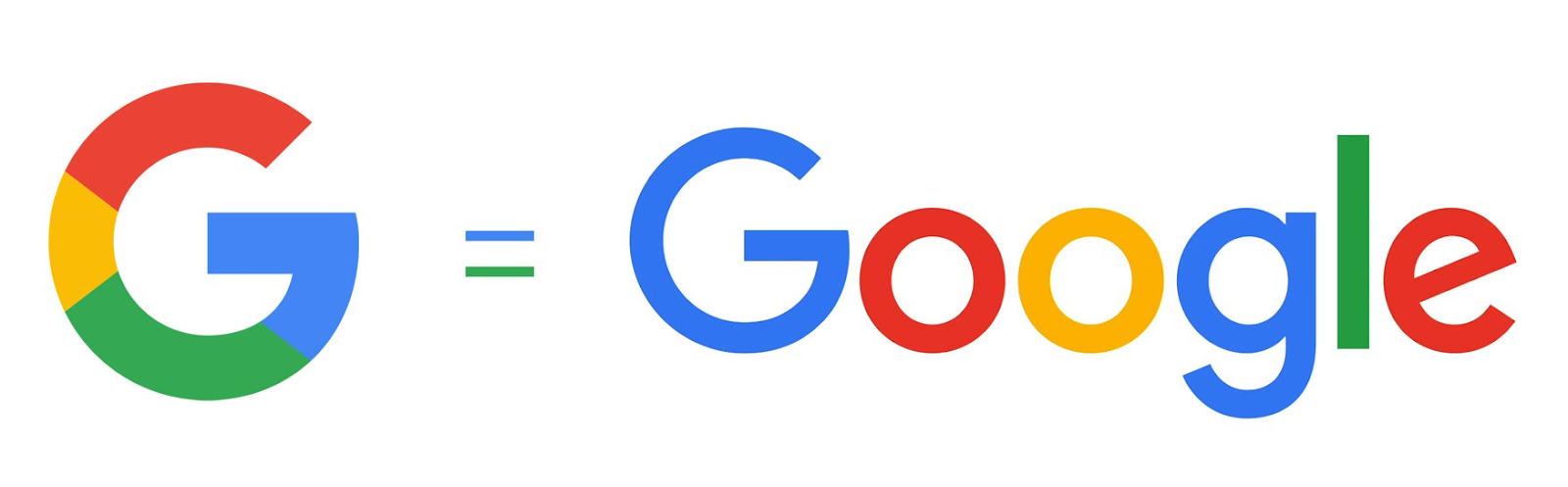
Photo Credit: 1000 Logos
The symmetry, however, adds stability and order to the design. It’s as if you fold the logo in half; you’ll observe that both sides mirror each other perfectly. Though technically, this type of exact symmetry doesn’t encompass the Google logo, it can still enhance the sorting and discovery of hidden images in the logo.
Final Thoughts
Suppose you want an out-of-this-world geometrically correct logo. In that case, Logomakerr.ai offers thousands of pre-designed templates, color combinations, symbols, icons, and typographies so you can craft the perfect geometric logo. Logomakerr.ai serves as a reminder that even in seemingly simple logos – like the Google logo- a world of artistic principles is at play! So, make your dream logo possible and design a true masterpiece with Logomakerr.ai – all for FREE!