Professional branding creates a unique and consistent image and identity for a business, product, or service. It involves developing a strategy encompassing the values, personality, messaging, and visual elements that represent the company and set it apart from its competitors.
A professional brand identity typically includes a logo, tagline, color palette, typography or unique font or fonts, and other visual elements that communicate the company’s values and messaging. It also consists of the company’s tone of voice and the language used in its messaging across different platforms and channels.
So here’s why we’re going to help you create the best logo fonts that you can professionally use for your brand!
Why Is Professional Branding Crucial for Businesses?
Professional branding helps businesses to establish a solid and recognizable identity that resonates with their target audience. It enables them to communicate their unique value proposition and differentiate themselves in a crowded marketplace.
A well-crafted brand identity can also help to establish credibility, foster loyalty, and ultimately drive business success. “Consistent branding builds recognition, but it’s the experience behind the brand that creates loyalty,” explains Ian Beevis, Co-founder of Clean Green Compare. “Your logo and fonts are just the beginning, every customer interaction should reinforce the professional image you’re trying to project.
Of course, when it comes to professional branding, a logo is crucial in giving a business its unique identity. Fonts logos can make or break your branding. The following sections will cover choosing the best logo fonts, the number of fonts to use, and how to combine logo fonts when considering professional branding.
Choosing the Perfect Logo Font for Professional Branding
It’s vital that your choice of fonts evoke only the best reactions from consumers. Memorable logos should be aesthetically lovely to look at. That’s why choosing the perfect logo font for professional branding can be a challenging task, but there are several key factors to consider that can help you make the right choice:
- Readability: Your logo font must be easily read and recognizable, even from a distance. Avoid complex or overly decorative fonts that can be difficult to read.
- Simplicity: Simple fonts are often the most effective in logo design. Avoid fonts with too many flourishes or overly stylized letters, as these can be distracting and difficult to read.
- Brand Personality: Your logo font should reflect your brand’s personality and values. For example, a tech company may want a modern and sleek font, while a traditional business may prefer a classic font.
- Scalability: You will use your logo font in various sizes and formats, so choosing a logo font that can be easily scaled up or down without losing its integrity is essential.
- Originality: Choose a unique and distinctive logo font, and avoid using overly standard fonts that may make your logo blend in with others.
- Consistency: Ensure that your chosen logo font is consistent with your brand’s overall visual identity and other marketing materials, such as website design and packaging.
By considering these factors, you can select a logo font that is visually appealing and effectively communicates your brand personality, message, and values.
You can pay a logo designer to work on your logo and logo font, and you can also pay them to create your own font. However, you probably know how much professional designers charge for their work.
Thankfully, logo generator like Logomakerr.AI (AI logo generator) let you create a unique logo with the perfect logo font for your business. They have a wide range of logo font types. Choosing an excellent logo font is easier with their different fonts, from thin serifs to other elaborate font choices.
How Many Fonts Should You Use?
There are so many logo font choices that finding the right fonts is like looking for a needle in a haystack. As a general rule of thumb, limiting the number of fonts you use in your professional branding to two or three at most is best. Too many fonts can create visual confusion and make your branding look unprofessional.
When selecting your fonts, choosing a primary logo font for your logo and other important brand elements is essential. Then, choose one or two secondary fonts that complement the primary font and can be used for other design elements such as headings, subheadings, and body text.
It’s also important to ensure that your chosen fonts work well together and create a cohesive visual identity. It means considering font size, weight, style, and spacing and testing combinations to see what works best for your brand.
How to Combine Your Logo Fonts
Combining logo display font for professional branding requires a careful approach to ensure that the fonts work harmoniously and create a cohesive visual identity. Finding the perfect logo fonts to combine to create the ideal logo design can be challenging.
And while you may have a hard time deciding on the perfect font for your logo design, here are some steps you can take to come up with effective font pairs:
Start with a Primary Font
Choose one that will be the primary font for your logo design and other essential brand elements. For instance, you can choose sans serif logo fonts or serif fonts, and this font should be the most prominent and represent your brand’s core values and personality.
Select secondary fonts
Choose one or two fonts for logos, like a script font, for example, that complement the primary font and can be used for other design elements such as headings, subheadings, and body text. The secondary fonts for logos should be visually compatible with the primary font but not too similar to create interest and hierarchy.
Consider Font Pairing Principles
Specific fonts for logos naturally work well together based on their similarities or contrasts. That’s why there are some general principles to remember when combining logo fonts, such as pairing a serif with popular sans serif fonts.
You can also combine a bold main font with a light font, fonts with thick and thin strokes, or a narrow script font with a wide script font. Play with font size, weight, style, and spacing to see what combination looks best for your brand.
Test and Refine
Experiment with different combinations and variations of font pairings to see what works best for your brand. For instance, use slab serifs with a simple sans serif or combine a simple sans serif with one from the cursive font families.
Test the logo fonts in different contexts and layouts to make sure they look good at different sizes and scales, and refine your choices until you achieve a cohesive and visually appealing look.
Combining logo fonts for professional branding requires a thoughtful approach that balances visual interest with coherence and consistency.
You don’t want large blocks of fonts if you’re using geometric shapes as design elements because the logo would look crowded. Following these steps, you can create a simple logo and visual identity that accurately represents your brand and resonates with your target audience.
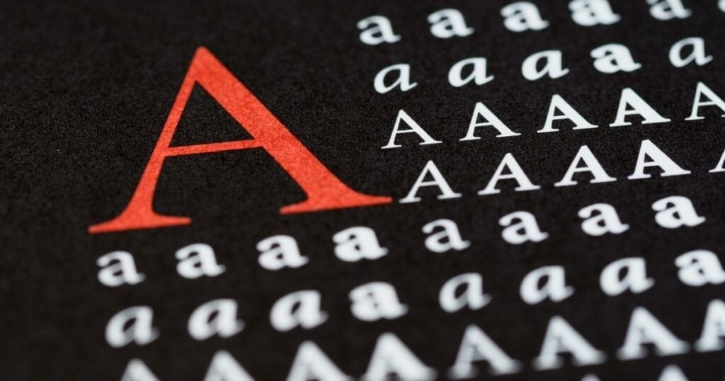
On Serif Typefaces
Designers consider a serif typeface the perfect font for professional branding because it conveys a sense of authority, tradition, and elegance. Serif typeface is generally easier to read in print than sans serif typeface because a serif logo provides visual cues that guide the eye along the text. It makes them a good choice for longer text passages, such as brochures or annual reports.
Moreover, serif typeface has a long history and is often associated with classic and timeless design. It can be advantageous in professional branding, where companies want to convey a sense of stability, tradition, and longevity than a serif logo.
Serif typefaces are often used in legal and academic contexts because they convey a sense of authority and credibility. It can be crucial in professional branding, where companies want to establish themselves as experts in their field.
You can also use them in a wide range of formal to informal contexts and pair them with other typefaces to create a balanced and visually exciting design. This versatility can make them a good choice for professional branding, where companies want to communicate different messages to different audiences.
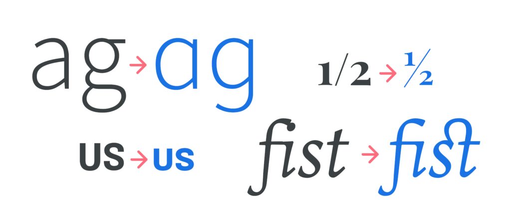
However, serif typefaces should not be confused with sans serifs. Serifs have small lines or strokes at the end of the letterform, called “serifs,” while sans serifs do not have these lines or strokes. Serifs are often associated with a more traditional or formal look, while sans serifs tend to have a more modern or minimalistic feel.
While both serif and sans serif typefaces have unique characteristics and advantages, they are not interchangeable and can be used to achieve different design effects.
Serifs can be a good choice for print materials, as they are often more legible in small sizes. In contrast, a sans serif logo would be more effective for digital design, as it tends to be more readable on screens.
The bottom line? A serif logo and a sans serif logo can be effective for professional branding, depending on the specific needs and goals of the company.
Some companies prefer the traditional serif font since it’s easier to read. Ultimately, the choice of typeface should be based on what will best communicate the brand’s message and values in a clear and visually appealing way.
Are Cursive Logo Fonts Good for Professional Branding?
Cursive logo fonts can be okay for professional branding in specific contexts, depending on the company’s design goals and brand personality.
Cursive fonts can convey elegance, sophistication, and character, but they can also be challenging to read and may not work well in all design contexts. They are what you can call display logo fonts since they are aesthetically pleasing to look at.
Cursive fonts can work well for brands that want to convey elegance, luxury, or a personal touch.
For example, many modern brands for fashion or boutique coffee shops might use a cursive or script font to bring sophistication and exclusivity. However, a more corporate or serious brand may want to avoid the cursive font family, which may appear too informal or playful.
10 Logo Fonts for Professional Branding
A well-thought-of logo design is essential to any brand, and the right logo font can make all the difference. A well-designed logo font should be easily recognizable, legible, and memorable. Choosing the best font family or pairs for your logo design can be daunting, especially when there are so many options.
Below are the top 10 best logo fonts for professional branding:
1. Helvetica
Helvetica is a timeless logo font that has been around since 1957, so unsurprisingly, most famous logos use this font. It is known for its clean, modern, and versatile design. Helvetica is a popular choice for logo fonts because of its simplicity and legibility.
2. Proxima Nova
Proxima Nova is a popular logo font designed by Mark Simonson. It is a modern font that is clean and simple, making it perfect for logo design. Proxima Nova is highly legible, even at small sizes, making it an excellent choice for logos that must be readable on various mediums.
3. Futura
Designed in the 1920s, Futura is a geometric sans serif font. And while it is a geometric sans serif, it is not to be confused with the geometric slab serif font. Its modern and minimalist design is a popular choice for logo fonts, making it highly legible and easily recognizable.
4. Avenir
Avenir is a geometric sans serif font designed by Adrian Frutiger. Its clean and minimalist look makes it perfect for logo design.
5. Gotham
Gotham is a sans serif font designed by Tobias Frere-Jones. You can use it if you want the character spacing to be readable and easily recognizable, and it’s an ideal choice for branding because of its clean and minimalist look.
6. Baskerville
Baskerville is a serif font designed in the 18th century. It is an extremely legible classic, versatile font that is highly legible. You can use all lowercase letters combined with a single uppercase font to add a unique element to your logo. Still, it’s a good choice for a brand’s logo design aiming to convey a sense of elegance and sophistication.
7. Gill Sans
Gill Sans is a sans-serif font designed by Eric Gill that’s clean, simple, readable, and has an instant recall. Hence, it’s an excellent choice for branding.
8. Trade Gothic
Trade Gothic is another sans-serif font designed in the 1940s that exudes modernity. People can easily read and recognize its clean and simple typeface.
9. Bodoni
During an era in which typeface designers were exploring the contrast between thick and thin typographical features, the Bodoni typeface emerged. Giambattista Bodoni pushed the limits of this experimentation by producing a dramatic font that has endured the test of time.
It has been used in renowned logos such as Vogue and Calvin Klein, making it an excellent option for mainstream fashion brands to consider.
10. Montserrat
Montserrat is a geometric sans-serif font that Julieta Ulanovsky designed. It’s one of those fonts used on famous logos. This modern and versatile font has an ultra-sleek, simple, neat look, so it’s easy to read and instantly recalled. It is one of the best choices for professional branding.
Choosing the right fonts for logos is crucial for creating a memorable brand. The fonts above are clear, easily distinguishable, and perfect for professional branding. Logomakerr.AI has additional fonts, free fonts at that, that you can choose from, which is why it’s ideal to use.
When selecting a logo font, it’s crucial to consider your brand’s overall design and choose a font that complements it. Whether you choose a classic font like Baskerville or a newer font like Proxima Nova, the suitable logo font will help your brand stand out in a crowded market.