
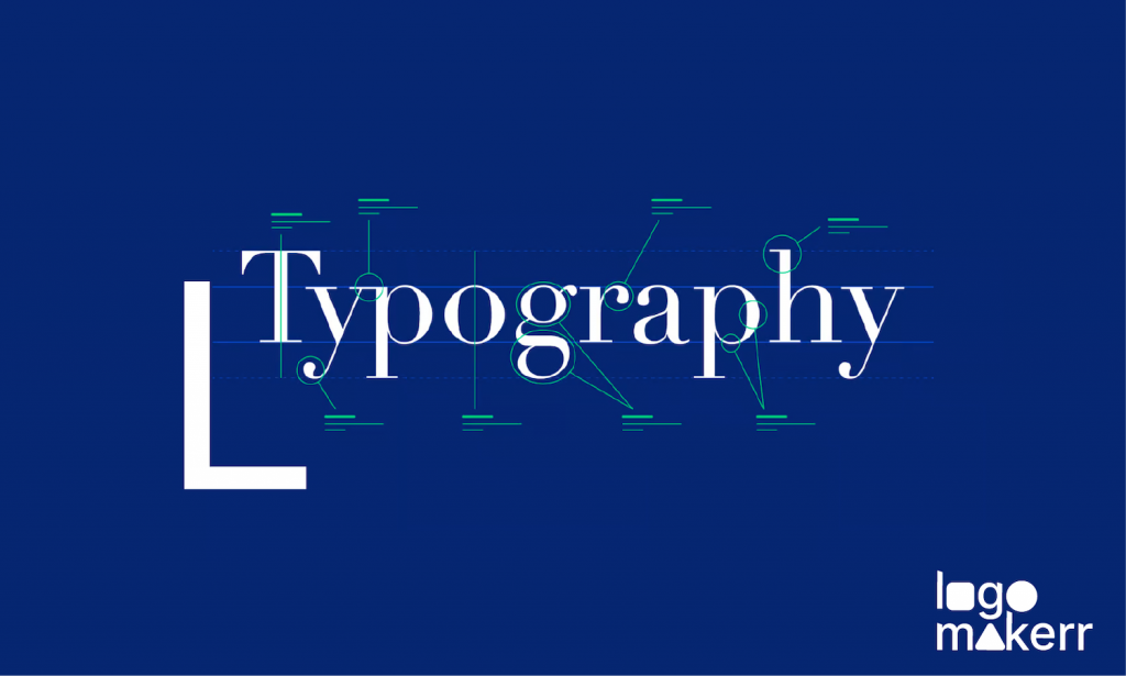
Typography is the backbone of logo design. Choosing the right font can make or break a project because it greatly influences the message a brand wants to convey.
There are five basic classifications of typography: serif, sans serif, script, monospaced, and display. Of course, there are general rules on using each classification, and you can’t just choose between the most and least popular.
If you break down these ground typography rules and use the wrong category for either a body copy or a headline, you are looking for a non-appealing, hard-to-read, and unprofessional logo. It’s 100% drama.
To help you avoid costly mistakes, this blog post will discuss the ten basic typography rules. Whether you’re a seasoned designer or just starting out, these rules will help you take your typography skills to the next level!
10 Basic Typography Rules
There are different rules in typography, from choosing the right font based on your audience to understanding the importance of readability. Without further ado, here are the ten basic typography rules we’d love to share!
- Choosing the right typeface based on your project and audience.

Before anything else, it’s important that you consider the purpose and context of your project. Is it for a startup business logo? A formal invitation for your next event? Or for a sleek, brand-new website?
You see, knowing the nature of your project will help you narrow down thousands of fonts available to a number you can count. Additionally, think about the target audience.
Doing so will help your brand resonate with different demographics, like vintage-style fonts appealing to an older audience or modern typefaces for younger people.
- Taking a good look at different font families and hierarchy.
Font families refer to a group of fonts that share similar characteristics. For instance, serif and sans-serif. But don’t be confused! Font families may look similar due to its overall design and style, but they can include regular, bold, italic, and more variations.
Hierarchy, on the other hand, is about organizing the different elements of your design by using font sizes, weights, and styles within a composition. A general rule of thumb in logo design is using a combination of font families to create a well-structured hierarchy.
- Appropriate font sizes and spacing.

For logo designs, choosing a font size that grabs attention and makes a statement is important. Larger font sizes are often used for emphasis, but be careful not to go too big, as it can overwhelm the design.
Experiment with different sizes to find the perfect balance between readability and impact. After all, you want your brand to be remembered by many, right?
- Limit the number of fonts you use.
You’re mistaken if you think there’s no such thing as ‘too many font styles’ when it comes to logo design. Keep in mind that you have to limit the number of fonts you use because overly decorative or intricate logos/taglines may be challenging on the eyes of the reader.
Now, if you use three different typographies in a logo design, the least you can do is prevent the text from appearing cramped or cluttered. Adequate line spacing is key.
- Spice things up with color contrast.

Creating color contrast allows you to guide the reader’s eye and immediately establish the brand’s information effortlessly.
One way to create a color contrast is by pairing a bold or heavy font with a lighter one to get that visually striking effect that draws attention to other specific elements of the logo design.
- Understand the proper alignment and positioning.
Let’s say you finally chose the most beautiful typography for your logo. Yet, you don’t know how and where to position it. This is where it creates a non-harmonious composition that makes the logo ugly.
Place the text of your logo on top of the symbol of the brand. It can also be beside the icon or in just a simple stacked text with proper width and alignment.
- Follow the consistency.

Once you have chosen your primary font, stick with it throughout your design. This means using the same font for website headings, body text, and any other text elements as long as it is applicable.
Remember, consistency in font choice creates visual harmony and guides your audience to remember the logo design smoothly.
- White space is a must.
Another important rule of typography is mastering the white space, also known as negative space. Though this may seem counterintuitive, negative spaces enhance typography’s readability and impact on your logo design.
More so, white spaces contribute to the overall aesthetics of the design, particularly giving sophistication and refinement. Obviously, white space doesn’t necessarily have to be white. It can be any background color or texture that compliments your brand’s color.
- The impact of colors
Color has the power to evoke emotions, set a mood, and convey meaning. When used effectively, it can enhance your typography’s overall visual appeal and readability.
To do this, you first have to understand how to contrast your logo design’s text color and background. Be mindful of using light text on a light background or dark text on a dark background, as this can strain the eyes and make the text difficult to read.
It’s also important to know every little thing about the color psychology of the hue you prefer for your brand! Doing so can help you effectively convey the right message to your audience.
- Don’t be afraid to experiment.
Trying something new and putting other things to the test is what makes each living day exciting. What’s life without a hint of experiment, right? So, push the boundaries of typography and unlock a world of creativity for your logo design!
Play with different font combinations, try many letterforms, break free from the traditional horizontal alignment, combine texture and effects, or break the grid by exploring thousands of fonts available in Google Fonts! Just make sure that whatever you do serves your brand’s purpose.
Final Thoughts

If you want to make your life easy whilst following the 10 basic typography rules we mentioned, embrace the art of logo designing and use an AI-powered logo maker for free!
Logomakerr.AI allows you to elevate your logo design to new heights and ensure you master typography with an eye-for-detail skill! This tool offers thousands of fonts, including a transformative potential that is Google Fonts. Leave a lasting impression on your audience today and create a logo that is built to last.