Designing a lettermark logo seems like an easy task at first glance—it’s just a few letters, right? But, as with many things in life, the simpler something looks, the trickier it often is.
You see, a lettermark logo might be just made up of a brand’s initials, but it’s a pack with a lot of punch for your business identity in just a small design. However, before you celebrate, you need to know that this only happens if done right.
Whether you’re using a professional designer or an AI logo generator, there are common pitfalls that can trip you up.
In this case, let’s take a look into the five mistakes you can avoid when designing a lettermark logo and how using Logomakerr.ai can help make the process much easier!
1. Choosing the Wrong Font
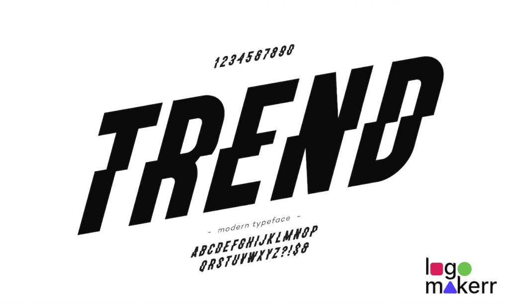
We can all agree that fonts are like the voice of your logo, because not only they speak for your brand, but it’s one primary thing people notice when they read your brand.
So, picking the right one is crucial.
One of the biggest mistakes in lettermark logos is choosing a font that doesn’t align with your brand’s personality. Imagine a sleek tech company using a playful, curly font—that’s a mismatch for sure.
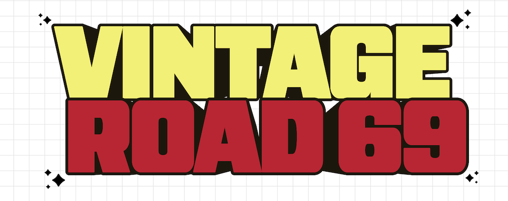
With this in mind, when selecting fonts, make sure that you consider the vibe you want to convey.
Are you a luxury brand? Go for something elegant and minimal.
Are you a creative startup? Then create a logo with a modern, bold font.
We at Logo Makerr AI offer font suggestions tailored to your industry – making sure you pick the right style!
You don’t want to give off the wrong impression with your font choice—so no Comic Sans for your law firm, please!
2. Ignoring Scalability
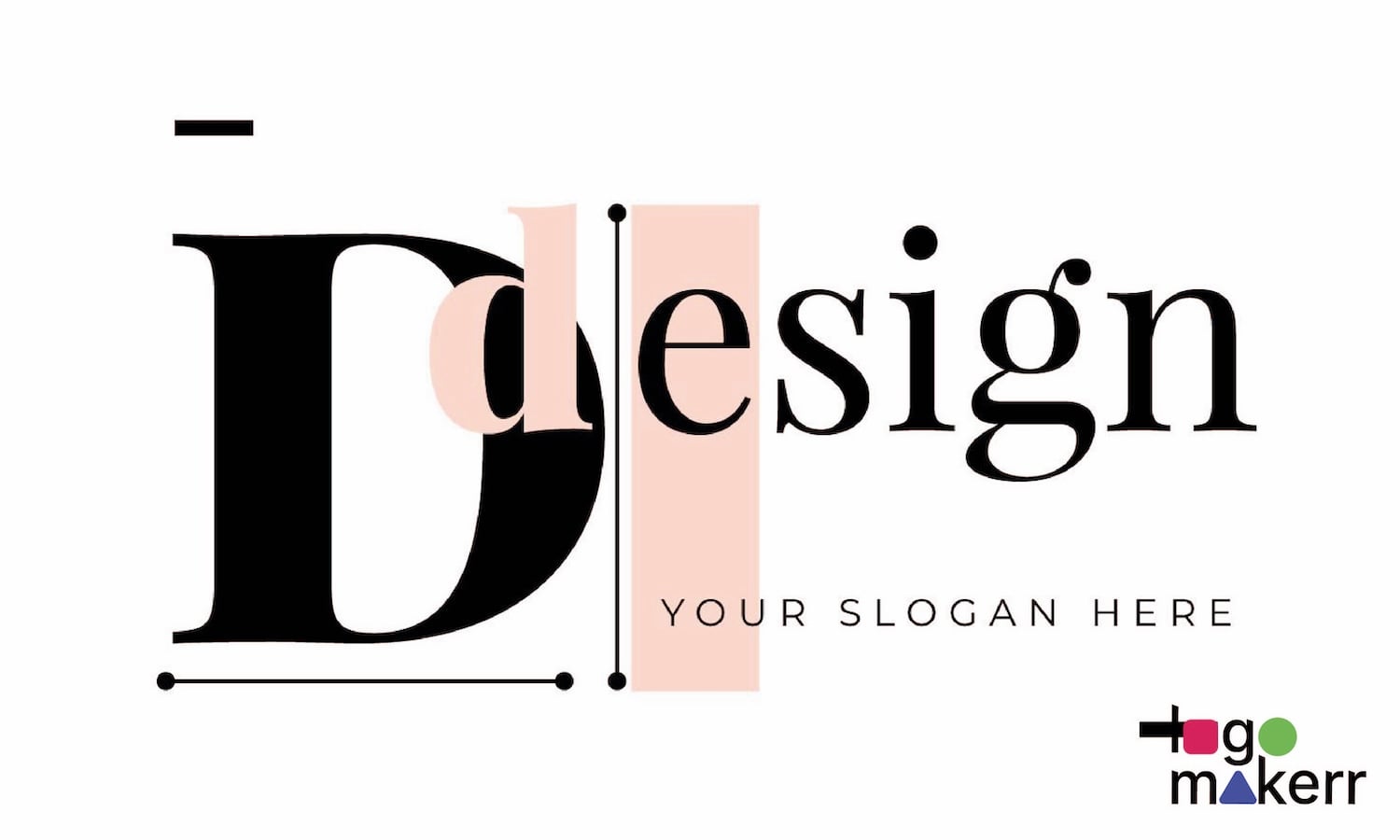
Another common mistake in logo design is creating something that looks fantastic on a big screen but falls apart when scaled down.
A lettermark logo is often used across different platforms like websites, social media profiles, business cards, and even the tiny product tags of your brand. And if your design doesn’t hold up at smaller sizes – be it in digital or physical product, it’s a big problem.
In fact, this is why simplicity in lettermark logos works well. Lucky for you, when using an AI logo generator, you can test out how your design looks at various sizes. You can just look at the brand kit identity you have with the tool – all the while ensuring your brand remains strong!
3. Overcomplicating the Design
Less is more, especially with lettermark logos.
We know it’s easy to get carried away with embellishments and details that you think will make your logo stand out. But here’s the thing: a logo should be simple, clean, and easy to remember. We know this may sound cliché, but people should be able to glance at your logo and immediately recognize it.
It’s easy to get carried away with embellishments and details that you think will make your logo stand out. But, here’s the catch: a logo should be simple, clean, and easy to remember.
4. Forgetting the Brand’s Purpose
A logo should reflect what your brand stands for. Agree?
We all know that some mistake businesses make is create a logo that looks great but has no connection to their brand’s values or identity.
You see, your lettermark logo might look modern and stylish, but if it doesn’t represent your business at all – it’s definitely missing the mark.

So before you design a logo, whether you are hiring a professional graphic designer or using an AI tool, take a step back and think about your brand’s purpose. Answer some questions in your head and see what message are your trying to communicate.
Logo Makerr AI is a tool that let you input your industry and style preferences, and suggest pre-designed logos and templates that matches your brand personality. All in all, Logo Makerr AI takes the guesswork out of finding a design that aligns with who you are!
5. Using Too Many Colors
Colors are powerful. This is why we have made lots of articles about color psychology. Because aside from the fact that colors evoke emotions, they can also make your logo pop. However, too many colors can quickly turn a logo into a visual mess.
You want your lettermark logo to stand out, but in the right way. Sticking to one or two colors is often enough to create something impactful and memorable.
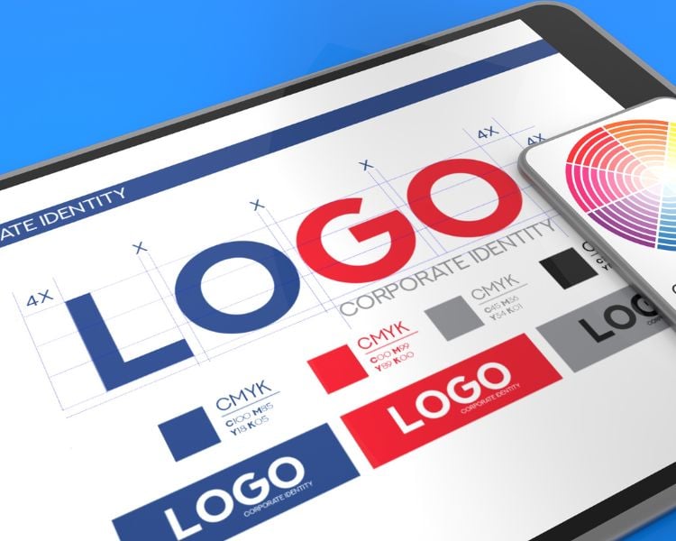
Think about iconic lettermark logos like HBO or IBM—they stick to just one or two colors, and they’re instantly recognizable. Keep it simple!
Here’s how to use Logomakerr.ai to create your lettermark logo:
So, let’s talk about Logomakerr.ai and how it can make your logo dreams come true.
Our AI-powered tool is perfect for designing lettermark logos – especially if you’re looking for something modern, sleek, and professional.
This AI-powered tool is perfect for designing lettermark logos, especially if you’re looking for something modern, sleek, and professional. It’s incredibly user-friendly, and you can have a logo ready in just a few simple steps!

- Go to Logomakerr.ai – Head over to the website and click “Let’s Make a Logo.”
- Enter Your Brand Name – Type in your business name or initials. If you’re focusing on a lettermark, just use the first letters of your brand’s name.
- Choose Your Industry – Select the category that best fits your business. This helps the AI suggest styles that are relevant to your industry.
- Pick Your Style – You’ll see a variety of font and design options tailored to your input. Scroll through the suggestions and pick one that matches your brand’s vibe.
- Customize Your Logo – Play around with different fonts, layouts, and colors until it feels just right. Logomakerr.ai offers endless customization options!
- Download Your Logo – Once you’re happy with your design, simply download it and start using it across your brand’s platforms!
With Logomakerr.ai, you can create a logo that’s not only professional but also perfectly suited to your brand’s personality.
The fun part? The process is so quick and easy; you can have a polished logo ready in no time! No need for that endless back-and-forth emails with a designer – unless you’re availing our Designer Fix feature.
Final Thoughts
Designing a lettermark logo can be a fun and rewarding experience, especially when you avoid common pitfalls like overcomplicating the design or choosing the wrong fonts.
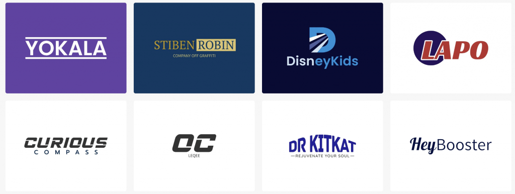
With AI tools like Logomakerr.ai, the process becomes even easier, allowing you to create a logo that’s perfect for your brand in just a few clicks.
So, what are you waiting for? Get creative and give your brand the standout logo it deserves!
