The IBM logo is an iconic symbol of innovation and excellence, instantly recognizable to people around the world. Designed in 1972 by Paul Rand, the eight-bar logo has become synonymous with cutting-edge technology and forward-thinking business.
But what makes this logo so effective? And how can you, as a business owner or entrepreneur, create a logo that resonates with your audience and leaves a lasting impression?
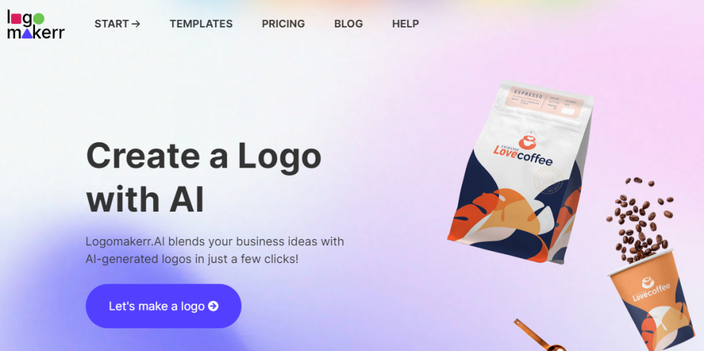
In this blog post, we will take a look at the design principles of the IBM logo and how you – as an entrepreneur or freelancer, use Logo Maker AI, a revolutionary AI-powered logo design tool that allows you to create your own professional-grade logo in just a few clicks!
What makes the IBM logo unique?
This eight-bar logo, designed by Paul Rand in 1972, is a masterclass in simplicity, elegance, and brand recognition. The eight bars, also known as “stripes,” are designed to represent the idea of “information” and “speed,” which were core values of IBM’s business at the time. The logo’s bold, sans-serif typography and striking blue color palette have become instantly recognizable.
We also like to believe that the IBM logo evokes the feelings of trust, reliability, and the forward-thinking capabilities of the company.
Although the IBM logo has undergone minor tweaks over the years, but its essence remains unchanged, especially with the fact that it is one of the best logos with effective power design.
History of IBM logo

The IBM logo has an interesting history. It all started in 1924 when IBM was known as the Computing-Tabulating-Recording Company (CTR). The first logo was quite complex, featuring an intricate globe design.
In 1947, IBM introduced a simpler logo with the letters “IBM” in a typeface called Beton Bold. This change aimed to modernize the company’s image.
The most iconic transformation came in 1956 when designer Paul Rand created a new logo. This version had “IBM” in a bold, blocky font. The letters were solid, giving a strong, stable feel.
In 1972, Rand refined the logo further, introducing the striped version we recognize today. He replaced the solid letters with 8 horizontal stripes, symbolizing speed and dynamism in the digital age. This logo was a hit and has been used ever since.
These changes reflect IBM’s evolution from a company dealing with mechanical tabulating machines to a leading tech giant. The logo’s simplicity and strength have helped it become one of the most recognizable in the world, with 90% of people recognizing it instantly, according to some surveys.
What Makes the IBM Logo So Effective?
The IBM logo is highly effective for several reasons:
Simplicity and Clarity
The logo’s design is clean and straightforward. The bold, blocky letters are easy to read, making it instantly recognizable. Simplicity ensures that it’s memorable and can be easily reproduced across various mediums.
Consistency
Since 1956, the IBM logo has maintained a consistent design language. This consistency has helped build strong brand recognition over decades. When people see the logo, they immediately associate it with IBM’s values and history.
Symbolism
The striped version of the logo, introduced in 1972, uses horizontal lines to convey speed and dynamism. This reflects IBM’s commitment to innovation and progress in the technology industry.
Versatility
The logo works well in different contexts, whether it’s on a business card, a billboard, or a computer screen. Its simplicity and boldness ensure it remains effective in various sizes and formats.
Strong Branding of the IBM logo
IBM has invested heavily in maintaining a strong brand identity. The logo is a key part of this effort, appearing consistently in all marketing and communication materials. This constant visibility reinforces the brand’s presence and reliability.
Time to create your own IBM logo with Logo Maker AI
Creating your own IBM-like logo with Logo Maker AI can be a fun and straightforward process. Here’s a step-by-step guide to help you design a unique and professional logo:
Step 1: Go to Logomakerr.ai
Step 2: Sign Up or Log In
Create an account or log in if you already have one. Most AI logo makers require you to sign up to save and download your designs.
Step 3: Enter Your Business Name
Enter the name of your tech company or brand. This will be the main text in your logo.
Step 4: Choose Your Industry
Select the “Technology” industry or a related category. This helps the AI generate designs that fit your specific field.
Step 5: Describe Your Style Preferences
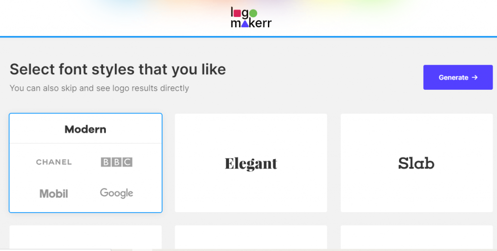
Describe the style you’re looking for. Options might include:
- Classic or Modern: Choose a traditional look or a contemporary design.
- Playful or Professional: Decide if you want a fun, casual vibe or a sleek, professional appearance.
- Minimalist or Detailed: Select between a clean, simple logo or one with intricate details.
Step 6: Select Colors
Pick a color scheme that represents your brand. Common tech industry colors include blue (trust, professionalism), green (innovation, growth), and black (sophistication, elegance).
Step 7: Choose Icons or Symbols
Select icons or symbols related to technology, such as circuit boards, gears, or abstract tech elements. The AI will use these to create a relevant design.
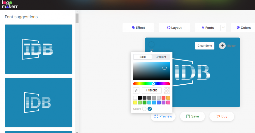
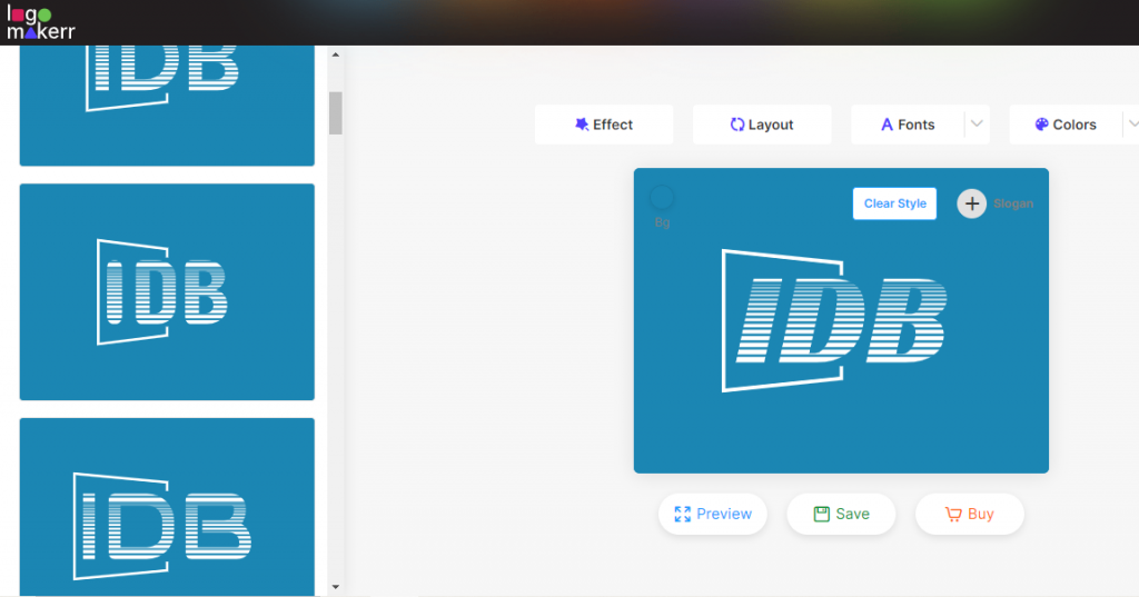
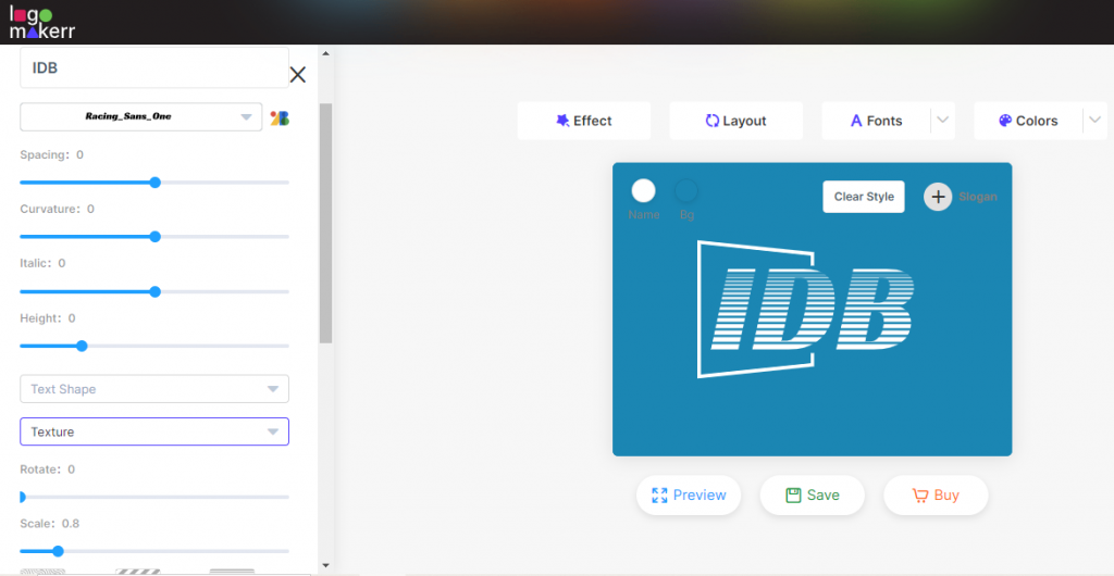
Step 8: Customize Your Logo
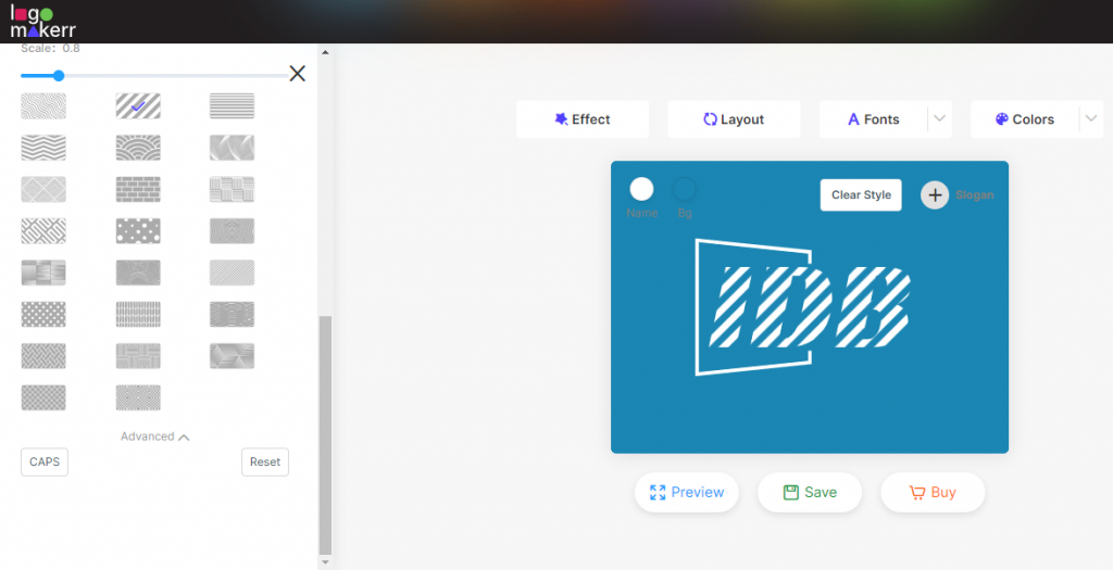
Fine-tune your chosen design. Adjust the font, color, size, and layout to make it perfect. Many AI tools offer easy-to-use customization features. More so, Logo Maker AI offers Texture effect so you can have an IBM-like logo with the lines and colors similar to it. Here’s how;
You may also change it to other textures based on your preferences.
Step 9: Download Your Logo
Once you’re satisfied with your logo, download it. Most AI logo makers offer various file formats (PNG, JPG, SVG) suitable for different uses, such as websites, business cards, and social media.
Tips for an Effective Tech Logo like the IBM:
- Keep it Simple: A clean, uncomplicated design is more memorable and versatile.
- Make it Relevant: Use tech-related symbols and modern fonts to convey your industry.
- Ensure Scalability: Your logo should look good both in large formats and small sizes.
By following these steps, you can create a professional and unique tech logo that effectively represents your brand using a Logo Maker AI tool.