There is no second thought that a strong brand identity is the foundation of a successful business. And what’s the cornerstone of that identity? A well-designed logo. However, even after creating the best logo, it can fall flat if it’s not strategically placed on your brand page.
Think about it: your logo is often the first thing visitors see when they land on your website or social media profile, and it’s what sets the tone for their entire experience with your brand.
With this in mind, you need the right logo placement. And if that’s done correctly, it can increase your brand recognition, boost engagement, and even drive traffic conversions! Otherwise, you are leading your audience to a confusing and disjointed brand experience.
Why should you double-check your logo placement?

As a team at Logo Maker AI, we are always looking to give you the best tips for logo designs. We also like to believe that it’s important to double-check your logo placement for a few simple reasons:
1. Get Noticed
Placing your logo where people can see it easily helps your brand get noticed. Whether it’s on your website, products, or ads, a well-placed logo grabs attention and makes your brand memorable.
2. Stay Consistent
Putting your logo in the same spot every time helps build a strong brand identity. Consistency makes your brand recognizable and trustworthy.
3. Share Your Message
Where you put your logo says something about your brand. For example, if you put it on eco-friendly packaging, it shows you care about the environment.
4. Look Professional
Placing your logo neatly and in the right spot shows you take your brand seriously. It gives a good impression to customers and partners. And guess what, learning and reading tips like this will get you there!
5. Avoid Clutter
Checking your logo placement helps prevent your design from looking messy. Keeping things neat and organized lets your logo shine without getting lost in the chaos.
But if you think you can’t do this, especially for beginners, we suggest creating black and white logos or emblems with low-profile backgrounds.
Tip 1: Balance Your Logo with Negative Space
A cluttered design can lead to a cluttered mind, making it difficult for your audience to focus on what really matters – your brand’s message and identity. Also, that works vice versa so make sure you choose your hard!
Negative space, also known as white space, is the empty area between and around design elements.
Whether you like it or not, negative space provides a sense of breathability and visual harmony to your brand page. Though some graphic designers find it awkward, it can make your logo stand out.
Tip 2: Consider the F-Shaped Pattern for Optimal Visibility

When it comes to logo placement, understanding how users interact with your website is crucial. This is where the F-Shaped Pattern comes in – a fundamental principle in web design that can significantly impact your brand’s visibility.
Research has shown that users tend to scan web pages in an F-shaped pattern, focusing on the top-left area of the page, then moving horizontally across the top, and finally scanning down the left side. This natural behavior presents a golden opportunity to position your logo for maximum visibility strategically.
It’s amazing how science works, right?
Tip 3: Create a Visual Hierarchy to Guide the Viewer’s Eye

The visual hierarchy of your logo is truly the roadmap that will lead your audience to a much better perception of your brand. You can use the size, color, and how you strategically place it to create a clear order of importance.
For example, if your logo is the most important element on your page, make sure it’s prominently displayed and larger than other design elements. Use contrasting colors to make it pop, and consider placing it in a prominent location, such as the top-left corner or center of the page.
Tip 4: Use Contrast to Make Your Logo Stand Out
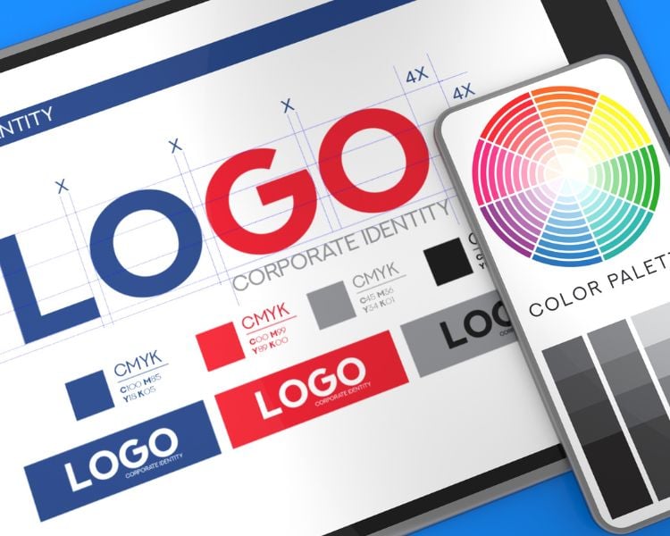
When it comes to logo placement, contrast is key to making your logo stand out and grab the attention of your audience.
Think of it like a spotlight on a stage – you want your logo to be the star of the show, not just a faint whisper in the background. You can do this by using contrasting colors, shapes, and textures.
Now, if your logo is surrounded by a lot of visual elements like images, text, or other digital graphics, make sure to use the contrast twice. Otherwise, you’re setting your brand identity up for failure.
For example, if your logo is a bright, bold color, pair it with a neutral or muted background to create a striking contrast. Alternatively, if your logo is a simple, minimalist design, consider placing it on a busy or textured background to again – make it pop.
Tip 5: Experiment with Logo Placement to Find What Works Best
You’ll never know how the art of experimentation can unlock the full potential of your logo placement unless you try it. Of course by now, with the few of the tips we’ve shared, your starting to see how you will place it, right?
But, don’t stop there!
The most effective logo placement strategies are those that are continually refined and optimized. It’s time to get creative, think outside the box, and test different approaches to find what truly resonates with your audience.
Try placing your logo in unexpected locations, such as the bottom of the page or even within a hero image.
We’ve been in the industry for almost three years now – and trust us, experimenting has a way to get you on top!
And, don’t be afraid to try out new logo designs or variations to see how they perform. You can click here to see the thousands of pre-designed templates Logo Maker AI offers!
Other logo tips and tricks from Logo Maker AI
1. Stop Making These 5 Logo Mistakes Today: A Guide to Correction
This guide helps you fix common logo mistakes. Learn how to pick better fonts, avoid clutter, and more to improve your logo’s impact and match your brand. From inappropriate font choices to overcrowded designs, this resource provides practical solutions to elevate your logo’s impact and effectiveness.
2. 7 AI Mockup Tool: How Does Your Design Would Look Like?
Discover seven tools that show how your logo looks on different things. See it on shirts, online, or signs to make better design choices. Also, we at Logo Maker AI offers product mockups right after you designed your logo.
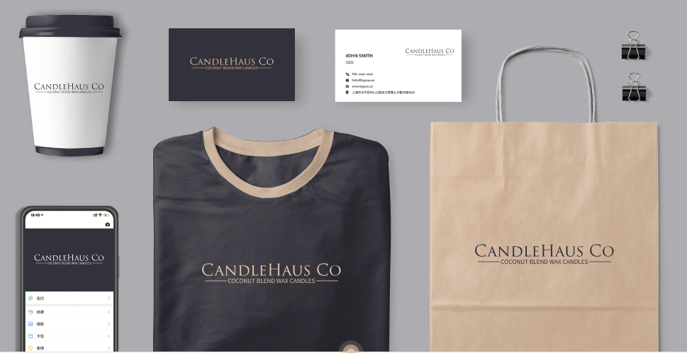
That’s one thing away from having the hassle of looking for alternative tools to get realistic previews of your brand!
3. Logomakerr.ai: Logo Design Revisions Tips
Learn how to change fonts, colors, and more to make your logo better. This blog is all about offering insights into effective revision techniques. And as if that’s not enough, Logo Maker AI offers a Designer Fix feature where one of the best logo graphic designers in the industry will help you find the perfect logo – for only $40!
4. Logo vs Branding: Understanding the 4 Differences | Logomakerr.ai
There’s a big difference between logos and branding – and you need to learn that, particularly for startups! So if you want to craft a very comprehensive branding strategy that both benefits your logo and broader brand messaging, read this blog today!
Final Thoughts
When crafting your brand page layout, nailing down the perfect logo placement is essential for leaving a memorable mark. Thanks to these straightforward pointers from Logomakerr.ai, you can guarantee that your logo grabs attention and maintains a consistent and captivating presence across all devices. Don’t hesitate—dive into your layout experimentation and watch as your logo steals the spotlight on your website!

