Twitter has succeeded in becoming a platform where everyone can express their opinion. We have all seen this iconic blue bird of the Twitter logo, but have you ever stopped to consider the design elements that make up this recognizable symbol?
For graphic designers everywhere, this logo is an example of how a well-crafted design can become instantly recognizable and iconic.
The simple logo design of the bluebird perfectly represents this idea, with its wings spread out wide, as if ready to take flight across the globe.
It is no surprise, then, that the logo represents the mission of Twitter, which is to make it easier for people worldwide to connect and share ideas.
Let’s look deeper into the elements that make up this internationally recognized logo and what makes the Twitter icon and the Twitter brand a highly successful endeavor.
Twitter Logo Evolution
The Twitter original logo has undergone several changes since the company started operating in 2006. The first official Twitter icon featured a stylized bird with “Twitter” written in small letters next to it, unveiled in the app’s official launch.
In 2010, Twitter updated its logo with a new design that featured a slightly more realistic bird with a more stylized appearance. The word “Twitter” was now written in bold, blue letters set in a darker shade.
Two years later, the Twitter logo bird again updated its look, simplifying the design even further.
In 2013, the social media giant made a significant change to their logo, removing the word “Twitter” from the logo and focusing on the little blue bird as the main symbol.
Three years later, Twitter came up with a new logo to replace the previous version, making the bird more abstract and giving it a more fluid and dynamic shape.
In 2019 Twitter decided to update its logo again; this time, they made the little blue bird more rounded and added some gradient colors.
Each logo evolution by Twitter — characterized by the bold color blue — aimed to keep the social network relevant and adapt to the changing design trends. Twitter’s little blue bird logo has become a recognizable symbol and a solid visual representation of the brand.
Twitter Bird Logo
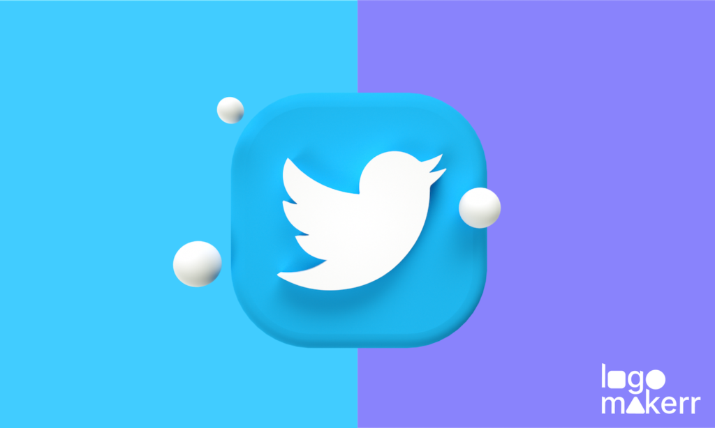
The Twitter logo consisting of a bluebird in a circle, has been the enduring icon of the company. Just a mere look at it quickly identifies with the app itself. Hence it’s no surprise that the Twitter logo is among the best icons today!
The great thing about it is that the animal – bird also has strong associations with communication due to its ability to fly and carry messages across vast distances.
The bird’s shape represents unlimited freedom and flight, which are associated with Twitter’s mission to give people a voice. Furthermore, the wings are spread out to create an image of the bird in flight, representing the speed and immediacy of Twitter’s communication platform.
The current bird logo is designed to look friendly, modern, and inviting. This is precisely why the design team wanted something simple but memorable enough to stick with people.
The much-beloved Twitter bird logo is more than just an icon – it’s a friendly, modern reminder of the power of connection! It’s like giving us all a warm and inviting hug.
Larry Bird and its Connection to the Official Twitter Logo
What does the Twitter Logo symbolize?
“Larry the Bird“, the official mascot of Twitter, is a cartoon character that has become an iconic symbol of the social media platform.
The bird is named after Larry T. Bird, a retired professional basketball player who played for the Boston Celtics. It represents the freedom of self-expression and the power of communication that Twitter represents.

Meanwhile, the character was first unveiled in 2010 and has been adopted as the official mascot for Twitter ever since. He is depicted as a blue bird with white wings, wearing a yellow beak and feet.
Many people find the character to be a source of amusement and joy, serving as a reminder of the fun and lightheartedness of Twitter.
What makes the Twitter Logo Stand Out?
The first official Twitter logo and the succeeding ones are one of the most recognized logos in the world, and it’s easy to see why. It’s simple and easily recognizable, and its colors have become associated with the company itself.
Combined with its amazing hashtag feature and clever advertisements, Twitter’s logo is an essential part of its brand identity that stands out from other social networks.
The simplicity of the design makes it easy to recognize, even when viewed at small sizes. The blue color in the logo is associated with trust, intelligence, and communication, which aligns well with the message of the Twitter brand.
The logo is flexible and can be used in various contexts, such as on the web, in print, or on merchandise.
Overall, the Twitter logo stands out for its simplicity, use of color, symbolism, flexibility, and evolution. It symbolizes the power of design in making such a successful brand! If you want something like this, using a random logo maker would totally help you out!
Colors & Type
By choosing light blue as their primary color, they subtly share trustworthiness and dependability—qualities that any social media giant should strive for.
The light blue color is also said to represent the ocean and sky, while the bird is meant to represent freedom and democracy.

The font used in the famous Twitter bird icon logo is “Helvetica Neue,” a variation of the Helvetica font. It conveys a sense of professionalism, confidence, and strength, which Twitter wants to be associated with.
Furthermore, this font choice helps convey strength and confidence while harmonizing with the color and design of the bird without compromising the other elements within the structure.
Twitter Logo’s Design Simplicity
What makes the current Twitter logo so effective is its simplicity.
The social network is heavily invested in social media, and the founders aim to cross its message without being overly complex or busy.
Thus, the designer who created it focused on ensuring each element was necessary for conveying their message for viewers to understand it quickly and easily.
This is especially useful when creating logos for websites and apps since, often, those logos appear very small on mobile devices or browsers. By keeping things simple yet effective, designers can ensure their symbols are still recognizable even at smaller sizes.
Despite the criticism received by Twitter due to its straightforward logo design, the little blue bird icon used in the Twitter bird logo of the company remains an instantly recognizable symbol of communication and freedom.
With a combination of minimalism, symbolism, color choices, and font decisions, Twitter’s logo is one of the most iconic corporate logos today.
As you can see, a great deal of thought went into designing this recognizable Twitter logo, and it serves as an example of how designers can create something simple yet effective.
With a few key elements and thoughtful decisions, you can create a logo that stands out from the crowd! Luckily, for those that are newbies but still want to create a similar logo, Logomakerr.AI can help! With our powerful tools, creating a stunning logo like Twitter has never been easier.
Adaptability in various sites
In addition to its robust design, the Twitter logo is also highly adaptable. It can be used in small and large sizes on various backgrounds and color palettes.
This makes it perfect for use in print campaigns, websites, apps, and even as favicons on browsers. Furthermore, the simple shape can be easily tweaked or distorted to fit different sizes and applications.
The curves on its wings balance the design, making it more visually appealing when viewed from different angles. This helps make the logo recognizable, regardless of the background or platform it appears.
The official Twitter logo has undeniably made itself the gold standard in iconic design in recent history. It solidified the Twitter brand as a social media giant in graphics design.
White as a Background
A white background helps make the bird more prominent and stand out against any other colors used in the design. This provides contrast and makes the bird recognizable even when it is small or placed on a busy background.
The clean white background or negative space also helps to emphasize the blue color of the bird and its wings, making it more striking and memorable. This also helps convey the brand identity while reinforcing a sense of cleanliness and professionalism.
Golden Ratio: Is it Used in the Twitter Logo?
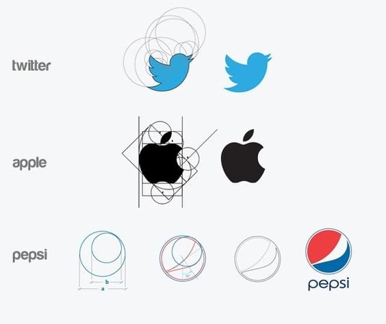
The Golden Ratio, also known as the “Divine Proportion,” is a mathematical concept that can be found in many different forms of art and design. It is a ratio of approximately 1:1.618, and it is said to be aesthetically pleasing to the human eye.
Some designers use the Golden Ratio as a guide when creating designs, including logos. Yet, there was speculation that the Twitter logo was designed using the Golden Ratio.
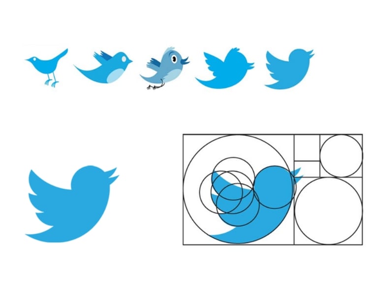
Some say that the bird’s vertical height and the wordmark’s horizontal width align with the golden ratio. But there is no official statement from the Twitter team regarding using the GR in the design.
Using the Golden Ratio in logo design is a preference for the graphic designer and can depend on the specific project. The Golden Ratio can also create a sense of movement or direction within a logo, leading the viewer’s eye through the design.
However, it’s important to note that not all designers use the Golden Ratio in their designs, and it’s not required to create a successful logo.
Some designers may use principles such as symmetry, contrast, typography, color theory, and negative space to create a visually compelling logo.
Final Thoughts
The Twitter logo is an excellent example of how simple design choices can create an instantly recognizable symbol that stands out above all others.
By analyzing each element separately and removing unnecessary elements, from color choice to font selection, graphic designers everywhere can learn valuable lessons about how necessary subtle details are within a successful design concept.
The key takeaway from the Twitter logo is its simplicity. The old saying never dies: there is beauty in simplicity.
If you aim to create a powerful logo like that of Twitter, you can use Logomakerr.AI, which uses basic shapes and fonts to create a modern logo that stands out from the crowd.
With Logomakerr.AI, an AI logo generator, you can modify existing design elements as much as you need until you are happy with your creation. It offers an intuitive user interface that makes creating logos a breeze.
Additionally, dynamic controls provide convenient access to editing settings so that even the most inexperienced users can create stunning logos in no time. It even offers a range of professional-grade graphic elements, including vector shapes, icons, and illustrations, that make creating logos easier!
