A logo design or every parts of a logo is what your customers will remember long after they’ve left. It’s a thing that gets people to stick around, whether you believe it or not. But a logo is ‘not just a logo.’ It’s the key ingredient to your brand, so it has to be perfect.
That’s why some consider using an AI logo maker to streamline and enhance the design process, ensuring that their brand identity is not only memorable but also visually striking. In fact, logos are so relevant to a business’s identification that a group of Harvard students studied which kind is most effective.
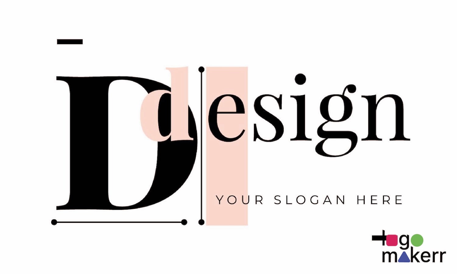
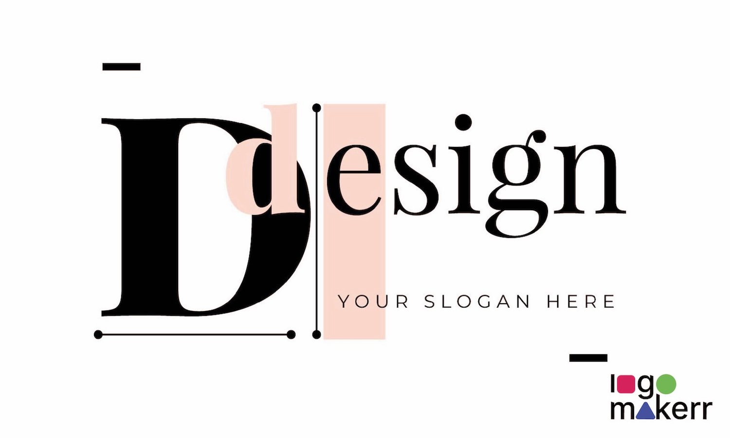
Now that we have identified why a logo is such a critical component of building a successful brand, we should look on the other side and consider its anatomy. As it happens, a logo has different parts, such as brand name, tagline, color, font, and icons.
Each of these things plays an important part in crafting the perfect logo for your business. Without further ado, let’s delve into the anatomy of a logo.
The Different Parts of a Logo
Every element of a logo, from the brand name and tagline to the choice of colors, fonts, and icons, plays a crucial role in shaping how a brand is perceived by its target audience.
Brand Name
A business’s brand name is its core element. It’s the label that identifies their product or service to the eye of the people. Aside from the logo, it’s often the first thing your audience will notice and remember.
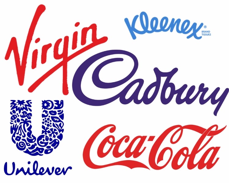
A brand name can also trigger instant recognition and let people recall what you offer. Whether it’s a home or office supply, tech products, or baked goods, a brand name makes it easier for your customers to choose your merchandise.
Here are some tips for you to come up with a good brand name.
- Don’t use buzz or jargon words.
- Gather ideas and brainstorm with your business partner/s or people you trust.
- Use easy-to-remember words.
- Ensure that it can easily be used for your logo, tagline, or slogans. After all, it’s not easy to go back.
Tagline
Once you have the perfect brand name, well, it’s just fair to pair it with a tagline. Though it’s unnecessary for startup businesses, a tagline helps accompany the brand name in a logo.
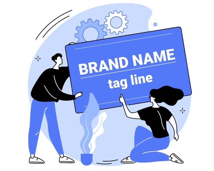
A tagline, or even a slogan, is a short, catchy phrase that communicates the unique selling proposition of a brand – especially its value. For instance, below are the most popular brands with their remarkable tagline.
- Nike: “Just Do It.”
- Apple: “Think Different.”
- McDonald’s: “I’m Lovin’ It.”
- Disneyland: “The happiest place on Earth.”
- Coca-Cola: “Open Happiness.”
Indeed, a tagline is a one-liner that tells everyone what your brand is about. It’s like instantly telling your audience what you’re up to. More importantly, it’s a way to set your brand apart from the competition because you can provide additional context to your business.
Color
Colors are the costume and the lair of your logo. It evokes specific emotions and associations, so it should be picked rightly. Otherwise, you’ll send the wrong message.
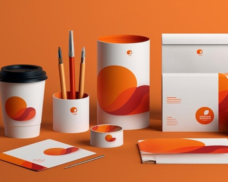
Different colours have different psychological impacts, and the right choice of colours can help reinforce the brand’s identity and message. It is important to consider the target audience and the industry when selecting colours for a logo.
For instance, the most popular colour for top brands is Blue. This color showcases ambition, perspective, and openness. No wonder why a lot of brands like Twitter, LinkedIn, Facebook, and DELL use the color blue entirely from logo designs to marketing strategies.
Remember, it’s important to do your due diligence to research the right color psychology guide for your brand because it can get difficult.
For example, red evokes love in real life, but for brand logos that want to pay their respect to sensitivity, love, and care, it should be pink (Barbie, Victoria’s Secret, and other high-end feminine brands).
Fonts
The font of your logo is its personality and legibility. The font choice can convey whether a brand is formal, playful, modern, or traditional. It helps in establishing a visual tone.
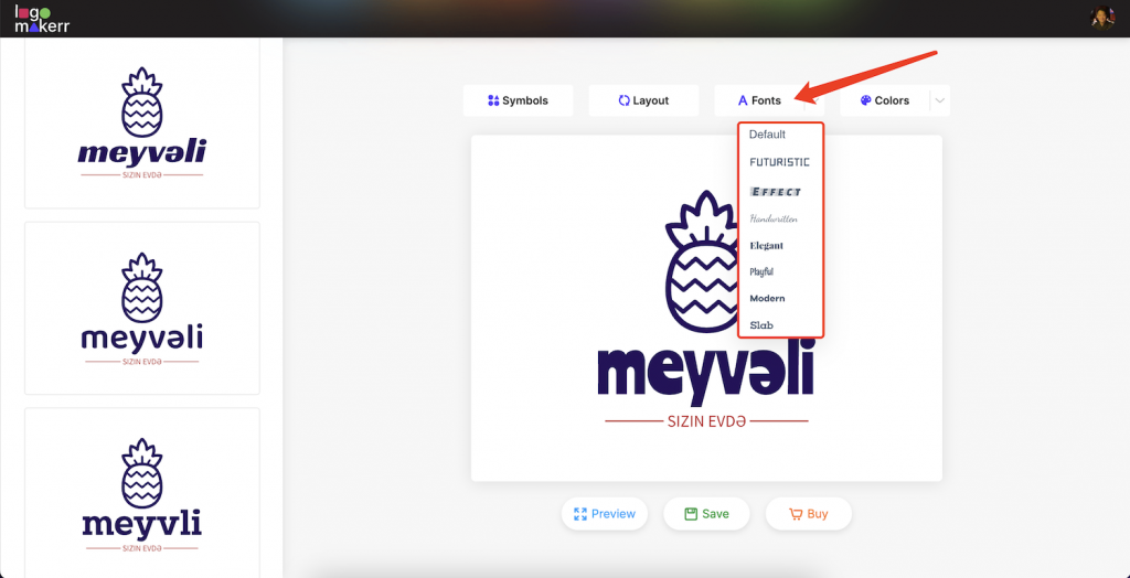
With fonts, your brand can suggest the right idea or sound mysterious. That’s definitely a no-go for most startup businesses.
Nowadays, Helvetica is the most popular font used by many car brands like BMW, Kawasaki, and General Motors. Popular brands like Microsoft, Apple, Skype, and Nestle also utilized the versatility of Helvetica.
But if you want to be unique yet still follow an easy-to-read font, opt for Futura, Times New Roman, Avenir, Bodoni, and Open Sans.
Icons or Symbols
Do you think Apple has made its name in the industry without its famous icon – a half-bitten Apple? Probably yes, probably not.
The Apple logo signifies Isaac Newton reading a book under a tree before an apple fell on his head. From then on, the world-renowned physicist first thought of his system of gravitation.
An icon or symbol on your logo can instantly make people think of you. They’re the ones that can simplify complex ideas and create visual associations with your audience, as well as make a logo more memorable and recognizable.
But the ultimate reason why you should add an icon to your logo design is that it extends your brand to multiple branding materials like social media profiles, website favicons, and app icons, providing a cohesive brand experience.
Craft a Logo using this all-in-one AI Logo Maker.
If you are looking for an AI logo maker that allows you to incorporate each part of a logo: brand name, tagline, color, font, and icon, then look no further than Logo Maker AI.
Gone are the days of using multiple tools or software to create different aspects of your logo. This AI logo generator simplifies the entire design process, making it accessible to both seasoned designers and beginners alike.
Whether you want a bold and modern logo or something more elegant and classic, Logo Maker AI provides a wide range of options, ensuring something to suit every brand aesthetic!
