Like most business owners, you’re always looking for ways to improve your marketing efforts. And if you’re thinking about redesigning your own logo, one of the questions you may have is, what are the ideal logo sizes?
There are a few reasons why knowing the ideal logo sizes can be helpful. If you print out marketing materials, such as brochures or business cards, you’ll want to ensure your logo looks good at that size.
You don’t want it to be so small that it’s difficult to see or so large that it takes up too much space and overwhelms the other content on the page. Knowing the ideal logo sizes is crucial, and exploring the possibilities with a simple logo maker could be a game-changer.
So how can you determine the ideal logo size for your business? There are several factors to consider, such as the type of media you’re using and the dimensions of the space where your company logo will appear.
And if you’re unsure what logo sizes suit your needs. This article will guide you through a few logo dimensions and logo variations proper for your brand’s logo.
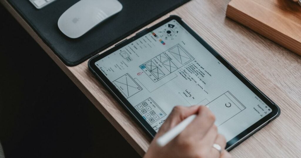
What is the ideal logo size for printing marketing materials?
When printing marketing materials, such as brochures or business cards, the ideal logo size for print is to make sure it’s easy to see and doesn’t take up too much space on the page.
You’ll want to make sure your logo looks good at the size you’re printing it, so it’s essential to do some testing before you send your design to the printer.
PDF, SVG, and EPS are the top vector format files. Why choose vector over raster? The explanation is that a vector logo — both an entire image and component parts — is simple to edit. A vector format logo keeps its quality when scaled up several times, which is crucial for printing.
Because of this, the ideal logo sizes for print are using 500рx (or more) logo for small print (like souvenirs) and a 1024рx (or more) logo for a large print.
What is the ideal logo size for website marketing materials?
You’ll want to use a smaller version of your logo for website marketing, such as banner ads or social media profile pictures. This is because there’s less space on web pages, and people typically view them from further away than printed materials.
Check out these logo dimensions for the two most popular layouts below.
Horizontal layout:
250 x 150 pixels; 350 x 75 pixels; and 400 x 100 pixels
For a square (vertical) layout:
160 px x 160 px
How can you determine the ideal logo size for your business?
You need to consider a few factors when determining the ideal logo size for your business. The most important one is the type of media you’re using.
If you’re printing out marketing materials, you’ll want to ensure your logo looks good at that size. But if you’re using it for a website or other online medium, you’ll need to use a smaller version, so it doesn’t take up too much space.
Another thing to remember is the dimensions of the space where your logo will appear. If you’re unsure what size is right for your needs, this article will guide you through the proper sizing for your brand’s logo.
When in doubt, it’s always best to avoid making your logo too big rather than too small. That way, people can see it clearly no matter what size they’re viewing it.
What is the ideal logo size for social media platforms?
Social media is one of the fastest ways to communicate with the target audience. It is necessary to know the dimensions of the images and their resolution. The aspect ratio calculator makes it possible to have precise length and width of the image. This ensures the sharing on social media is easy for the user.
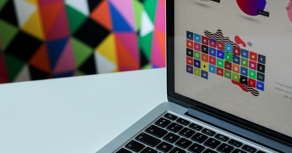
For example, Facebook recommends using a 400 x 400 pixels logo for a profile photo and 851 x 315 pixels for cover photos. And on Twitter, the recommended dimensions for a profile photo are 400 x 400 pixels, while the cover photo size is 1500 x 1500 pixels.
If you’re unsure of the exact dimensions for a particular social media site, a good rule of thumb is to make your logo as big as possible while still fitting within the site’s guidelines. That way, people can see it no matter where they are or what type of device they use.
How do you create a scalable vector graphic (SVG) version of your logo?
Creating a scalable vector graphic (SVG) version of your logo is a great way to ensure that it looks good no matter what size it’s being viewed. This is especially important if you’re using your logo online, such as on a website or social media.
There are several ways to create an SVG version of your logo, but using a vector graphic editor like Adobe Illustrator is the easiest.
Simply open up your logo file in the editor and save it as an SVG file. You can then upload this file to any website or social media platform without worrying about looking blurry or pixelated.
Online tools like PNG to SVG converter can create an SVG file for you if you don’t have access to a vector graphic editor. Upload your logo file and select the “convert to SVG” option. Then, download the new file and use it wherever you need it.
What’s the ideal logo file size for email signatures?
Email signatures typically don’t take up a lot of space, so you don’t need to worry about using a small logo. It’s often best to use a larger version of your logo so people can see it. Every email signature size should be in PNG files with a maximum size of 10 KB.
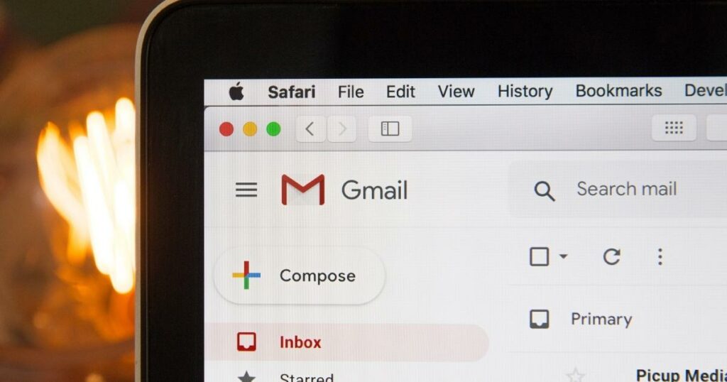
Remember that people viewing email signatures on mobile devices will have a smaller screen, so make sure your logo is still legible at that size. A good rule of thumb is to use a logo no larger than 200 x 200 pixels. You can also use same SVG logo file to set your email domain’s BIMI.
What’s the ideal logo size for business cards?
The standard business card size is 3.5 inches x 2 inches, so you’ll want to use a small version of your logo. A good rule of thumb is to use a logo no larger than 1 inch x 1 inch.
You can use a larger logo on the back using a two-sided business card. Just remember that people will be viewing it from a distance, so make sure it’s still legible.
What are some common mistakes made when choosing a logo size?
One of the most common mistakes is using a too-small logo, which can make it difficult to see, especially when viewed on a mobile device. Another mistake is using a too big logo, which can take up too much space and make your corporate image look unprofessional.
It’s also essential to ensure your logo is legible in different sizes. This means choosing a font that’s easy to read and avoid using too many colors or intricate details. Otherwise, people might not be able to understand what your logo represents.
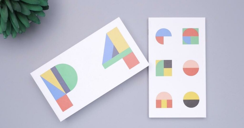
Finally, avoid using generic logos commonly used by other businesses, making it difficult for people to remember your brand. Instead, use a unique logo that reflects your company’s personality.
Can you use multiple sizes of logos in the same marketing campaign?
Yes, you can use multiple sizes of logos in the same marketing campaign. This is often seen in print advertisements, where a smaller logo is typically seen on the top page, and a larger one is featured prominently in the center.
You can also use different sizes of logos on different versions of your website. For example, you might use a smaller logo on your mobile site and a larger one on your desktop site. Or, you could use a different size for each social media platform.
It is crucial to ensure your logo is still legible and recognizable, no matter what size.
Creating a professional logo is for everyone!
From big businesses to small startups, keep these tips in mind to ensure your logo looks its best.
When it comes to choosing logo sizes, there are a few things you need to keep in mind:
- Consider the purpose of your corporate image or branding.
- Think about the different devices people will be viewing it on.
- Make sure the logo is legible in various sizes.
There’s no one-size-fits-all answer when it comes to logo sizes. However, following these tips will help you choose a size that looks great no matter what.
If you want to create a professional logo with the perfect logo size, using a logo maker app like Logo Maker AI is your go-to platform to generate logo designs in minutes!
