Graphic design is a realm where visual elements come together to create stunning and impactful compositions. Every designer knows that choosing colors, shapes, and properties is crucial in the final visual output.
Among these properties, two terms that often cross paths are “opacity” and “fills.”
Understanding the differences between opacity and fill can significantly enhance your design skills and help you create more compelling visuals. In this article, we will embark on a journey to explore the fascinating world of the difference between opacity and fill in graphic design.
Whether you’re designing logos manually or utilizing tools like a logo maker AI, a grasp of these concepts will elevate your design prowess.
Understanding Opacity or Transparency.
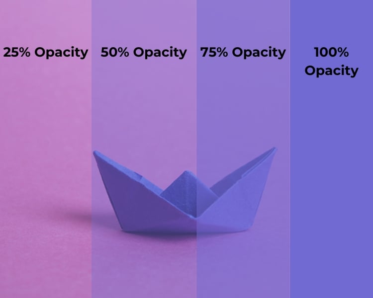
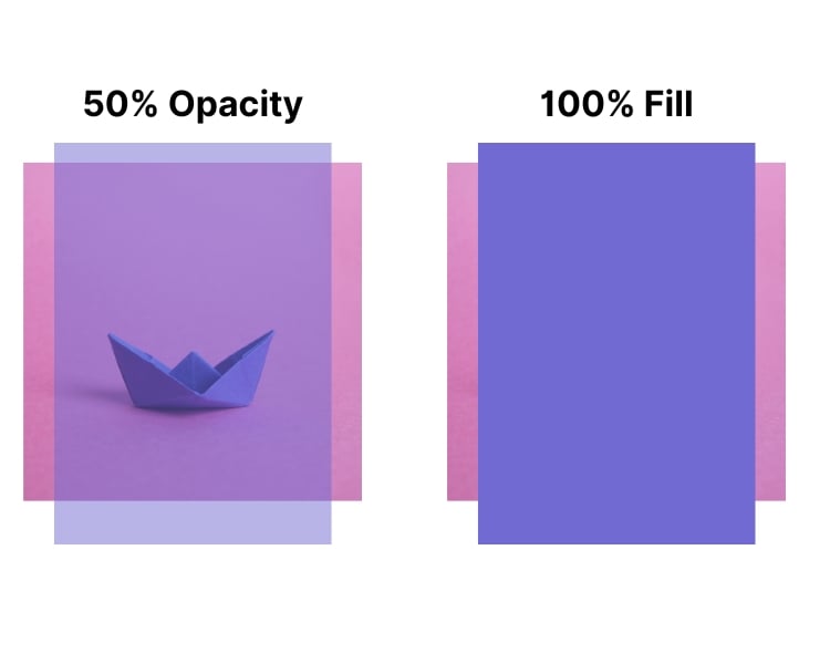
Opacity, in the design world, refers to the level of transparency of an object or a layer. It determines how much of the underlying layers or background can be seen through the object. Think of it as a way to make something partially see-through.
In design software, you often encounter opacity settings represented as a percentage. For instance, opacity is typically measured on a scale from 0% to 100%, where 0% represents complete transparency (the object is invisible), and 100% represents complete opacity (the object is fully visible).
Everything between these two extremes allows you to create varying levels of transparency. By adjusting the opacity of elements, you can create layers, add subtle shadows, and evoke a dreamy atmosphere. This is particularly useful in web design, where semi-transparent elements can make text more legible over background images or patterns.
What Opacity Does?
Opacity is a versatile tool in the designer’s arsenal. Here are some common use cases:
- Layering and Overlapping: With opacity, you can stack objects on top of each other. It’s like creating layers in a painting, where you can see some parts through the others. For instance, you can make one object partially transparent, allowing the object beneath it to show through. This technique is handy for creating shadows or stacked design elements.
- Highlighting: When you want to draw attention to a specific part of your design, you can reduce the opacity of surrounding elements. This effectively highlights the area you want to emphasize, making it pop out.
- Blending: Opacity is crucial for blending colors and creating smooth gradients. By varying the opacity of colors, you can achieve seamless transitions and soft transitions between colors, adding depth and realism to your design.
- Creating Textures: Using different opacities, you can simulate textures. For example, you can make a surface look like frosted glass, watercolor, or something more abstract by adjusting the opacity of various layers.
- Backgrounds: Opacity lets you add shadows that make objects look like they are floating. It can also set the mood such that it adds vibes to your design. It’s like adding a foggy window to your artwork.
- Plays with Shadows: Opacity lets you add shadows that make objects look like they are floating. It can also set the mood such that it adds vibes to your design. It’s like adding a foggy window to your artwork.
Fills or the Solid Foundation
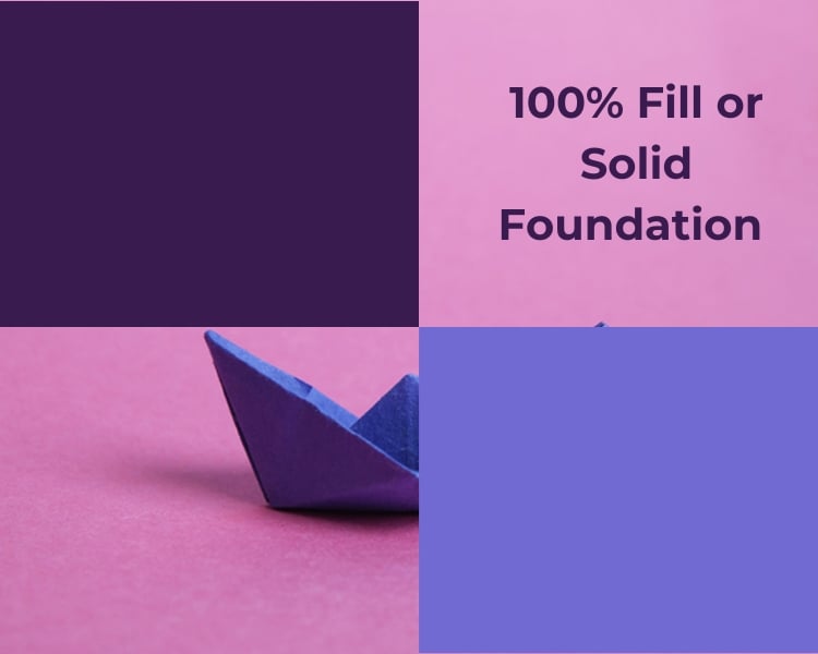
Now that we’ve explored the power of opacity, let’s shift our focus to fills. Fills refer to the solid color, pattern, or gradient that covers the inside of a shape or object. In most graphic design software, you can easily apply fills to shapes and objects by selecting a color or pattern from a palette.
When working with fills, you have a variety of options at your disposal, including solid colors, patterns, gradients, and even images. Fills play a pivotal role in establishing the visual hierarchy of your design and can be used to guide the viewer’s eye. They create contrast, separate elements, and inject vibrancy into your compositions.
What Fills Do?
Fills are integral to design, and they offer a broad range of creative possibilities:
- Color Splash: The most basic form of fill, solid colors are great for creating a bold and eye-catching design. They work well for backgrounds, text, and icons, providing clarity and contrast.
- Patterns: Fills can wear all sorts of patterns, which adds interest and texture to your design. They can be stripes, polka dots, or even a funky checkerboard.
- Gradients: Gradients transition from one color to another or from color to transparency. They create depth and dimension in your designs. Gradients can evoke different emotions depending on the color choices and direction of the gradient.
- Textures: Using image fills, you can incorporate textures like wood, fabric, or concrete into your designs. These can give your project a tactile feel, making it more relatable and immersive.
- Make Things Pop: You can use contrasting fills to make certain elements stand out. It’s like having a spotlight on the main actor in a movie.
Understanding the Difference Between Opacity and Fill
Now that we’ve looked at the individual concepts of opacity and fills, let’s delve deeper into their differences and how they can be combined to create stunning designs. The fundamental difference lies in their role within a design:
- Visual Transparency vs. Solidity: Opacity deals with visual transparency, allowing elements to be more or less see-through. Conversely, fill is all about solidity and defining the color or pattern that covers an object.
- Layering vs. Emphasis: Opacity is often used to control the hierarchy of elements in your design. When you want to emphasize a specific part of your design, adjusting the opacity of other elements can guide the viewer’s attention to the focal point. Meanwhile, fills define the core color or pattern of a component.
- Depth vs. Realism: Opacity is commonly used for special effects like blending images or creating a subtle vignette. Fills are essential for establishing an element’s identity and visual appeal. Consider designing a glass of water: the fill is the blue color of the liquid, and the opacity controls the transparency of the glass. When done right, this combination can make your design feel real.
Bringing It All Together
In graphic design, opacity and fills are like the Yin and Yang. They complement each other, creating a dynamic balance that gives life to your visual compositions.
Whether designing a logo, a poster, a website, or a magazine cover, mastering the distinction between these properties will enable you to unleash your creativity and produce captivating, impactful designs.
So, the next time you find yourself in front of a blank canvas, remember that opacity is your tool for depth and atmosphere, while fills are the foundation of color and identity.