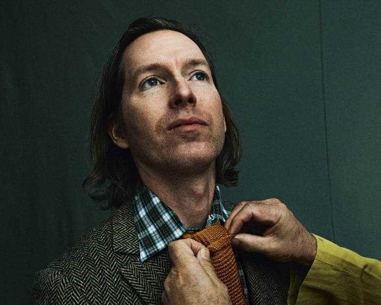
Wes Anderson, an acclaimed filmmaker known for his distinctive visual and narrative style, has captivated audiences worldwide with his highly stylized films.
This blog post aims to delve into the unique design principles underpinning Anderson’s filmography and how these principles can inspire and inform designers. This includes how one – in case they would love to use our AI logo maker tool, can benefit as well!
Let’s get going, and learn design principles from Wes Anderson Films in general!
Who is Wes Anderson?
Wes Anderson is an American filmmaker known for his eccentric, visually striking films that often explore family, loss, and redemption themes.
His films are characterized by their symmetrical compositions, bright colors, elaborate sets, and a recurring cast of actors, including Owen Wilson, Bill Murray, Anjelica Huston, Tilda Swinton, Jason Schwartzman, and Adrien Brody.
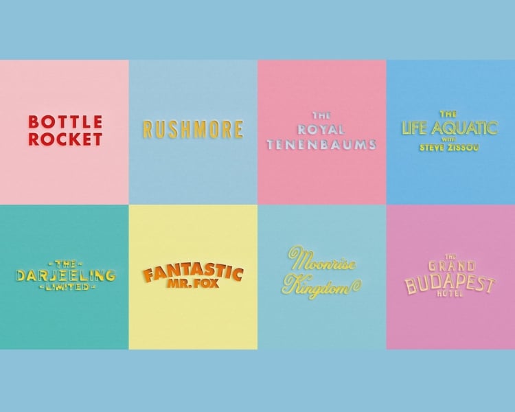
Anderson’s early films, such as Bottle Rocket (1996) and Rushmore (1998), established his unique style and voice. He went on to make a string of critically acclaimed films in the 2000s, including The Royal Tenenbaums (2001), The Life Aquatic with Steve Zissou (2004), and Fantastic Mr. Fox (2009). Many consider his 2012 film Moonrise Kingdom one of his best works.
Anderson’s most recent films, The Grand Budapest Hotel (2014), Isle of Dogs (2018), and The French Dispatch (2021), have continued to push the boundaries of cinematic storytelling. His films are both visually stunning and emotionally resonant, and they have resonated with audiences around the world.
Design Principles from Wes Anderson Films
Wes Anderson’s films are a visual feast, with meticulous attention to detail and a signature use of patterns. But what do these patterns tell us about his design principles?
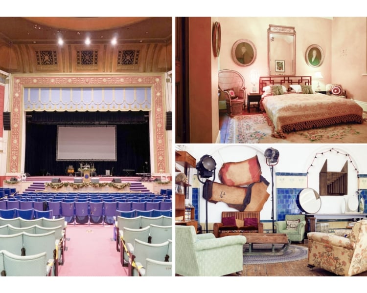
- Symmetry – His unwavering dedication to symmetry characterizes Wes Anderson’s films. Whether it is “The Grand Budapest Hotel” or “Moonrise Kingdom,” Anderson meticulously crafts each frame with precise balance and attention to detail. This obsession with order and harmony is not limited to the architectural elements portrayed in his movies.
The buildings showcased in Anderson’s films exhibit symmetrical facades with perfectly aligned windows, doors, and meticulous details. This intentional visual composition fosters a sense of control and harmony, underscoring the artificiality of the film’s world.
By symmetry, Anderson transports the audience into a meticulously constructed universe, allowing them to escape from reality and fully engage with the narrative.
In addition to the architectural symmetry, Anderson employs symmetrical framing throughout his films. Shot after shot, the tightly centered composition becomes a natural focal point, drawing the viewer’s eye to characters, objects, or locations. This deliberate use of symmetry creates visual satisfaction while adding structure and balance to each composition. Now, if you want to be as good as this without putting too much work, using an AI character generator like BasedLabs.ai is a game-changer!
- Color Palettes – Anderson employs color to set the mood and tone of his films. The color palette chosen for each film is deliberate and consistent, consistently supporting the story and creating a harmonious atmosphere.
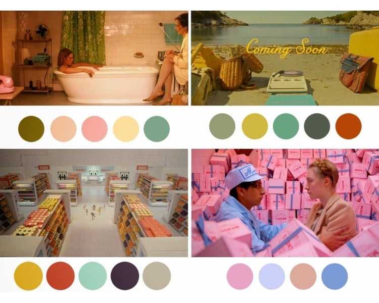
In “The Grand Budapest Hotel,” Anderson employs pastel colors to evoke a nostalgic feel, while in “The Darjeeling Limited,” vibrant colors create an exotic ambiance. The selection of the correct color palette in design can significantly affect the perception and reception of the work.
Furthermore, each frame in Anderson’s films is carefully composed, with each scene having a meaningful and consistent color scheme. For example, in “The Life Aquatic with Steve Zissou,” a predominantly blue and white color scheme supports the nautical setting, with the red Team Zissou hats standing out vividly.
This choice directs our attention to the crew and emphasizes their presence.
In “Fantastic Mr. Fox,” a color palette centered around fox-fur orange adds warmth and harmony to the charming setting. Contrast, dark greys, and black illustrate the artificial tunnels and the wolf’s silhouette, creating a sense of foreignness with the fox and his woodland friends. In this way, color sets the tone and supports the narrative.
Similarly, in “The Grand Budapest Hotel,” the use of bright, saturated reds and purples signifies the decline of the hotel’s grandeur. As the building loses its luster, the color palette becomes less vibrant.
Through the deliberate use of color, Anderson crafts visually striking and meaningful films, where each color choice plays a vital role in conveying the desired mood and enhancing the storytelling experience.
- Patterns – Wes Anderson is a renowned filmmaker known for his distinctive visual style, characterized by meticulous attention to detail, use of symmetry, and pastel color palettes. Patterns are a prominent feature in Anderson’s films, from the wallpapers and set design to the characters’ clothing and accessories.
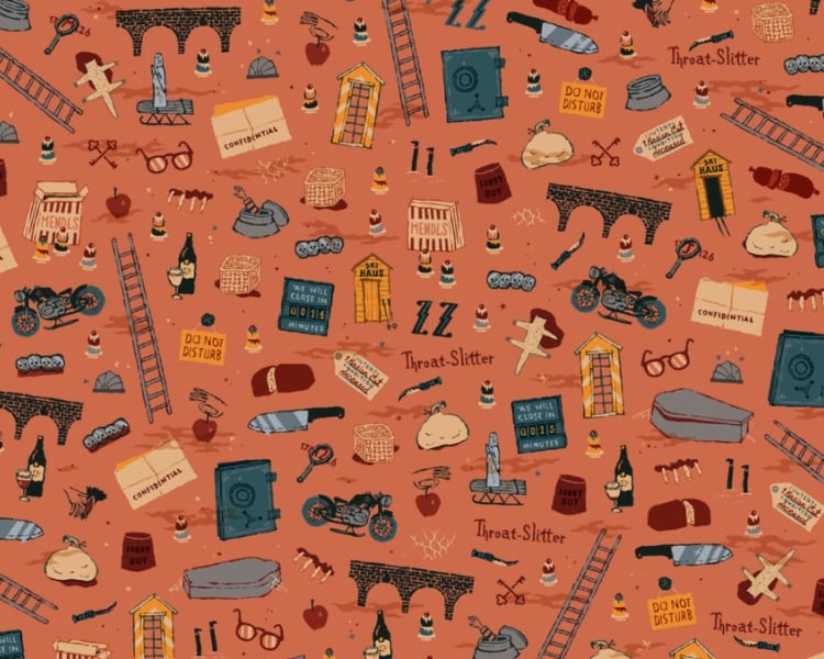
Patterns add depth and texture to the visuals of Anderson’s films. They can also be used to create a sense of order and symmetry, often juxtaposed with his films’ quirky and offbeat humor.
For example, in the film The Grand Budapest Hotel, the symmetrical architecture of the titular hotel is contrasted with the zany antics of the characters who inhabit it.
In design, patterns can add visual interest and reinforce branding. For example, a company might use a signature pattern in its marketing materials and product packaging to create a cohesive and recognizable visual identity.
Similarly, a designer might use patterns to create a sense of rhythm and movement in a space or to highlight certain elements.
- Space – In real life, people always need space. However, in the movies of Wes Anderson, characters are given more than enough room to breathe. Anderson uses space wisely, and his production design is well thought out. It is detailed, visual, and clean, sometimes too neat for the public eye. He ensures every aspect is necessary or enhances the overall visual impact.
- Typography – Anderson’s films often feature custom fonts and stylized text that complement the overall aesthetic. For example, The Grand Budapest Hotel uses a custom typeface called “Tilda” inspired by the Art Nouveau style.
Anderson’s use of typography is more than just decorative. He uses typography to convey information about his films’ characters and settings. For example, in The Royal Tenenbaums, the Tenenbaum family home is decorated with intricate wallpaper patterns.
These patterns reflect the family’s eclectic taste and their unconventional lifestyle. Similarly, the use of different typefaces in the film reflects the different personalities of the Tenenbaum children.
Final Words
Discover valuable design insights from Wes Anderson’s films. With an impeccable eye for detail, vibrant colors, captivating patterns, symmetrical compositions, and unmistakable typography, Anderson has crafted a signature style worth emulating.
While designers must cultivate their artistic voice, gaining inspiration from accomplished artists like Anderson can be a game-changer. Experience the transformative power of exceptional design and storytelling, just like in cinema.