No one knows a person who doesn’t have their favorite color. Why? Because colors make everything better!
Color is a powerful tool that can evoke emotions, set moods, and communicate messages in a way that words alone often fall short. Just think about how a vibrant red can ignite passion, a serene blue can calm a restless mind or a sunny yellow can instantly uplift your spirits.
Colors add beauty, depth, and meaning to our world. When it comes to logo design, whether with the use of an AI logo maker or not, graphic design, branding, painting, or anything in art in general, the color wheel is here to help us navigate this mesmerizing realm of hues.
They add beauty, depth, and meaning to our world. And the color wheel is here to help us navigate this mesmerizing realm of hues.
A color wheel is more than just a circle filled with a spectrum of hues. If you’re concerned about which colors complement each other, this simple tool makes everything easy.
So let’s talk about the color theory – color wheel, and why it’s essential to learn more about them and how you can use them as a designer, an artist, or simply someone who appreciates the world’s beauty.
Understanding Color Theory
Color theory is a guide that helps us explore relationships, combinations, and meanings of colors. It’s the study of how colors can create harmony, contrast, and visual impact – and there’s a science and artistic side to that.

In other words, it helps us understand the effect and feeling of colors and how they can influence a specific purpose. It encompasses concepts like the color wheel, color harmony, and the psychological effects of different colors.
So learning about color theory can help you make informed decisions when choosing colors for various purposes, such as painting, design, fashion, or even setting the mood in a room.
So What is a Color Wheel?
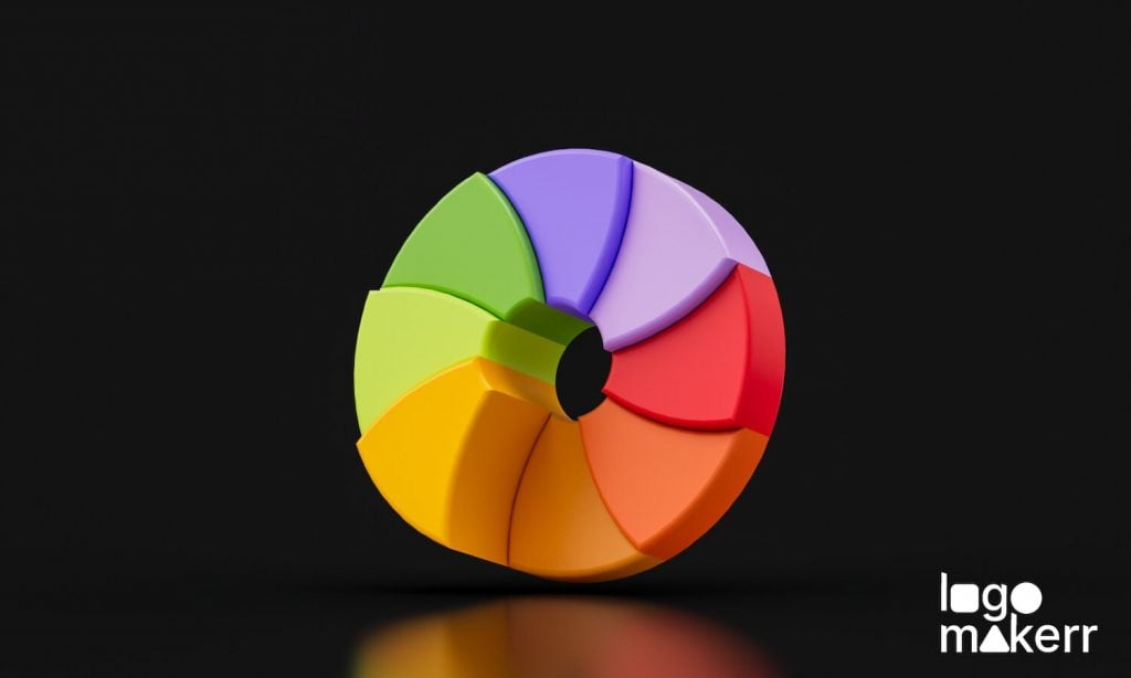
At the heart of color theory lies the color wheel. It’s a visual representation that systematically organizes colors, allowing us to explore their relationships and create harmonious combinations.

The color wheel helps us understand how colors relate to each other and how they can be combined to create various effects. Imagine a circle filled with all the colors of the rainbow. This circle, known as the color wheel, is divided into primary, secondary, and tertiary colors arranged in a circular pattern.
Primary Colors
Primary colors – red, blue, and yellow are like the building blocks of all other colors that cannot be created by mixing different colors. They are the starting point for artists, designers, and anyone who wants to play with colors and create something unique.
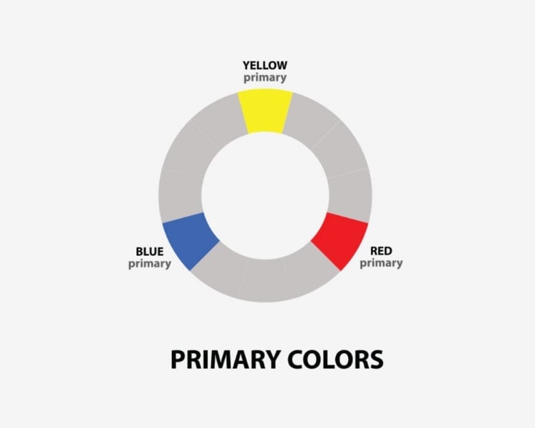
Photo Image by: WCP Solutions
Understanding the primary colors and how they interact is key to unlocking the full potential of many other colors!
Secondary Colors
When you mix primary colors in different combinations, you get secondary colors – green, orange, and purple. For instance, mixing red and blue gives you purple, blue and yellow gives you green, and yellow and red gives you orange.
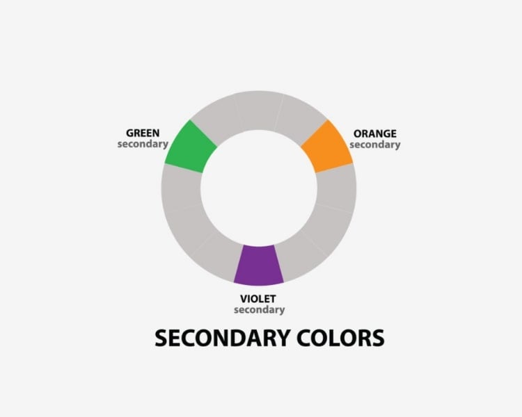
It’s like a color alchemy, where the primary colors blend and transform into something new and exciting.
Tertiary Colors
Now, here’s where it gets even more exciting. Tertiary colors come into play when we mix a primary and an adjacent secondary color together. Imagine blending the rich red of a primary color with the vibrant orange of a secondary color.
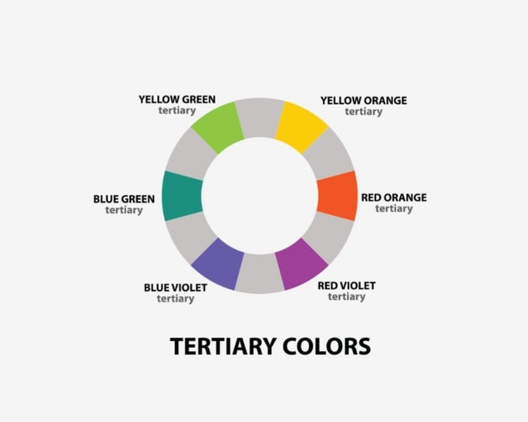
The result? The gorgeous tertiary color is known as red-orange.
The other five tertiary colors that fill the gaps are:
- Yellow-Orange = yellow (primary) + orange (secondary)
- Yellow-Green = yellow (primary) + green (secondary)
- Blue-Green = blue (primary) + green (secondary)
- Blue-Violet or Blue-Purple = blue (primary) + purple (secondary)
- Red-Purple = red (primary) + purple (secondary)
Hence, tertiary colors give us more variety and subtlety in color choices. With the knowledge gained from the color wheel, we can confidently select and combine colors in our designs, artworks, or any creative endeavor.
But what if your favorite shade of color doesn’t seem like a part of the color wheel?
Hue, Tint, Shade, and Tone
As fascinating as they may sound, these terms are like the building blocks of colors, and they can help us understand how colors work and how we can play around with them to create different effects.
Hue
Hue (pronounced as yu) is the original or pure color. It is simply another word for color.
When we say “red” or “blue,” we talk about different hues. Think of it as the essence of a color, the purest and most basic form. They are part of the color wheel, without any mixture of the neutral colors black, white, and gray.
Tint
The ‘tint’ is a color that is lighter or has a lighter shade than its pure color.’ These are achieved by adding white to a hue, almost giving it a pastel-like appearance.
If you mix a bright red with white, you get a lighter shade of red, almost like pink. Tints often have a soft and delicate feel, and they can create a sense of lightness and airiness.
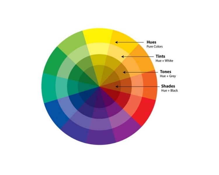
Photo Image by: Beach Painting
Shade
The opposite of tint is shade, where you mix black with a pure hue instead of white. This makes the color more intense and even darker, giving it a deeper, richer look.
Picture a dark navy blue or a deep burgundy. Shades are often associated with mystery, depth, and intensity. They can add a sense of drama and sophistication to any color palette.
Tone
Meanwhile, the tone is just adding neutral grey to the hue (a mixture of black and white), reducing the color’s intensity.
Unlike tint and shade, which alter the brightness or darkness of a color, tone affects the overall intensity and saturation. It can make a color appear muted or desaturated.
Think of earthy tones like olive green or dusty pink. Tones have a calm and subtle quality, and they can create a harmonious and soothing atmosphere.
Master the Art of Color Wheel
Let’s be honest, life without colors would be like a world without laughter—a little dull and lacking in vibrancy. Yet discovering and mastering color theory and understanding the color wheel opens up a world of possibilities for artists, designers, and anyone who appreciates the beauty of colors.
Colors can evoke emotions, set moods, and communicate messages in ways that words alone cannot. The color wheel is not just a circle filled with hues but a guide that helps us explore color combinations, relationships, and meanings.
By learning about color theory and the color wheel, you gain the knowledge to make informed decisions when choosing colors for various purposes.
Remember, colors are like an artist’s palette; you’re holding the brush. So have fun, and let your imagination run wild with hues, tints, shades, and tones.