Meta, formerly known as Facebook, is one of the biggest social media platforms on the internet. It has over 3.1 billion active monthly users – that’s almost half the population on Earth.
With that, it’s no secret that Meta has come a long way since its creation in 2004. And along with the transformation and growth of the company, it has also undergone several changes to its branded Facebook logo. After all, creating a logo to rebrand is fun, right?
From the iconic blue and white lettering to the new Meta logo, we have all been closely watching the process and evolution of Facebook’s brand. Nevertheless, each new logo signaled the growth and renewed commitment of the social media platform to its users.
In this blog post, let’s take a look closed at the branding and history of Facebook logo, especially the company’s reasons for the changes and how each new logo was received by the audience.
What is the current Facebook logo?
Building on their past heritage, the current Facebook logo is a lowercase ‘f’ in a highlighted blue background. Though it has different versions of blue, the primary Facebook logo showcases different shading and color grading.

Photo Credit: Wikimedia Commons
A lot of people like – and remember, the Facebook logo. Not just because it’s iconic but because it has a sense of homage that makes the logo stick in your head. We know you know what we mean!
Everyone also remembers the Facebook logo because the social media platform itself is so popular. So, you see their logo all over the place – on your phone, computer, even in ads. All that exposure helps burn it into your memory.
What was the first Facebook logo, and when was it founded?
Did you know that Facebook was called as Facemash? The first ever logo and brand name of this social media platform is a red and white color scheme. The word Facemash was written in capital letters in a white text and has a red rectangular background.
Before the name Facebook, Facemash was Mark Zuckerberg’s creation from 2003 to 2004. It was only in 2005 that he and his team decided on the name and changed the brand’s color scheme to blue.
The logo has evolved over the years, but that original design is where it all began!
What is the Meta logo?
The Meta logo is the new branding for Facebook’s parent company, which was announced in 2021. It consists of the word “Meta” written in a sentence case font and has a form of infinity symbol (∞) on top.
The logo represents the company’s focus on creating a metaverse, a virtual shared space where people can interact and explore in digital environments.
The CEO of Meta, Mark Zuckerberg, introduced the newly branded company. He said that Meta has a goal to bring together apps and technologies including their very own social media platforms like Facebook, Instagram, WhatsApp, Messenger, Meta Business Suite, Creator Studio, Workplace Chat, etc.
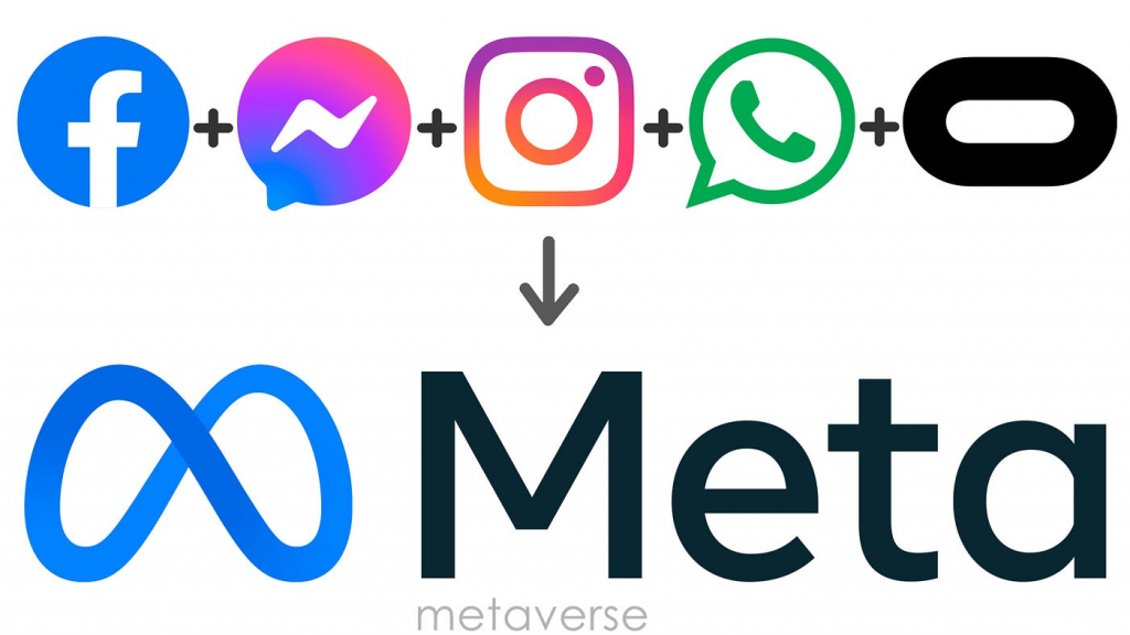
Photo Credit: Medium
The infinity symbol hints at never-ending chances and opportunities, fitting well with the concept of exploring endless digital worlds in the metaverse. It’s a smart design pick that grabs people’s attention and represents the company’s big dreams for what’s ahead.
Speaking of what’s ahead, Artificial Intelligence is also one of the most promising software today. With tons of AI tools like AI logo generators, AI product mockups, and AI video presentation makers, we are in an era where technology is unstoppable.
Why is Artificial Intelligence important in the Metaverse?
In Meta’s case, AI is used to improve user experiences, like showing you stuff you’re interested in on Facebook or suggesting friends to connect with. Plus, AI helps keep things safe by spotting and stopping harmful content.
Basically, AI is like the secret that makes Meta’s platforms work better and safer for everyone, which is why it’s so important to them.

Related: Blog link
And obviously, a lot of companies now are turning to AI to help their businesses – especially with branding.
Let’s take AI logo makers for an example.
AI logo makers allow you to design a logo in minutes. With this AI tool, you can draft, create, and see your logo in different product mockups without spending a lot of money.
Though it still requires a human touch, nothing beats the power of the many cool things an AI logo generator can do, as compared to hiring an expensive graphic designer only to find yourself in between revisions.
To support that, here are some general features of an AI logo maker.
- Free to use
- You can design a logo in as little as 5 minutes
- A lot of typographies and fonts available
- Endless color schemes
- Different pre-designed templates for every industry
- Brand related features such as Split Font
- Ready to use product mockups
- Download in different formats for as low as $29
See, AI is a super-smart assistant you can use as an advantage to your business. Be it for branding or helping you make faster decisions, there are AI tools to attend to all your needs as a businessman.
What makes the Facebook logo perfect for branding?
Just like many startups ad large corporations today, Facebook – (or should we say Facemash), started with nothing. But how does this multibillion dollar company made it to where they are today – despite only changing their logos every once in a while?
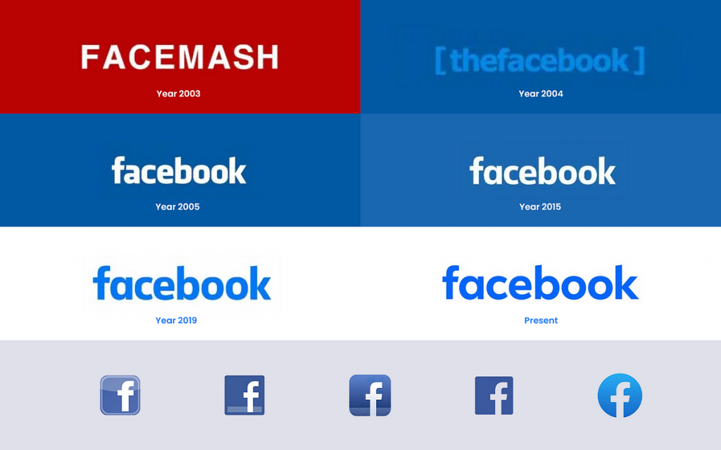
Photo Credit: Medium
Well, as many of you might not know, the Facebook logo is perfect for branding – which means it’s perfect for digital marketing strategies and SEO. These two things played an important role in the success of Facebook today.
Facebook logo for branding means it’s simple, recognizable, and versatile. Its clean design with the lowercase letters and distinctive blue color make it easy to spot and remember.
Plus, it works well across various platforms and sizes, whether it’s on a tiny phone screen or a big billboard. The logo has also become closely associated with the Facebook experience over the years, making it instantly recognizable to billions of people worldwide.
So, it’s not just a logo – it’s a symbol of connection and community, which is why it’s so effective for branding.
