Did you know that Coca-Cola has the most widely recognized logo design on the planet? It’s pretty amazing when you think about it! Their logo is refreshingly simple, consisting of just text and a splash of color.
Surprisingly, a whopping 94% of people can spot Coca Cola’s logo instantly, even more than other industry giants like Google or Apple.
This exciting fact highlights the importance of typography or font in a logo design. The font you choose can significantly impact how your logo is perceived. So, if you’re planning to create a logo for your brand, it’s crucial to consider the typography you use carefully.
But don’t worry; we’ve got you covered! The following discussion will explore some of the best typography and fonts for your next logo design. So, let’s dive in and discover the perfect typography that will make your logo stand out from the crowd!
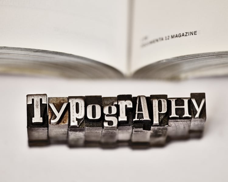
The Importance of Typography in Logo Design
What’s the big deal with typography, and why does it matter for logo design?
Typography is about the style and appearance of words or written language in any printed material. When it comes to logos, typography plays a starring role in how the brand’s name is presented, and its message is conveyed.
It’s like the fancy outfit that makes your logo stand out in a crowd.
Here’s the cool part: typography allows you to create a logo with a lasting impression. You can go for a bold and straightforward approach, grabbing attention with strong, impactful fonts. Or, if you’re into a more elegant and refined vibe, you can choose typefaces that exude sophistication and charm. The choice is yours!
But to truly succeed in logo design, staying up-to-date with the latest trends is essential. Keeping an eye on what’s hip and happening in the world of typography helps you connect with modern customers.
You want your logo to speak their language and reflect your brand’s personality. And that’s how you make a real impact!
5 Most Popular Typography in Logo Design.
Choosing the perfect typography can be overwhelming, with so many options. That’s why we’ll help you navigate the sea of possibilities and discover the best typography and fonts for creating stunning logos.
But first, here are some popular typography fonts that you can consider and look at!
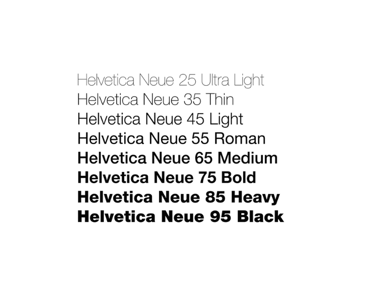
1. Helvetica
Source: ThoughtCo
We can all agree that Helvetica is considered a timeless font from its humble beginning in the mid-20th century up until now. Many logo designers love Helvetica because you can read it well and pair it up with almost any image! With that, this font is one of the most popular choices of companies for both print and digital media!
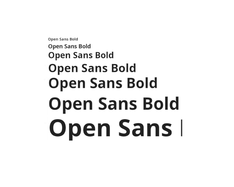
2. Open Sans
Source: Stockio
Open Sans is another classic Steve Matteson created in the early 21st century. Google commissions this font, which has been widely used for many logos, headlines, and body of text because of its clean and modern aura. More so, a font like this is available in Google fonts – which is also one of the many features of Logo Maker AI!
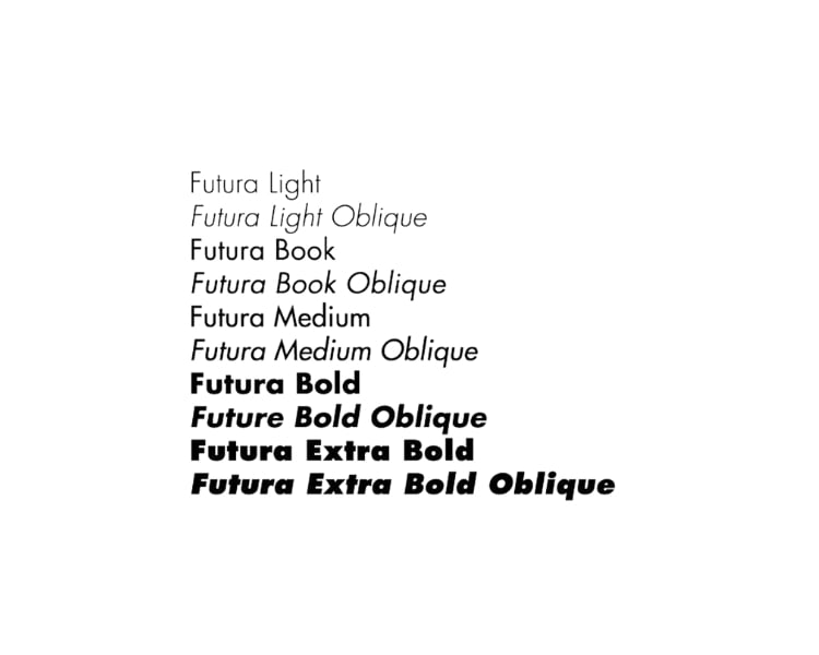
3. Futura
Source: Pinterest
This geometric sans-serif typeface hit the surface around the early 20th century. Futura conveys a sense of modernity and sophistication – and the font is great for companies who want to thrive in this modern world. This font is popular for logos and branding projects because of its ‘legible’ yet professional characteristics.
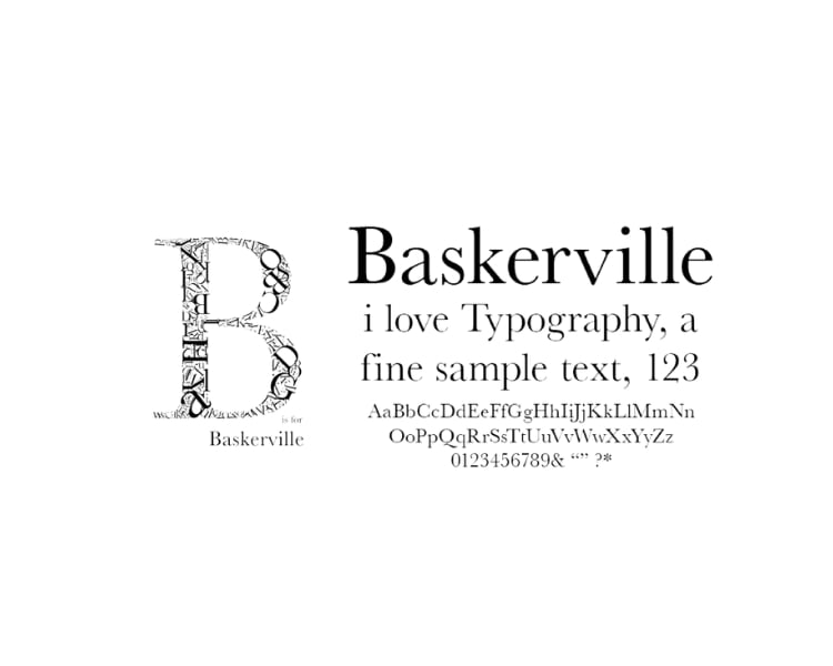
4. Baskerville
Source: Jemmae
If you want a serif font with a classic and elegant feel, you can never go wrong with Baskerville! This font is perfect for books and magazines or other formal documents you please, like resumes and business letters. This font is also ideal for pairing different typography fonts because it can fit with anything!
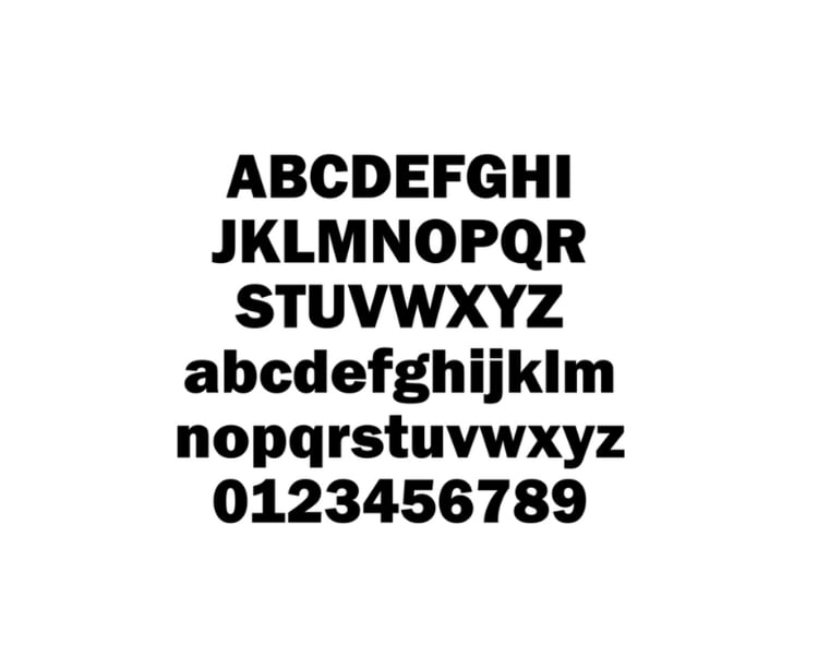
5. Franklin Gothic
Source: Wikimedia
Morris Benton developed Franklin Gothic in the early 20th century. This font is known for being a sans-serif typeface with clean lines and robust geometric shapes. The font is also bold and sturdy, making it a popular choice for headlines, posters, and logos!
5 Best Typography Fonts for Logo Design
Are you ready to take your typography game to the next level? These fonts are like a secret weapon to make your logos stand out in a crowd.
So in terms of typography for logo design, here are our top 5 picks:
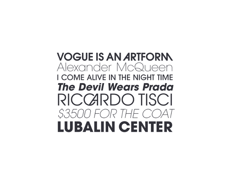
1. Avant Garde
Source: MyFonts
Avant Garde is a font that embodies modern creativity and innovation. As its name suggests, it’s all about pushing boundaries and thinking outside the box. But here’s the interesting part: despite its trendy reputation, Avant Garde has been embraced by several original, iconic brands that have not only stood the test of time but are thriving in their respective industries today.
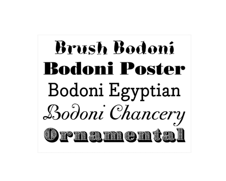
2. Bodoni
Source: CreativePro
Bodoni is a font many high-end brands use with its sophisticated design that conveys nothing but exclusivity and quality. Bodoni’s clean lines and bold contrasts make it a popular choice for fashion, beauty, and lifestyle brands.
3. Garamond
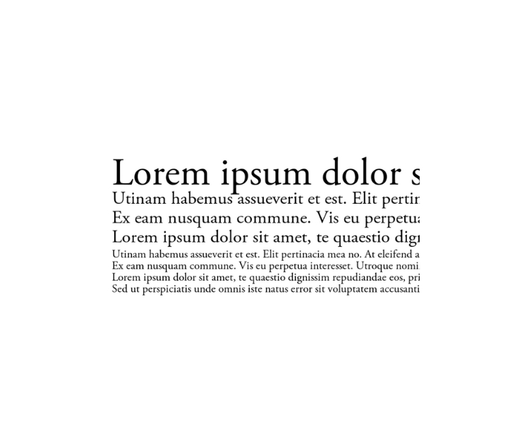
Source: Fontsgeek
If you have a brand with a sense of tradition and authenticity, then the Garamond font is for you. It has a stylish yet elegant look making it perfect for law firms, publishing houses, and luxury brands!
4. Avenir
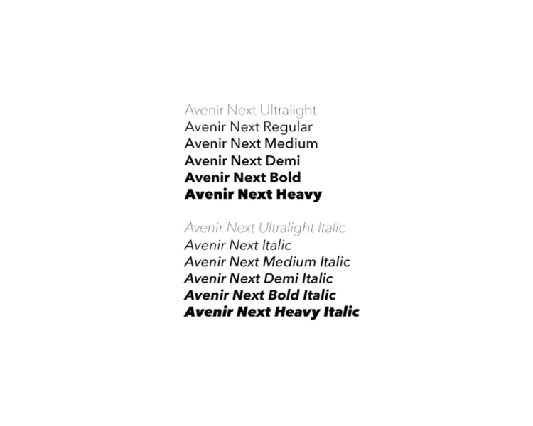
Source: Pinterest
The last top typography font perfect for logo design on our list is Avenir. This font gained popularity in the 1980s, and ever since, it’s created a powerful statement for brands who long for a subtler and approachable look!
3 Most Popular Easy-to-Read Fonts for Logo Design
Compared to the most popular and preferred font for logo design, these top 3 ‘easy-to-read’ typography are visually appealing and make sure your message comes across loud and clear.
So make a lasting impression with your logo while ensuring maximum readability with these three logo picks!
1. Arial
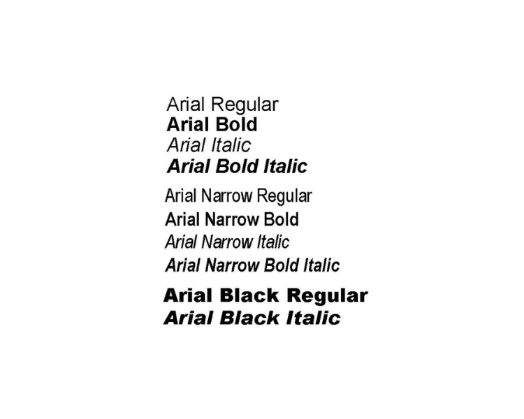
Source: Pinterest
Ah, the classic and the most commonly used. From print, digital materials, articles, or even app-incorporated texts, Arial is a readable, clean, and simple font. It’s also easy on the eyes and doesn’t require the readers to make a double-look to understand the text.
2. Verdana
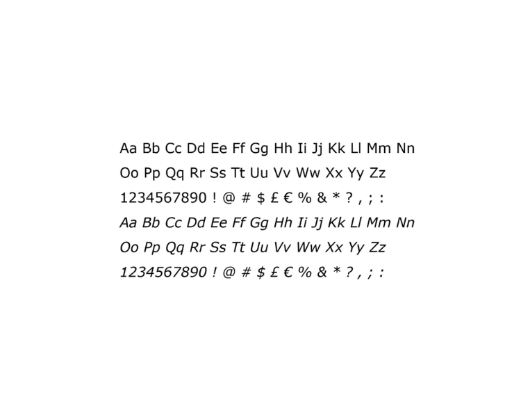
Source: Microsoft
Designed specifically for on-screen use, Verdana is easy to read, even in small sizes. The font also has a large x-height, meaning the lowercase letters are more significant than other fonts, making it easier to read on screens.
3. Century Gothic
Source: Weebly
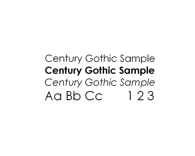
Finally, Century Gothic is a modern font that is often used in advertising and marketing materials. This sans-serif font also has rounded edges – making it readable and versatile. Also, Century Gothic is beneficial for headlines and titles as it’s bold and eye-catching!
Ready to Try A Font With Us?
Choosing the perfect font for your logo can greatly impact how your brand is perceived. If you’re feeling lost in effectively communicating your message through a well-designed logo, this guide gives you the right suggestions to try.
While staying up-to-date with the latest typography trends is always a good idea, it’s equally important to do your homework and find a font that aligns with your industry and enhances your brand identity. You don’t want to choose a font that does more harm than good.
Here’s where things get exciting: you can create your logo with the help of an AI logo maker, and the best part is it won’t cost you a penny! This handy tool is your guide, allowing you to explore different design ideas, draft your logo, and ultimately make the best decision for your business. It’s like having a creative partner right at your fingertips!
So, whether you’re a typography enthusiast or a complete novice, consider the power of the right font choice. Let your logo talk and leave a lasting impression on your audience. Try the AI logo maker, and watch your ideas come to life!
