The market is crowded with competitors today, and that’s one of the grim realities you must face if you are a business owner. Nonetheless, there are many ways to make your brand stand out, and branding like logo designs and letterheads plays a crucial role in achieving that distinction.
Branding is the process that creates a distinct image and voice for your business, and one of the key elements of it is a well-designed letterhead. I mean, what’s a better way to make your business shine than to offer a good impression of the company’s identity, right?
In this article, look at ten inspiring letterhead examples to help you create a compelling and memorable branding strategy. Whether sleek, modern, playful, or colorful, these letterheads will make a lasting impression on your clients and customers!
Contract with Louisiana – A boot-shaped Southern state on your hands
Let’s start with helping individuals find an enterprise, chore, or any other mission in the state of Louisiana. The Contract with Louisiana‘s letterhead and logo instill trust and professionalism in clients and partners while reflecting the organization’s unique characteristics.
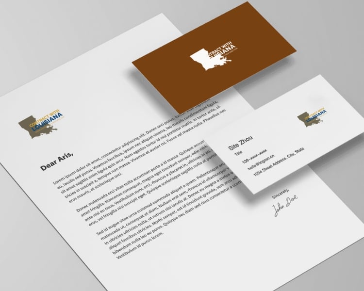
Obviously, having a logo like this means you mean business. You can’t just create a cohesive logo design by encompassing the official map of Louisiana for nothing.
Additionally, the letterhead best suits the integral components of establishing a strong brand identity and thoughtfully evoking trust and recognition.
Dark Housework – A conceptual blueprint for all your house needs
Dark Housework‘s letterhead design is a stunning template that combines modern aesthetics with a touch of darkness. As a minimalist company that offers many house services, Dark carefully selected and laid its logo to feature bold typography and a gray color palette.
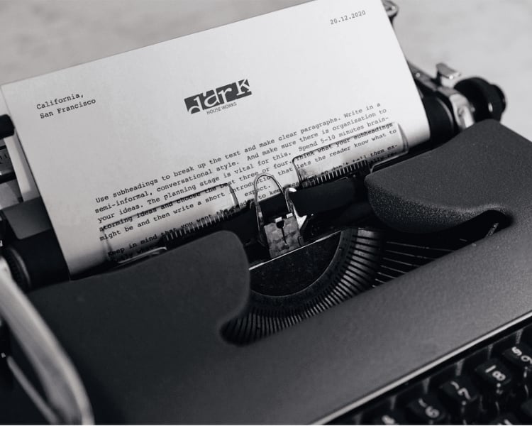
The company is fond of sending out its invoices, proposals, and other important correspondences using this letterhead, which is an excellent kick-start for its branding strategy.
CoffeeFox – For an energetic coffee experience
We can all agree that there’s nothing better than a morning cup of joe! One of the brands that offer the finest and high-quality coffee beans in the market is CoffeeFox.
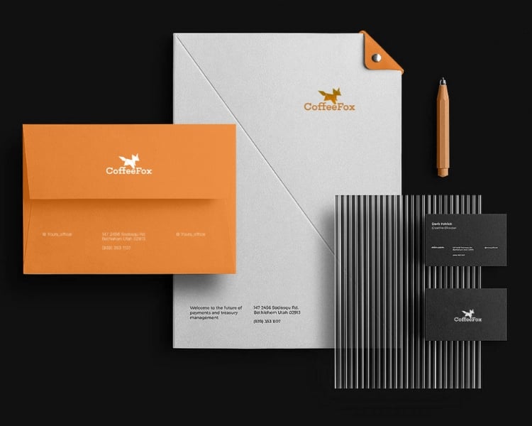
And despite being one of the best in the industry, CoffeeFox still elevates its professional image by embodying a brand identity with a true reflection of its commitment to quality produce.
A combination of rich coffee brown and vibrant orange hues creates a warm and inviting tone, evoking the comforting feeling of sipping a freshly brewed cup of coffee.
The letterhead also features an origami fox that speaks volumes about CoffeeFox’s attention to detail and well-executed branding.
SweetHome – A line-up of Interior Designers to revamp your space
If you are an organization with an exceptional lineup of interior designers, the brand of SweetHome is what you are meant to have for an effective branding strategy. SweetHome’s letterhead design exemplifies the essence of the brand – a harmonious blend of elegance, imagination, and functionality.
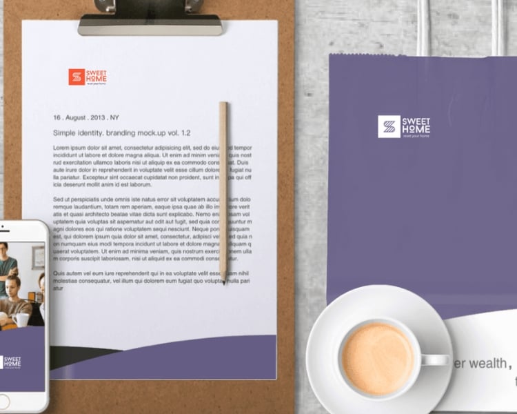
SweetHome’s letterhead is in soft, muted tones combined with vibrant accents of orange. It captures the attention of the reader without overwhelming them.
Plus, the font choice is professional and chic with an easy-to-read typeface. All-in-all, the letterhead of SweetHome exudes effectiveness and clarity for a successful branding strategy!
BEXfit – For a fitter, healthier you
As a go-to brand that helps individuals achieve a fitter and healthier lifestyle, such as BEXfit, you need an impactful branding strategy. Not just visual-wise but also physiological influence.
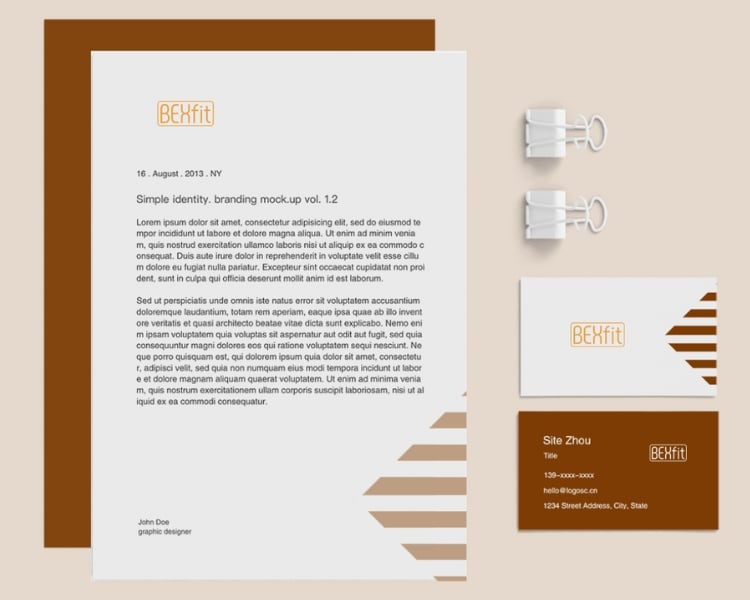
To do that, you need a logo and letterhead design that is clean and inspired by vitality. It would help if you also opted for a sense of freshness and optimism with an energetic orange color palette.
For typography, look for an uncluttered and balanced alignment, as this will allow the letter’s content to take center stage. Indeed, BEXfit understands the importance of strong and concise communication, and their letterhead design reflects this commitment.
Pokemon – A game-changing design
Pokemon is a game that has captured the hearts of millions globally, from children to adults. As we enter a new era of the game, even the smallest details such as letterhead, can significantly impact us.
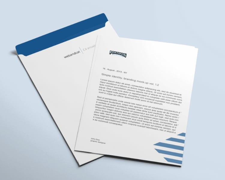
The Pokemon-inspired letterhead design features a vibrant, cold color scheme and black touches for added professionalism. It has a playful typography that illustrates an overall sense of excitement to those reading the letter.
Of course, the iconic name of Pokemon takes center stage, so the reader will instantly sense the nostalgic allure of the game!
Wisbot – Your hands-on robot companion
If you have a brand that wants to capture the cutting-edge technology and forward-thinking approach that is Artificial Intelligence, this Wisbot-inspired letterhead design is how you’ll be able to revitalize effective branding.
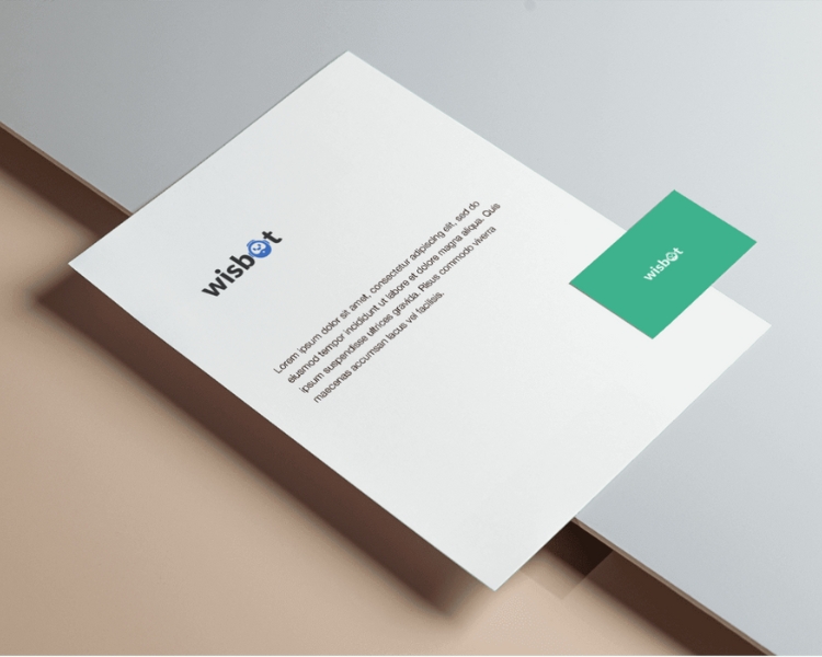
Wisbot’s letterhead has a color scheme incorporating a harmonious blend of vibrant blues and crisp whites, evoking a sense of trust and reliability. It also has a small robot icon instead of the letter ‘O ‘ to symbolize the various solutions Wisbot offers.
MAHALO – Your Exclusive Digital Marketing Agency
Starting a digital marketing agency is a familiar business today. And to put your company out there, you need to have effective branding that conveys a sense of trustworthiness and expertise. This is especially true for professionals or partnerships that receive correspondence from your brand-new agency.
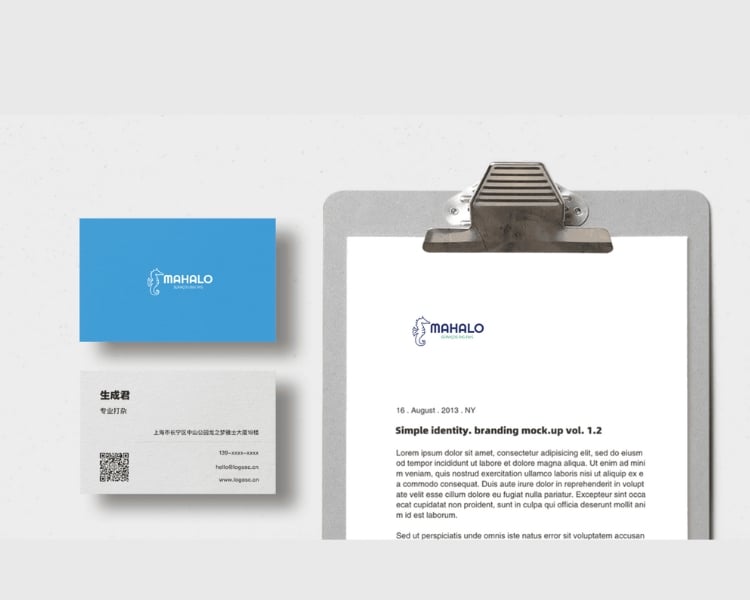
MAHALO letterhead design is a combination of modern aesthetics and timeless elegance. It has an animated seahorse that swims upright, describing a calm and patient character during tricky situations (something you’ll often encounter in your agency).
SkillUp – Recruit for Growth
SkillUp, one of the leading recruitment agencies, is focused on helping companies look for top talents for growth. And to make a long-lasting impression on clients, the importance of a well-designed letterhead in conveying the brand’s professionalism and credibility cannot be overlooked.
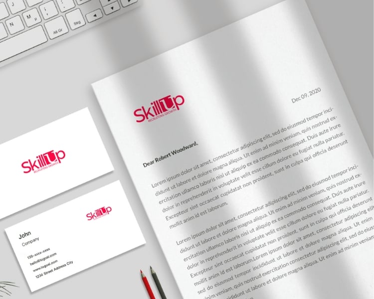
SkillUp’s letterhead design features a simple yet impactful Red and White logo. This serves as a visual reminder of SkillUp’s mission to help companies reach new heights through recruitment.
Additionally, the company slogan ‘Recruiting Growth’ is placed under the logo to reinforce its brand value easily. This way, any recruiting strategies of the company are immediately showcased to its viewers.
AIRPIXEL – All-Inclusive Pro Studio
With AIRPIXEL, an all-inclusive pro studio, even the most mundane aspects of your business, such as letterhead, can reflect the effectiveness of your branding. AIRPIXEL’s letterhead design features a minimalist black and yellow logo to showcase the brand’s distinctive identity.
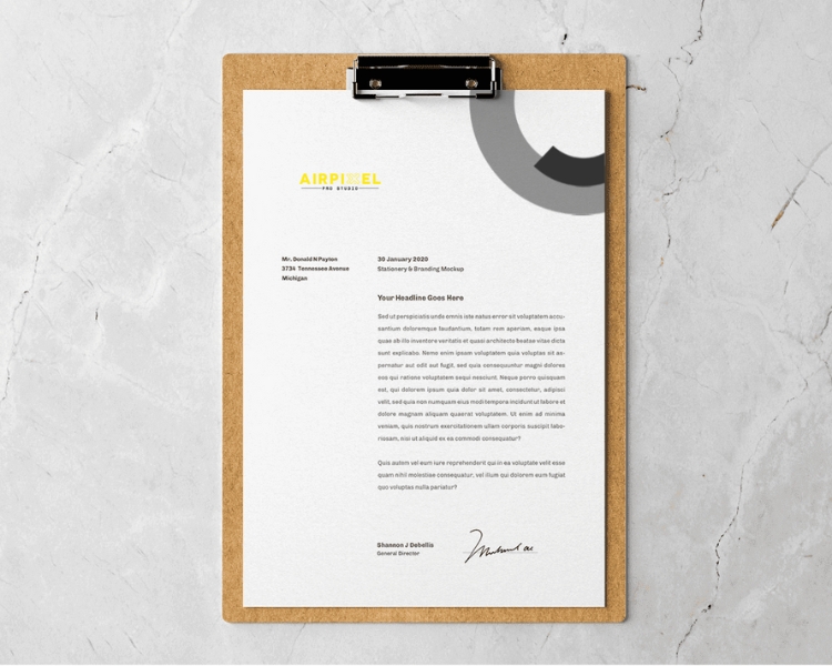
And as far as we all know, this color palette exudes nothing but an embodiment of elegance, refinement, and commitment to services.
The typography, however, is in all-caps with a precise alignment to each letter. The AIRPIXEL letterhead design sets the tone for a strong and memorable brand experience, from business proposals to thank-you notes.
Final Thoughts on Letterhead Examples
Go ahead and unleash your creativity to craft a stunning letterhead that truly reflects the style and essence of your brand using these examples! You can also use an AI logo maker tool to craft one easily and cost-efficiently!
