Color palette plays a big part in business branding, and one of the most crucial steps in branding is identifying the color palette. This will help consumers decide whether your brand is interesting enough to purchase an item or service from.
Knowing how to present your business will help you choose a logo that will reflect the message you want to convey. Hence, you must select the right colors to give your business the perfect brand image and recognition.
Take advantage of the psychology of color and your marketing expertise, utilizing tools like an AI logo maker to create a positive customer experience that leads to brand loyalty.

But before finalizing those colors you probably have in mind, check out these steps in choosing the best palet warna that will perfectly fit your personality and business goals. Shall we begin?
Start with the Basic – Color Wheel
Did you know that color has psychology behind it that could affect a person’s mood?
Color has meanings and symbolism that convey information nonverbally which shapes certain moods and influences the decisions people make. Thus, understanding colors and using them to your advantage can impact your business branding and marketing.
You will notice that popular brands like McDonald’s, Starbucks, and Coca-Cola have done an impressive job building a brand. Just by one look, customers can already identify their brand.
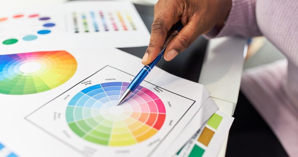
A color wheel is your best ally in creating your first logo branding. It isn’t just a random idea that pops into your mind, as there’s great science behind it.
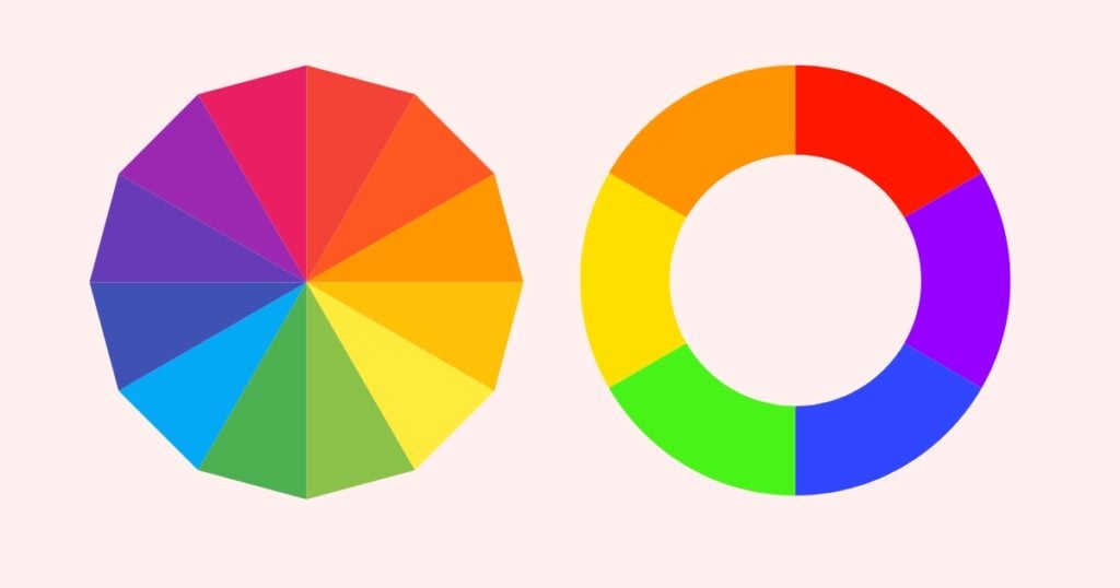
The color wheel follows a specific guideline that pleases the human eye and helps easily determine the best color. Color Wheel is a pie chart that categorizes the colors into Primary, Secondary, and Tertiary.
Primary colors are those that aren’t created by mixing with other colors. Instead, they are used in producing new shades like Red, Blue, and Yellow. Think of them as the parents of your palette. They give a general color scheme.
Any one of these colors or a combination of them can help your brand stay on track as you experiment with other shades, tones, and tints.
Meanwhile, secondary Colors are obtained by mixing the primary colors. Lastly, Tertiary Colors are a mix of primary and secondary colors but are adjacent. For example, green with blue gives a green-blue tone. Knowing the basics, you can now develop a color palette through mix and match that is easily recognizable and liked.
3 Easy Steps to formulate a Brand Color Palette
Now that you know the basics and understand the color wheel, it’s about time to delve into the meaning behind every color and how they influence our logo.
1. Understand the meaning behind every color
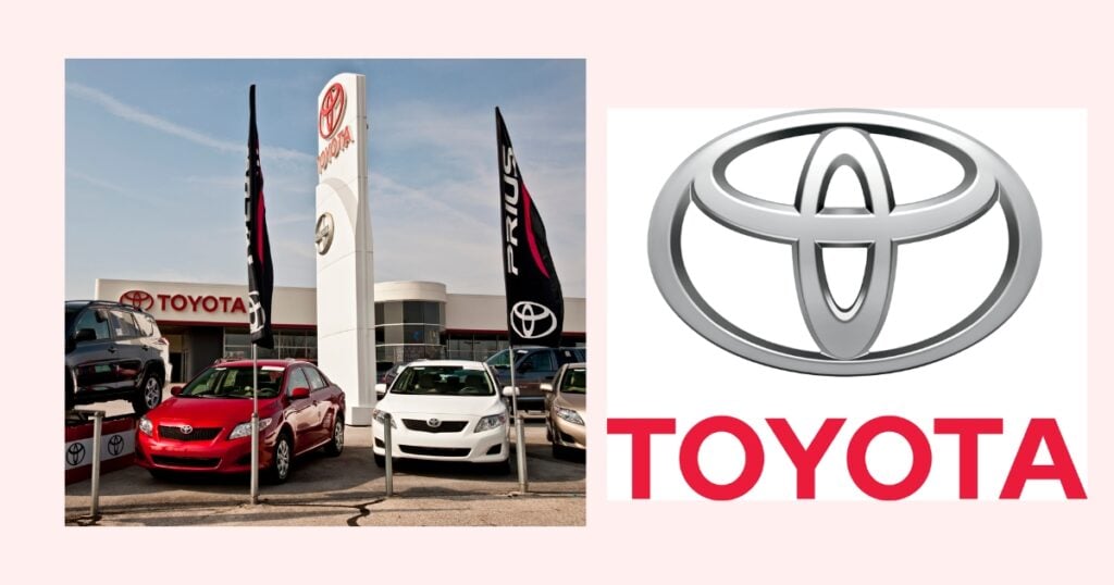
Red is a warm color that attributes power, energy, passion, desire, and other exciting and strong qualities. The brand Toyota features red and white logo colors that have become its signature over the years, representing passion, energy, and acceptance.
Green is a lighter shade used in the brand color palette to showcase freshness, growth, cleanliness, and the environment. In contrast, the darker green is used to symbolize cash, wealth, and money.
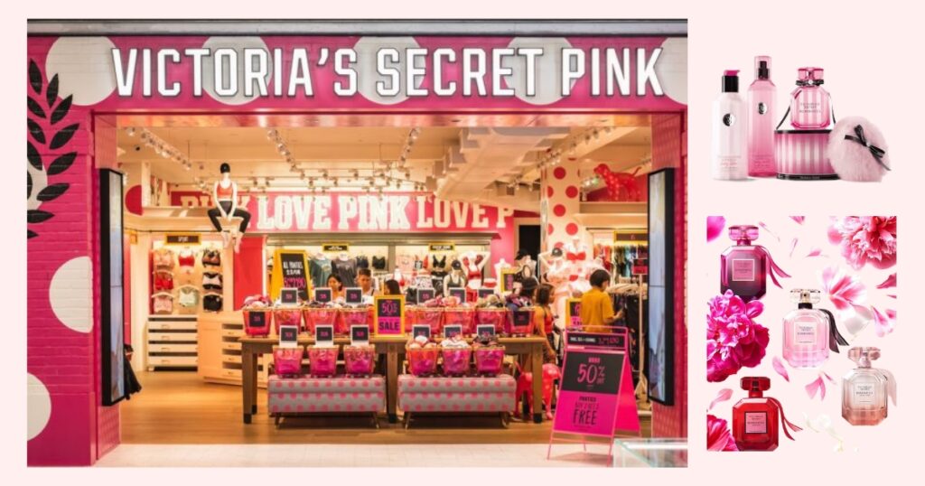
Pink induces femininity often associated with innocence, sensitivity, sensuality, and romance. Victoria’s Secret signature palette of pink, black and white makes the logo strict and sophisticated.
Yellow reflects positivity. Hence, most brand palettes in logo design use yellow to display those welcoming feelings.
Blue in different shades delivers different emotions. Lighter shades of blue in the brand color palette depict the solidity and candidness of a brand. On the other hand, darker shades symbolize a brand’s trustworthy and secure nature.
2. Find the colors that replicate your brand identity
Brainstorm with your team to share keywords and features that best describe your brand. The list will help you pick relevant color ideas and ensure you are aligned on the main objective.
It’s easy to distinguish a color palette as subjectively attractive to you rather than to ponder whether it objectively represents your brand in the eyes of the consumer.
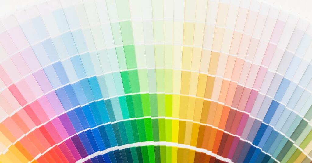
Contemplate what colors best mirror your business. Plan a clear description of your brand goals and how you want your target market to feel. Focus on the impact you want to make as a brand and the customer’s perspective of your brand.
At Logo Maker AI, a color palette helps startup businesses establish their brand by providing a swatch of colors you can choose to emulate the style you want. We have suggestions to help you find the colors you like and guarantee they work well together.
3. Learn your competitor’s brand palette
Research is the key! Learn ways to differentiate your colors. Your product may appear among competitors, and it is vital to understand the reason for your competitor’s choice of palette.
Analyze the market and customers. The brand’s market must have a set of frequently used colors, and it is wise to include them in your brand color palette to make it more relatable to your customers.
Get Kicking and Use your Brand Color Palette!
Once you’ve decided on your brand color palette, design a great logo to attract customers and boost your brand’s image. Use the tips we shared and navigate Logo Maker AI now to create your unique and striking logo.
Using an Ai logo maker can help you choose between hundreds of logos generated in minutes or the best color to represent your brand with minimal effort.
Now that you know how to choose your palette, it’s time to get creative! Browse our collections of color palettes with customizable templates to help you design your brand’s best logo.


