Making the perfect car is tricky because there are many essential things to consider. These things or factors include reliability, good gas mileage, enough driver comfort, tilt-and-telescope steering, and so on.
However, designing an ideal auto logo and distinguishing the brand from the competition can be equally challenging. Enter AI logo makers, which use intelligent algorithms to create unique, eye-catching vibes. They are time and resource savers.
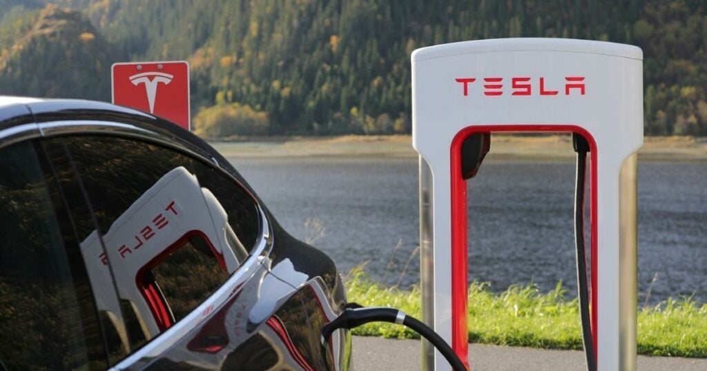
The renowned American automaker Tesla Motors has an alluring and persuasive brand identity as its vehicle models. The Tesla logo is a graphic masterpiece in the automotive industry.
In this article, let’s examine the history and significance of the Tesla logo’s evolution.
The Story Behind the Tesla Logo
The Tesla logo is a simple yet elegant design with a slanted T with a horizontal line crossing through the center. The meaning behind the logo comes from the company’s founder, Nikola Tesla.
Nikola Tesla was a Serbian-American inventor, electrical engineer, and futurist who developed and designed some of the most critical innovations in electricity and engineering. He is best known for his work on Alternating Current (AC) electricity supply systems, which are still the standard today.
One of the primary intentions for the Tesla logo design is to honor Nikola Tesla’s legacy and contributions to science and technology.
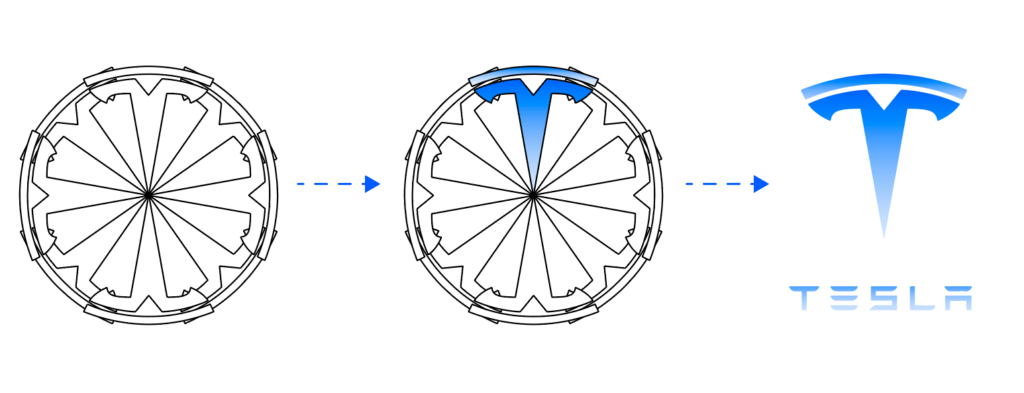
Elon Musk, the CEO of Tesla, recently tweeted that what appears to be a simple stylized “T” is a reference to the company’s products. He states, “the T is like an electric motor’s cross-section, just as the X is like a rocket trajectory.”
Musk appeared to refer to the horizontal line “T” as a portion of the stator and the vertical line of the “T” as one of the poles that protrude from a motor’s rotor.
The Tesla logo was specifically created to spread awareness of electric motors on a global scale. The main goal was to simplify the electricity connection to make the electric motor accessible to the general public.
Today, this device is a crucial component of Tesla Roadster vehicles despite being improvised.
Tesla goes above and beyond to ensure that every aspect of the vehicle and its manufacturing process works in the driver’s favor regarding safety, comfort, and satisfaction.
Fun fact! Throughout the company’s founding, Elon Musk was completely absent. Martin Eberhard and Mark Tarpenning, two investors, came up with the idea for Tesla, which was introduced on July 1, 2003.
Musk invested a whopping $6.5 million before joining Tesla a few months later. And this represented a turning point for the business. After taking over as Tesla’s CEO, Musk oversaw the company’s growth into one of the most prestigious and expensive automakers in the world.
Tesla’s logos over the years
Let’s dissect and evaluate the elements of the Tesla logo design over time.
Tesla Motors (2003)
The Tesla logo design was originally made to fit inside a shield, but the company later got rid of the shield and just kept the letter “T” as its logo.
Model 3 (2017)

Those who have been following the business for a while may be aware that the original name was “Model E” instead of the Tesla Model 3. Due to a trademark dispute with Ford, Tesla changed it to “Model 3” and made the “3” look like the “E” in the “Tesla” logo by using three horizontal lines.
Tesla Cybertruck (2019-Present)
In 2019, the current Tesla logo was launched along with the Tesla Cybertruck. The new logo is a minimalist design that ditches the shield in favor of a simple wordmark.

Some have speculated that the new logo is a nod to Tesla’s move away from cars and towards trucks and other commercial vehicles. Others believe the new logo is a more modern and streamlined version of the old one.
Regardless of the reason, the new Tesla logo is a sleek and stylish update to an already iconic design.
Tesla font and colors
One of the most important aspects of the Tesla logo is the font. In addition to some fanciful and technological components, the font also has a sci-fi feel.

Black and silver dominate the Tesla badge’s color scheme, and these hues typically stand for sophistication, balance, elegance, originality, and creativity. Tesla added red, signifying their passion for and commitment to electric vehicles.
Tesla’s mission statement
“To accelerate the world’s transition to sustainable energy.”
This is Tesla’s mission statement, and it perfectly encapsulates the company’s goals and values. Tesla is on a mission to change the way the world uses energy, and they are doing so by creating sustainable, renewable energy solutions.

Tesla is committed to making the world a better place, and its mission statement reflects that commitment.
Wrapping up
The Tesla logo is a great example of how a company can change its logo over time and maintain recognition. The font and colors are unique to Tesla and help set them apart from other car companies.
Some companies, like Nike, Ford, and Apple, do this with a simple logo, but others take a different approach to make their logo look bold, strong, and maybe even mysterious. And Tesla has made a name for itself in the car business with its exciting and unique symbol.
If you want to create a logo like Tesla’s, check out Logo Maker AI and make a car logo today!
