A logo is ready to launch when people can recognize it, read its essential wording, and use the correct file in the places where the business actually appears. A polished preview is only the first check. Before approving a design, test it on real backgrounds, at real sizes, and alongside the rest of the brand.
This guide gives small businesses a practical review process. If you are exploring directions with an AI logo maker, use the same checks on each shortlisted option rather than choosing the most impressive large mockup.
Start with a short launch brief
Write down the exact business name, the intended audience, and the three places where the logo will be seen most often. For a local café, that might be a storefront sign, a mobile menu, and a social profile. A consultant may care more about a website header, proposals, and presentation slides.
Separate required wording from optional wording. A legal business name, a public trading name, and a tagline may not need to appear in every version. Confirm spelling, capitalization, punctuation, and any accented letters before evaluating style.
The brief should also say who makes the final decision. Collecting comments from several people is useful, but a launch can stall when every preference becomes a new requirement. Ask reviewers to connect their feedback to a use case.
Review recognition before decoration
Show the shortlisted logo briefly, then ask what the reviewer remembers. Look for a recognizable overall shape, a clear name, and a visual direction that fits the business. The aim is a useful conversation, not a statistically meaningful consumer study.
Do not explain the symbol before asking the question. A design that works only after a long explanation may need a simpler composition. Decorative details can still belong in a brand, but they should not compete with the essential mark.
Our guide to logo versus brand identity explains why the logo is one part of a larger system. A strong symbol cannot compensate for inconsistent product photos, messaging, or typography.
Test the smallest planned size
Place the logo in an actual header or profile preview rather than shrinking it by eye on a large design canvas. Check whether the business name remains readable and whether fine strokes disappear. Review the result on a phone as well as a desktop.
A small icon may need a simplified symbol while a larger banner uses the full name. Treat those as approved variants of the same identity. Avoid improvising a different crop every time someone prepares a social post.
If the tagline becomes unreadable at the planned size, remove it from that version instead of assuming visitors will zoom in. Record which version belongs in each placement so the next person does not repeat the experiment.
Compare symbols without changing everything at once
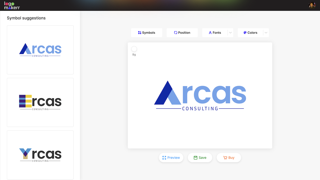
Logomakerr’s editor includes symbol, position, font, and color controls. When reviewing alternatives, change one major variable at a time. Otherwise, you cannot tell whether the improvement came from the symbol, the font, or the spacing.
Keep a small comparison sheet with the version name and the reason it was kept or rejected. “The symbol stays clear in the profile circle” is actionable. “It feels more premium” needs an example of where that impression matters.
Reject variants that distort the name, create an unintended visual association, or require awkward spacing to fit. Do not select a direction solely because it resembles a familiar competitor. Recognition should support your own business identity.
Check light, dark, and one-color applications
Place each finalist on the actual light and dark backgrounds you intend to use. A transparent background does not automatically make every color combination readable. Pale lettering can disappear on a light page, while a dark symbol can disappear in a dark footer.
Also test a single-color version for simple stamps, labels, or documents where full color is unavailable. If the shape loses meaning without a gradient or several color bands, decide whether an alternate simplified version is needed.
The guide to transparent logos covers background-free files. Use those files to test placement, then inspect the exported result rather than relying only on the editor canvas.
Make color decisions in context
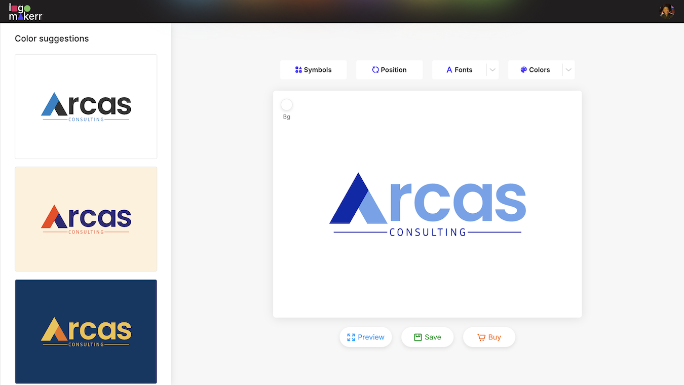
Compare the logo with your website buttons, packaging, and photographs. A palette that looks attractive alone may clash with existing materials. Decide whether the logo introduces a new direction or needs to work inside an established brand.
Record the approved color values and their intended use. Avoid collecting screenshots as the only color reference. Different displays, lighting, and export settings can make two screenshots look different even when the original design is unchanged.
Before ordering printed materials, review the printer’s requirements and request an appropriate proof. Our explanation of RGB and CMYK color modes provides background for that discussion. A screen preview alone cannot confirm the final printed result.
Inspect the exported files
Open each delivered file independently. Confirm that the background is what you expected, that the artwork is not clipped, and that the visible name matches the approved version. Check the dimensions and file type before handing it to another team.
A website, a presentation, and a print supplier can need different formats. Choose from the export options actually available in your account and match them to the recipient’s requirements. Do not rename a file extension and assume that its underlying format has changed.
Use the file-format guide to understand common choices. Preserve the original approved files, then create copies for specific placements so repeated resizing does not become the only surviving version.
Run a real-placement review
Prepare a website-header preview, a square social avatar, and one document or printed mockup relevant to the business. Review all three side by side. A logo can pass a full-width banner test and still look crowded inside a circular profile crop.
Check surrounding whitespace, alignment, and the relationship between the logo and nearby text. If a design needs unusual exceptions in every placement, revisit its proportions. The best launch choice is the one the team can apply consistently.
Use descriptive image alternatives on your website where the logo conveys the business name. A decorative repeat may need different treatment. The label should communicate the identity rather than list visual styling for its own sake.
Approve a small handoff package
Save the final master files, the approved small-size variant, a color reference, and a one-page placement note. Use filenames that distinguish light-background and dark-background versions. Include the date and an owner who can answer later questions.
Keep a brief issue list: spelling errors, unreadable text, clipped exports, and unsuitable backgrounds are launch blockers. Minor preferences can be recorded for a later revision if the current version meets the agreed brief.
Finally, review the logo wherever it is publicly used after upload. Check the live header, mobile crop, and downloaded document. Uploading a correct file does not guarantee that a platform will display it at the intended size or crop.
FAQ
How many logo concepts should I test?
Use a manageable shortlist, such as two or three directions, and test each against the same launch brief. More options are useful only when the review criteria remain clear.
Does a transparent logo work on every background?
No. Transparency removes a surrounding background; it does not guarantee contrast. Review the artwork on each planned background and approve suitable variants.
Can a visual checklist prove that a logo is unique?
No. It helps evaluate usability and consistency. It does not establish ownership, clearance, or exclusivity.
What should I check after publication?
Inspect the public page and profile on actual devices. Confirm cropping, readability, backgrounds, and that the approved version appears everywhere intended.