Following logo trends is what you can do to set your brand apart from competitors. Whether you’re a new business owner or entrepreneur, it’s no secret that designing a logo should be at the top of your list before you set your product out there.
And what better way to do that than to check out the Top Logo Trends this 2024, right?
As one of the best AI logo generators in the industry, we can name these logo trends like the back of your hand. But following a trend means doing your due diligence to research whether it will stand the test of time. After all, creating a logo or rebranding for just a year or two might overwhelm you or your audience!
So, here are the best top logo trends this year – yet we’re sure that it’ll stick with relevancy for so many years!
1. Animated Logo
First on our list is an animated logo. As one of the top logo trends this year, animated logos are popular because of our huge sentiment on video marketing (reels, TikToks, YouTube shorts, etc.). What you’ll like most about animated logos is they attract attention without trying so hard. They’re perfect for digital advertising, presentations, social media content, and even Email signatures!
2. Geometry Logo
If you love to demonstrate the shape of the objects you see in your business or career, creating a geometry logo is your best bet! This type of logo trend uses geometric shapes like circles, squares, or triangles. Some of the best samples for Geometry logos are the Olympic logo, YouTube logo, and Adidas logo.
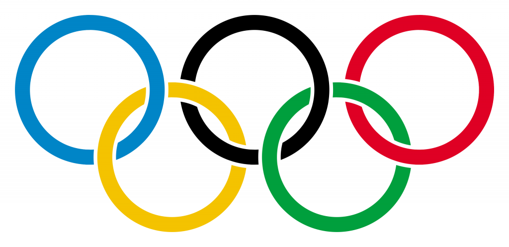

Photos from Wikipedia.com
3. Dynamic Logos
Yup, dynamic logos are still a thing! These logos are number three on logo trends this year because you can do multiple iterations with it. Though often seen as ineffective because they’re kind of hard to remember, but dynamic logos offer more energy, movement, flexibility, and more to your brand. Plus, you can be unique as possible! Just take a look at the Meta logo and Airbnb logo – both amazing, right?!
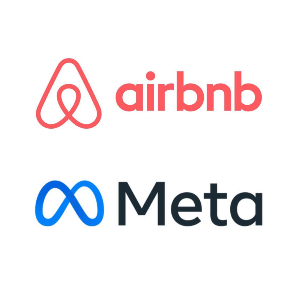
Photo Credit: X
4. Minimalist Logo
Before and during the pandemic, we’ve seen many people use minimalism for their homes, clothing, and brands. With that being said, minimalist logos rose to the challenge and became one of the top logo trends this year (especially for cafes). Iykyk)!
Minimalist logos are simple, intriguing, and have the power to be the center of attention – despite only having one or two logo elements. We think the best minimalist logos out there are Gap, Uber, Nike, and KIA motors.
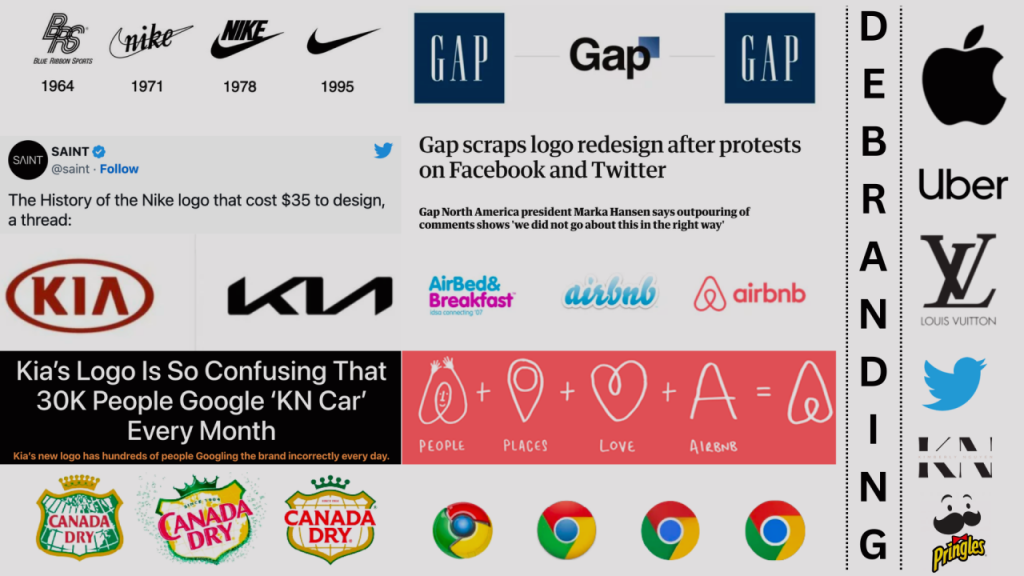
Photo Credit: LinkedIn
5. Wordmark logo
A wordmark logo is typically composed of text. Brands that use wordmark logos do a lot of research to find the best typography or font for their logos. They also like to choose the right color to trademark. In fact, a chocolate brand like Cadbury, which uses a wordmark logo, made it legal that you can’t ever use its purple shade.
Photo Credit: Wikipedia
Click here to see other colors you can’t legally use for your brand.
6. 3D Logo
3D logos are of three dimensions. They make your logo ‘pop off’ and create this additional dimension to make it more interesting. Many users often view 3D logos as one of the most essential logo trends because of the brand storytelling you can showcase.
7. Chunky Logo
Ah, you didn’t see that coming, right? Chunky logos are part of the top logo trends this year, and for good reason. These types of logos are best for their thick and heavy shapes. Chunky logos are also perfect for brands who want to come out as robust businesses to their audience and competitors.
8. Gradient Logo
Gradient logos are a thing—and you can participate by playing with colors and shades! Gradient, also called color progression, makes logos more interesting and gentle on the eye. Since you are required to choose more than one color, you can blend a range of shading to partner with your brand. More color options and more ways to design your logos!
9. Lowercase logos
Brands like Facebook, EBay, Nutella, and Nickelodeon use lowercase logos. Companies that like to use this type of logo want to portray their brand as casual and more accessible than ever.
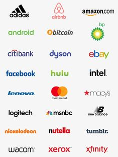
Photo credit: Pinterest
Also, using lowercase logos instills that your brand aligns with a modern sensibility. For instance, digital marketing and traditional marketing are both different. But since your brand loves to talk about what’s current, approachability takes over what’s formal or informal.
10. Royal Blue logo
Another one of the top logo trends is the Royal Blue logo. We’ve seen this in a lot of luxury brands especially in the car industry like Ford. Royal Blue logos are more than just loyalty and professionalism. These logos depict reliability – thus, ensures the trust of consumers more than anything.
11. Monogram logo
Of course, who can forget about monogram logos?! Brands like Gucci, LG, HP, and Chanel uses monogram logos. The brands we mentioned was founded way back 1800s – so just imagine how monogram logos stand the test of time in the streamline of trends!
Monogram logos are also popular with personal choices especially those who wants to make a logo out of their initials.
12. Affordable Logos
This is not a particular or exact type of logo but affordable logos are definitely something worth checking out! With the rise of AI logo generators, affordable logos are considered one of the top logo trends of all time.
Though many people like to believe that they offer a more general design, most AI logo generators today has a plethora of editing features you can use to ensure a unique emblem for your brand!
So why not make use of AI logo generators that you can pay for as low as $29 and get inspiration from the first 11 top logo trends we mentioned? I mean, no one’s stopping you, right?
Final Thoughts
As a graphic designer, there must be a time when you are out of options or suffering from a creative’s block. Lucky for you, these top logo trends can help you get out of it!
So get up and sketch that design for your brand!
