
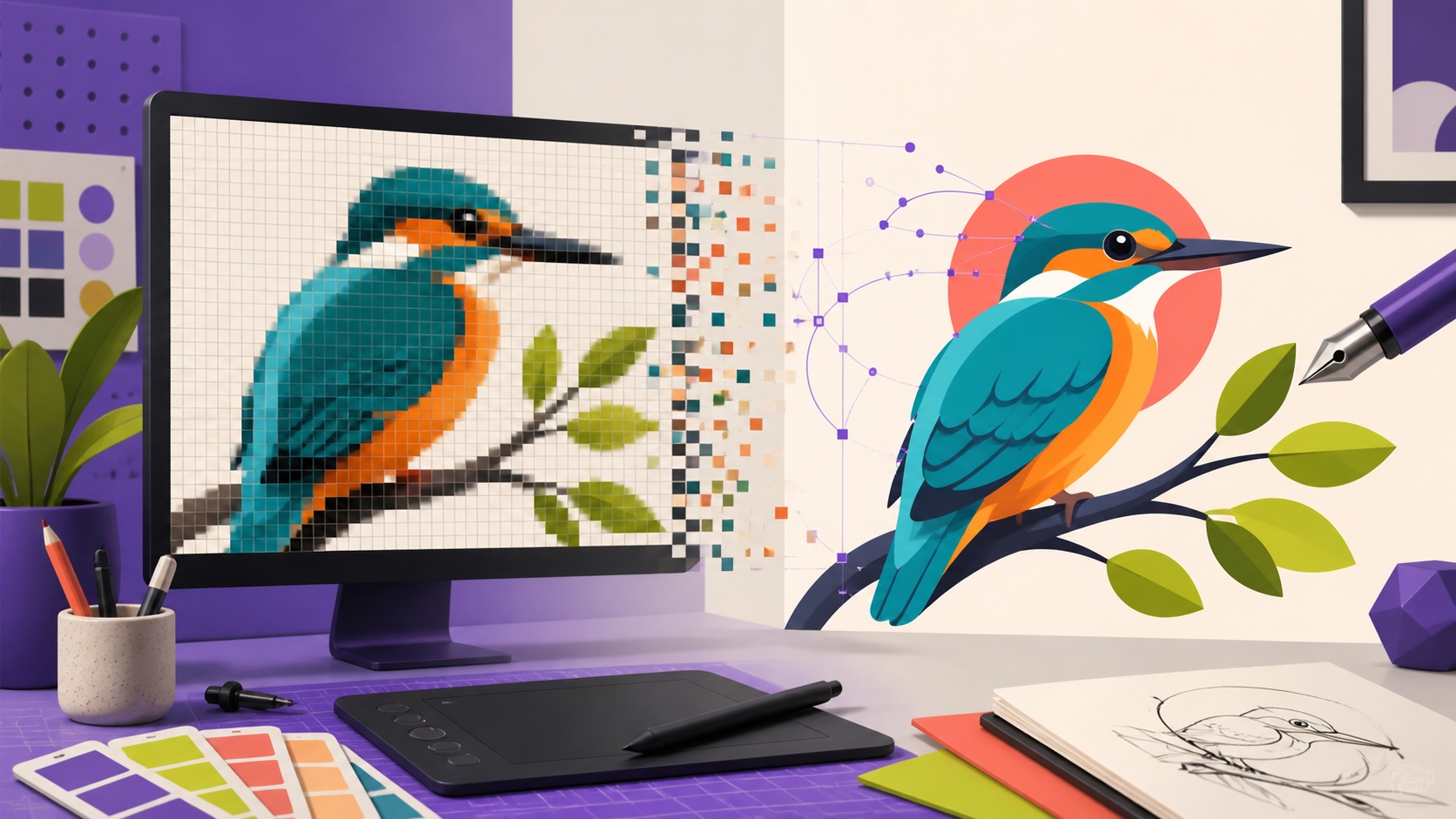
An AI image vectorizer analyzes a raster image made of pixels and rebuilds it as mathematical paths, shapes, fills, and curves. Flat logos, icons, stickers, line art, and illustrations with clear color boundaries usually convert best. Photographs can be stylized but will not become infinitely detailed editable photos. For a professional result, start with the cleanest large source, simplify noise, limit colors, inspect nodes and corners, and export SVG for web or PDF/EPS when a printer requests it.
Raster versus vector: the essential difference
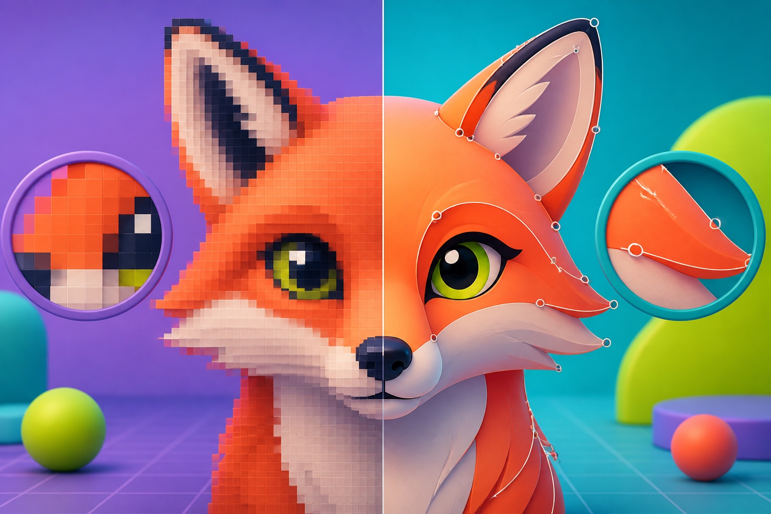
A raster image stores a grid of colored pixels. JPEG, PNG, and WebP are common raster formats. When enlarged beyond their native resolution, individual pixels become visible and curves look jagged. A vector image stores instructions for drawing points, lines, curves, and filled shapes. Because the geometry is recalculated at any size, a well-built vector logo can appear on a business card and a billboard without becoming pixelated.
Vectorization does not recover an original design file or reveal detail that was never captured. It interprets the visible raster and creates a new geometric approximation. This is ideal for simple marks, icons, flat illustrations, stickers, signatures, and diagrams. To begin, visit the AI image vectorizer workspace and use the focused image vectorizer tool for a scalable result.
Which images vectorize best?
The best candidates have a strong silhouette, solid or gently graded color regions, clear internal gaps, and deliberate edges. Think of a simple logo, bold badge, cartoon character, line drawing, or flat editorial illustration. High contrast helps the system distinguish neighboring shapes, but the artwork does not need to be black and white. A clean four-color icon can convert beautifully because each region has a clear visual role.
Difficult candidates include tiny compressed screenshots, watercolor washes, photographs, smoke, soft hair, complex textures, and low-contrast gradients. They can still be processed, but the result is a stylization with many paths rather than an efficient reproduction. Decide whether you want faithful tracing, simplified illustration, or a posterized effect. That decision determines whether the output succeeds artistically even when it cannot match every pixel.
Prepare the source before vectorization
Use the largest, cleanest source you can find. A direct PNG export is better than a photo of a screen or a JPEG saved through multiple messaging apps. Crop away unrelated margins and straighten artwork photographed on paper. Correct uneven light so white paper does not become several beige shapes. If the background is meant to be transparent, remove it cleanly before tracing so the system does not build a large rectangle around the design.
Reduce noise without erasing intentional detail. Small speckles, JPEG blocks, paper texture, and antialiasing fringes can become hundreds of unnecessary paths. For brand graphics, consider limiting the image to the intended palette before conversion. Preserve closed counters inside letters and icons—the center of an O, the space inside a handle, or a gap between shapes—because filled holes are among the most noticeable errors in a vector result.
A practical AI vectorization workflow
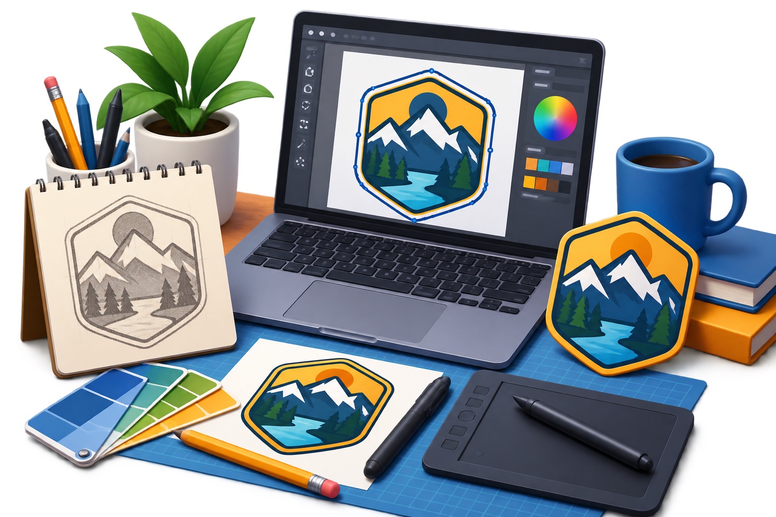
Upload the prepared source and choose a result that preserves the major silhouette before judging small detail. Review the image first at normal size, then zoom into corners, curves, and narrow gaps. If the output contains excessive texture, simplify the source or reduce the expected detail rather than deleting thousands of nodes manually. A clean vector is not the version with the most paths; it is the version with enough paths to express the design accurately.
Compare the vector over light and dark backgrounds. Check that transparent areas are genuinely empty and that no pale fringe remains. Inspect overlapping shapes for hairline gaps that might appear in print or at different browser zoom levels. When possible, open the result in a vector editor, select individual shapes, and confirm that the artwork is actually editable rather than a raster image embedded inside an SVG container.
- Find the largest original and remove unnecessary background or noise.
- Vectorize with a detail level appropriate to the artwork.
- Check the silhouette, internal gaps, corners, curves, and palette.
- Delete stray shapes and simplify paths where it preserves appearance.
- Verify editability and export a master plus channel-specific versions.
Clean paths, nodes, corners, and curves
Automatic tracing often creates more nodes than a designer would draw. Extra nodes can make curves lumpy, increase file size, and complicate later edits. Simplify a path gradually while watching the silhouette. Keep deliberate sharp corners and reduce redundant points along smooth arcs. A circle should behave like a circle, and a straight edge should not contain a chain of tiny deviations inherited from pixel noise.
Look for detached islands: tiny shapes floating near the edge, often created from compression artifacts or dust. Confirm that overlapping colors meet cleanly and that strokes have consistent width. If the artwork includes typography, automatic outlines may preserve its appearance but not its editable text. Identify and license the correct font when possible, then rebuild the wordmark as type or carefully reviewed outlines.
What vectorizing a photograph really means
A photograph contains millions of subtle color and brightness changes. Converting every variation into a vector shape creates an enormous file that is difficult to edit and offers little practical advantage. Useful photo vectorization therefore simplifies: it may create a limited-color portrait, a screen-print effect, a geometric illustration, or posterized shading. Judge it as a new visual treatment, not as a lossless format conversion.
For a photographic image that merely needs to print larger, vectorization may be the wrong solution. Find a higher-resolution original, use careful raster upscaling, or choose a smaller print size. Use vectorization when the intended result is graphic and shape-based. This distinction prevents a common disappointment: technically receiving an SVG that is neither simpler nor more scalable in a meaningful way.
SVG, PDF, EPS, and PNG exports
SVG is usually the best master for responsive web logos, icons, and illustrations. It supports scalable paths and can remain small when the artwork is clean. Sanitize SVGs from untrusted sources before publishing because the format can contain more than visible shapes. PDF is widely accepted by print providers and can preserve vector data, color settings, and page dimensions. EPS remains common in older print workflows, but use it only when a vendor asks for it.
Keep a transparent PNG export for platforms that do not accept vectors, email signatures, or quick previews. Export that PNG at the actual pixel size required instead of relying on a tiny raster copy. Save an editable master before outlining or flattening everything for delivery. The earlier brand consistency guide explains how a reliable asset system keeps colors and image treatment aligned across channels.
Quality and legal checks before using the vector
Test the artwork at very small and very large sizes. Fine gaps may close at favicon scale, while rough curves become obvious on signage. Print a quick proof in black and white to reveal weak silhouettes. Check brand colors against the approved palette and confirm that transparent areas do not contain accidental white shapes. For cutting machines or embroidery, ask the production partner about minimum line width and path requirements.
Vectorizing an image does not grant rights to use it. Confirm that you created the source or have permission to adapt it, especially for logos, characters, stock art, and client assets. Do not use tracing to remove a watermark or imitate protected brand artwork. Keep the licensed source and conversion notes with the master so future collaborators know where the design came from and how it may be used.
People also ask
Frequently asked questions
Can AI convert a PNG or JPEG to SVG?
Yes. It can trace visible shapes into vector paths. Flat, high-contrast artwork usually converts much better than photographs or heavily textured images.
Does vectorizing an image improve its quality?
It can create smooth scalable geometry, but it cannot recover missing original detail. Poor inputs may produce smooth yet inaccurate shapes.
Why is my vector file so large?
The trace probably created too many nodes and small shapes from texture, gradients, or compression noise. Simplify the source, reduce detail, and clean redundant paths.
Which format should I use for a vector logo?
Keep an editable SVG master for web and general use. Provide PDF or EPS when a printer requests it, plus transparent PNG versions for systems that require raster files.