If you’re looking into starting your business, chances are you’ve come across ZenBusiness—one of the most popular LLC formation services in the U.S. But beyond its affordable pricing and automated filing tools, there’s something subtle yet powerful that sets it apart: its logo.
This isn’t just about font or color—it’s about emotional design. The kind that makes a busienss owner feel seen. In this review, we’ll dive into the ZenBusiness logo, explore how it positions itself visually against LegalZoom, Incfile, and Northwest Registered Agent, and suggest how it could evolve with support from modern tools like AI logo maker.
Because in branding, as in business, how you show up often says more than what you say.
What Is ZenBusiness?
Founded in Austin, Texas, ZenBusiness is a public-benefit corporation that helps entrepreneurs start, run, and grow their small businesses. Their core product? Business formation—primarily LLC setup, EIN registration, operating agreements, and ongoing compliance.
ZenBusiness has earned trust for its ease of use, affordability, and customer-centric approach. But there’s another layer: its branding. It doesn’t shout. It breathes. From the color palette to the typography, every design decision seems intentional—like the company wants your startup journey to begin not with chaos, but with calm.
ZenBusiness Logo Breakdown: Simplicity That Builds Trust
Typography: A Friendly Wordmark
The logo uses a smooth, rounded sans-serif typeface, set in all lowercase. It’s clean. Warm. Approachable. This isn’t the legalese-heavy world of old-school filing companies. It’s branding made for first-time founders, creatives, and freelancers who want clarity over complexity.
The lowercase format in particular is inviting. It levels the playing field. No capital letters screaming importance. Just ahumble, modern wordmark that works well on mobile, desktop, and everywhere in between.
Color: Calming Teal for Credibility
Teal. Somewhere between green and blue.
- Blue says trust, professionalism, and technology.
- Green adds vitality, growth, and financial freshness.
Together, they form a brand identity that feels peaceful but capable. It’s the kind of color that reassures without sedating. In the fintech and SaaS world, that’s gold.
Layout: Minimalism as a Message
There’s no icon, badge, or mascot. Just the word “zenbusiness.”
That choice says a lot. It tells you they believe in the strength of their name—and the clarity of their service. It also means the logo scales perfectly across contexts. From favicon to footer, there’s no guesswork.
In an age of sensory overload, that kind of branding is strategic. It lets the user breathe.
The Zen in “ZenBusiness”
Let’s call this what it is: brilliant brand psychology.
Entrepreneurship is rarely serene. It’s filled with bank forms, IRS documents, and moments of late-night second-guessing. And yet, this brand dares to position business formation as a meditative experience.
“You focus on your dream. We’ll handle the filings.”
That’s not just smart marketing—it’s positioning.
The logo reinforces this. Its rounded edges and balanced spacing feel deliberate. Like someone finally took the stress out of starting something new.
ZenBusiness vs. Competitors: A Visual Branding Face-Off
To appreciate ZenBusiness’s logo, we need context. Let’s compare it to three major competitors: LegalZoom, Bizee, and Northwest Registered Agent.
BrandFont StyleColorsLogo SymbolEmotional Vibe
ZenBusiness Sans-serif Teal + white None Calm, trustworthy
LegalZoom Serif Blue + gray None Authoritative, legal
Bizee Bold sans-serif Orange + black Wordmark Direct, efficient
Northwest Registered Agent All caps serif Black + white Wordmark Quiet, discreet, premium
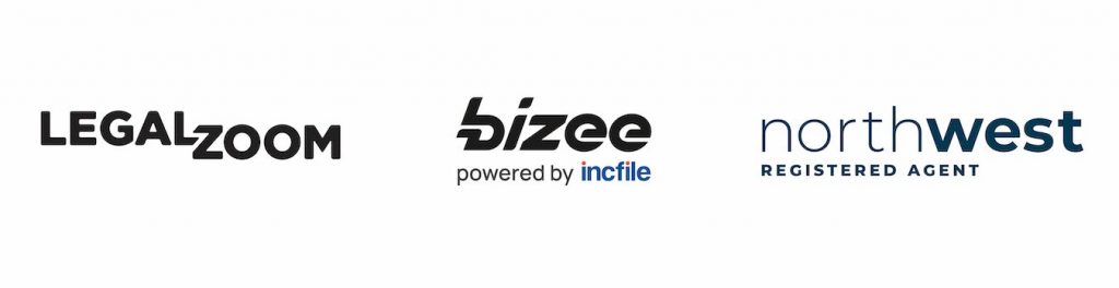
LegalZoom
The most established of the bunch. Its serif font and conservative colors feel official—perhaps even bureaucratic. It communicates legal seriousness, but can feel cold to first-time entrepreneurs.
Bizee
Punchy and to the point. The Incfile’s blue stands out, the font is direct. Good for urgency and conversion, but lacks the emotional softness ZenBusiness offers.
Northwest Registered Agent
Anonymity is the brand’s game. It leans into minimalism but with a shadowy twist. It’s for people who want to disappear behind the paperwork—not shine through it.
ZenBusiness offers a middle path. It’s modern, warm, and transparent. You can trust it and relate to it.
Where the ZenBusiness Logo Wins (And Where It Could Improve)
Strengths
- Simplicity: Nothing distracts. Every element serves clarity.
- Emotional resonance: It makes you feel supported, not sold to.
- Scalability: The wordmark is versatile across all media.
Suggestions for Evolution
- Add a Subtle Icon
- Consider a minimal Zen circle (Enso) or a brushstroke “Z” as a mark for app icons or favicons. This could enhance memorability without cluttering the design.
- Introduce Animation
- A gentle fade-in, breathing effect, or glow on hover could reinforce the calming UX across digital platforms.
- Dark Mode Variant
- The teal might lose contrast in low-light UI. A white-on-black or black-on-teal variant would serve modern interfaces well.
Reimagining ZenBusiness with AILogomakerr.com
At Logomakerr.AI, we believe great logos are born from clarity—not complication. If we were to redesign ZenBusiness today, here’s how our AI logo generator would approach it:
- Font: Keep the sans-serif, but optimize kerning for better readability at micro sizes
- Color: Offer gradient teal options for a more dynamic digital look
- Symbol: Introduce a modern Enso ring or minimalist origami “Z” icon
- Variations: Provide animated, dark, and embossed variants—ideal for branding packs, social media, and mobile UX
This wouldn’t replace the existing logo. It would extend its story—offering flexibility while keeping the original spirit intact.
Is ZenBusiness a Good Brand? Our Review Through Design
From a brand strategist’s perspective, ZenBusiness stands out by doing less—and doing it better. Its logo doesn’tcompete for attention. It reflects the service promise: no hassle, just help.
In a market where everyone’s trying to “wow,” ZenBusiness tries to “reassure.” That’s not just smart—it’s soulful.
For any entrepreneur building their first LLC, this is the kind of brand that whispers, “We’ve got your back.”
And yes—you can create a logo for your startup with the same values. Just like ZenBusiness did, you don’t need to over-design. You need to align. Our platform can help with that. Try our logo design for business formation and build something that feels right.
FAQs About ZenBusiness and Its Branding
Q: What does the ZenBusiness logo represent?
A: The ZenBusiness logo reflects peace of mind and simplicity in entrepreneurship. Its minimalist wordmark in calming teal signals clarity and trust.
Q: Who are ZenBusiness’s competitors?
A: Key competitors include LegalZoom, Bizee, and Northwest Registered Agent—all offering business formation services with varying brand tones.
Q: Can I create a logo like ZenBusiness?
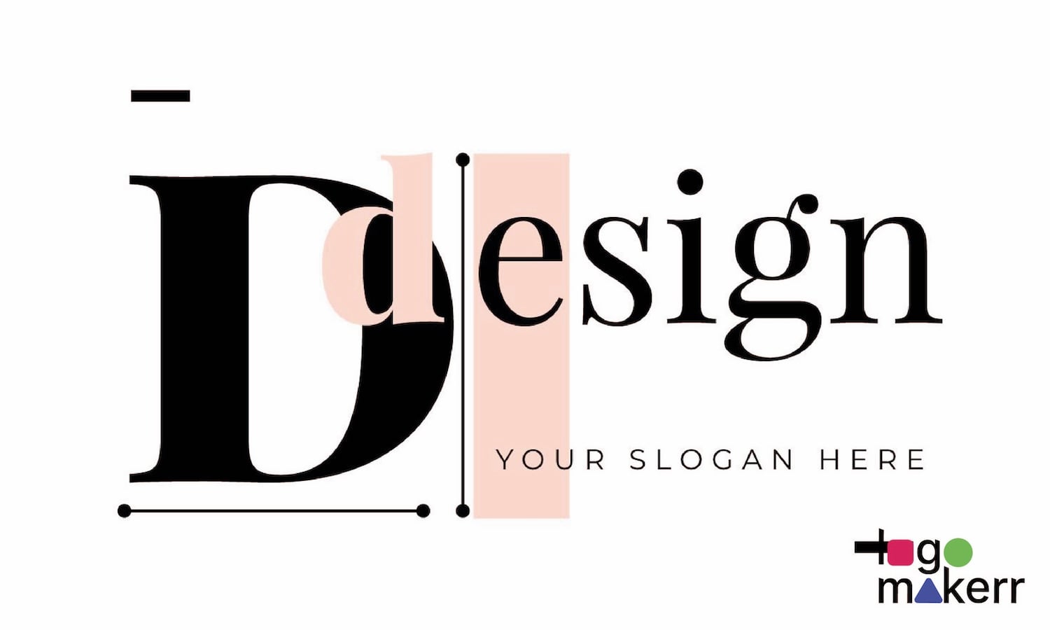
A: Yes. Tools like Logomakerr.AI allow you to build simple, clean, and professional logos in minutes—perfect for startups and LLCs. Here is the sample ZenBusiness logo created in 3 minutes.
Q: Is ZenBusiness legit for LLC formation?
A: Yes. ZenBusiness is widely reviewed as one of the top LLC formation services for affordability, transparency, and ease of use in 2025.
Final Thought: Calm Is the New Loud
In a world addicted to noise, ZenBusiness builds trust through quiet confidence. Their logo doesn’t scream innovation—it invites it. It’s branding with intention, not decoration.
Because when everyone else is chasing attention, ZenBusiness is building something better: belonging.