ZARA is one of the most high-end fashion houses worldwide. It is a Spanish clothing and accessories retailer founded in 1975 by Amancio Ortega and Rosalía Mera. The company is headquartered in Arteixo, Galicia, Spain, and operates over 2,000 stores in over 70 countries.
But behind its enormous success in retail, what made the world-famous brand the way it is? Why is it so successful among other designers? Every brand wouldn’t function without an identity, and their simplistic, minimalist logo comes with their identity.
The Zara logo perfectly captures the understated yet sophisticated style of its goods. In this blog, let’s talk about the brand’s history, logo analysis, and success story.
ZARA’s History
In 1963, Ortega opened a dress manufacturing facility under the name Inditex, and its success introduced him to the retail industry. Ten years after opening a small store with Rosala Mera under the name Zorba in La Coruna, Spain, he changed the company’s name to Zara without apparent reason.
From the small Spanish town to the rest of the nation and eventually, to Portugal, Zara gradually increased its business. ZARA arrived in the United States of America in 1989.
Every year since then, Zara has expanded globally. Zara expanded into France (1990), Mexico (1992), Greece, Belgium, and Sweden in the 1990s (1993).
The first Zara stores opened in Singapore and Japan in 2002, Malaysia and Russia in 2003, China, Morocco, Estonia, Hungary, and Romania in 2004, the Philippines, Costa Rica, and Indonesia in 2005, South Korea in 2008, India in 2010, South Africa, and Australia in 2012. (2011).
The fashion company currently operates about 6500 stores in 88 different countries.
ZARA’s Logo Design Elements
The Zara logo is an ideal illustration of a straightforward yet successful brand identity. The logo uses a unique typeface with long, narrow letters entwined at the bottom and an R with a curled and slightly elongated leg.
The logo uses a unique typeface with long, narrow letters at the bottom and an R with a curled and slightly elongated leg.

The logo’s black color represents the superiority, style, and quality of Zara’s high-end goods. Despite being one of the world’s top high-end fashion houses and designers, Zara doesn’t advertise much as it relies more on sales promotions and its incredibly distinctive corporate identity.
In addition, despite its growing popularity and praises, the Zara logo has been criticized for being overly straightforward, unoriginal, and uninspired.
ZARA’s Logo Evolution
Few fashions and luxury companies enjoy the same level of widespread recognition on a global scale as Zara. Even though the logo has changed a few times over the years, it has always maintained the brand’s iconic status in the fashion industry by remaining straightforward and rigid.
1975-2008
The original Zara logo was designed in 1975 and utilized a sophisticated, clean serif typeface with a monochromatic color scheme. Its font was very similar to that of the TT Tsars Bold and Calmius SemiBold, with the curve of the letter “R” slightly modified. The logo’s capital letters were bold and adequately balanced.
2008-2019
The business has been around for about 30 years and has changed its logo. This was done to ensure that the logo works flawlessly on internal tags, product labels, digital media, and printed materials.
The logotype slightly changed in 2008 but kept its prior look and feel. This time, the letters had wide and shortened letter shapes and were separated from one another. The new square shape gives the logo a more assured and authoritative appearance, emphasizing the brand’s mastery, supremacy, and agelessness.
2019-Present
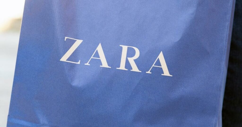
In 2019, Zara changed its logo again, keeping the monochromatic color scheme and emphasizing the bold alphabets’ sheriffs. The new logo now uses a unique font with tall, tapered letters entwined at the bottom and an extended, curled “R” leg. The characters were also intertwined on top of one another in a stretched-out font.
Controversy about the Zara logo
The controversy surrounding the new logo looks like the handwriting of Zara’s artistic director and founder of Baron & Baron, Fabien Baron.
Baron also serves as the creative director for several high-end labels, including Dior, Burberry, and Maison Margiela, which may indicate Zara’s intention to reposition itself among other upscale fashion companies through rebranding.
Given its established date in the middle of the 1970s, Zara seems to have more in common with the more established and enduring global brands than with the more recent crop of well-known retail names.
Fellow designers, particularly typographers, have attacked the updated Zara logo, calling it “claustrophobic.” Erik Spiekermann, who recently worked with Adobe to convert Bauhaus ideas into typefaces, called it “the ugliest piece of type [he’s] seen in years” and questioned if it was “one of those new robots that will replace humans.”
Fabio Basile of the British design studio Fortnight also criticized the design. The new font style eliminates spaces between the characters, entwining them together to create an incomprehensible and perplexing logo.
The ZARA logo’s font and color
The Zara wordmark is meant to evoke the accessibility of luxury apparel. Therefore, it only has the brand’s name, which is simple, concise, and understandable to all fans of fashionable clothing. Like many other luxury brands, the current Zara logo design strays from modern design trends to present a classic and timeless look.
The company’s bold, all-caps logo may hint at its aspirations to establish itself as one of the world’s leading luxury fashion houses. The timeless contrast of black and white resembles a much-needed change from the era of elaborate and vibrant logo designs. Additionally, it represents the accessibility of fashion for everyone.
Wrapping up
ZARA’s text logo design indeed helped them reach new heights and target people looking to wear high-end fashion brands. In a nutshell, when you create a versatile logo design, you can be sure to have a design that’s not unique and stands out among all competitors. But it can also be used in other marketing materials, campaigns, or merchandise.