Are you starting your own business or already have one but haven’t decided on the logo design yet? Deciding a logo for your business is like choosing a lifetime partner—it doesn’t have to be perfect, but it has to be meaningful, sparks joy, and can withstand the test of time.
Many business owners opt for the popular choice of having a graphics logo. However, there is another option that you may want to consider – a wordmark logo.
But what is a wordmark logo, and why do more and more companies like Adidas, Amazon, IKEA and other famous brands, choose simple wordmark or text logos over graphic logos? And how can AI tools like an AI logo maker help?
Keep on reading to find out more!
What is a Wordmark?
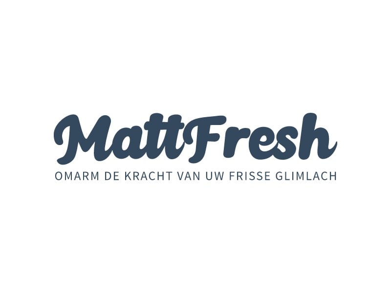
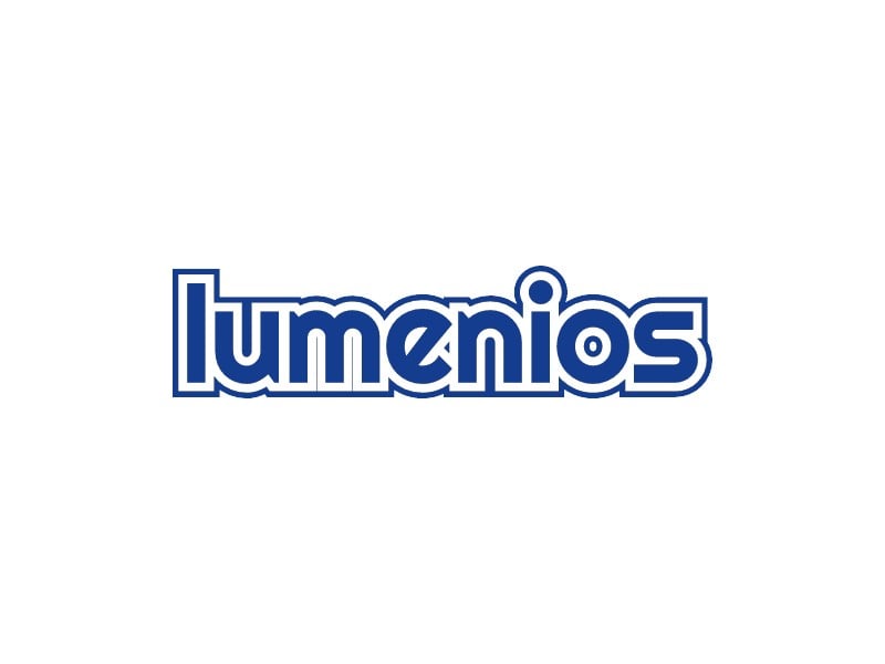
Wordmark or logotype is a type of graphic logo that consists solely of the name of your business—no symbols, mascots, or badges—spelled out in a specific font and color to represent a business name, product, or service.
It is the opposite of graphic logos, which relies heavily on images. (i.e., Apple, McDonald’s, Nike, etc.)
Even without a symbol or a graphical logo, a good wordmark logo is incredibly powerful and utilized in every industry, including clothes fashion, food & beverages, recreational businesses, and the list goes on.
Why Use A Wordmark Logo?
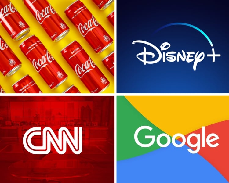
The use of words for logos has been seen with some success in recent years, most notably with Google, Coca-Cola, Disney, CNN, and even the FedEx logo – are all among others.
They are becoming more popular today as they are easy to create and can be used across all media types.
And the best part about wordmarks is that you don’t have to worry about creating an image or graphic for your brand identity because the words themselves will do it for you!
Benefits of using a wordmark logo:
- They are easy to remember and associate with your business name, which can help build brand recognition over time.
- Wordmarks tend to work well with other design elements like images, icons, or symbols, giving designers flexibility when designing graphic elements that represent their brand.
- Wordmarks are timeless and require fewer variations because it’s can already stand on their own
- A wordmark can easily be translated into other languages without losing its original meaning or design aesthetic – making it perfect for businesses with global aspirations (even if you aren’t there yet).
It’s definitely a great option for startups on a budget or existing businesses that want to create a professional and credible image. However, there are also drawbacks in using a wordmark logo, including:
Drawbacks in using a wordmark logo
- Creating good typography requires expertise in graphic design, so it’s not something everyone can do themselves.
- Since other companies rely heavily on fonts, they may lack the originality of other logotypes, colors, and logo fonts.
- It may take time to find something that works for your brand identity.
- It can be irrelevant if your values and interests don’t align with the wordmark.
Pro Tip: A great logo always grabs attention and gives a solid first impression that challenges your customer’s curiosity towards your brand, perceived identity & value, recognizability, and encourages brand loyalty.
Elements of a Great Wordmark Logo:
A wordmark logo is a great option for businesses to create an easily recognizable, branded identity. A well-designed wordmark logo can help your business stand out from the competition and remember customers.
When designing your own wordmark logo, there are four elements to consider:
- Choosing the best font, aka typeface
- Creating unique style (Spacing and Type Styles)
- Perfecting the alignment or layout.
- Choosing the best color
1. Choosing the best font, aka typeface
The typeface is the foundation of your branding in creating a wordmark logo design. Choosing a typeface that complements the business or product will make all the difference in your logo design.
For example, if your brand is about juices for kids? You wouldn’t want to use a typeface with bold block letters. Instead, choose something light and fun like an italic cursive typeface.
What if your brand is about late adulthood fitness products? Then try a typeface like Avenir or Merriweather.
The key is to be creative – and this alone is your character feature! Try it in bold, italic, underlined, slashed-through. Mix and match fonts and find what works best.
2. Creating unique typesetting
Your wordmark logo should be styled uniquely to your brand. You don’t want it to look like any other wordmark logo out there.
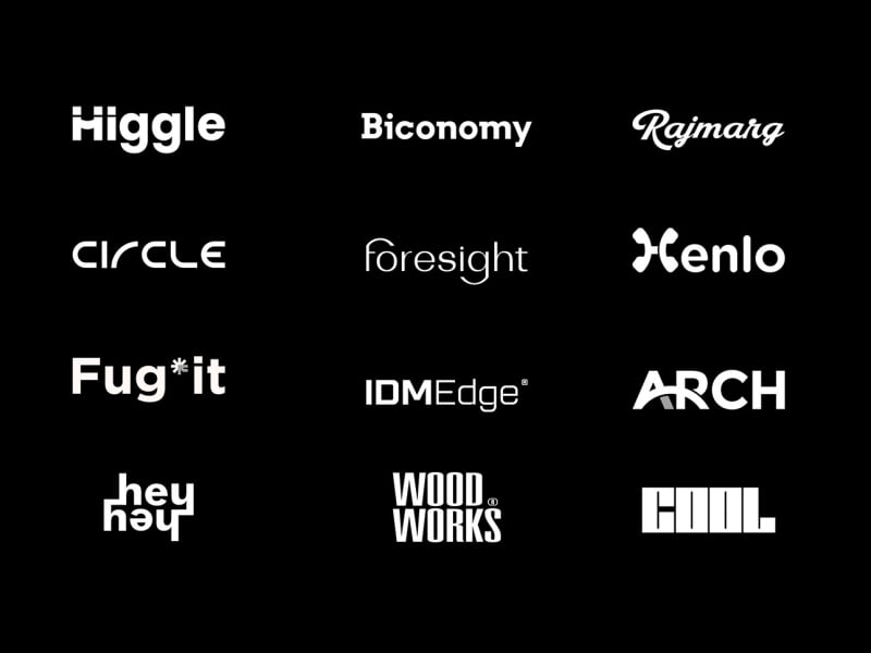
Play with the spacing and typestyles and see what works best. Keep it readable, ask for feedback, revise, and make sure it looks polished. Customers love that!
Pro Tip: Keep in mind that it’s not just for you, but how it will be valuable to your customers as well. Make sure that you’re creating and considering something they want to see.
3. Aligning the elements
The alignment of your wordmark is entirely up to you. But if your chosen business name is more than a single word, then aligning elements is something you must keep in mind.
Figuring out the perfect alignment for your logo is a mental exercise, and it requires a lot of time and a few revisions before finalizing it. But with proper alignment, your wordmark logo can hit the right spots on your brand.
Stack the words of your business name: left or right align, center, or justify. It should be simple and symmetrical, with each letter evenly spaced apart.
4. Choosing the best color
Color is an essential part of crafting the visual style for your brand, and they create emotional responses that will reinforce the value and vision of your brand.

For instance, the color Red can trigger excitement, strength, love, and energy. If your brand promotes sportswear for people who seek thrill, adventure, and love high-intensity activities, then red is the perfect color for you!
It’s best to keep the number of colors limited to two or three, and anything more will make the branding look too busy and less appealing.
Pro Tip: Before finalizing the color, make sure you approve the B&W render first. Like I said earlier, there are times that some logos don’t translate well on print.
3 Awesome Examples of Effective Wordmark
Just in case you’re having a hard time brainstorming your own original wordmark. Here’s a list of my “3 Awesome Examples of Effective Wordmark” to help you get started.
Adidas Logo
Fun Fact: Did you know that Adolf Dassler, the founder of the German sportswear company Adidas, referred to the brand as “The Three Stripe Company”?
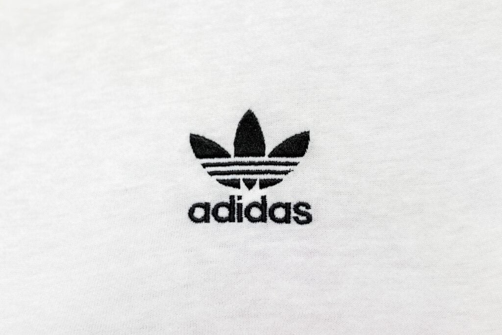
Adidas (formerly known as “Adi” Dassler, which was based on Dassler’s nickname) started off with a graphic logo then later transitioned to a wordmark in the early 1950s.
Although the brand has many iterations in its logo design, they always keep the important elements that their customers love, such as the font, the Adidas three stripes, the color, and the typesetting.
Adidas’ logo is still evolving and will continue to grow to keep up with the times and demand.
IKEA Logo
IKEA is a Scandinavian home furnishing and appliances store founded by Ingvar Kamprad on July 28, 1943, in Älmhult, Sweden.
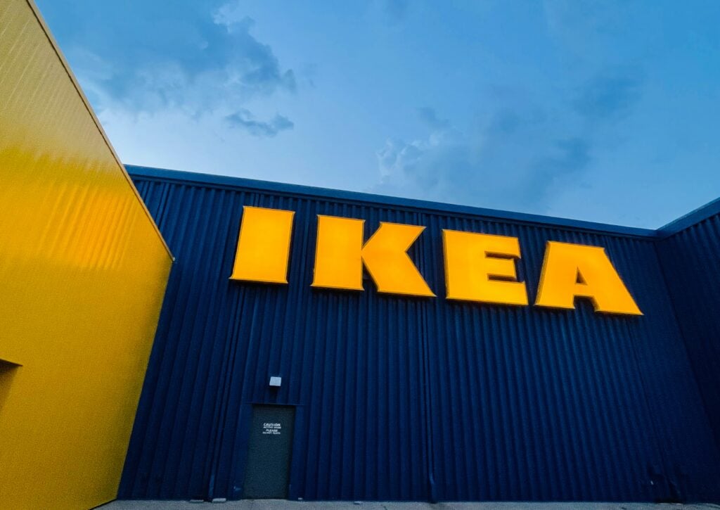
IKEA is a remarkable example of a perfect wordmark logo simply because you can’t miss it – literally. Bold uppercase letters with complementary primary colors just catch your attention. Like their warehouses, their logo is massive, and the logo is great in size.
Fun fact: IKEA also shares those colors with the national flag of its home country, Sweden.
Amazon Logo
And finally, the controversial Amazon logo.

Amazon is a US-based eCommerce business founded by Jeff Bezos on July 5, 1994, in Bellevue, Washington. Amazon started off as an online bookstore until 1998, when they started selling items other than books ranging from A to Z.
The Amazon logo creates an effective marketing strategy that generates engagement because some of its earlier iterations caused controversies.
Although some of it was bad publicity that could stick to their customer’s minds and could possibly harm the company name and reputation for good, Amazon managed to save itself and still benefit from them somehow.
I’m not so sure about you, but I’m still confused. Is it really an arrow? Or is it a smile? Which one is it? Let us know!
Fun fact: Amazon was almost called Cadabra, but the idea was immediately scrapped after Jeff Bezos’ lawyer misheard it as “cadaver.”
Should You Use a Wordmark Logo?
Wordmark logos reinforce your brand name and your brand’s personality, which makes it super effective. Wordmarks are becoming the industry’s standard in designing logos since they are more effective than their graphic counterparts.
If you’re still hesitant whether to use a wordmark logo for your brand’s logo, consider the following factors:
- You have a short business name. A wordmark helps establish name recognition, which is essential for any startup. If your business name is short or limited to a single word, then a wordmark logo is the best way to go.
- You want to focus more on the value or message. The quality and value of your product or services are still more important. Since your products and services are associated with your logo, make sure that you live up to its worth.
- You’re going across multiple mediums and platforms. They take up less space, which is a great way of integrating seamlessly into various social media platforms or other mediums without worrying about how legible they might look or what size it requires because sometimes one word is just enough!
- You love to get creative and fun with colors. A bright, distinctive color can help you stand out in a crowded marketplace. A splash or two colors might be able to help make certain parts stand apart from each other more effectively than others would alone.
Remember, not every brand is suitable for a wordmark logo. If you are in a more creative or artistic field, you might want to consider a more elaborate graphic logo.
Oh no! I’m too busy for this…
If you don’t have enough time to craft your new logo and are looking for the best way to produce a high-quality wordmark logo, our team has a fantastic offer that I’m sure you will love!
All you need to do is simply input your desired logo name (with an option to add a slogan), click the button, and thousands and thousands of beautiful logos will appear for you to choose from to create a wordmark logo for your business!
But you might ask, ‘what exactly is it?’ It’s a wordmark logo maker – well, technically, it’s an AI logo maker for all types of logo needs! Want to know more? Browse through our number of logo ideas today!
