Think about some of the world’s most iconic logos. The golden arches of McDonald’s, the swoosh of Nike, or the apple bite of the Apple logo. What do all of these good logos have in common? Well, maybe they created a great logo by hiring the best graphic designers in the world. But if you don’t have the budget for that, using the best free logo maker online is no different.
In addition to being instantly recognizable, they’re also incredibly simple and memorable. So what makes a great logo?
Is it an iconic design that is instantly recognizable? Is it a clever play on words or symbols? Or is it something more subtle that doesn’t stand out but still communicates the essence of the brand?
In this blog post, we’ll look at some of the key factors that make a great logo and how you can create one for your startup or small business.
5 Elements to Consider on What Makes a Great Logo
There’s no single answer to that question – it depends on the brand, the target audience, and the overall design aesthetic. However, certain design elements can make a logo more successful.
A great logo is:
- Simple
- Distinctive
- Appropriate
- Memorable
- Versatile
1. Simple
Less is definitely more!
While it may feel ‘plain’ or ‘boring,’ simple logos can become truly iconic over time. If we look at the biggest brands in the world today, we will see a definite trend towards simplicity in their identities.
Even when put on digital or print media, they are still recognizable.
Meanwhile, a complex design can be difficult to remember and may not work as well when it’s scaled down or used in a different color. It may also be difficult to reproduce and be off-putting to potential customers.
So the next time you’re about to create a logo, aim for simplicity and clarity. Avoid singing too many shapes and colors and other elements that make it look cram.
2. Distinctive
It’s important to do your research before you starting the design process. Take a look at your competitor’s logos and see what they’re doing. Make sure yours looks different enough to be noticed and remembered.
This is especially true if you are in a competitive industry or offer multiple products or services. Your logo should be able to stand out from the rest and convey the unique selling point of your brand at a glance.
Of course, being too different can also be a problem. It may not be taken seriously if your logo is too wacky or out there. The key is to find the right balance. Make sure your logo looks unique but still appropriate for your brand.
3. Appropriate
Does it fit the brand and its target audience? This is another essential factor to consider when creating a logo. It’s no good having a cool, trendy design if it doesn’t reflect the brand or its values.
For example, a luxury fashion brand wouldn’t want to use a grungy, urban style logo, as it would be inappropriate and send the wrong message.
Meanwhile, a children’s toy company could use bright colors and playful designs to appeal to its target audience.
So always think about who your brand is targeting and what would be the most appropriate logo style for them.
4. Memorable
How easily can your logo be remembered? Good logo design should be easy to remember so that potential customers can recall it when they need your products or services.
There are a few ways to make a logo more memorable. One uses simple, recognizable shapes that will be etched into people’s minds. Another is to use color psychology to choose colors that will stand out and be remembered.
You can also create memorable logos by playing on words or symbols. For example, the Nike swoosh is a simple but effective symbol that is easily recognizable and remembered.
So think about how you can make your logo more memorable so that it will stay in people’s minds even when they see it for just a few seconds.

5. Versatile
Last but not least, your logo should be versatile. This means it should look just as good on a billboard as it does on a business card. It should also be able to be reproduced in different colors and sizes without losing its impact.
This can be a challenge, especially if you want to use more than one color or include a lot of detail. However, it’s important to think about how your logo will be used and ensure that it can be adapted for all different mediums.
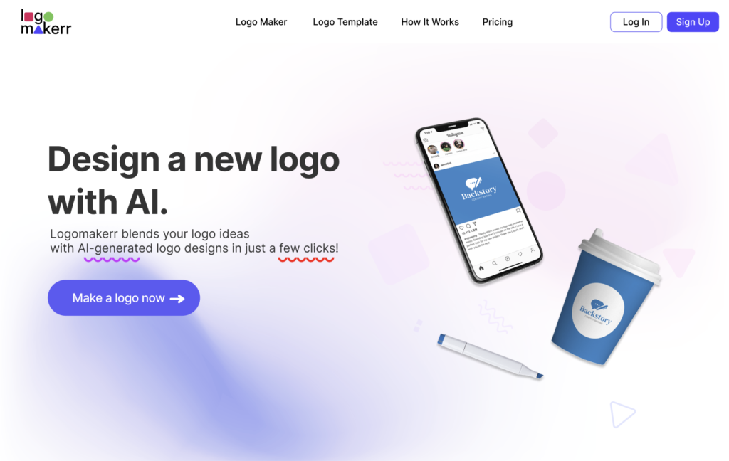
An AI logo maker, added the latest feature on the logo preview or presentation to help us to visualize how a logo will look in different applications.
Whether it is shrunken to the size of a mobile app icon or blown up on the side of a building, you want your logo to look its best while preserving legibility.
Keep In Mind…
A logo that is simple, distinctive, appropriate, memorable, and versatile. By following these logo design tips, you’ll be able to create a brand identity that will help promote your brand and its values. And that’s what makes a good logo!
What are your thoughts? Do you have any other tips to share on designing a logo? Let us know in the comments below! seem.
