A logo serves beyond graphic representation since it represents both a brand’s core values and its ability to connect with target audiences. Logo redesign stands as a sensitive operation. Branding updates that revitalize a brand’s image often succeed but transformation efforts sometimes spark public criticism. We will look at various logo redesigns and the consequences that came with them.
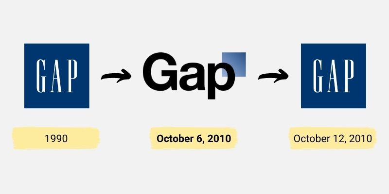
Gap introduced its new logo in 2010 when the company changed from the traditional blue box with serif font to a simple Helvetica font enclosing a small blue square. The brand wanted to appear more contemporary and cool. Designers criticized the new logo as being too basic and failing to maintain the original’s recognizability. Gap reinstated its original logo just one week after its deployment because of public pushback.
Pros:
The brand tried to create a new, modern appearance.
Cons:
The brand identity was lost.
The company experienced public backlash.
Tropicana’s 2009 Packaging Revamp
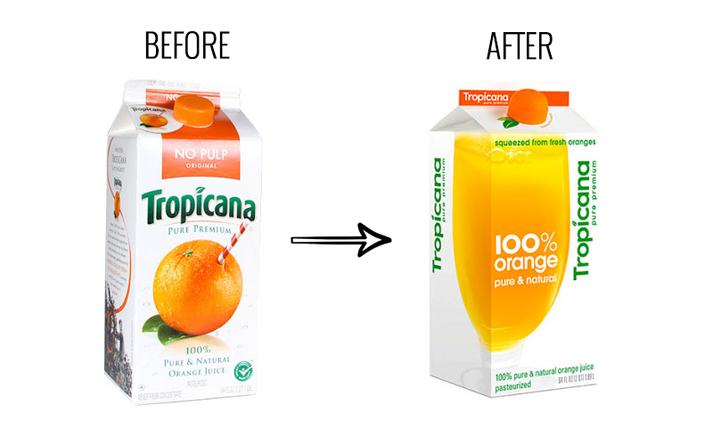
When Tropicana introduced its 2009 packaging update it replaced the traditional orange with straw design with a new simplified version. Customers became perplexed by the new design which resulted in a 20% sale reduction over two months. Tropicana went back to its original packaging after realizing its mistake.
Pros:
The company sought a style that would appeal to modern audiences.
Cons:
Loyal customers were misled by the new design.
Sales took a severe hit.
London’s 2012 Olympic Logo
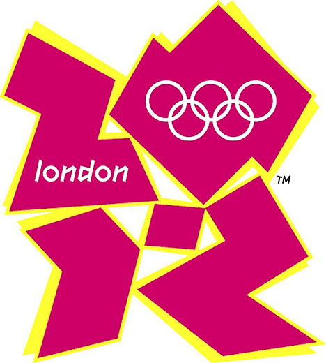
Wolff Olins created the 2012 London Olympic logo which included a twisted version of the numerals “2012” in vivid colors. The design intention was to create a modern and trendy logo that appeals to young people yet designers criticized the logo as too abstract and unrecognizable as London. The logo endured throughout the Games despite public criticism.
Pros:
The design was aimed at young people.
Cons:
Some people interpreted it as abstract and understood it as confusing.
Did not align with what the public expected.
Airbnb’s 2014 Brand Revamp
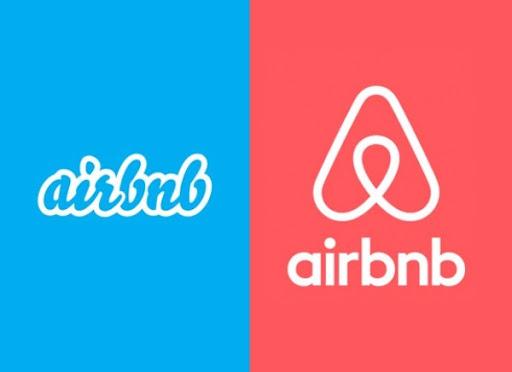
Airbnb introduced the “Bélo” symbol in 2014 as a representation of the notion of “belonging.” The logo suffered from criticism for its similarity to other global symbols and certain people considered it inappropriate. Over time though the logo has become completely identified with the brand of Airbnb.
Pros:
The logo effectively transmitted the idea of belonging.
Cons:
Design received negative comments for its resemblance to other logos and understanding of the symbol was wrong.
Yahoo’s 2013 Brand Symbol Redesign
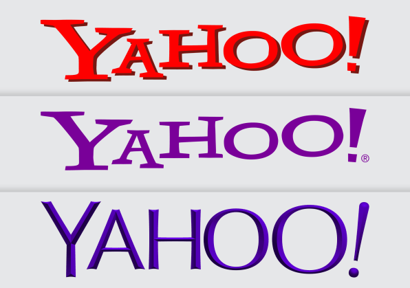
Yahoo showed an interest in modernizing its logo in 2013 after selecting a new design that contained a smaller exclamation point together with a thinner text format. People complained that the new design lacked the unique personality and fun element of the original logo which led to user opinions.
Pros:
The brand looked more contemporary and up-to-date.
Cons:
Some of the qualities that made the original logo great were lost in the transition.
Received mixed public reactions.
Uber’s 2016 Brand Transformation
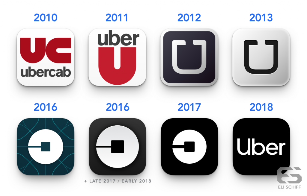
Uber revealed a new logo in 2016 through the substitution of a classic “U” for a simple circular and square shape. According to the company the new logo symbolizes the combination of bits and atoms which stand for the digital and physical worlds. Many users however found the new design ambiguous and failed to understand how it relates to the brand. Uber returned to a basic wordmark arrangement when it unveiled another new logo in 2018.
Pros:
Made an effort to symbolize the brand’s focus on technology.
Cons:
Created confusion through its abstract symbolism which affected users.
Led to another redesign not long after.
What We Can Learn from Popular Logo Redesign Controversies
This collection of examples demonstrate the potential problems and risks that come with rebranding logos. A well-executed logo redesign or rebranding can help a company gain new life but negative results include public backlash along with financial consequences. It is crucial to maintain brand recognition while also making sure that the design is not outdated.
Key Takeaways:
Preserve Brand Identity: The new designs should include recognized brand elements that customers recognize.
Test with Audience: Get feedback from loyal customers before making a full-scale product launch.
Avoid Unnecessary Changes: When the current logo serves the brand well it is better to make small adjustments instead of completely redesigning.
How Logomakerr.ai Can Help
Changing a company’s logo remains a major decision. Logomakerr.ai simplifies the logo design process by providing AI-designed options specifically for your brand requirements. The user-friendly platform at Logomakerr.ai provides extensive design choices which help you find the perfect logo that perfectly reflects both your brand and target audience.
Benefits of Using Logomakerr.ai:
AI-Driven Designs: Creates new logos specifically for your brand’s unique identity.
Customization: Provides a variety of design aspects to choose from based on your specific vision.
Cost-Effective: Offers high-quality professional logo designs at an affordable price that compares positively to working with a freelance designer. Logomakerr.ai stands as a cost-effective solution for startups, small businesses, and other entities that seek professional logos without expensive developmental costs.
Why Logomakerr.ai Outperforms Other AI Logo Generators?
Logomakerr.ai produces distinctive logos using advanced algorithms to match your brand identity unlike some other AI logo makers that deliver standard outcomes. Your logo will not be a generic icon with your company name added to it. You will receive a carefully designed logo that accurately represents your business.
Additionally, Logomakerr.ai offers:
Easy Editing: Want to tweak the colors, font, or layout? No problem. The platform gives you full control over customization.
Multiple File Formats: Get your logo in high-resolution formats that you can use for your website and social media pages as well as print materials.
Quick Turnaround: Do not have to spend days or weeks wondering what to do — make your logo in just minutes.
Final Thoughts
Any brand relies heavily on strong logos because redesigns carry significant risks yet offer opportunities to reinvent your brand and stay market relevant. Throughout history some logo redesigns have proved successful while others have not but one fact remains true: a well-designed logo remains essential for branding success.
If you are in the market for a new logo or need to update an existing one then Logomakerr.ai is definitely worth checking out. It makes the process much easier, cheaper and guarantees that your brand will stand out with a professional look. So what do you have to lose? Your new logo could be just a few clicks away!