When you think of coffee, what pops into your head?
For most of us, it’s that green mermaid who’s probably had more coffee dates than any of us. Yep, we’re talking about the Starbucks logo.
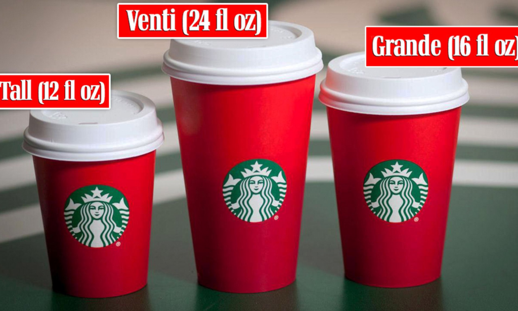
Although we’d like to believe that it’s definitely not just a logo – it’s practically one of the top-tier coffee brands out there. Starbucks logo is iconic, recognizable, and offers a lot of stories that could literally fill up your Venti cup.
But just like everything else – it all started from something. How you wonder?
In this article, let’s talk about the Starbucks logo evolution, its impact, and how you can create a logo similar to this coffee brand all by using an AI logo generator tool – Logo Maker AI!
Evolution of Starbucks Logo
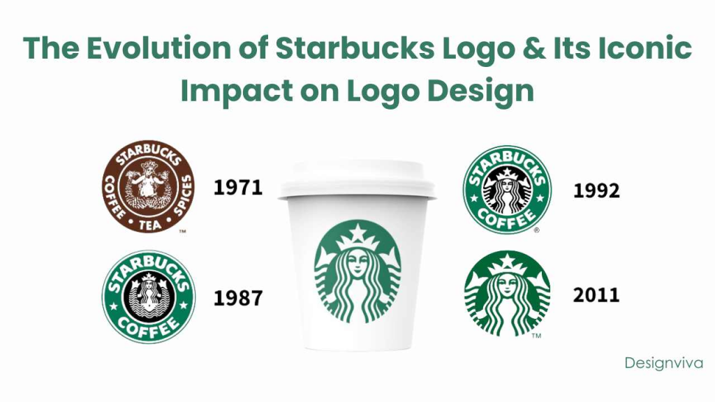
The Starbucks logo is more than just a pretty picture of the siren. It’s a carefully crafted image that has undergone several transformations since its inception in 1971.
1971-1987: The Original Siren
The first logo featured a detailed, twin-tailed siren inspired by Norse mythology. The brown color scheme and rustic design conveyed the brand’s focus on coffee’s exotic origins and high-quality product.
1987-1992: A Refined Look
As Starbucks began to expand, the logo was simplified. The siren was cleaned up, and the color was changed to green to represent growth, freshness, and environmental consciousness. This was also when the word “Coffee” was prominently placed in the logo, reinforcing the brand’s identity.
1992-2011: Iconic Transformation
The logo went through another transformation, further simplifying the siren’s design. The image became more abstract, focusing more on the siren’s face. This move was strategic—it made the logo more recognizable and easier to reproduce across different mediums.
2011-Present: The Minimalist Siren
The most recent version of the logo dropped the text entirely, leaving only the siren. This minimalist approach reflects Starbucks’ global dominance, where the brand’s symbol alone is enough to be instantly recognized.
Why your brand needs a well-designed logo as powerful as Starbucks?
A strong logo does more than just look good; it creates an emotional connection with customers, tells a story, and builds brand loyalty.
According to a study by ScienceDirect, 75% of consumers recognize a brand by its logo, and 60% are more likely to purchase from a brand with a recognizable logo. Starbucks’ logo is a perfect example of this—it’s a symbol of quality, comfort, and a premium coffee experience.
But why does the Starbucks logo work so well?
- Simplicity: The logo is simple and clean, making it easy to recognize and remember.
- Storytelling: The siren tells a story of mystique and adventure, which aligns with Starbucks’ brand message of offering a unique coffee experience.
- Consistency: Over the years, Starbucks has consistently evolved its logo while maintaining its core elements, helping to build trust and familiarity.
- Versatility: The logo works across various platforms, from storefronts to mobile apps, without losing its impact.
Now that you are aware on why does your brand need a well-designed logo as powerful as the Starbucks logo, it’s time to recreate what you’ve started and use a simple logo maker!
How to Create Your Own Café Logo with Logomakerr.ai?
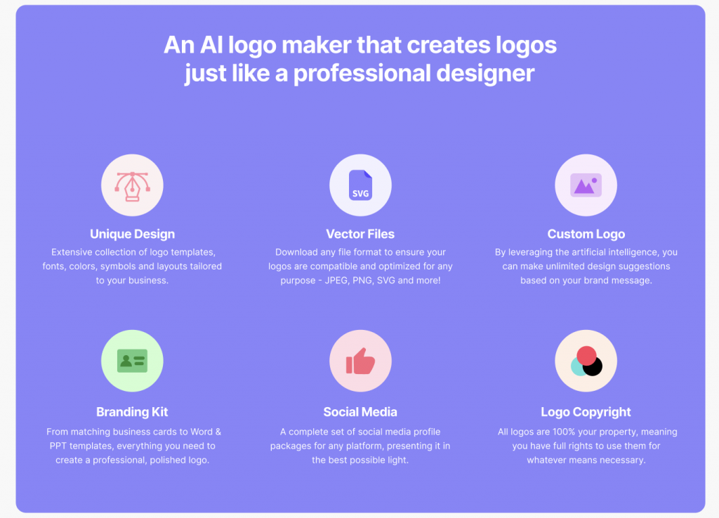
Creating a logo that perfectly captures the vibe of your café might feel like trying to make the perfect cup of coffee—tricky, right?
But don’t worry, it’s not as complicated as it seems. With tools like Logomakerr.ai, you can whip up a professional, one-of-a-kind logo that not only looks amazing but also tells your brand’s story in a way that’s as unique as your signature brew!
Start by understanding your brand identity
Yep, it all starts on thinking about what makes your café unique. For instance;
- A cozy, family-run café might benefit from warm colors and a homey, welcoming design.
- An eco-friendly café could use green hues and natural imagery like leaves or trees.
- A modern, minimalist café might opt for a sleek, monochrome design with simple geometric shapes.
Choose the right elements for your logo
At the beginning of the logo process, Logomakerr.ai allows you to choose the right color scheme, font, and of course – your industry. In this instance, you might as well choose Retail or something related to the café industry.
Logomakerr.ai to design your logo
- Start with a Template: Logomakerr.ai offers a variety of templates specifically designed for cafés. Choose one that aligns with your brand’s identity and customize it to fit your needs.
- Customize Your Design: With Logomakerr.ai’s easy-to-use interface, you can tweak colors, fonts, and imagery to create a logo that’s uniquely yours.
- Experiment with Variations: Don’t be afraid to experiment with different designs. Logomakerr.ai allows you to create multiple versions of your logo, so you can compare and choose the best one.
Test out your logo
Before you finalize your logo, it’s important that you have the right AI mockup tools to ensure that it’s the right emblem that balance your brand.
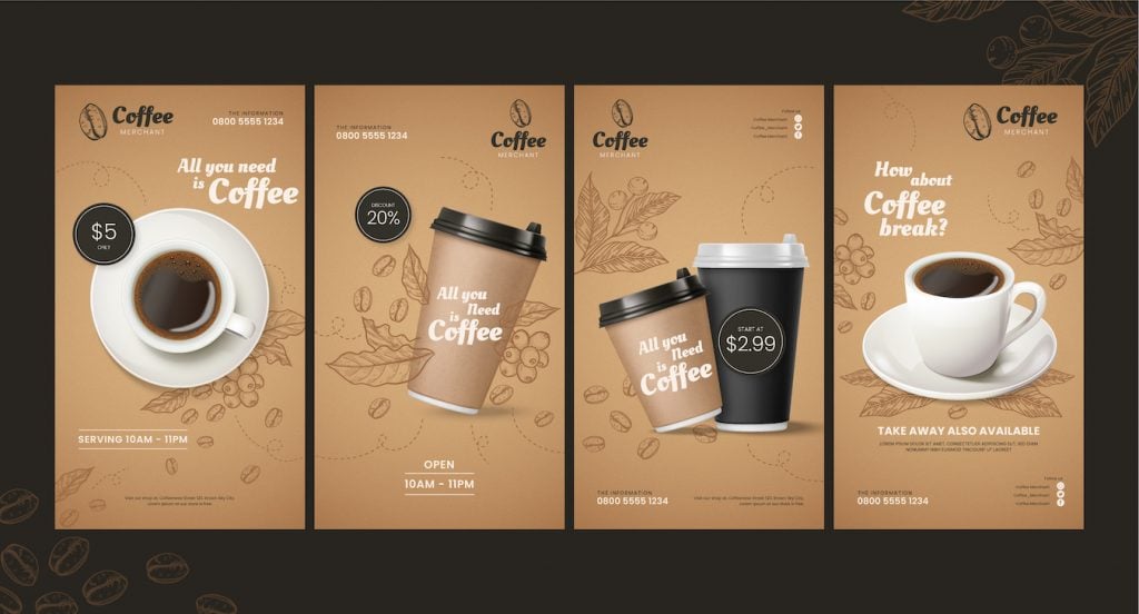
Lucky for you, Logomakerr.ai offers a high-quality brand kit which you can use for brand packaging, billboard testing, digital marketing, and other types of advertisements.
You may also gather feedback from friends, family, or even potential customers. A fresh perspective can help you spot any issues and refine your design!
Final Thoughts
The Starbucks logo is proof that a well-designed logo can become an icon. It’s not just a symbol—it’s the face of quality coffee and a top-tier experience.
By getting to know your brand, picking the right design elements, and using tools like Logomakerr.ai, you can create a logo that’s not just eye-catching but also tells the unique story of your café.
Keep in mind, your logo is often the first thing customers notice about your café. Make it count.
