In May 2022, Starbucks officially pulled out of its licensed 130 stores across the Russian market. The action took over after other global American brands like Exxon Mobile and Mcdonald’s suspended all their store operations within the country.
Yet, a Russian rapper and restaurateur, namely Timur Yunusov and Anton Pinskiy, bought the licensed locations of the brand in Russia and ‘Russified’ it with a new name – making the brand still a Stars Coffee.
In such cases, brand identity, including logos, is crucial. New owners may consider using an free AI logo maker for rebranding to align with the ‘Russified’ theme. But in terms of this news, how does this affect the brand identity of the multinational chain of coffeehouses and roastery reserves?
The Birth of Stars Coffee
With thousands of Global companies exiting Russia, several Russian elites are trying to snatch the discarded businesses, with some at a bargain price.
The same thing happened to Mcdonald’s chain when Siberian Billionaire Alexander Govor bought it for “far lower than the market price,” and French Carmaker Renault who sold its share to a Russian Science Institute for just one ruble or 17 US cents.
Business partners Timati and Pinsky didn’t disclose the amount they paid for the Starbucks franchise, but they mentioned that “We have invested as much as we paid them” and described it as an “expensive pleasure.”
After purchasing all the assets and lease agreements together, it’ll be hard to acquire the old menu or the old resources for the brand due to the western sanctions and the fact that Starbucks has its resource and production base.
But, Timati promised not to “disappoint the millions of coffee lovers” in the country and that “we have a chance not just to change the sign, but to make a real live case of a cool import substitution.”
The RBC published an article that Stars Coffee will have to rename and expand their menu collection with some stores identified as ‘premium’ locations that offer sushi bars and alcohol service.
Thus, giving rebranding Starbucks to Stars Coffee.
Rebranding the Brand’s Logo Design
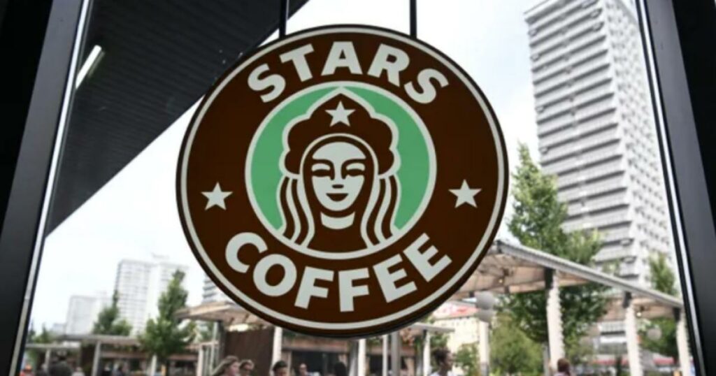
On August 18, the duo attended the grand opening in Moscow, Russia, which is said to be one of the first 130 cafe locations in the country, unveiling the chain’s new logo design.
The agreement calls for a new brand identity, including the logo design. So, they need to create a logo design different from the brand’s green and white color with a siren in the middle.
And that’s what they did!
Even though they look pretty similar, some features seek continuity with the circular shape of the logo and the female emblem.
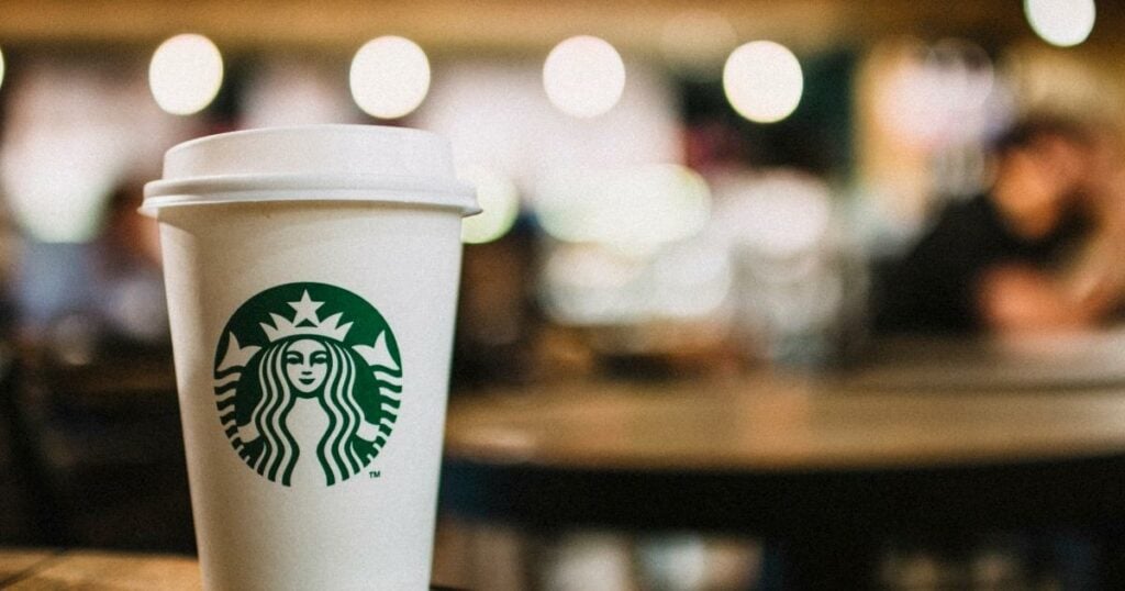
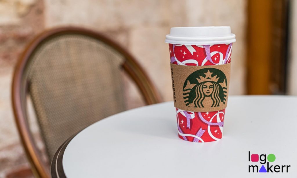
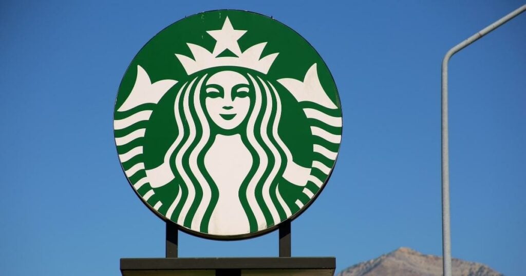
The current Starbucks logo has an enlarged image of the siren that occupies most of the circle space. But, they made noticeable changes to the siren’s eyes, nose, and hair, making it look realistic and asymmetrical on the whole look.
The lettering ‘Starbucks’ and ‘coffee‘ is no longer present along with the two stars on both sides of the circle. And there are only two colors left, white (for the font and icon) and green (as the background).
Meanwhile, Stars Coffee has a similar concept to the original logo. The siren was replaced by a woman who seemed to be wearing a kokoshnik, a traditional headdress of Russia.
They also brought back the original Starbucks color, brown, which signifies the color of coffee beans, along with the color aqua. Timati said that the female gender is “contrasted nicely with the brown, cigar-like masculine color” in the new logo.
Besides that, the concept and logo design seems to have many similarities.
The Knock Offs of the Brands
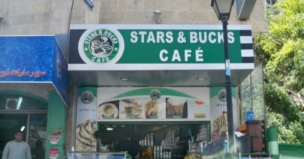
Over the years, Starbucks has been inspired by many coffee copycat brands. The “Stars & Bucks” in Palestine offers the same menu but with hookahs for customers to serve.
The “Star Box Coffee” in London was renamed “Coffee Box” after losing the case with Starbucks. And the Bucksstar Coffee somewhere in the Eurasian continent opened in a place dedicated to purely knockoff shops.
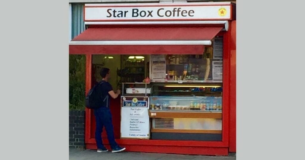
Regardless of how they look, they might’ve changed their branding design to avoid confusing them with the original coffee house.
But the one that stirs up controversies on social media is the one in Venezuela.
Perhaps due to the inflation and the statement made by Nestlé about not being “contacted or involved in the marketing of these products in the country,” which is why many people were amused at the opening of the ‘We Proudly Serve’ store location and show up.
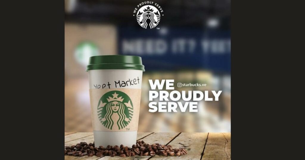
But surprisingly, the independent coffee business uses the same Starbucks logo, knockoff T-shirts, and drink menu, which is far superior to the few ones we mentioned.
There has been no updated news regarding any lawsuit or copyright infringement made by Nestle corps. In the meantime, the owner plans to run the store as an independent business.
One thing’s for sure! If you have a great logo that creates a memorable and unique appearance, it will create a curiosity effect that many people will come and visit.
Regardless of what you offer, many people will definitely want to try, buy, and check them out.
What Are Your Thoughts?
In terms of design elements, the ‘continuity’ shows the recognition of Stars Coffee to the original brand, Starbucks. The siren turning into a woman with a Russian touch helps create a versatile identity that most people can appreciate.
Although other people might say it’s a knockoff, the rebranding definitely helps create a whole new brand identity that Russians now consider as the authentic source of their previous favorite coffee brand.
But if you were to rebrand any famous company, what would it be, and how would you do it?
Perhaps, Logomakerr.AI might help! Our AI-powered based logo creator can help you create the logo design of your dreams for an affordable price.
