Are you a fan of coffee or a coffee enthusiast? There’s no denying that Starbucks is one of the most popular coffee chains in the United States and all around the world.
The Starbucks founders, Jerry Baldwin, Zev Siegl, and Gordon Bowker, who started the business with a mere sixty thousand dollar loan, could not even imagine that they would revolutionize the way Americans would take their coffee.
To some extent, the Starbucks logo played a significant role in taking its business to the next level. It is a clear reflection of the brand’s essence; that’s why we’re here to break down the logo and understand what made it such a powerful brand.
This way, you can take key pointers for your own ventures too whether you’re gonna opt for a professional graphic design, or make use of a free AI logo maker!
Hey! We have a new Starbucks logo analysis for you to read – link here.
A Review of the Starbucks Logo
The name of the Starbucks itself came from Heman Melville’s Moby Dick novel, and the brand from other coffee tea house by its unique and simplified logo design and color theme.

In some way, the logo represents the brand itself, with its famous 16th century Norse woodcut twin-tailed “mermaid” or “siren” character, who we can say is the face and the heart of the company.
What’s in the Starbucks Logo?
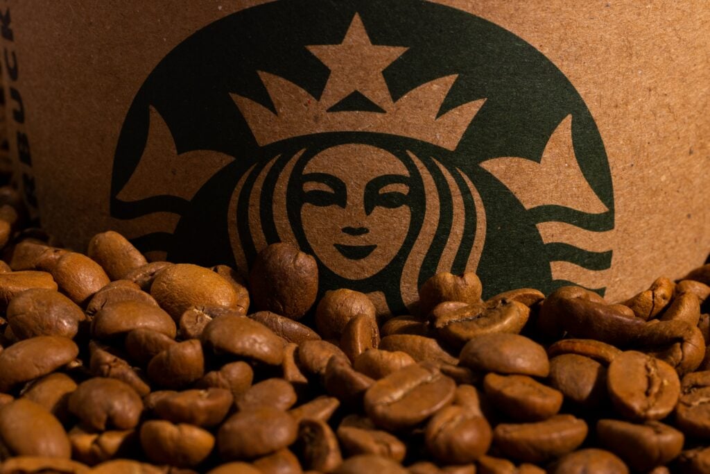
The most outstanding part of the Starbucks logo, who was designed by Terry Heckler, is the white figure of the siren, representing the female figure of Greek mythology, beautiful, seductive, and enchanting.
The story behind the mermaid’s iconic presence was an ode to Seattle and its proximity to the sea, the birthplace of Starbucks.
The Circular Shape
The logo of the mermaid itself is not very complex, but its simplicity is what makes it so powerful and memorable. The white silhouette is layered in a circular shape on a black background, giving the logo a vintage, retro, and classic feel.
The circular shape of the Starbucks logo stands apart from the brands easily. It also represents unity, equality, eternity, and an ever-present legacy in the coffee industry.
The Color Scheme
The simple white and green hues seem basic at first glance, but it packs enough punch to make the Starbucks logo outstanding from others.
The white color of the Starbucks logo gives it a softer and warmer feel, representing the natural, raw and organic side of the brand. It is also a symbol of purity and peace, giving the Starbucks logo a cultural element to it as well.

The green color in the Starbucks logo symbolizes vibrancy and growth, representing the brand’s organic and green side. Green colors also indicate wellness, growth, and abundance.
It is safe to say that the colors of the Starbucks logo are a perfect match for the brand.
The Font
Like the color scheme of the Starbucks logo, the font of the company’s logo is also a simple and elegant style. The font is a dominant style of the company, with just a few changes over the years.
In fact, it has remained the same since its inception in 1971.
A Throwback to the Starbucks Logo Evolution
1971 – Forgotten, but Groundbreaking
1971 was when Starbucks first opened its doors in Seattle with the mission to sell high-quality coffee beans and be a gathering place for the people who loved coffee.
It is also the year when the company introduced the mermaid or siren as a logo to represent their identity on paper.
Regarding the birth of the siren, the founders envisioned Starbucks as a place where different characters from many different backgrounds across the globe could meet and connect.
To represent this idea, the founders of Starbucks drew inspiration from Greek mythology, symbolizing the siren as the face and the heart of the company.
But the Starbucks logo didn’t start out with a green and white scheme, nor was it a close-up illustration of the twin-tailed mermaid. Initially, the logo took on a brown and white color, with a topless double fishtail mermaid seen in her entirety.
1987 – the Classic
After years of selling high-quality coffee beans with a growing company, Starbucks finally decided to change its more contemporary and refined logo.
The Starbucks logo in 1987 saw the removal of the siren’s exposed body. Instead, it adopted a more conventional close-up picture of the star-shaped mermaid in front of a green background.
In the picture, the logo also adopted a green, white, and black color scheme to symbolize the company’s sustainability, freshness, and unity.
All in all, the Starbucks logo in 1987 was a more modern version of the previous logo. The siren was a little bit larger and closer to the focus of the logo, and the words opted for a simpler message: Starbucks Coffee, which is all you need to read to understand the brand’s essence.
1992 – a Closer Look of the Siren
One of the most significant changes to the Starbucks logo was the image of the siren. The brand had once again adopted a close-up illustration of the twin-tailed mermaid, focusing more on her upper body.
2011 – Cleaner, Crisper, and More Visually Compelling
The Starbucks logo in 2011 took on a more simplistic approach with new changes to the logo, including the siren, the words, and the color scheme.
This was the year when the brand decided to simplify its Starbucks logo even more because of the growing complexity of the Starbucks brand itself.
Starbucks reached a point wherein one look at the siren set against a green background is enough to let everyone know the brand, so it made complete sense to remove the words from the logo.
The timeless quality of the Starbucks logo makes it a classic design that has transcended time. This logo’s longevity is undeniable, as you can still recognize it today at first glance.
The Bottom Line: The Steady Rise of Starbucks to Success
The Starbucks logo started out as a simple but powerful representation of the brand and the coffee chain.
Over the years, the logo has become a household name and a symbol of unity, equality, and sustainability in the coffee industry.
How can Logo Maker AI Help Craft Your Brand Image?
Today, Starbucks is a household name in the U.S. and in countries like Argentina, Canada, Japan, and many more. Apart from being the world’s favorite coffee brand, Starbucks also offers top-notch coffee beans for brewing at home, proving that drinking Starbucks is a way of life for people across the globe.
The Starbucks logo is a success, an undeniably distinctive icon of the coffee industry, the brand, and the business.
But how can we help you craft your logo and brand image?
Logo Maker AI is here to give you the shortcuts to create a powerful brand identity for your business.
You can choose from thousands of ready-made logo ideas, and customize each according to your needs and preferences. You can even call our in-house designer for further professional customization.
So check us out today and see what we can do to establish your presence in your industry.