Have you ever wondered why your digital images and file formats look different from their printed counterparts? Or are you eager to learn when to use each color mode to make your logo design creations stand out?
This is where the color modes – RGB Vs CMYK enters!
If you’ve ever wondered what these mysterious acronyms mean and how they affect your designs, you’re in the right place!
Whether you’re a seasoned graphic designer or a budding artist, understanding the fundamental differences between RGB and CMYK is essential to produce stunning visuals that truly pop off the page.
So, let’s dive in and unravel these beautiful color modes together!
RGB – The Radiant Realm of Light
RGB stands for Red, Green, and Blue – the primary colors of light, and holds the key to a myriad of shades when blended in varying intensities, breathing life into your digital designs.
From the dazzling glow on your computer screen to the vivid hues of your favorite mobile app, RGB image reigns supreme in the digital realm.
What is RGB?
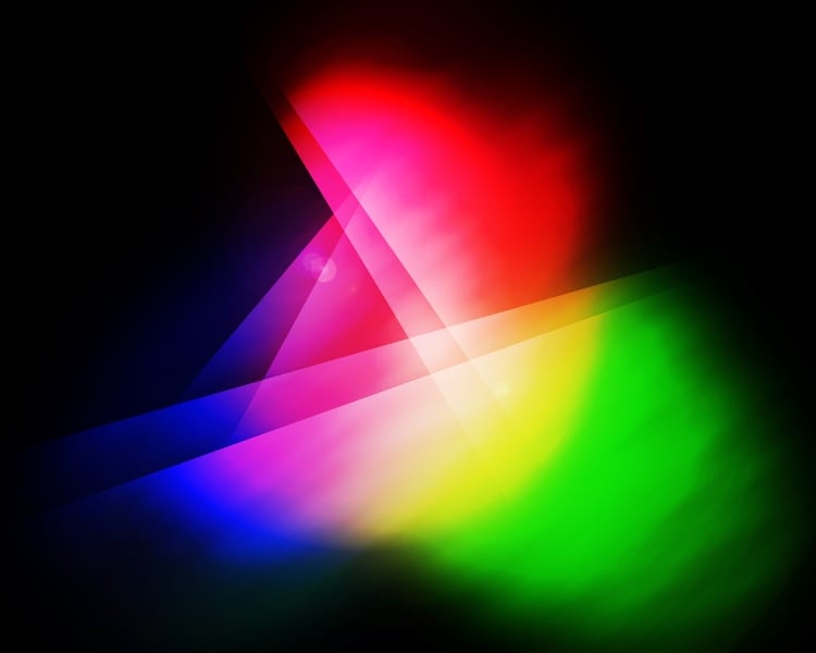
RGB represents the additive color model used in electronic displays like computer screens, TVs, and smartphones.
Imagine the pixels on your screen as tiny, glowing light sources where the intensity of red, green, and blue light combines to create millions of colors.
In the RGB mode, black is the absence of light (all spotlights off), and white is the sum of all colors (all spotlights on full blast). So, whenever you’re designing for screens, websites, or digital artwork, RGB is your go-to companion.
CMYK – The Charming World of Ink
CMYK stands for Cyan, Magenta, Yellow, and Key (black). These four colors work harmoniously to bring your designs to life on paper, making them the ideal choice for all your print-related endeavours.
Stepping into the captivating realm of the CMYK color gamut, we encounter a different, more enchanting form of color magic.
What is CMYK?
CMYK is the champion of the print world, where precision and consistency are paramount. It ensures that what you see on your computer screen translates beautifully onto physical media, captivating audiences with tangible and tactile creations.
So how does it work? CMYK colors absorb light, creating a print that looks rich, vivid, and visually stunning. In this color model, the creation of colors happens through subtracting light from white, where ink selectively absorbs specific wavelengths and reflects others.
So the more ink you add, the darker the colors become. By skillfully blending different percentages of cyan, magenta, yellow, and black, you can achieve a wide range of colors for your printed materials.
Whether you’re designing business cards, brochures, or wedding invitations, CMYK mode guarantees that your colors pop off the page with exceptional brilliance.
RGB vs CMYK: When to Use Each Color Mode?
Now that we’ve acquainted ourselves with the wonders of RGB and CMYK, let’s answer the burning question: when should you use each color mode? Here’s a simple breakdown to guide you:
RGB Color Mode
When creating visuals for online platforms, social media, websites, and digital ads, RGB colors are the way to go. Its radiance and wide gamut ensure your designs shine on screens of all sizes.
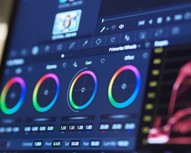
For instance, if you’re planning to create a logo design for a brand, perhaps using an AI logo maker, you can save the file as RGB, only if you’re going to use it in digital platforms.
Overall, it’s also great for multimedia projects like videos, animations, and digital artwork. Its ability to create bold and electrifying visuals is unparalleled!
CMYK Color Mode
When your design is destined for the tangible world of print – business cards, brochures, or banners – CMYK ensures accurate color reproduction so your creations look stunning in print.
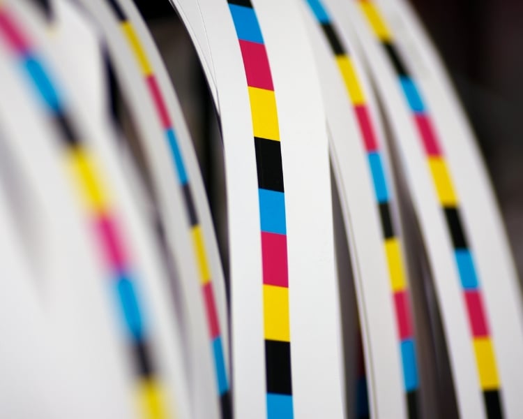
And if you want to ensure that your design revolves around consistent branding, CMYK preserves your brand colors and integrity across all printed materials.
But Can RGB and CMYK Coexist?
Ah, the age-old question – can RGB and CMYK coexist harmoniously? The answer is a resounding “Yes!”
In graphic design, we often need to handle digital and print projects. To make the transition smooth between the RGB and the CMYK color model, here are some handy tips:
- Begin with RGB color space: Start your creative journey in the vibrant world of RGB. Here, you can freely explore ideas, play with colors, and perfect your design without worrying about print restrictions.
- Preview with Soft Proofing: When you’re almost done, try soft proofing tools in your design software to see how your RGB masterpiece will appear in CMYK print. Soft proofing is another term for virtual previewing that allows designers, photographers, and artists to check how their digital creations will look in different color modes or on various output devices before actually printing or publishing them.
- Convert Colors Carefully: When converting RGB to CMYK, make conscious color choices and be ready to adjust colors slightly to keep the essence of your design intact.
- Collaborate with Print Experts: For big projects like banners or merchandise, it’s wise to collaborate with print experts. They’ll guide you through the process, ensuring a fantastic final result.
Embrace the Colorful Harmony
In the colorful clash of RGB vs CMYK, we’ve now unlocked the secrets of these color modes to help you confidently conquer both digital and print realms with a burst of creativity.
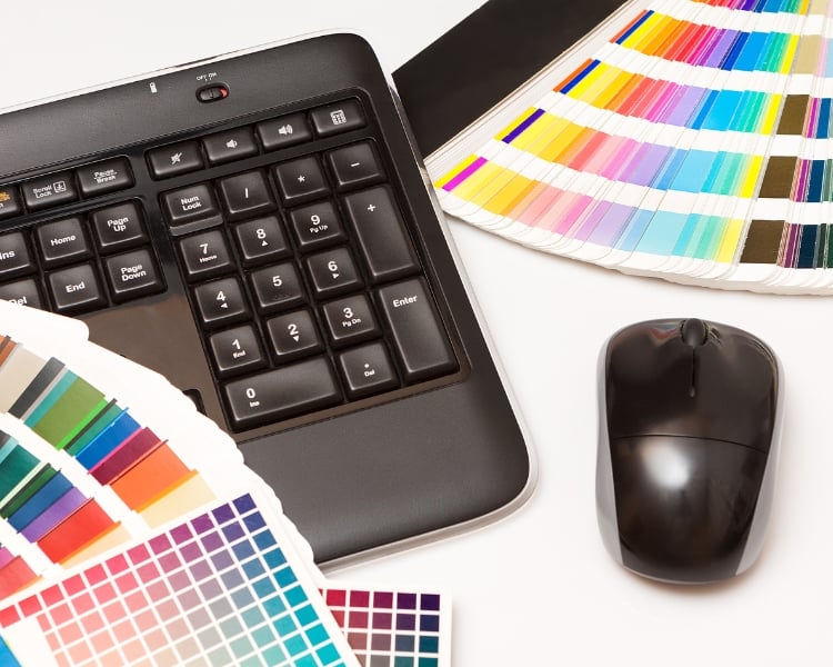
When should you use each color mode? The answer lies in your creative intent. RGB files dazzle on screens, while CMYK excels on paper. So, whether designing for the web or bringing your ideas to life in print, understanding these color modes will help you create captivating masterpieces.
And the best part? RGB and CMYK can coexist harmoniously, bridging the gap between the digital and tangible worlds. Armed with this newfound knowledge, you can transform your artistic visions into stunning masterpieces that fit both the digital and print worlds.
So embrace the harmony between these color modes, and let your creativity take place!
