What do you see when you look at a logo design, whether it is made from a simple logo maker or by a professional logo designer? Chances are, you see more than just the company name and product. You might see an image or a symbol that represents the company somehow.
But what about the space around all of that?
The negative space logos is just as important as the positive for every logo design. You can use it to your advantage if you know how to apply them appropriately.
In this blog post, we’ll look at some examples of negative space logos and discuss how you can use negative spaces in your own logo designs. We’ll also explore some tips for using empty space effectively in your branding efforts.
What is Negative Space Logos?
Negative space logos defines as anything that is within the empty or unoccupied areas surrounding or between the main subjects or objects in an image, design, or composition.
This space, often called as the “white space,” is anything between, above, below, and sides of your design without objects or elements in it – it creates a breathing room for an art, and draw attention to the main subject.
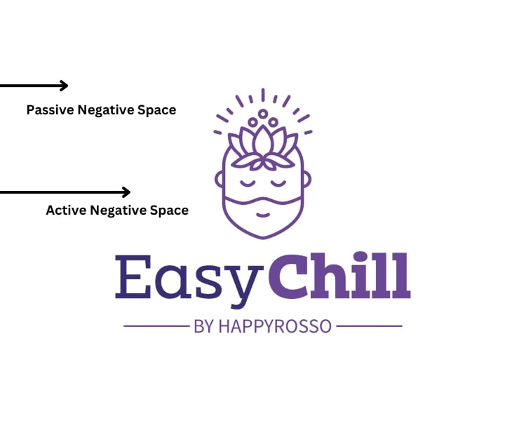
Negative or white space can either be active or passive. The active negative space is usually the result of intentional design. It creates tension and emphasizes the structure of your logo design.
Meanwhile, the passive negative space recedes into the background, or it occurs naturally when there are no elements around the canvass or paper. It’s simply a leftover area that wasn’t utilized during the creative process.
When used correctly, negative space can make a logo more memorable and add to the meaning of a design.
Why Use Negative Space in Logo?
Negative space is often overlooked as it was thought of as blank or empty areas. In logo design, negative space can be intentional and used to your advantage. So why use negative space in logo design? Why is negative space important?
Perhaps the most obvious reason is that it can make your logo more visually appealing, providing a bit of contrast and making it stand out from the competition – just like what we can see in some of the negative space art around us.
But there are many good reasons why negative space is essential in logo design. Here are just a few:
1. Negative space help simplify the logo.
A complex logo with too many visual elements can be difficult to remember and may not stand out from the competition. Negative space can help to simplify your logo design, making it easier to understand and more memorable.
2. Negative space makes clever use a logo.
For instance, the world-famous FedEx, a transportation and cargo company, is a classic example of the clever logo design in a negative space.
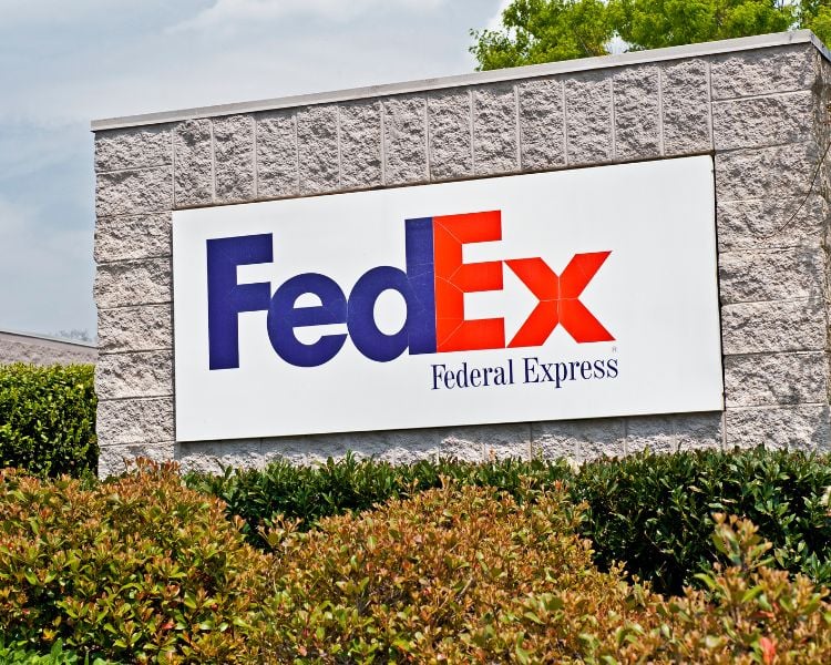
Other observant might see that FedEx is simply a wordmark logo. Little do people know is that the negative space forms an arrow pointing between the E and the X, symbolizing speed and forward movement.
3. Negative space can create more subtle logos.
The Spartan Golf Club shows how negative space allows subtle look in a logo design.

At first glance, it may just look like an elegant logo with an emblem on it. But if you look closely, you’ll see that the negative space forms a golf club or ball and a spartan helmet. Genius!
4. Negative space creates timeless logo design.
A well-designed negative space logo is more likely to be remembered than a simple positive space logo. This is because the viewer’s eye is drawn to the negative space, which is not often seen in logos.
The World Wildlife Fund (WWF) is an international non-governmental organization that deals with conservation movement, research, and endangered species education.

It’s one of the most successful non-profit organizations for fundraising, and its logo is one of the best examples of effective negative space usage.
The simple image of a panda is instantly recognizable, which is one of the most endangered animals in the world.
Its logo was designed over 40 years ago, and it’s still in use today!
5. Negative space allows balanced and harmonious design.
Positive and negative space should be balanced. If a certain canvas, frame, or any board where art is added becomes mostly positive space, it can make the design feel cluttered and busy.
The same thing goes is the design is mostly negative space. It can make a design feel unfinished or unbalanced. Hence, the perfect amount of negative space will help create a more polished and professional look.
6. Negative space can communicate company values and mission
For example, the negative space in the FedEx logo mentioned earlier can be interpreted as an arrow symbolizing speed and forward movement.
The empty space in the WWF logo can be seen as a panda, which communicates that the organization is about animal conservation.
There are many good reasons to use negative space in logo design. It’s such a powerful tool that should not be underestimated.
Using negative space wisely can create a more visually appealing, memorable, and timeless logo for your business.
Practical Tips and Best Practices in Mastering Negative Space
Negative space isn’t just about leaving things blank; it’s a subtle art that can make your logo memorable and impactful. Here are some practical tips and best practices to help you master the use of negative space in your logo designs.
1. Start with Simplicity. One of the golden rules is “Simplicity is the key,” as negative space allows you to enhance your message subtly and strive for clarity in the design.
2. Build a Strong Concept. What is the story or message you’re trying to convey? Would it make more sense to have a compact design with negative spaces around it?
3. Study the Masters. Analyze famous logos that effectively use negative space. What makes them successful? How do they balance simplicity and creativity? Learn from the best.

4. Maintain Versatility. Always test your design in different scales and platforms, and ensure the negative space elements remain clear and recognizable.
5. Balance and Harmony. Strive for visual harmony by ensuring that the positive (filled) and negative (empty) spaces complement each other.
6. Hidden Meanings. Embrace the opportunity to convey hidden meanings or double entendres through negative space. Subtle symbolism can make your logo more intriguing and memorable.
7. Feedback and Iteration. Don’t hesitate to share your work and gather feedback. Sometimes, fresh eyes spot issues or opportunities you have missed. Iterate and refine your design based on constructive feedback to ensure your concept is communicated effectively.
8. Stay Consistent. If your brand already has a logo, consider incorporating negative space elements without a drastic departure from the existing identity. Consistency is vital in branding.
9. Be Patient. Great design takes time. Don’t rush the creative process. Allow your ideas to simmer and evolve. The best concepts often emerge after a period of reflection.
Minimalist and Negative Space Logo Design
Less is more is often applied to the designing approach.
This is especially true when it comes to negative space logos. Designers have long been using the power of negative space to create a minimalist effect, aiming for an impactful and memorable logo with very little visual clutter.
The minimalist logo also allows for more personality and creativity. At the same time, loud, giant, brightly-colored displays can be overpowering or take up all the space.

Look at the logo design above. This one is created by a brand through Logo Maker AI, an ai logo maker that helps you customize your own brand alone.
But as you can see, the design still has its engaging and interesting effect without unnecessary clutter that takes up more space than necessary. This is especially true if they’re designed well enough so as not to distract from anything else around them!
That’s why maintaining a balance between these two extremes will help people get acquainted with what makes your brand special without feeling overwhelmed by detail overload.
Final Thoughts
Negative spaces are a great way to use empty space to your advantage. By understanding what is a negative space in a logo and why you should use it can help you create an eye-catching and memorable logo for your business.
They are also a great way to make a minimalist statement and create an unforgettable visual identity for your brand.
So don’t be afraid to experiment with different ways of using negative and positive space in your own work. When used correctly, they can help your business logo stand out from your competitors positively!
