Netflix is one of the most popular streaming services available today. With a library of movies, tv shows, and documentaries, it’s no wonder that people flock to Netflix for their entertainment needs.
With its rise in popularity, the Netflix logo design has also become iconic. The simple yet recognizable red N is now synonymous with the streaming service. But how did this logo come to be? And what should we know more about its logo?
The Netflix Logo Through the Years (1997-present)
Netflix was founded by Reed Hastings and Marc Randolph in Scotts Valley, California. Hastings in the 1997. The headquarter is located in Los Gatos, California, while few offices branches out worldwide, including New York, Melbourne, Vancouver, and France.
This popular streaming platform’s original logo design has been rebranded over two times. Let’s go over them!
The year 1997 to 2000
The first and original logo design was used from 1997 to 2000.
It featured the word “Netflix” in a serif font in all caps with a celluloid film icon placed between the words NET and FLIX. They said that the ringlet split between these two words served the purposed of it being easy to remember and memorize in the media content.
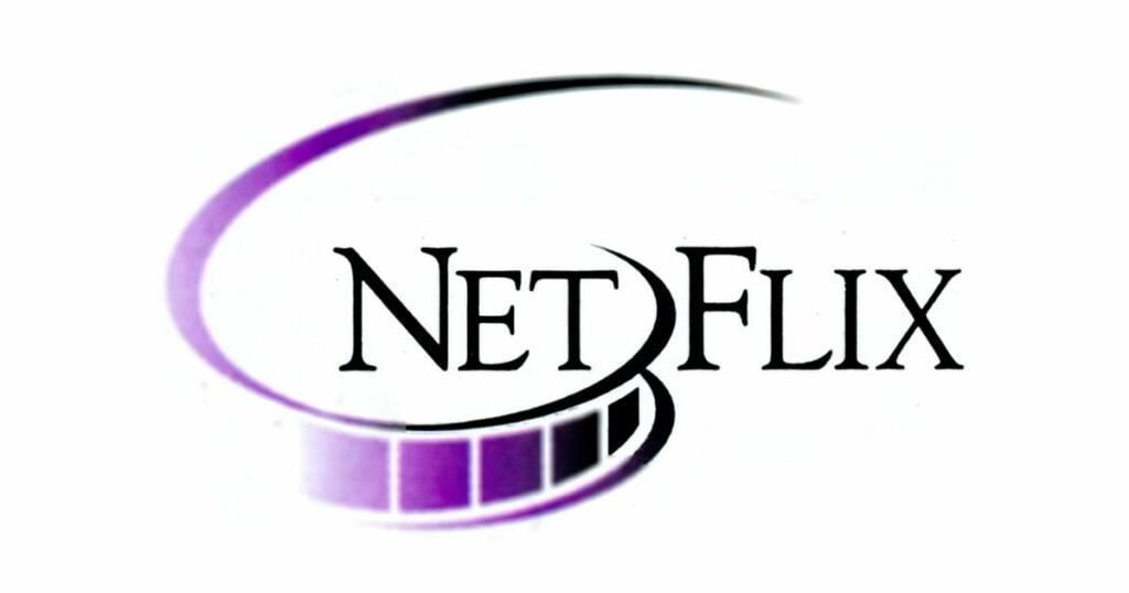
The logo was also in simple black and white wordmark with the first “N” slightly taller than the rest of the letters to create a more unique and recognizable logo.
Although some might say it fits perfectly with its theater look, we thought it was a bit boring compared to the current logo we know today. It has a simple typeface with a bit of bluish-purple colors on the icon film.
Nothing special? That’s what we thought.
The year 2000 to 2001
Little did people know that the first logo rebrand for Netflix was a black elliptical emblem with two yellow brackets on the side. The wordmark uses a contemporary square sans-serif font resembling a huge tv screen serving as a dot to the letter ‘i.’
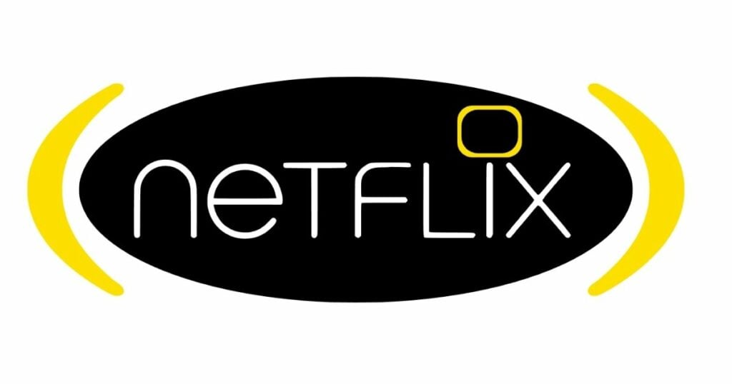
Unfortunately, this first logo rebranding only lasted for a year, and it may have been too much of a departure from the original logo and confusing for customers.
The year 2001 to 2014
In 2001, the company simplified the logo with just a wordmark that appears to be in a Graphique font with a thick black shadow behind the red background or shield.
This gives a 3D effect from the striking color contrast of the logo design. But if you were to ask our team, it would be a bit harsh to change from something as simple as black-and-white or black-and-yellow to something so red.
But who knows! Maybe Netflix felt confident about its brand identity or what’s yet to come. After all, they are, in fact, not wrong!
The year 2014 to present
By 2014, the company rolled out a new logo that was inspired by their old one but with a few changes.
If you were to take a closer look at the emblem, you could see that the Netflix logo had become much more refined with the word “Netflix,” written not just in red but in gradient red.
The old red backdrop has also been replaced by a white one, while the font uses a more modern Graphique font without any shadows, which helped to convey the company’s forward-thinking attitude, especially in the films industry.
The new logo was more modern and reflected the company’s shift to streaming.
Thus, it looks good on every device!
All About Netflix Logo
Netflix’s logo is one of the most widely recognized in the world. The simple red and white design has become synonymous with the streaming service and is recognized by billions of people around the globe.
But many people don’t know that there’s much more to the Netflix logo than meets the eye. Upon closer inspection, the logo contains several messages that you, as a user, may want to know.
The Netflix Icon
I doubt you’ll never find a movie-watch or film enthusiast without knowing about the Netflix symbol. Thanks to social media, and other video streaming platform users, Netflix has become a necessity for entertainment media.
This iconic letter ‘N’ with a gradient light and white mixture gives off a simple yet unique presence that looks good on any platform. It really does give off a sense of power and attraction that makes them identifiable and exciting for many audiences.
The Colors Red and White
The colors red and white are often associated with passion and purity, respectively. Meanwhile, using a simple font keeps the logo modern and sleek.
In the case of Netflix, these colors may represent the company’s commitment to providing its users with an enjoyable and quality streaming experience.
The Use of Fonts
The font on the current Netflix logo is intentionally designed Graphique font that combines two font elements – the Gotham bold and the Gotham book. This was originally digitized and expanded by Ralph M. Unger.
This may have been meant to convey a sense of motion and energy, which is fitting for a constantly expanding and evolving company.
The popularity of the Netflix Logo
It’s no surprise that the Netflix logo is one of the world’s most popular and easily recognizable logos. The simple yet eye-catching design is unique and memorable, making it the perfect symbol for the leading streaming service.
From its early days to its current status as a global entertainment brand, Netflix has always had a strong visual identity. The company’s logo has undergone a few iterations, but the essential elements have remained the same.
The Netflix logo is an excellent example of how a simple design can effectively convey a brand’s personality and values. The clean, minimalist aesthetic represents the company’s commitment to quality and innovation.
Want to create your own film movie logo design?
Whether you’d like to open your own streaming platform or just want to try and pitch them to the Netflix team, you can now create your own logo design in less than 5 minutes!
How’s that possible? With the help of our team at Logo Makerr AI. With hundreds of a ready-made templates for you to customize and choose from, we guarantee that you’ll find the perfect logo for your brand.
