Did you know that over 900 million people use LinkedIn worldwide? That’s a massive community! And one thing we all recognize is that little blue “in” in LinkedIn logo. But have you ever wondered how LinkedIn keeps its logo looking consistent everywhere? Maybe they use a simple free logo maker or have been working with professional graphic designers for years now!
With that, in this blog post, we’ll explore the secrets behind LinkedIn’s logo design and the brand guidelines that keep it looking sharp and professional, no matter where you see it. Whether you’re a designer, a marketer, or just curious, this is going to be a fun and insightful look at the power of good branding.
Let’s get started!
Introduction to the LinkedIn logo
LinkedIn’s logo is more than just a small blue icon—it’s a symbol recognized by millions across the globe. With over 900 million users on the platform, LinkedIn’s logo needs to be consistent and professional everywhere it appears.
This isn’t by accident; it’s the result of strict brand guidelines that ensure the logo maintains its integrity and recognizability. Yes, those two are actually a thing when creating a logo!
These guidelines cover everything from the exact shade of blue used, to the spacing around the logo, and even how it should be displayed in different contexts.
In short, brand guidelines are the backbone of a strong, cohesive brand identity. They help to ensure that every interaction with the brand is a positive one, reinforcing the brand’s values and making it easily recognizable to the audience.
What is the LinkedIn logo?
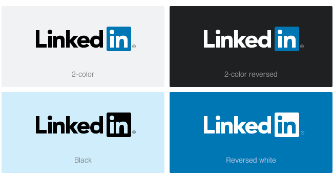
At its core, the LinkedIn logo consists of a clean, sans-serif typeface paired with a distinctive blue and white color palette that exudes trust, reliability, and professionalism.
It features the word “LinkedIn” with the “in” part in a striking blue square. This specific shade of blue is carefully chosen to convey professionalism and trust. The logo’s clean and simple design ensures that wherever you see it—on a website, app, or business card—you instantly know it’s LinkedIn.
Yeah, we bet you to do so!
This consistency helps the brand stand out and stay memorable to millions of professionals around the globe. So if you are ready to know the best brand guidelines to follow, here they come!
Follow these Brand Guidelines like LinkedIn logo does!
Brand guidelines cover a range of elements to ensure that a brand’s visual identity and messaging remain consistent across all platforms. Here’s a breakdown of common brand guidelines and what each entails to the LinkedIn logo.
- Logo Usage: This guideline specifies how the logo should be displayed, including size, placement, and spacing. For example, it might include rules about not stretching or altering the logo’s proportions and maintaining a clear space around it. In fact, the LinkedIn logo should never be altered or distorted—its “in” part should always be in the blue square, ensuring it remains recognizable and professional across all uses
- Color Palette: This outlines the specific colors that represent the brand. It includes primary colors and secondary colors, along with their exact color codes (e.g., Pantone, CMYK, RGB, or HEX). The LinkedIn logo uses a precise shade of blue known as “LinkedIn Blue” (HEX #0077B5).
- Typography: This guideline details the fonts and typefaces used in brand materials. It includes the primary and secondary fonts, font sizes, line spacing, and any special typographic treatments.
- Iconography: Guidelines might cover size, color, and placement to ensure that icons are used effectively and consistently. For example, the blue square containing the “in” in the LinkedIn logo should not be combined with other icons or altered, preserving its distinct and recognizable appearance.
- Brand Applications: This part outlines how the brand elements should be applied in various contexts, such as business cards, websites, social media, and advertising.
- Digital Guidelines: These specify how the brand should appear in digital formats, including websites, mobile apps, and social media profiles. For digital applications, the LinkedIn logo must be displayed with the correct color and size. If you also do this, your brand will surely remain clear and recognizable.
The Evolution of the LinkedIn Logo
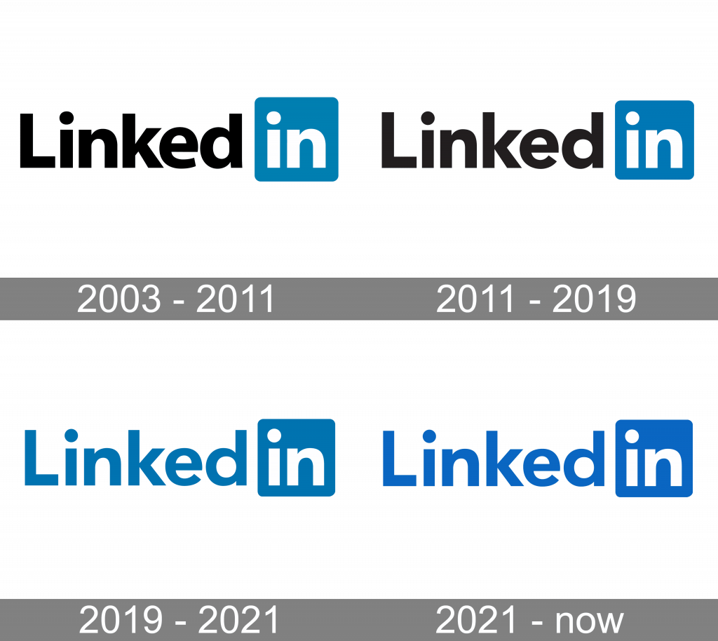
Here’s a look at how LinkedIn’s logo has changed:
- Early Designs (2003-2011): When LinkedIn launched in 2003, its logo was a simple design with a lowercase “in” inside a blue box, accompanied by the word “LinkedIn” in a straightforward, sans-serif font.
- First Major Update (2011): In 2011, LinkedIn introduced a more refined version of its logo. The blue square was slightly altered, and the font used for “LinkedIn” was updated to a more modern and streamlined typeface.
- Significant Redesign (2019): The most notable redesign occurred in 2019. The blue square was simplified, and the font for “LinkedIn” was updated to a custom, clean typeface that matched the new logo’s more minimalistic style. The “in” icon was given a softer, rounded look, enhancing its visual appeal while keeping the design simple and recognizable.
- Current Logo (2024): Today’s LinkedIn logo continues to build on the 2019 redesign. It features the “in” icon in a more refined blue square, with a clean and modern typeface for the “LinkedIn” text.
Create a mockup LinkedIn logo with this AI logo maker
Logomakerr.ai lets you design a logo that captures the essence of LinkedIn’s iconic style—just upload your design and watch the magic happen.
Whether you’re a business owner or just exploring logo ideas, Logomakerr.ai provides an intuitive and user-friendly platform to create stunning logos.
It’s a great way to see how your designs can stack up against some of the world’s top brands, making sure you get a logo that’s both unique and professional. Try it out and see how simple logo design can be!
To know more how you can do that, ready this blog to see how Logo Makerr AI works!
