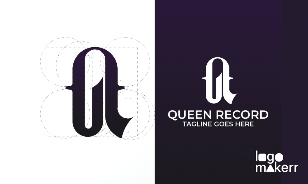
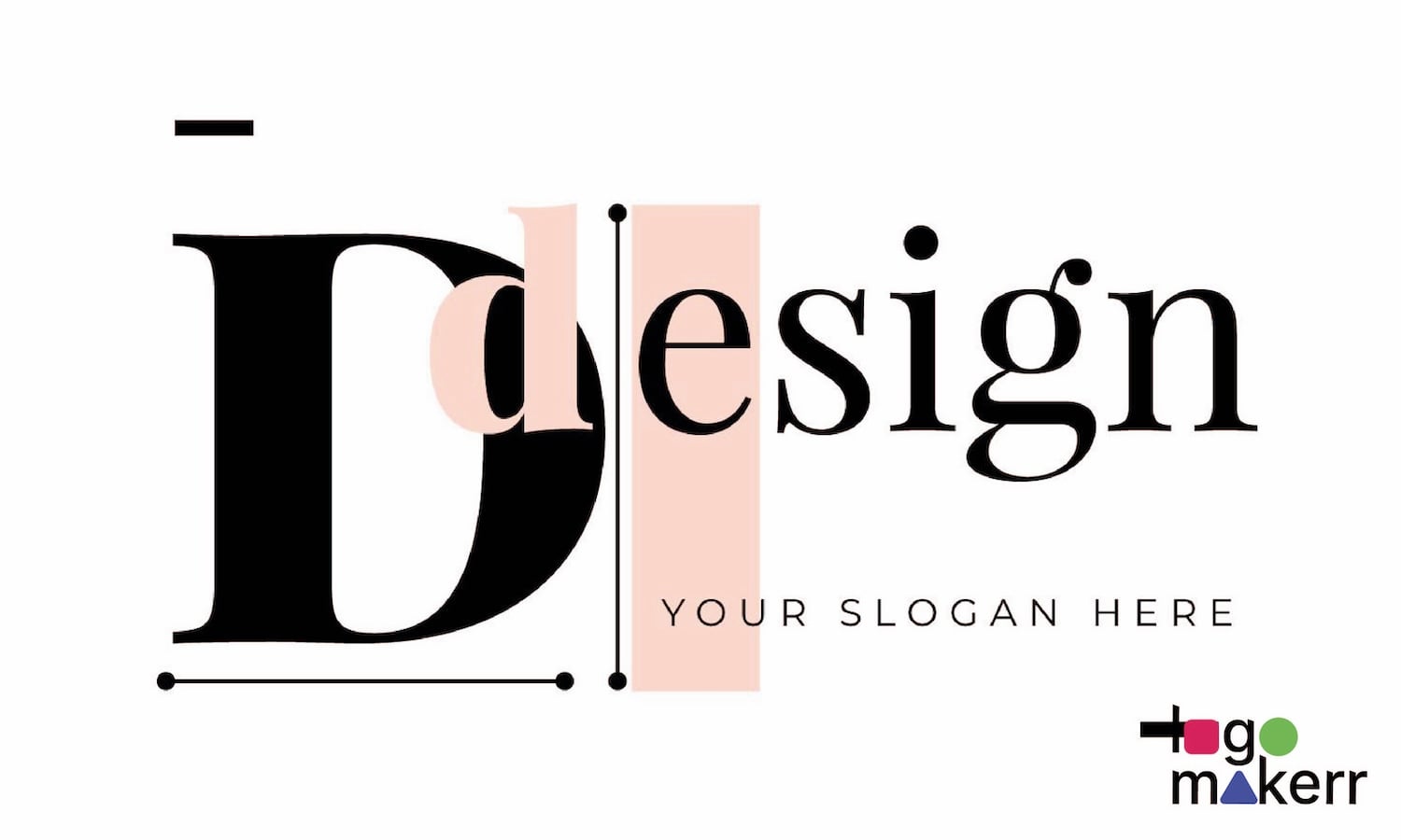
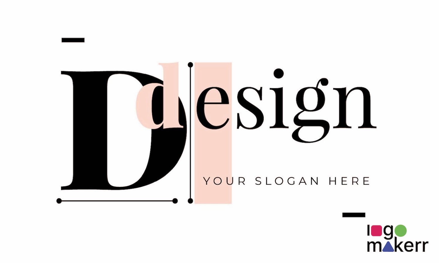
Minimalism in design is not just a trend; it is a philosophy that embraces the concept of “less is more.” This approach seeks to eliminate the unnecessary, stripping away the superfluous elements to reveal the essence of a logo design. No wonder why a lot of businesses, freelancers, and those who wants to build their personal brands turn to a free logo generator these days!
When designing lettermark logos—logos that utilize initials or abbreviations of a brand’s name—minimalism becomes even more significant.
This is because focusing on typography and the strategic use of negative space, designers can create logos that are not only visually appealing but also easily recognizable
With all these in mind, let’s take a look at what is a lettermark logo and how you can design it using an AI logo generator!
What is a Lettermark Logo?
A lettermark logo is a sophisticated and streamlined design that utilizes the initials or letters of a brand’s name to create a distinct visual identity.
Unlike more intricate logos that incorporate imagery or elaborate graphics, lettermark logos focus on typography to convey a brand’s essence in a clean, minimalistic way. This approach is particularly effective for companies with long or complex names, allowing them to distill their identity into a memorable and recognizable format.
Think of iconic examples like IBM, CNN, and HP. Each of these brands has transformed their lengthy names into succinct, impactful visuals that emphasize their initials.
The beauty of a lettermark logo lies in its simplicity and versatility; it can be easily reproduced across various media, from business cards to billboards, without losing its clarity or impact.
When designing a lettermark logo, the choice of font is crucial. The typography should reflect the personality and values of the brand—whether that’s modern and sleek, traditional and elegant, or bold and adventurous. Color also plays a pivotal role, as it can evoke emotions and set the tone for how the brand is perceived.
Sounds simple, isn’t it?
Key Principles of designing a Lettermark logo
When it comes to crafting lettermark logos, understanding the key principles of minimalist design is essential. Minimalism is not just about stripping away elements; it’s about distilling your message to its most essential form while maintaining clarity and impact. Here are several fundamental principles to consider when designing a lettermark logo;
Simplicity is Key
- Keep the design clean and uncomplicated.
- Focus on the essential elements that convey the brand’s identity
Typography Matters
- Choose fonts that reflect the brand’s personality.
- Ensure the text is legible and visually appealing.
Versatility
- The logo should look good in various sizes and formats.
- It should be adaptable to different backgrounds and uses.
Memorability
- Design a logo that is easy to remember and recognize.
- Aim for a unique and distinct look.
Timelessness
- Create a design that will remain relevant and effective over time.
- Avoid overly trendy elements that might become outdated.
Balance and Proportion
- Ensure the logo is well-balanced and proportionate.
- Pay attention to spacing and alignment.
Relevance
- The design should align with the brand’s values and message.
- It should resonate with the target audience.
If you adhere to these key principles, you’ll be well on your way to creating a lettermark logo that is not only visually striking but also resonates with your audience, ensuring that your brand makes a lasting impression.
Color Theory: Minimalist Palette Choices for your Lettermark logo
Mastering minimalism in designing lettermark logos isn’t just about removing extra elements; it’s about focusing on what truly matters and creating a striking representation of a brand’s values.
Key principles include keeping the design clean and uncomplicated, choosing fonts that reflect the brand’s personality, and ensuring versatility so the logo looks good in various sizes and formats.
When it comes to color theory, minimalist palette choices enhance the logo’s elegance and effectiveness. Consider using a monochrome scheme, black and white, neutral tones, pastel hues, accent colors, earthy palettes, or a limited color scheme of two or three colors to maintain simplicity while making the logo eye-catching and memorable.
How to create a Lettermark logo with Logo Maker AI?
- Go to Logomakerr.ai.
- Click on “Let’s make a logo” to begin your project.
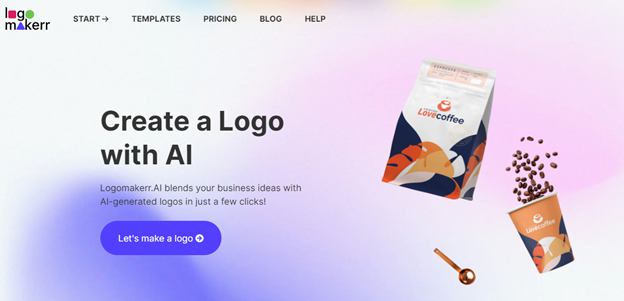
3. Input the brand name or initials you want to use for your lettermark logo. This will be the central element of your design.
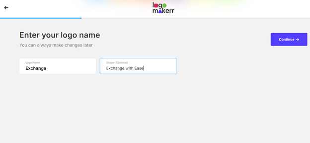
4. Browse through the font options provided. Choose a font that reflects your brand’s personality and values. Ensure it’s legible and visually appealing.
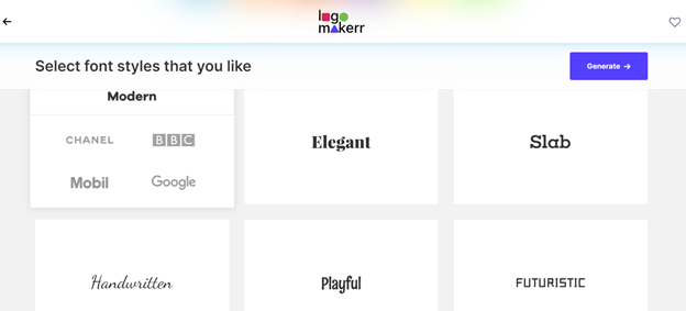
5. Adjust the font size, spacing, and alignment to create a balanced and proportionate design. Use the color picker to choose a minimalist palette. Consider monochrome, black and white, neutral tones, pastel hues, accent colors, or earthy palettes.
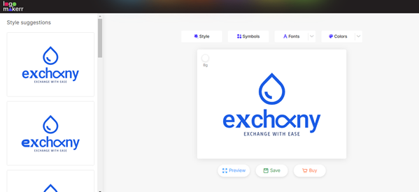
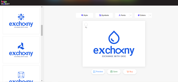
6. Use the preview function to see how your logo looks in different sizes and formats. Ensure its versatile and works well across various applications.
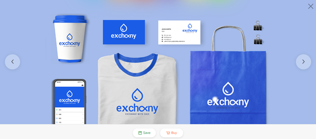
7. Once satisfied with your logo, click “Save” or “Download” to save your design. Choose the appropriate file format for your needs (e.g., PNG, JPG, SVG).
To make things much easier to understand, here’s a video you can watch to create a logo with Logo Maker AI!
Final thoughts
A well-crafted lettermark logo distills the essence of a brand into its simplest form, allowing for immediate recognition and recall. This simplicity fosters a deeper connection with your audience, inviting them to engage with your brand on a more intimate level.
Of course, if you want it easy, make sure that you use an AI logo maker for easy mockup logos.
