When you think of IKEA, what do you see?
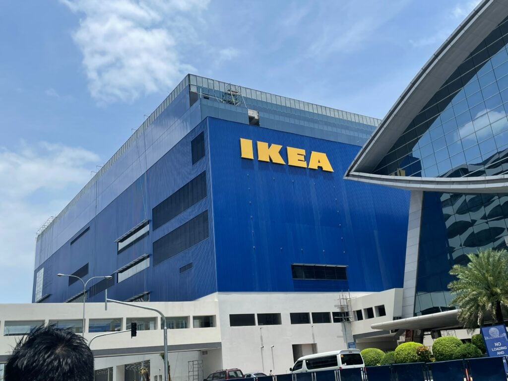
The blue-and-yellow logo is a very well-known trademark. It’s hard to imagine a time when IKEA didn’t have its own unique symbol or simple logo design.
Ikea is a Swedish furniture store that was founded in 1943. The founder, Ingvar Kamprad, wanted to create a store that would offer high-quality, affordable furniture to the public. At the time, there were very few affordable furniture stores in Europe, so he decided to open his own.
But let me stop you right there. If you want to continue all the details about Ikea and its logo, read more!
IKEA Logo Design & History
The name IKEA derives from the initials of the founder, Ingvar Kamprad, and the first letters of the Swedish words for “Ingvar Kamprad,” “Elmtaryd,” and “Agunnaryd.”
The company has grown significantly, and its emblem has become one of the most recognizable worldwide.
Why? Starting from the company name and logo, both are simple and distinctive, making them easy to remember and instantly recognizable. I-K-E-A!

This makes it easy for customers to find what they’re looking for and allows them to browse at their own pace without feeling overwhelmed.
Moreover, IKEA has always been good at marketing, and it has created an image of being a modern and hip brand without being too expensive or exclusive.
This has made it especially popular with young adults who are furnishing their first homes.
The brand’s simple, functional design is another factor that makes them so popular, and it’s one of the reasons why the company’s showrooms are often so crowded.
Meanwhile, the showroom was designed in an easily navigated way, with clearly-marked product categories and a clean, uncluttered layout.
But, just like the story of Ingvar Kamprad, the tale behind the birth of the IKEA logo is one of simplicity, necessity, and luck. It has undergone a few changes since its founding date in 1943, but the basic design has remained relatively unchanged.
The original IKEA logo was designed to be simple and easy to recognize, with blue and yellow colors representing Sweden. Over the years, the logo has been tweaked slightly, but it remains one of the most recognizable logos in the world.
The IKEA logo is simple and easy to remember.
Did you know that there’s more than meets the eye to this seemingly simple design? Let’s take a closer look at what makes this new logo so effective.
The yellow oval with the blue letters is instantly recognizable, even to people who have never been to an IKEA store. The logo’s simplicity is one of its key strengths, as it can also be easily printed on products and marketing materials.
IKEA has created a logo that is so simple and iconic that no one can forget it. And they did it all by using their own name—a completely pronounceable name.
Anyway, IKEA’s logo is simple and easy to remember because it uses just four letters. These letters are pretty easy to draw with your eyes closed (not as easy as a smiley face or an arrowhead).
Plus, drawing their logo will be even easier if you’ve ever been inside one of their stores before since you’ll already know how it looks in person!
The colors are warm and complimentary.
The IKEA logo is a classic example of complementary color pairings.
It consists of a yellow oval and a blue rectangle. This simple design is an example of a classic color pairing known as complementary colors.
Blue and yellow are two colors that are so different from each other that they don’t even look like they belong to the same family. But then, if you put these colors next to each other, they create an entirely new color.
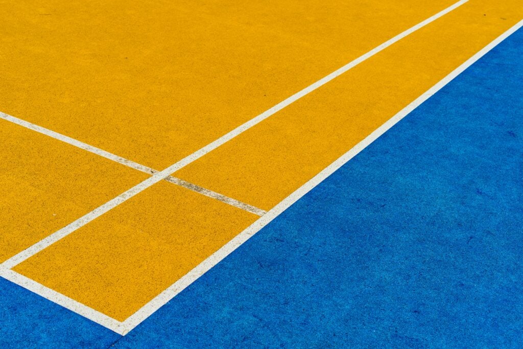
The blue is a cool shade, while the yellow is warm; they’re also very bright. When you put them together, what you get is something that looks like it’s straight out of a children’s book—it’s happy and cheerful, with just enough contrast between the two colors to make it enjoyable without being overwhelming or distracting.
It’s no wonder that IKEA has become such a massive success over the years—their branding is built around these complementary pairings of colors in their logo design!
The IKEA logo font is modern and stylish.
Here’s a little secret: IKEA is a little bit more than just furniture.
Sure, they make some of the most iconic and affordable pieces of furniture in the world. But they also produce some of the most recognizable logos in history. And if you’re not convinced yet, we’ll just have to keep going—because there are so many reasons why their logo is so great!
The font is modern and stylish, which goes perfectly with their mission statement “to create a better everyday life for the many people.” It’s bold and straightforward, designed to stand out against any background or color scheme without getting lost in the shuffle. Just like their furniture!
And finally, there’s one last feature that makes this logo so great: it works both vertically and horizontally! Whether you see it on a sign or printed on paper, it always looks great—which means it’ll work wherever you need it.
Overall, it reflects the company’s values.
The design has successfully maintained IKEA and Ingvar Kamprad’s identity and ideas. After many years of success, the IKEA brand is one of the best examples of presence, and a solid and memorable brand can go far in the industry!
The design also speaks volumes about what kind of company IKEA is, explaining why it has become so iconic over time. These things are important to most people since they want to feel relaxed when shopping around town instead of stressed out over prices or crowds.
It has no unnecessary elements and conveys the idea that you can buy furniture from them without spending too much.
It also has been carefully designed for any particular region or culture—it’s just universally recognizable as something related to furniture. This logo is a great demonstration of the power of simplicity, which allows the brand to be versatile enough for various uses, from clothing and furniture to food packaging and even toilet paper rolls.
The overall design is highly functional, conveying Ikea’s commitment to functionality and high adaptability. This flexibility reflects Ikea’s global reach and its ability to appeal to customers from all walks of life.
What Makes You So Confident?
Our team at Logo Maker AI has experience and background in creating different types of designs, primarily logo design, which is why we offer thousands of logo templates that you and other startup brands can use, customize, and purchase at an affordable price!
Because indeed, IKEA is one of the best wordmark logos you can see out there.
So what are you waiting for? Try creating your brand logo today!