Gradient logos are a great way to stand out from the competition and create a unique branding identity for your business. They can be used on websites, social media, and other marketing materials to help you stand out from the crowd.
Here are a few reasons why you might want to learn how to create your logo design (whether you are using a simple, free logo maker or hiring a graphic designer):
- To create a unique branding identity for your business
- To stand out from the competition
- To create an eye-catching and memorable logo
- To make your business look professional and modern

One of the common challenges people have when creating gradient logos is understanding how to use color effectively. Choosing the right colors and creating a harmonious design that looks good on all media types can be tricky.
However, when is a gradient logo acceptable? And what hues work well together to create a gradient? Everything will be covered, including the gradient design and how to create one. Let’s get started!
Is There Such Thing As A Gradient Logo?
A gradient logo is a type of logo that uses two or more colors to create a visually pleasing effect. Gradients (also called color ramps or color progressions) are colors that gradually fade, creating a smooth transition from one color to the next.
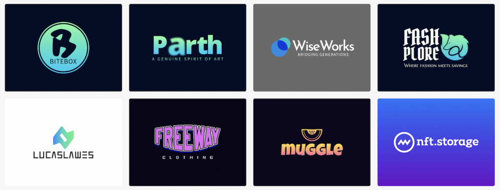
Gradients come in three main varieties: linear, radial, and conic. Each method of blending the colors differs slightly, but they all result in the same blended gradient effect.
Businesses often use this hottest design trend to create unique branding identity and stand out from the competition. A gradient logo design can be used on websites, social media, and other marketing materials to help your business look professional and modern.
When to Choose a Gradient Logo Design?
Looking for a way to differentiate yourself from your rivals? Then, making your gradient logo might be the secret to standing out. Logos frequently have a 3D effect thanks to gradients, making a design stand out on the screen.

However, we don’t advise picking a colorful gradient logo to be different or because it’s in style. It must be consistent with your brand identity and, more importantly, appeal to your target market.
For instance, using a gradient logo for your law firm is probably not going to go over well with your clientele, who are accustomed to seeing traditional and simple law logos on black and white backgrounds.
On the other hand, you’ll have more freedom to experiment with fun styles and colors if you’re creating a gradient logo design for your online health and wellness blog.
Having a gradient logo design is ideal if:
You only use it for online (and fun) purposes.
Due to their use of various colors, gradients are typically difficult to print. You should strongly consider using a flat design if your company will be marketing primarily through print materials like menus, business cards, signs, or other decorations.
You’re in the tech industry.
If you work in tech, having a gradient logo design is practically a must. Most tech companies these days have some bold gradients in their branding, whether in their website design, logo name, app icons, or even product packaging.

Some examples of well-known tech companies that use gradients in their logos are Google, Firefox, Apple, and Instagram.
Your target market is millennials.
Gradient logo designs are especially popular with millennials, who are known for their preference for more modern and trendy designs with multiple colors.
If your target market is millennials, using a gradient logo design could help you better connect with them and appeal to their sense of style.
How to Create a Gradient Logo?
Now that we’ve gone over when you should and shouldn’t use a gradient logo design, it’s time to learn how to create one.
There are four main steps in the process:
- Choose your colors
- Create your design
- Pick a gradient type
- Export your design
Let’s go over each step in detail.

Choose your logo colors.
The first step is to choose the colors you want to use in your gradient logo design. You can either pick two colors that complement each other or choose a color scheme from an online tool like Adobe Color.
When choosing your colors, it’s important to remember how the different hues will look when blended together. You’ll also want to ensure that your chosen colors fit well with your brand identity.
Create your design
Once you’ve chosen your colors, it’s time to start creating your gradient logo design. If you’re not a designer, you can use a free AI logo generator like Logo Maker AI to create a professional-looking logo in minutes.
If you are a designer, you can use Adobe Photoshop or Illustrator to create your own custom gradient logo design from scratch.
Pick a gradient type
There are two main types of gradients: linear and radial.
A linear gradient goes from one color to another in a straight line, while a radial gradient starts as one color and then gradually changes into another color in a circular pattern.
Export your design
Once you’re happy with your gradient logo design, it’s time to export it. If you’re using Logo Maker AI, you can download your gradient logo for free in either PNG or JPG format.
If you’re designing your logo in Photoshop or Illustrator, you’ll need to export it as a PNG file to preserve the gradient’s transparency.

What’s Next?
Gradient logo designs are an excellent way to modernize your brand and appeal to millennials. However, they’re not ideal for companies that rely heavily on print marketing, as they can be difficult (and expensive) to reproduce.
When creating gradient logos, choosing colors that complement each other and fit well with your brand identity is important. Before exporting your design, you should also decide whether you want a linear or radial gradient.
If you’re not a designer, you can use logo maker apps like Logo Maker AI to create a beautiful gradient logo in minutes—no design experience is required!
That’s it for our guide on gradient logo design! We hope you found it helpful. If you have any questions or comments, feel free to leave them below.
