Given our digital world, most online businesses start with the proper eCommerce web design tips or practices if you want to boost your sales, get more leads, and retain your existing customers.
The online space is highly competitive, and you ought to know that consumers love a seamless experience. That’s why we’ve run through the best practices to turn your fortunes around if you are running an online store and grappling with low sales.
Here are the best eCommerce web design tips to boost your sales.
8 eCommerce Web Design Tips
Just as there are best practices for web design, there are also best eCommerce web design tips and practices. By following these tips, you can create a website that looks great and helps convert visitors into customers.
1. Be Creative with CTAs
A CTA (call-to-action) is an essential ingredient in the success of any eCommerce site because they redirect visitors to desired page, item, or product.
It is worth noting that over 90% of those who visit your site read your CTA. Therefore, you should create creative, clear, and eye-catchy CTAs that’ll make user navigation easier and full of fun.
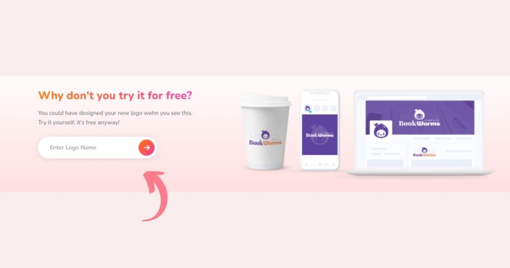
A well-designed and attractive CTA can help fetch traffic and sales into your eCommerce. You can make your CTA attractive by using the right colors, frames, sizes, and words. You can even benchmark other established websites or seek advice from seasoned CTA designers.
2. Make Customers Feel Protected
With many eCommerce brands competing to win customer trust and drive more sales, you must pay more attention to making your website safe and trustworthy as one of the ecommerce web design tips.
According to Statista, only 2.17 percent of all eCommerce visits result in a purchase. Why? It may be easier for customers to trust those well-established brands due to their high transaction safety level and reputation, creating more trust and sales.
The good thing is you can do something to convince customers without draining your financial muscle. Some of the best practices for e commerce website design to improve customer trust include testimonials, reviews, contact information, positive press coverage, and trust badges.
It would help if you also worked on your eCommerce security to protect your transactions. Installing an SSL certificate to secure your site is one of the best places to start, along with ensuring you have best antivirus protection.
Not only will they help you gain customer trust, but they will also help you get noticed by the search engines and create more traffic in the long run. Incorporating a VPN for additional protection can also enhance your website’s security, further boosting customer confidence in your brand.
Remember, when customers know your website is safe, they will most likely buy, use their credit cards and share their personal information with you. Hence, this will undoubtedly improve the volume of your sales.
So, it’s necessary to buy SSL certificate and install them on your eCommerce site to ensure data integrity and instill trust in customers’ minds.
3. Provide Multiple Payment Options
While everything about your website might tick the boxes, the unavailability of a suitable payment method for a buyer can break the deal.
Of course, some local payment methods will only be available due to different restrictions and integrations. However, there are convenient and globally accepted payment modes you can use.
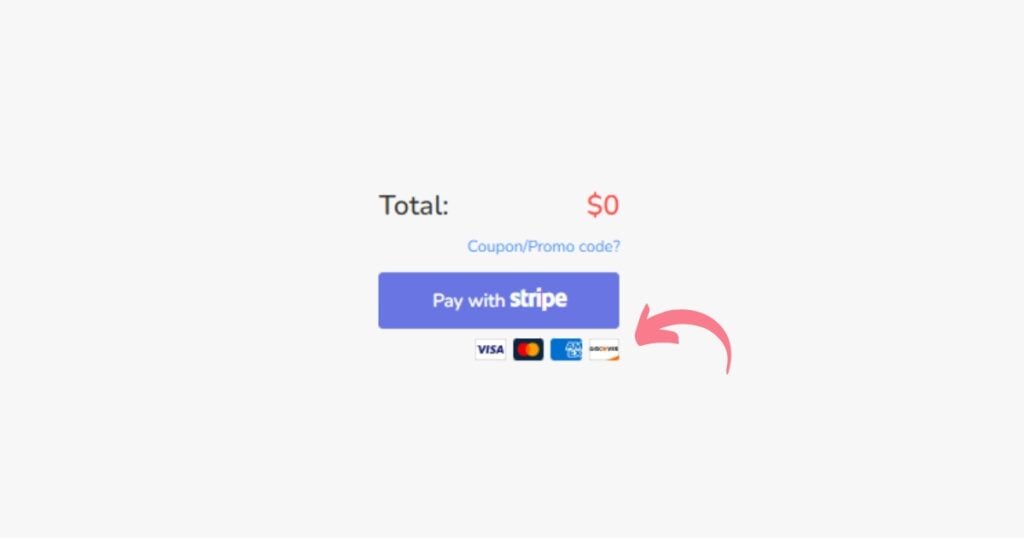
Just like what we do within our payment method. We made it simple – provide multiple payment methods, including credit cards, debit cards, bank transfers, and online invoices.
Multiple payment options maximize conversions and a great ecommerce web design tips, appeal to broader demographics, enhance brand perception, allow customers to check out quickly, and minimize abandoned carts.
4. Improve Loading Time
No one wants anything slow, including browsing your site and finding the right item or service they need.
People want to shop faster and go about their duties. So, a slow-loading page is a serious turn-off to visitors and paints a dire picture of your website.
Reputable eCommerce websites understand the importance of fast page loading and cannot afford to downplay it. If a page takes more than 2-3 seconds to load, visitors will probably lose interest and consider leaving your website.
It’s better to know if your website has this type of issue and the source of why it happens, that’s another ecommerce web design tips. Some common causes of slow loading time include heavy images, wrong server configuration, and excessive usage of themes, comments, plugins, and social media scripts.
However, you can quickly turn things around and boost your loading speed by testing your website speed, choosing a good hosting company, optimizing CSS delivery, enabling browser caching, reducing redirects, and many more!
5. Create and Maintain Customer Connection
One of the most crucial things eCommerce sites and brands need to remember is to keep in touch with customers. Creating brand connections helps retain existing customers and attract new ones because it makes them feel valued and appreciated.
According to the American Express Open summit CEO, customer behavior tells you much about your business, especially consumer-centric ones.

It’s best if you can keep them updated with everything that’s happening to your business. This includes using push notifications, emails, SMS, web/mobile banners, follow-up, maintaining personal connections and not transactional, and responding to customer concerns.
In a nutshell, the customers will feel emotionally connected to your ecommerce store and become loyal brand ambassadors.
6. Optimize Your Website for Mobile Devices
The usage of mobile phones to make a purchase is massive, and there are no signs of slowing down is another ecommerce web design tips.
Mobile devices are convenient, easy to use, save time, and make it easy to switch to your regular phone apps. Customers love the convenience and will probably shop anytime, anywhere, because a mobile phone is easy to carry around.
Hence, it’s unsurprising that over 50% of eCommerce purchases happen over mobile phones.
Thus, not paying attention to using mobile devices for an eCommerce brand is a big mistake. On the other hand, making your website mobile-friendly is the new norm for serious eCommerce platforms.
You can avoid using big banners and pop-ups if you want to make your website mobile-friendly. Make CTAs clear to read within a small screen, show essential things at the top, and display products orderly.
7. Keep Navigations Simple
When customers visit your ecommerce website, they would always want an easy-to-use interface and a seamless process. After all, anything that involves money must be simple and trustworthy.
Let’s take Logo Maker AI, an AI logo generator, for instance. The purpose of our product is to create a logo. So, how would we make visitors realize that that is what we do?
When you go to our home page, you can see that’s what we encourage people to do – type in their brand name, browse from our logo templates, and either download them as is or make customization. Simple, isn’t it?

They want to avoid making mistakes and paying for the wrong products or sites because of the complexity of your site. This is why simple navigation and a great user experience are needed! Accessing resources for elevating UX research skills can further refine these aspects, ensuring a seamless journey for your users.
Some ecommerce business put their customer in a series of challenging steps just so their website may not look basic. But in reality, customers will only tend to get bored and immediately switch to other sites.
What should you do? Simplify your navigation bar and get rid of cluttering. Allow customers to move quickly and track their behavior across the site. Refrain from giving them unnecessary cognitive load because they will run away, and you will struggle to retain and attract other customers.
8. Insert Attractive Images and Themes
Another ecommerce web design tips is appealing images and themes attract visitors, so you probably need to work on exciting visitors and dull, outdated, and non-appealing ideas.
The product or service images should be colorful and not exaggerated. It is easy for customers to buy target products if they get a good product view. You can add colorful themes that blend well with your product and make it eye-catchy.
Make sure you choose the right colors and font to make a good impression easily. Remember, you may not find another chance to make a first impression. Therefore, pull all your strings to make your e-commerce website design attractive to visitors.
Wrapping Up
Start building your eCommerce website today. When creating a comprehensive eCommerce company, one of the most crucial factors that business owners and marketers must consider is design. After all, visitors to your eCommerce business may form a perception about your site in seconds.
First impressions are essential. Make an exciting logo that goes well with your eCommerce site. Your logo is the face of your business and the first thing people will notice about you, so it’s important to think about it.

A good website takes effort and innovation, and a quality eCommerce site needs many studies and artistic endeavors.
A well-designed website has a genuine chance of delivering the wow factor. Take your time, research, invest, and then build!
So, is it all worth it? In essence, you should increase sales by using eCommerce best practices. Your eCommerce site’s traffic will increase, and more of that traffic will be converted into sales.
