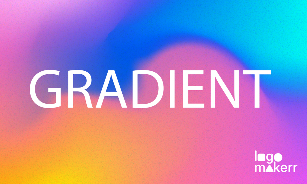
Did you know that 94% of people say first impressions are based on design? One of the hottest trends in logo design today is the use of gradient effects. Gradients bring your logo to life, adding depth, dimension, and a fresh, modern look.
But how do you use gradients effectively in your logo? In this guide, we’ll walk you through the steps to create a stunning gradient logo that truly stands out.
Why Gradient Effects Are Trending?
Gradients have made a big comeback in recent years, especially in digital and branding design. But why are they so popular? Here are a few reasons:
Depth and Dimension
Gradients add a sense of depth and realism to a flat design, making your logo appear more three-dimensional. This can help your brand stand out, especially in digital spaces where flat designs can sometimes feel lifeless.
Versatility
Gradients are incredibly versatile. They can be subtle and smooth, or bold and vibrant, depending on the colors and transitions you choose. This flexibility allows you to tailor your gradient effect to fit your brand’s personality.
Modern Aesthetic
A well-executed gradient can give your logo a sleek, modern look that feels fresh and contemporary. This is particularly important for brands that want to appear innovative and forward-thinking.
How to Create a Gradient Logo: Step-by-Step Guide

Creating a gradient logo might seem challenging, but with the right tools and a bit of creativity, you can design a logo that’s both eye-catching and professional. Here’s how to do it:
1. Start with a Solid Foundation
Before you dive into gradients, it’s important to have a strong base for your logo. This means choosing a shape, symbol, or wordmark that effectively represents your brand.
2. Choose Your Gradient Style
There are several types of gradients you can use in your design:
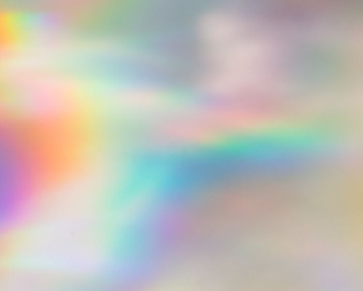
- Linear Gradient: This is the most common type, where colors blend smoothly from one side to the other in a straight line. It’s simple, versatile, and works well in most designs.
- Radial Gradient: In this type, colors radiate outward from a central point, creating a circular effect. This is great for logos that need a focal point or center of attention.
- Angular Gradient: This style blends colors in a circular pattern, but with angular transitions, making it perfect for logos that need a bit more edge and complexity.
Depending on your brand’s identity and the message you want to convey, choose the gradient style that best fits your design.
3. Select Your Colors Wisely
The colors you choose for your gradient will significantly impact the overall look and feel of your logo. Here are some tips to help you make the right choice:
- Stick to Brand Colors: If your brand already has established colors, start with those. Gradients can enhance your brand colors by adding dimension without straying too far from your core identity.
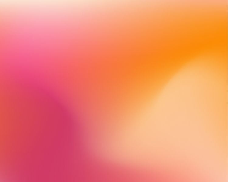
- Use Contrasting Colors: Gradients that transition between contrasting colors can create a bold and dynamic effect. For example, transitioning from a deep blue to a bright yellow can make your logo stand out.
- Consider Emotion: Different colors evoke different emotions. Warm colors like reds, oranges, and yellows can feel energetic and exciting, while cool colors like blues and greens can feel calming and trustworthy. Choose colors that align with the feelings you want your brand to evoke.
4. Apply the Gradient Effect
Once you have your base design and color choices, it’s time to apply the gradient. Here’s how you can do it:
- Use Design Software: Tools like Adobe Illustrator, Photoshop, or even online tools like LogoMakerr.ai, offer gradient tools that make it easy to apply and adjust gradient effects. Start by selecting your base shape or text and then choose the gradient tool to apply your chosen gradient style.
- Adjust the Transition: After applying the gradient, adjust the transition between colors. You can make it smooth for a subtle effect or sharp for something more dramatic. Play around with the angle, spread, and color stops to find the perfect balance.
- Preview in Different Contexts: Once your gradient is applied, it’s important to see how it looks in different contexts. Test your logo on various backgrounds, in different sizes, and across different media. This will help ensure that your gradient logo looks great everywhere it’s used.
5. Add Finishing Touches
After applying your gradient, take a step back and review your design. Consider adding a slight shadow or highlight to enhance the 3D effect.
Make sure the logo is balanced, with no color overpowering the other, and that it maintains readability and clarity, even in smaller sizes.
Real-World Examples of Gradient Logos
To get a better idea of how gradients can be used effectively in logo design, let’s take a look at some real-world examples:
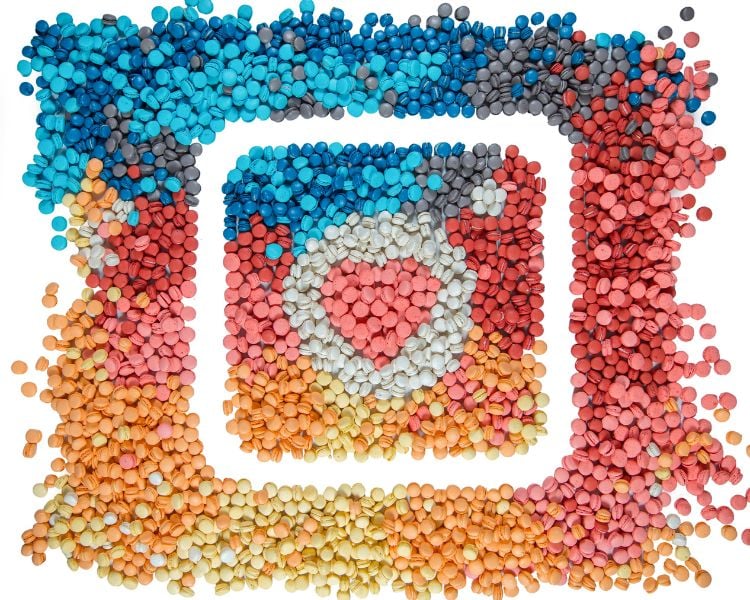
- Instagram: Instagram’s logo is one of the most recognizable gradient logos out there. The transition from pink to orange to yellow creates a vibrant and dynamic feel that perfectly matches the platform’s energetic and creative community.
- Asana: The project management tool Asana uses a subtle gradient in its logo, transitioning from a soft coral to a light pink. This gradient adds warmth and a touch of friendliness to their brand, aligning with their mission to create a positive and collaborative work environment, a feeling many users look for when considering Asana alternatives.
- Microsoft: Even tech giants like Microsoft have embraced gradients. Their four-color window logo features a gradient that adds depth and a modern twist to their long-standing brand.
These examples show how gradients can be used to enhance a logo, making it more modern, dynamic, and engaging.
Here’s how to make Gradient Logos with Logomakerr.ai
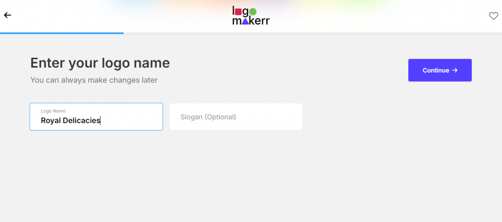
- Go to Logomakerr.ai
2. Enter your brand name, choose colors that matches your preferences, and tap the color of your choice.
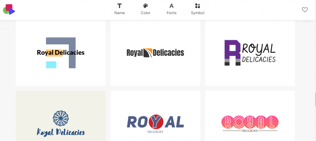
3. Choose a logo you like and click ‘Edit’.
4. After that, click on the symbol of your logo, tap the color option then choose ‘Gradient’.
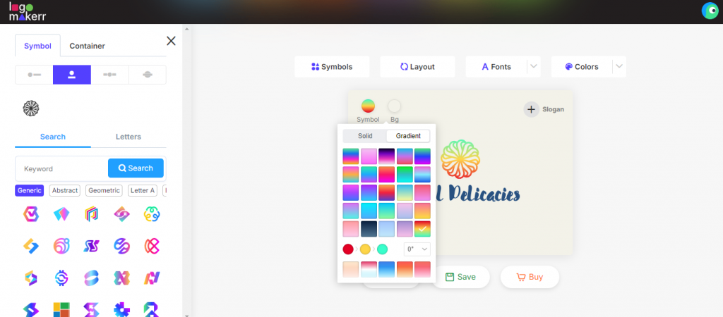
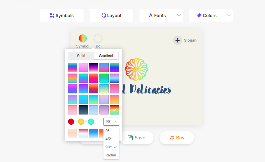
5. Pick the color you love and select the angle or degree you’d like your Gradient logo to look like.
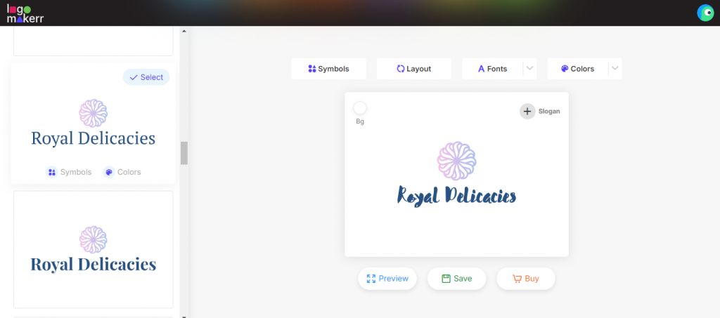
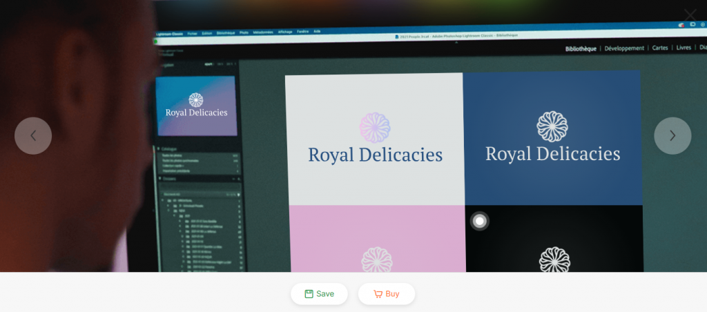
6. You can always change the font, colors, or background color you prefer. Tap ‘Save’ or ‘Preview’ to see how your logo would look like in packaging, billboards, marketing materials, website, etc.
7. And that’s it! You can buy your logo and download it in high-quality file for your business or personal use.
Conclusion: Bring Your Logo to Life with Gradients
With LogoMakerr.ai, you can effortlessly design professional-grade logos with stunning gradient effects, all within a user-friendly platform.
It’s fast, affordable, and gives you full creative control, so you can bring your vision to life in just a few clicks. Start designing your dynamic gradient logo today with LogoMakerr.ai, and watch your brand shine!