Have you ever wondered why some brands have such a wide appeal, and others have so little? You may think that you’re doing everything right, but maybe you aren’t.
Colors that go together can make or break your logo design, branding image, marketing copy, or anything at all. Not only do colors influence your brand’s tone, but they also affect your audience’s perception of your product, service, company, and business.
It’s important to know which colors are best suited for your brand and which ones to avoid.
What about two or three colors that look good together? Color combinations create a more compelling and attractive visual experience for your audience.
Yet, some colors look great together while others don’t. In this article, we’ll show you five color combinations that look fantastic and which are guaranteed to appeal to your audience.

Theory Behind Color Combination
Color is one of the most powerful tools in the marketing toolbox. It helps you convey your message, set the tone, and create an emotional connection.
What colors a person sees depends on various factors, conditions including their eyes, the light at the time of day, and what they are wearing. Yet, people process color differently.
According to the psychology of color, certain types of colors can evoke a specific emotion in people. Meaning, that when consumers purchase something, their brain responds to different colors in different ways.
For example, shades of blue might be an eye-catching color in an ad for a new car, but it might not be as important to people buying a piece of clothing. Red might be an excellent color to sell food items or beverages. Still, it may not be the most effective way to persuade people to buy products like household cleaners or electronics.
When consumers shop online, they may respond to different colors differently from in real life. Some may look more carefully at specific colors on websites.
Meanwhile, not every brand sticks to a single color alone. In fact, successful businesses have mastered the art of color combination, which serves as an effective sales tool as well.
How so?
A combination of two colors has the power to stimulate emotions. When a viewer looks at a photo and sees two different hues of a single color, the brain automatically processes the image as a whole, creating a unified feeling and perception.
The Color Wheel and Its Basic Colors
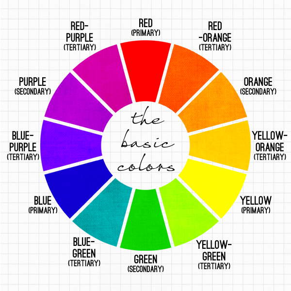
All colors comes from the various combinations and ratios of the primary colors red, blue, and yellow.
You can make a secondary color by combining two primary colors, and a tertiary color is produced by combining a secondary color with a primary color.
- Primary colors: Red, blue, yellow
- Secondary colors: Orange purple, green
- Tertiary colors: Blue-green, red-orange, yellow-green
It’s important to keep the basic colors in your back pocket so you can easily reference how color combinations are made.
Finding Colors That Go Together (So Well)
We’ve all been there.
You see a great-looking product at a reasonable price, and your immediate impulse is to click the buy button. However, what sudden urge made you want to make a purchase?
What was it that was so attractive about that product? It wasn’t because you were excited about the color scheme or the brand. You subconsciously recognize that they go together and have the same meaning.
So how do you go around and find colors that go well together (alone)?
A great way to find what colors go together is to look at the color wheel patterns. In general, warm colors (reds, oranges, yellows, and browns) pair well together, while cool colors (blues, greens, purples, and grays) are more diverse and can go with almost any other color.
You can also put together a list of your favorite color combinations, both in terms of actual colors and patterns (for example, stripes), and then choose a color scheme that you feel makes your business stand out.
If you put the two colors together in front of your friends and family, ask what they think of the combination. If your friends are positive, it will be easier to see if the colors go well together.
There are other ways how you can choose the right color combination. This process requires creativity, but the payoff is well worth it.
Why Color Combination is Crucial?
Let’s say your business is in its beginning stages, and you want the ideal color scheme.
The use of the right color combinations helps create an intention. Colors are essential when creating your company’s branding and logo.
This is because when your target market thinks of your brand, these are the first things that come to mind. One of the first things your target market notices is color, which has a big impact on consumer behavior.
For example, when you think of Starbucks, you think of the color green. For Instagram, you think of the color pink, and Facebook is full of shades of blue. To put it simply, colors are a great way to distinguish your brand, so it’s crucial that they relate to your brand.
Classic and Modern Sample of Two-Color Scheme:
A two-color layout is the most common and popular way to produce a product, especially in graphic design. The reason for this is simple – these prints are easy to reproduce and therefore affordable for any startups or small businesses.
A two-color layout is the most common and popular way to produce a product, especially in graphic design. The reason for this is simple – these prints are easy to reproduce and therefore affordable for startups or small businesses.
Here are a few modern samples you might want to try:
Blue & Green
Some people might not agree, but when used together, the colors blue and green can be more powerful than either color individually. You can either add royal blue and a light shade of green or forest green and a light shade of blue.
Either way, a great blue-green color combination works tremendously well for almost any industry. But getting the lighter or ‘brighter’ mix has a refreshing feel that never gets boring or too bold.
The combination can also add a youthful element to any workplace or business environment.
Black & Orange
Black and orange are not only the colors used for Halloween. It’s a great color combination of branding because black symbolizes mystery and power. Orange, on the other hand, is bright and cheerful, symbolizing happiness and warmth.

If you combine these two colors that are rarely used in colors, you get a bold, powerful appearance that gives you the feeling of being in control.
Desert Sand Beige and Emperor Gray
Desert sand beige is a warm and welcoming color combination that symbolizes comfort and relaxation. Emperor gray, on the other hand, exudes authority and strength.
This color combination is perfect for businesses that want to project an air of sophistication and power.
Yellow and Blue
Primary colors are also good together, when the right shade were combined. The yellow color that instills friendly approach and (navy) blue colors that creates trust and reliability appearance gives the impression that a company is easy to work with and reliable.

Desert Sand Beige and Emperor Gray
Desert sand beige is a warm and welcoming color that symbolizes comfort and relaxation. Emperor gray, on the other hand, exudes authority and strength.

This color combination is perfect for businesses that want to project an air of sophistication and power.
Popular Three-Color Combinations:
Besides combining two colors, a 3-color scheme is also an easy way to add some character and personality to a brand. They are a great way to create visual interest. They can also be used to stand out and differentiate your brand from the competition.
Here are four of the best three-color combinations:
Beige, Brown, Dark Brown
These color combos are perfect for businesses that want to project an air of sophistication and dependability. The colors are warm and inviting, and the darker shades give the impression of stability and strength.

Blue, Yellow, Green
These colors complement each other, and they create a beautiful contrast. The colors are bright and cheerful, and they can also add a youthful element to any workplace or business environment.

Navy, Yellow, Beige
Are you noticing a bit of similarity between these colors to those in IKEA logo designs?

Navy, yellow, and beige combined form an air of professionalism and expertise. The colors are warm and inviting, and the navy or any dark blue gives the impression of stability and strength.
Gray, Baby Blue, Canary Yellow
Two lighter colors and a solid dark background are not your typical color combination, but they can be very stylish when done right. The gray and baby or light blue create a beautiful contrast, while the canary yellow adds a touch of fun and playfulness.

We can see a snap of modernity and trendiness, giving the fresh and young colors with a gray provides the impression of sophistication and expertise.
Color Combinations and Emotions Behind
Readers are most likely to engage with your writing when the colors you use create an emotional reaction.
Different color combinations produce different feelings, so it’s important to choose wisely based on the message you’re trying to convey.
For example, blue and green are often used to represent peace and nature, while red and orange can be associated with excitement and energy. By carefully selecting the colors you use, you can create a more powerful and engaging experience for your readers.
Always remember colors that go together attract consumers better.
Ready to Take On Color Combinations to Your Branding?
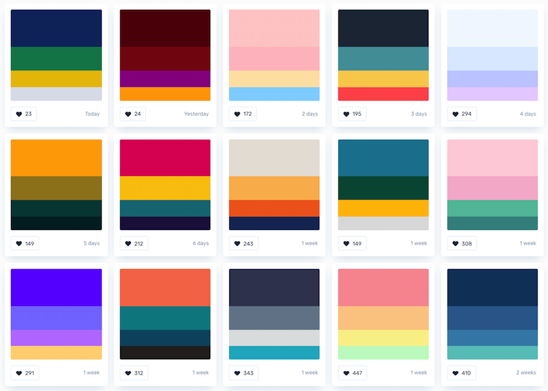
A simple rule that’s proven to work time and again is that if two colors look great together, go with it. But what happens if you place two colors that don’t play nicely together? You get a mess.
This is why people often shy away from using color combinations that look awkward together. And this is also why it’s essential to be willing to experiment with different combinations of color, just like you would when trying new products or services.
It can be a bit overwhelming at first, especially when you realize that you need to learn about all the different color combinations and the order in which you should apply them.
However, once you have a good idea of how colors work together and what order to use them in, it’s just a matter of time before your brand starts making you money!
At Logo Maker AI, we strive to help newbies and startups take inspiration and create their very own logo design from our thousands of ready-made logo templates that they (and you!) can use anytime.
Remember, don’t always need to use a specific color palette for your brand. Sometimes, it can be fun to mix up the hues. With a color combo, there are no limits to what you can achieve!
