Color is essential to our lives, from our clothes to the rooms we decorate. Whether we realize it or not, our chosen colors can profoundly impact our emotions and perceptions. But with many colors to choose from, it can take time to figure out where to start.
With the new year, it’s time to shake things up and try some new color combinations. In this blog post, we’ve compiled a list of 49 unique and beautiful logo color combinations to inspire your next project.
There’s a combination here for everyone, from soft pastels to bold and bright hues. Whether designing a website, creating a piece of art, or simply redecorating your living room, these color combinations will help you achieve your desired look and feel.
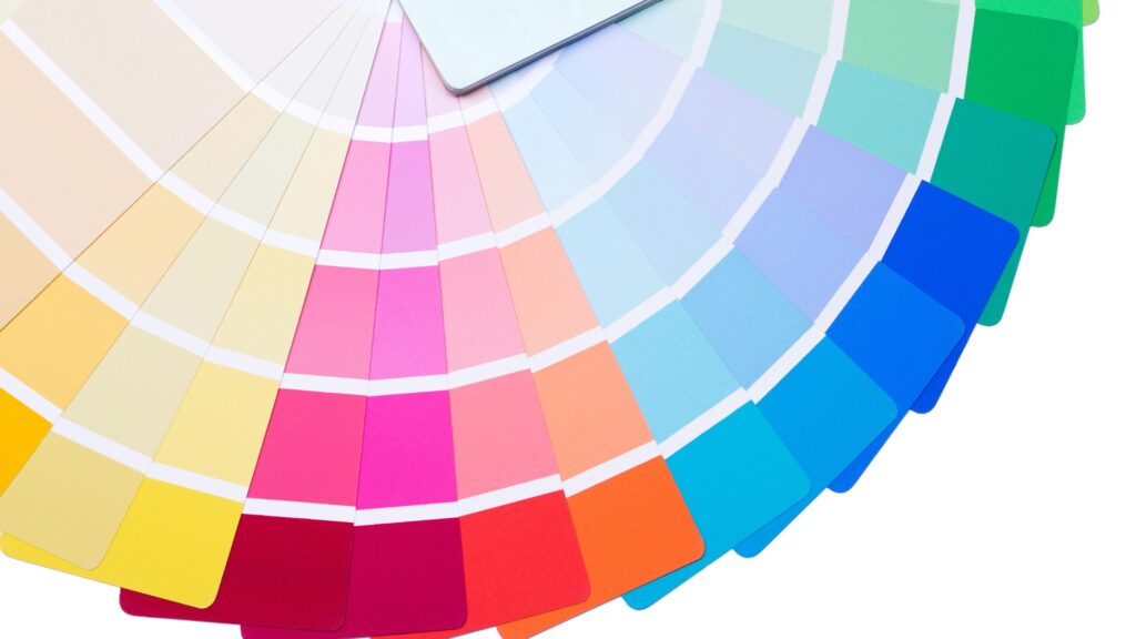
So, let’s dive in and discover some of the most stunning color combinations to try out for this year!
49 Color Combinations To Try Out This Year!
As we start a new year, it’s the perfect time to explore new color combinations and add fresh hues to your palette.
Whether you’re a designer, artist, or just someone who loves to experiment with color, this guide will inspire you to try out 49 stunning color combinations that are on trend this year!
Mustard, Yellow Fern, Green, Indigo, Blue
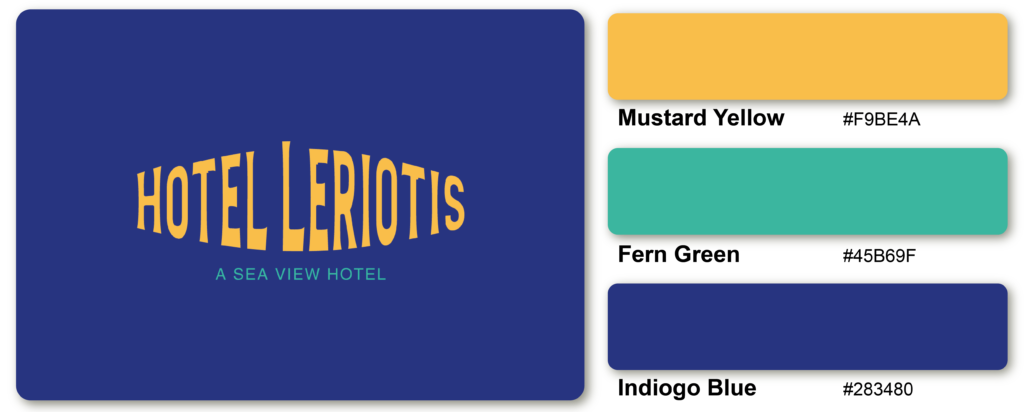
The warm and earthy tones of Mustard and Yellow Fern pair well with Green’s natural and calming qualities, while the calm and deep hues of Indigo and Blue provide a striking contrast.
The combination of black, cyan, magenta, and yellow, also known as CMYK, is a commonly used color scheme in printing and graphic design. Each color serves a specific purpose in the printing process, and together they create a wide range of colors and shades.
Crimson Red, White, and Black
These three colors can create a sense of drama and power, making them a popular choice for branding and marketing materials. Whether used in fashion, graphic design, or interior décor, the combination of crimson red, white, and black can create a dynamic and memorable impact.
Strawberry, White, Pebble Grey
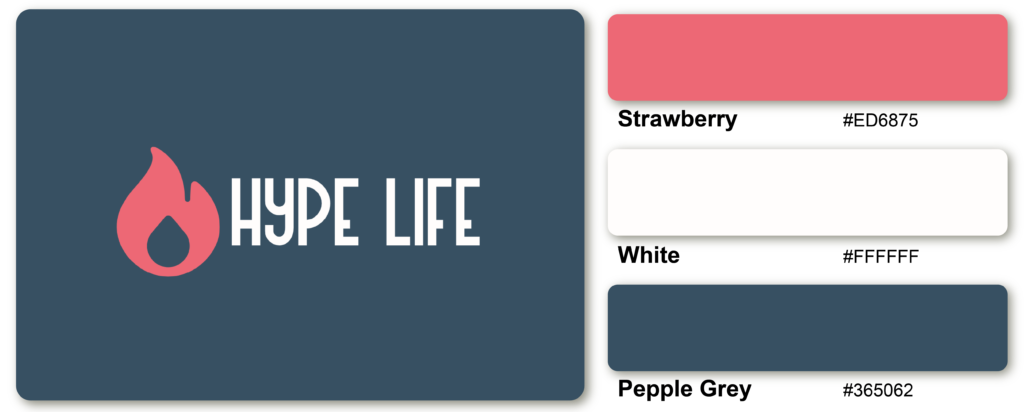
The boldness of Strawberry adds energy and excitement to the palette, while the neutral and calming properties of white and Pebble Grey balance it out. This combination is perfect for creating a refreshing and lively look with a touch of sophistication.
Black and Mustard
Black is a classic and versatile color representing sophistication, elegance, and timelessness, while mustard is a warm, vibrant shade that symbolizes creativity, positivity, and energy. When used together, black and mustard can create a perfect balance of intensity and harmony.
Latte Brown and Berry Blue
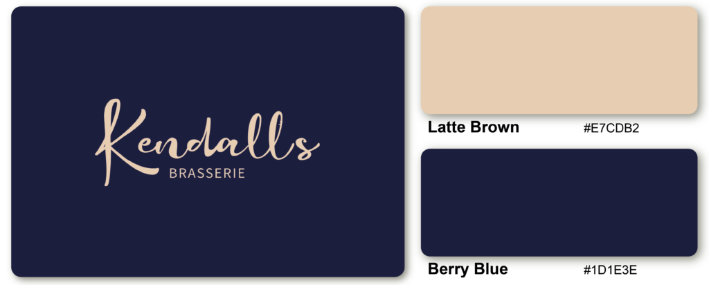
The combination of Latte Brown and Berry Blue is a warm, inviting color palette that creates a cozy and comforting look. Latte Brown is a neutral and earthy shade representing simplicity, warmth, and reliability, while Berry Blue is a bright and cheerful hue that symbolizes creativity, energy, and happiness.
Shades of Brown and Pink
Multiple pink color combinations give the design more flexibility and depth. Pink is attractive, fashionable, and abounding, and pink and dark brown provides a lot of contrast and cool colors.
Crepe Pink, Teal Blue, and Iris Purple
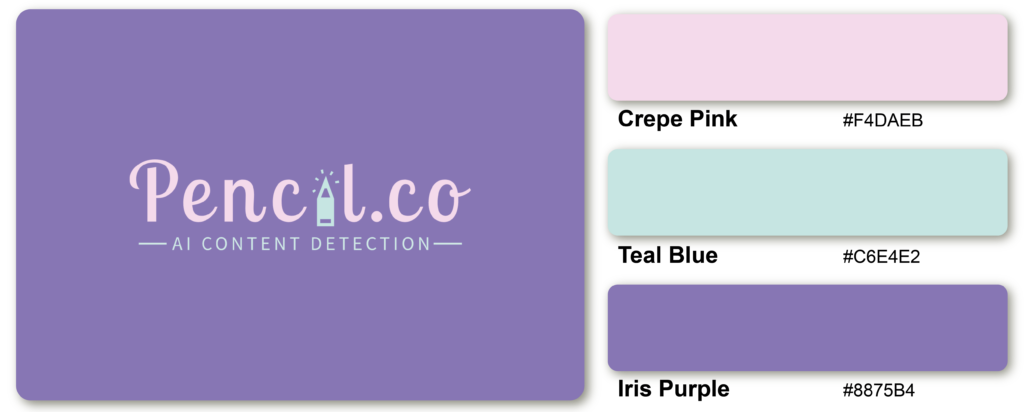
Together, these colors create a harmonious and balanced palette that is elegant and modern. Crepe Pink is a soft and delicate shade representing femininity and gentleness, while Teal Blue is a cool and calming hue that symbolizes serenity and stability. Iris Blue is an intense blue that adds depth and dimension to the palette.
Brick, magenta, goldenrod, and turquoise
This analogous color scheme figures a lot of personality into a single palette. This color scheme brings friendliness and accessibility, while the accent colors – Goldenrod, Turquoise, and Brick – add a sense of maturity and good nature to the design.
Leather Black, Cobalt Blue, and Cerulean Blue

A design featuring a cerulean blue background with cobalt and leather black accents can create a calming and grounded atmosphere. Whether used as a bold statement or a subtle accent, the Leather Black, Cobalt Blue, and Cerulean Blue combination is a great choice for those looking to create a bold and modern look.
Violet Jade, Sea Foam, and Red
The color combination of Violet Jade, Sea Foam, and Red can create a unique and eye-catching effect that evokes creativity and energy. The soft, relaxed tone of Violet Jade establishes a sense of calm and tranquility, while the refreshing shade of Sea Foam brings to mind the ocean and nature. The vibrant, fiery hue of Red adds an element of excitement and passion to the mix.
Cotton White, Emerald Green, and Parakeet Green
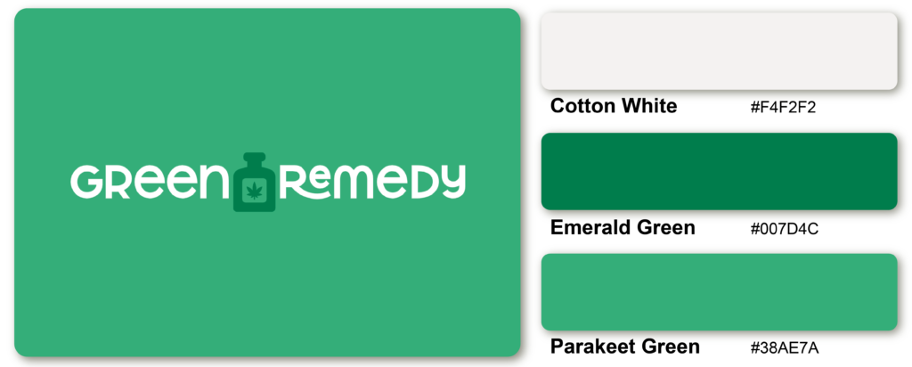
Cotton White, a pure and clean color, is the perfect neutral base for this combination, allowing Emerald Green and Parakeet Green to pop and stand out. Emerald Green, a deep and rich shade, adds a touch of elegance and sophistication to the palette, while Parakeet Green, a brighter and more vibrant shade, adds a playful and energetic element.
Red-Orange, Navy, Almond, and Mango
This harmonious color scheme of neutral almond and navy, with burning accents against it, translates to dependability and strength.
Seafoam Green, Slate Grey, and Porpoise Grey

Seafoam Green, a soft and muted green shade with a hint of blue, is the primary color of this combination, and it adds a sense of tranquility and freshness to the overall scheme. Slate Grey, a calm and muted shade of grey, adds a touch of sophistication and elegance, while Porpoise Grey, a darker and warmer shade of grey, adds depth and richness to the palette.
Grey, Charcoal, and Gold
A perfect blend of light and sincerity. In many religious settings, gold evokes divinity and power, which pairs perfectly with two different shades of black and grey that add a layer of maturity.
White, Magenta, and Black
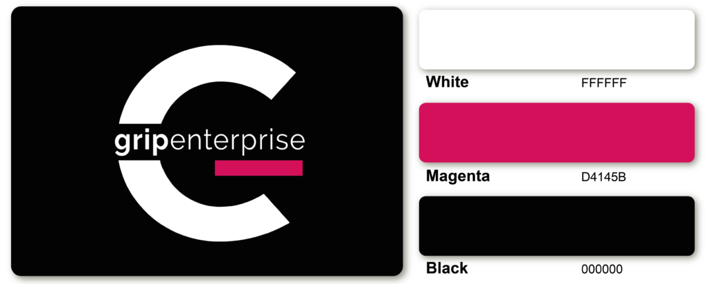
The color combination of White, Magenta, and Black creates a bold and modern color scheme that can be used in various design contexts. White serves as the primary neutral color in this palette, while Magenta and Black add pops of color and contrast.
Salmon, Peach, and Teal
Salmon and peach are two shades that aggregate each other, which go along beautifully, while the teal accent adds a second level of depth to the color scheme.
Chartreuse Green, Fern Green, and Black
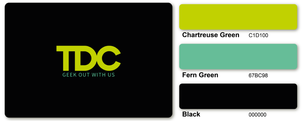
Chartreuse Green can be the primary color, while Fern Green and Black can be used for text, logos, and other design elements. This creates a high-contrast and impactful look perfect for branding, advertising, and marketing materials.
Shades of Blues and Greens
The accent combination of blue green is filled with dynamic natural colors, still representing nature, growth, trust, and intelligence.
Magenta, White, and Indigo Blue
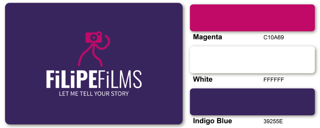
When combined, Magenta, White, and Indigo Blue create a vibrant and sophisticated color scheme. The bright and intense magenta adds energy and excitement to the palette, while the clean and neutral White provides balance and contrast. The deep and rich Indigo Blue adds a sense of sophistication and depth, making this combination perfect for creating a high-impact and modern look.
Yellow, Cyan, Red, and Bright Purple
These four vibrant color palette combines primary colors that appeal to children and evoke a sense of optimism, joy, and youth.
Charcoal Black and Butterscotch Yellow
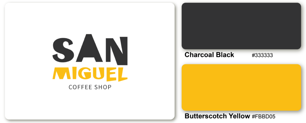
Charcoal Black and Butterscotch Yellow are two colors that create a strong and dynamic contrast when combined. Charcoal Black is a deep, dark, and neutral color that provides a sense of grounding and sophistication to the color scheme, while Butterscotch Yellow is a warm and lively color that offers a pop of brightness and energy.
Seafoam, Green, and Light Pink
This triadic color scheme combines soft shades of natural greens and blues with hot pink accents to create a sense of warmth, luxury, and calmness.
Parakeet Green and Black
This color combination is often associated with nature, as the vibrant green can represent new growth and vitality, while the black can symbolize the mysterious and powerful forces of the natural world. It can also evoke a sense of sophistication and elegance, as the pairing of bright and dark tones creates a timeless and refined look.
Yellow, Magenta, and Fuchsia
Combining fuchsia, yellow, and magenta will give you a modern, young, vibrant, and bold look. Using these three colors in your design will make it stand out and ensure you make a good first impression on your audience.
White and Purple
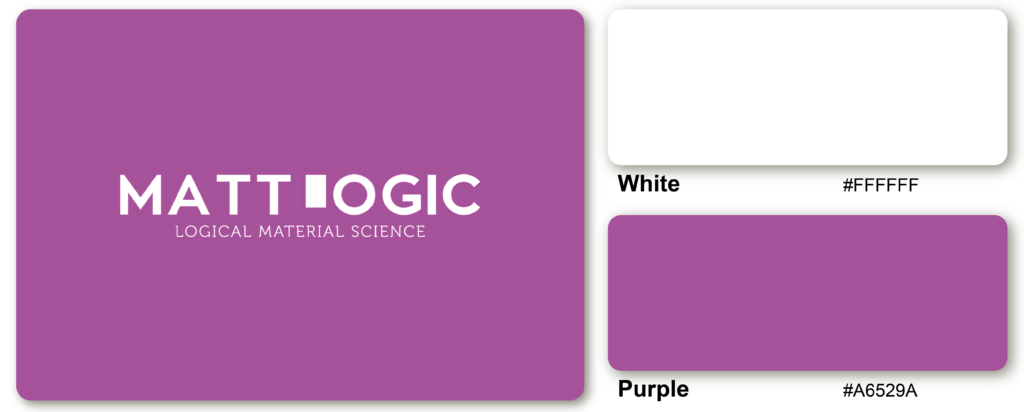
The cool, crisp, and pure tone of white contrasts elegantly with the rich, deep, and regal shade of purple, creating a sophisticated and gentle combination. This pairing creates a timeless, classic, subtle, bold look.
Raisin and Pin
The contrast created by combining these two colors displays a bold and dynamic energy. This color combination’s bright pink brings fun and youthfulness with a touch of feminity.
White and Rose Red
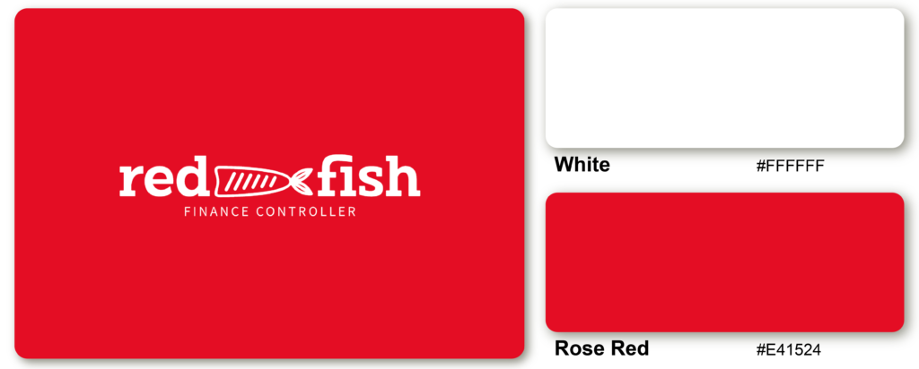
When the colors White and Rose Red are combined, they create a romantic and charming color scheme that can convey a sense of purity, sweetness, and love.
Sage, Sky Blue, Grape, and Light Pink
A lovely tropical palette: these four colors evoke the finest of beach life. Their pastel colors keep them modern, young, and playful.
Coral, Turquoise, Teal, and Grey
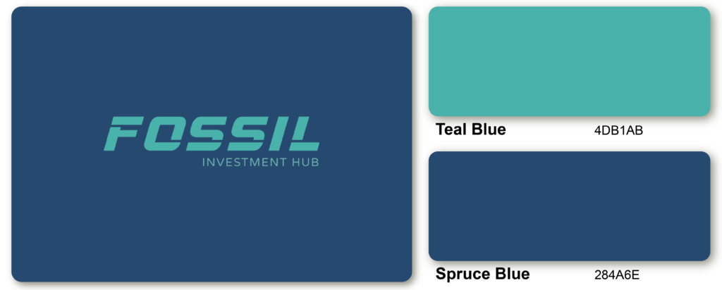
Teal Blue is a cool, greenish-blue color reminiscent of the ocean or a tropical lagoon, while Spruce Blue is a deep, cool blue with green undertones that bring to mind the forest and the great outdoors. These colors create a harmonious, balanced, soothing, and refreshing contrast.
Coral, Turquoise, Teal, and Grey
This complementary color combinations combines blue’s calming properties with Green’s renewing qualities. It is a color built up and restored and represents open communication and clarity of thought. Elegant grey symbolizes neutrality and balance.
Indigo Blue and Magenta Purple
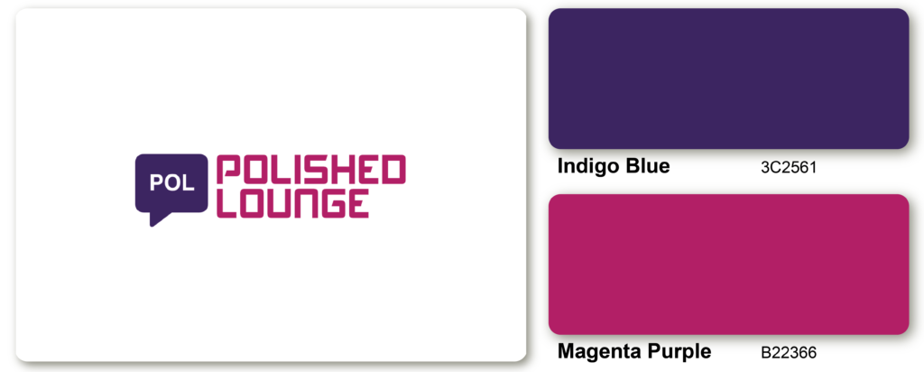
The Indigo Blue and Magenta Purple color combination is often associated with spirituality, creativity, and innovation. It can be a great choice for artistic endeavors, as well as for businesses and products that emphasize originality and inventiveness.
Shades of Blue and Raspberry
The foundation of this combination, like the palette above, is trusted blue. At the same time, the pinkish-purple addition of raspberry represents sensual experiences and the heart’s blood, which is the source of all acts of kindness.
Hot Pink and Black
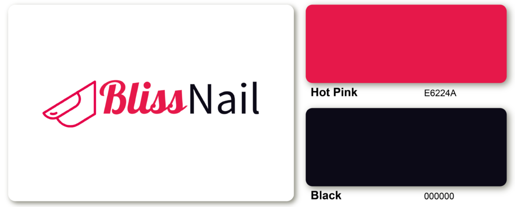
The Hot Pink and Black combination is often associated with femininity, glamour, and nightlife. It can be a great choice for fashion and beauty products, as well as for branding and advertising. This color scheme is also popular in interior design, where it can create a bold and modern look.
Hazelnut Yellow and Black
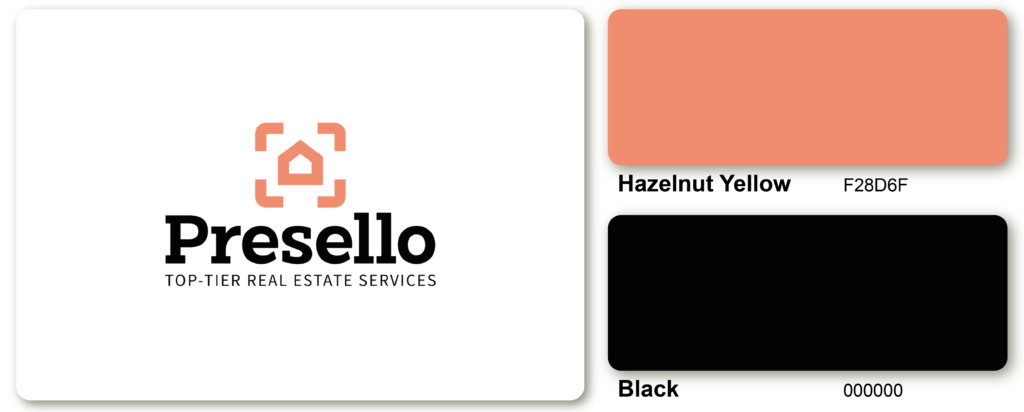
The combination of Hazelnut Yellow and Black is a striking contrast of cool and warm colors, creating a bold and sophisticated visual statement. Hazelnut Yellow, a friendly and earthy hue reminiscent of toasted nuts, provides a natural and calming backdrop for the sharpness of black.
Powder Blue, Sapphire, and Mauve
This combination of rich mauve and delicate powder blue screams decadence, youth, and femininity. The natural sapphire brings luck, loyalty, happiness, and love.
Indigo Blue and Red
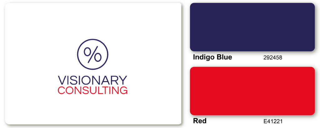
The Indigo Blue and Red Color Combination is a dynamic and powerful pairing that creates a sense of energy and passion. Indigo Blue is a deep, rich color that conveys a sense of mystery, sophistication, and elegance, while Red is a bold, intense color associated with power, confidence, and excitement.
Tan, Olive, and Beige
Tan, olive, and beige are all attractive pairings of brown, usually neutral and natural. The brown evokes warmth, security, and earthiness; the olive also signifies perception and empathy. This color combination works well to give a sense of grounded maturity.
Cobalt Blue and Pearl White
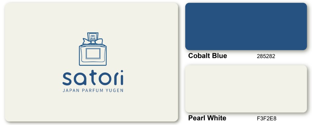
The vivid, intense tone of Cobalt Blue provides a bold accent that stands out against the subtle, muted tones of Pearl White, creating a sense of depth and complexity in the color scheme.
Light Teal, Light Olive, and Scarlet
This triadic color combination creates a highly subdued gathering of primary colors, with the addition of gray to evoke a sense of calmness and mystery.
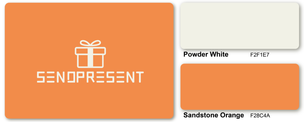
Powder White and Sandstone Orange
Olive, Yellow-Green, and Forest Green
Combining these three green shades in a design creates a sense of nature, excitement, and youth. These colors produce color palettes that are common in mint and lime beverages.
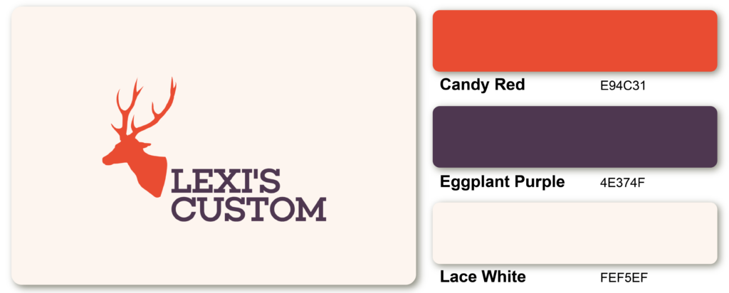
Candy Red, Eggplant Purple, and Lace White
Violet and Turquoise
Refreshing tones don’t have to mean it is not very bright tones. This turquoise is also beneficial when feeling lonely because it helps to restore emotional balance and release creative blocks.
Aegean Blue, White, and Fossil Grey

The cool and calming Aegean Blue serves as the primary color, reminiscent of the crystal-clear waters of the Aegean Sea, while the clean and crisp White acts as a neutral tone to balance out the scheme. The warm and earthy Fossil Grey adds depth and texture to the palette, creating a harmonious balance between the three colors.
Deep Turquoise, Tan, and Black
The combination of these three colors results in a design that is cool and essential. In situations where the design has a natural, masculine tan base, including turquoise and black, the design highlights its adaptability as a color that captures nature and rebirth.
Black, White, and Red
The contrast between the neutral tones of Black and White with the striking accent of Red creates a high-impact effect that catches the eye and draws attention to the design. This color combination is often used in branding and advertising, as it commands attention and leaves a lasting impression.
Navy, Salmon, and Sea Foam
The ideal beachy color scheme. This pastel palette of navy, salmon, and sea foam highlights everyone’s favorite coastal colors, evokes feelings of tradition and symbolizes health, vitality, and persistence.
Butter Yellow, Honey Yellow, and Seaweed Green
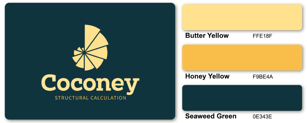
The combination of warm yellows and cool green creates a sense of balance and calmness, making it ideal for spaces where relaxation and serenity are desired.
Takeaway
The significance of color combination stems from the importance of color to the human mind. Color generates ideas, expresses messages, sparks interest, and creates certain emotions.
And these 49 color combos are just a starting point for your design journey. Don’t be afraid to experiment and create your unique combinations.
Some colors have universal significance—for example, choosing colors for a logo is more than just like them—the colors should strengthen the business’s branding and product design.
Moreover, colors that work well alone may work better together. As such, the correct color combination seeing how colors work together literally, and art, seeing what colors symbolize and how they are evaluated internally and emotionally.
So if you’re planning to start a new business or re-create your brand’s color palette, Logomakerr.ai is where you can mix and match logo design colors based on your needs and preferences.
Remember to consider the mood and tone you want to create and your project’s overall style and aesthetic. You can create a beautiful, balanced, and truly unique design with the right color combination.