Like most people, you probably want to understand the BMW logo. There are a few reasons why this might be important to you.
Maybe you’re considering buying a BMW and want to be sure you’re getting the real thing. Or maybe you’re interested in logo design and want to learn more about how this one of the most successful logos in history started.
No matter your reason, it’s important to understand the history and symbolism behind this car logo, and this will help you appreciate it more and maybe even see it in a new light. So let’s take a closer look at what makes this logo special.
Origins of the BMW Logo
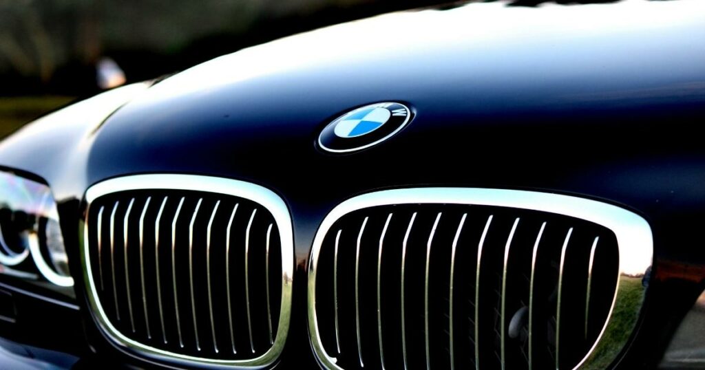
The Bayerische Motoren Werke or the BMW badge has a long and interesting history. In 1916, the BMW brand was still relatively new. And after a year, the logo was created.
Since then, it has undergone a few changes over the years.
The company is also in charge of making Mini and Rolls-Royce automobiles. Along with Mercedes Benz and Audi, it is one of the most popular luxury car brands worldwide.

Due to BMW’s history as an aircraft engine manufacturer, many people initially thought the white and blue shapes in the company logo represented a spinning propeller. Contrary to popular belief, Bavaria—the brand’s place of origin—is represented by blue and white colors.
The state colors of Bavaria, white and blue, are displayed in the inner circle quarters of the BMW brand but the opposite order. At that time, using state colors was illegal under trademark law.
Since 1922, vehicles and engines have been made at the Munich plant in Munich, Germany, located in the city’s northern part. Since the plant’s founding, it has continuously expanded and employs about 7,800 people from 50 nations to produce cars.
The Symbolism of the BMW Logo
The BMW logo has a lot of symbolism behind it.
The main symbol is the black propeller representing the company’s aviation history. But there are other symbols in the logo as well.
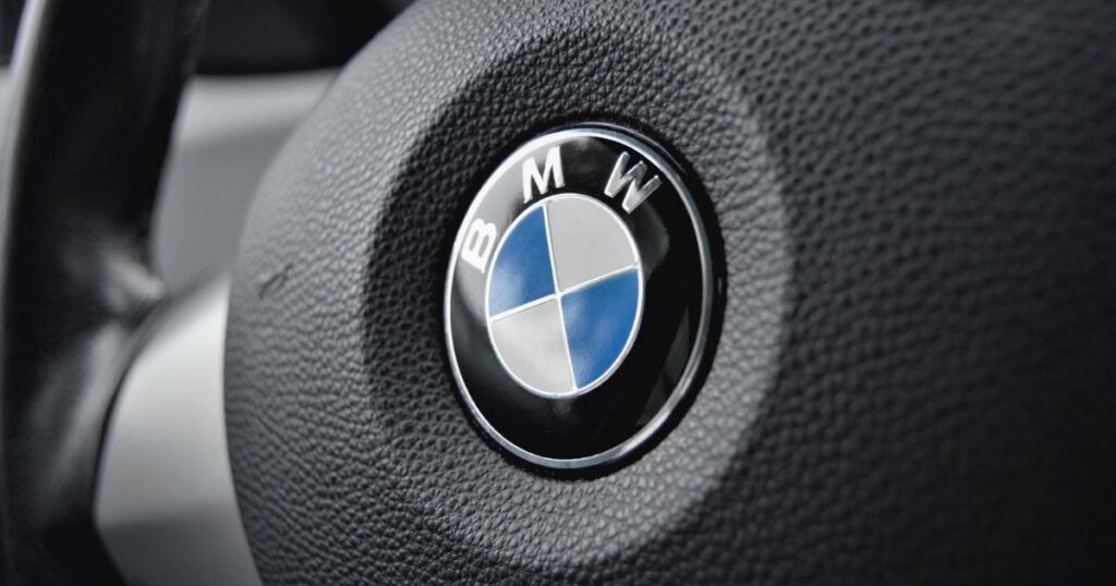
For instance, the blue and white colors in the logo represent the Bavarian flag. This is a nod to the company’s origins in Bavaria, Germany.
The logo also features the letters “BMW.” These stand for Bayerische Motoren Werke or Bavarian Motor Works, and this is the company’s original name.
Evolution of the BMW Logo
Over the years, the BMW logo has undergone a few changes. The most noticeable change is the addition of the roundel in 1929. This is the blue and white symbol that is now so iconic.
The roundel was originally designed to represent a spinning propeller, a nod to the company’s aviation history. However, it has come to mean much more than that.
Today, the roundel is one of the most recognizable symbols in the world. It is synonymous with luxury and quality. And it helps make the BMW logo one of the most successful in history.
BMW Logos over the years
Over the years, the BMW logo hasn’t changed all that frequently. Even though the business has occasionally changed how it looks, the evolution of the BMW logo makes it simple to trace the design’s roots back to the automaker.
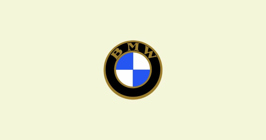
1916
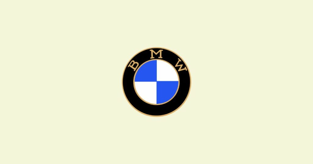
The first version of the BMW logo includes the well-known blue and white symbol, which is very similar to the one we are familiar with today.

The color choices significantly differ between the current BMW logo and the one that BMW previously used. In this instance, the BMW lettering is written in gold, and the emblem fonts are on a black background.
Here, the font has also undergone a slight change. Like many older businesses, BMW decided on a serif font to project sophistication.
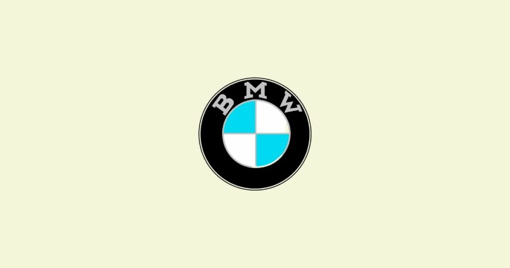
1936
The company made one of the biggest changes to the BMW emblem in 1936. The golden accents were swapped out for silver to satisfy a growing demand for a futuristic, chrome look. The central white and blue pattern used a much lighter shade of blue.
The 1930s logo’s silver outlines were much thinner, which gave the black circle surrounding the central pattern the appearance of being more prominent. The “BMW” font’s lettering was now in a classy gray with more pronounced serifs.
1963
In the 1960s, BMW updated its appearance with a more contemporary BMW logo emblem. The letters were changed from serif to sans-serif in a strong white font, and the badge’s edges became more defined.
Once more, the colors in the center circle changed, this time to a deeper shade of blue.
A thin double white-and-black line was also used in place of the silver framing surrounding the company logo to create a cleaner appearance.
1997
The BMW logo is a variation of the previous logo using silver, white, black, and blue hues.
This badge has many of the same components as the previous one, despite having a slightly more three-dimensional appearance. A different version of the BMW logo is also available, though not all BMW vehicles feature it.

The company simplified its branding for 2020, sticking to the three primary colors grey, blue, and white.
BMW logo colors
The colors in the BMW logo have a lot of meaning. The blue and white are a nod to the Bavarian flag, which is a tribute to the company’s origins in Bavaria, Germany.
The color black is associated with power, strength, and elegance. It is also the color of the central propeller symbol, a reference to the company’s aviation history.

The white color is associated with purity and perfection, which aligns with the company’s commitment to quality. The silver color is associated with sophistication and modernity, and this reflects the company’s image as a luxury automaker.
BMW’s font is currently white or silver, but it has previously alternated between silver, gold, and white hues.
How to create a robust car logo
When creating a car logo, it is important to consider the following elements:
- The company’s history and origins
- The company’s values and mission statement
- The company’s target audience
- The company’s image and reputation
- Trends in the automotive industry
- The competition
After considering all these factors, choosing colors and a font that reflects the company’s image is essential. The logo should be simple, memorable, and easy to read, and it should also be appropriate for the company’s target audience. Opt for an AI logo maker for an efficient design process.
Wrapping up
The BMW logo is one of the most recognized car logos in the world, and it has a long and rich history and deep symbolism.
The design of the logo has evolved, but it still retains its iconic look and feel. If you’re looking to create your car logo, take inspiration from BMW and ensure your logo is robust enough to stand the test of time. Creating a great logo is easy with Logo Maker AI!


