An apple a day keeps androids away. Get that? Kidding aside, the history of the brand Apple has been ahead of the curve for decades. With a net worth of at least $3 trillion, this US-based company is founded by Steve Jobs – a late pioneer of the personal computer revolution. He is also known for his philanthropy, developing the apple logo, and balancing a full-time successful career while being the family man that he is.
There are so many myths and facts about Apple’s name and logo. But one thing’s for sure—designing a logo for a successful brand like Apple can be challenging.
Thanks to innovation and a handful of AI logo makers of this generation, owning and creating a logo for a startup business or rebranding company is a walk in the park.
Still, it’s fun to look back and see how the Apple logo plays a vital role in terms of branding and history of the company. With that in mind, this article is an Apple Logo Analysis to give you a smooth sail in designing your own!
The Apple Logo

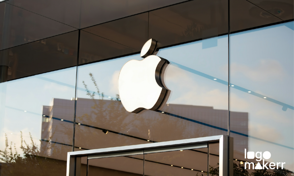
Photo Credit: crowdspring
The Apple logo could not be more iconic. A simple yet powerful image of an apple with a bite taken out of it truly holds deep symbolism – and luxury. Yes, believe it or not, is some countries, owning an Apple product is considered luxurious. Not just because of the reputation built around the brand, but also the popularity of its logo being viewed as ‘sophisticated brand identity’.
To make matters more interesting, did you know that Steve Jobs decided to make it a ‘bitten’ apple instead of just a standalone fruit?
It’s because, in the first years of the Apple logo, it was often mistaken for a cherry. So, to give it scale and make it clear that it was an actual apple, the founder decided to look like it had been eaten.
Of course, just like any logo in the world, the Apple logo has undergone subtle changes to adapt to the company’s evolving products. Read on to learn about the evolution of the Apple logo!
Throughout the years: The Apple logo
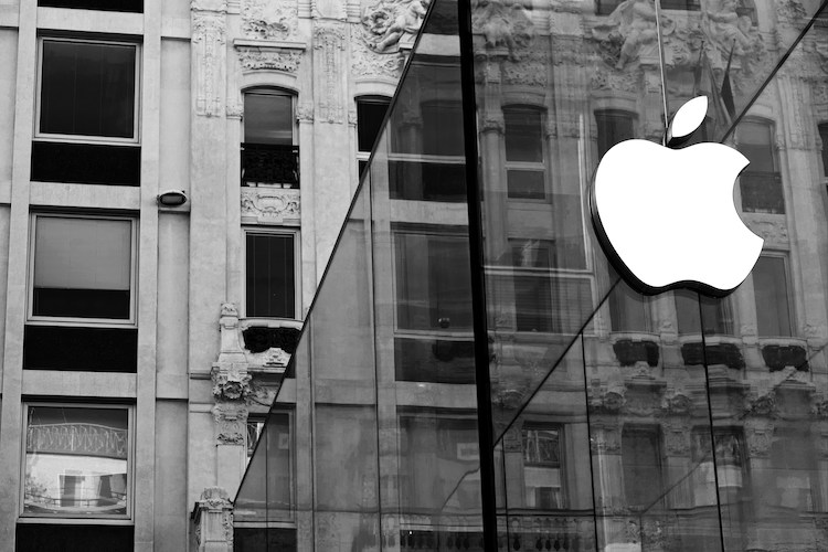
Photo Credit: 3catslabs
1. Newton Crest – 1976-1977
For a year, the very first logo of the brand Apple features Sir Isaac Newton sitting under an apple tree, with an apple dangling above his head. One of the company’s founders, Ronald Wayne, designed the Newton crest logo. However, being used briefly, they decided the logo was too complex to imprint on their products and marketing strategies.
2. The Rainbow Apple – 1977-1994
After a long brainstorming session, Rob Janoff designed a Rainbow Apple logo for the company. The primary goal of this logo is to showcase Apple’s mission—to bring color and innovation to the world of personal computing. Believe it or not, this logo became iconic during Apple’s rise to prominence.
3. The Aquatic Apple – 1995-1997
And now we’re getting to the good part. With the introduction of Mac OS X in the early 21st century, the Apple logo was designed in an aqua-like appearance to align with the visual style of the new operating system.
4. The Black Apple – 1998-2000
This is the logo that got us to where we are today. The Black Apple logo is a solid black-filled apple—obviously, in a sleek and modern look. This logo was used across Apple’s products, marketing materials, and branding.
5. The Glass Apple – 2001-2007
Many people love the Glass Apple logo. After the Aqua logo, Apple replaced it with a more reflective, glass-like appearance to showcase the company’s simplicity and elegance. This version of the logo coincided with the introduction of iconic products such as the iPhone and iPad.
6. The Flat Apple – 2015-present
Last but not least (and current), the Flat Apple is a significant redesign of the Black Apple to launch their iOS 7. The logo was simplified into a flat, two-dimensional shape with a solid color fill of black – and for us, it’s the best thing we had since the company’s foundation!
We can all agree that even in its layered evolution, the Apple logo has remained one of the most recognizable symbols in the world.
If you think you were to create a logo as iconic as this, what fruit would it be?
How did the Apple logo bring Marketing magic to the company?
We are sole believers that the iconic Apple logo stands as the cornerstone of this tech giant brand. Embodying simplicity, innovation, and just a little pinch of rebellion, the Apple logo is a standard for those who want to start a business in the tech industry.
As the Apple logo dominates the brand—and the world—with its marketing magic, the company will surely continue its commitment to pushing boundaries and setting trends.
No matter how many you revise a logo, its culture will speak volumes without saying a word.
Final Thoughts
In conclusion, the Apple logo is more than just a symbol – it’s a representation of innovation, creativity and a brand that has transformed the tech industry. The bite taken out of the apple carries a deeper meaning, symbolizing knowledge, temptation, and the pursuit of excellence.
Understanding the history and branding behind this iconic logo gives us insight into Apple’s values and vision. Let’s embrace innovation and creativity in all aspects of our lives, just like Apple has done so successfully.