Logos are a big part of our lives, and we see them everywhere. Thus, we subconsciously process the logo designing and information they provide.
Logos are also designed to communicate the company values, mission statement, and target audience. They can be in the form of a simple icon, wordmark, emblem, monogram, abstract, and many more.
But, one of its many forms is the acronym logos. These, too, reflect the values and mission of a company and can be used to build brand recognition and loyalty.
Many famous logos are actually acronyms with hidden meanings that most people never knew about. This blog post discusses the ten hidden meanings behind the most popular acronym logos.
Acronym logos: what are they?
An acronym logo is a type of logo made up of the initial letters from other words put together to spell out a name or phrase. They are often seen in company or product names and can effectively create a memorable and distinct brand identity.
But, there are a few different ways to interpret an acronym logo. The most common is to look at the individual letters and try to guess what they stand for. Another way is to read the whole logo as a word or phrase. This can often give you a better understanding of the meaning behind the logo.
If you still don’t have any idea how it will look like, here are some famous acronym logos:
- The Nike Swoosh
- Toblerone
- FedEx Arrow
- NASA
- Toyota
- BMW
- Coca-Cola
- Mcdonald’s
- Pepsi
- Adidas
Let’s find out what their hidden meanings are below.
#1. The Nike Swoosh
The first acronym logo on our list is the Nike swoosh.
Carolyn Davidson designed the Nike swoosh in 1971, and the meaning is that it represents the Winged Goddess of Victory, Nike. It symbolizes the goddess’ attributes of flight, speed, and victory, and the company wanted its customers to feel they could achieve anything when they wore their products.
#2. Toblerone
Toblerone, a well-known chocolate bar, has been on the market for a considerable time.
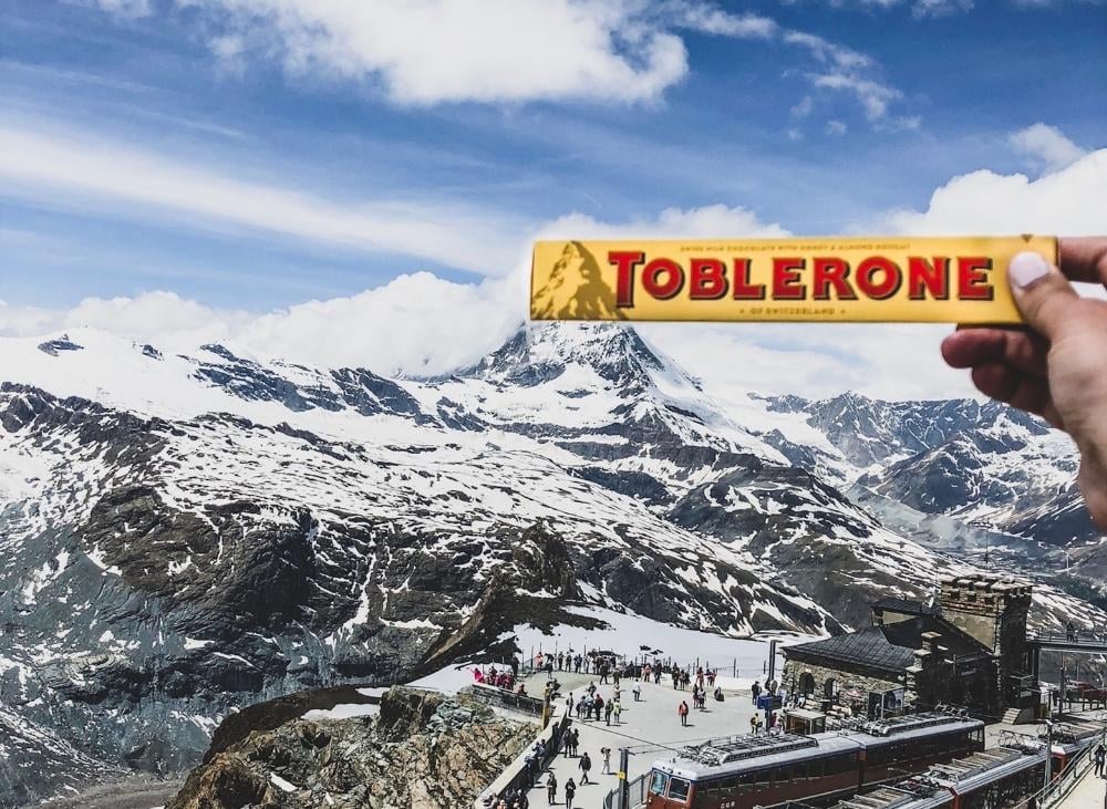
The company’s current logo depicts a mountain meant to stand for Matterhornlocated in Switzerland. The bear hidden in the mountain represents the unique honey flavor in the chocolate and how it’s made in the “City of Bears.”
#3. FedEx Arrow
The third acronym logo on our list is the FedEx arrow.
The FedEx arrow designed by Lindon Leader in 1994. The company trucks and planes are covered in their logo design throughout the world. Although the colors aren’t particularly ground-breaking, a hidden gem still exists.
Have you ever seen the arrow tucked away between the letters “E” and “x”? The arrow symbolizes forward motion with speed and accuracy, much like the FedEx trademark.
This is a fitting branding, as FedEx prides itself on its fast and reliable shipping service.
#4. NASA
The National Aeronautics and Space Administration, or NASA, is one of the largest space agencies in the world. Because of its enormous stature, NASA has been in several science fiction films.
On the other hand, NASA is renowned for its significant advances in aviation. In fact, it is now regarded as the leading space agency for its operations and missions in space.
James Modarelli created the round red, white, and blue logo, known as the “meatball,” in 1959, the second year NASA entered the space industry. While the round shape of the logo represents a planet, the red v-shaped vector represents aeronautics.
The design represents the various facets of NASA’s existence — the circular orbit around NASA’s letter name means space travel, while the stars stand in for outer space.
#5. Toyota
The logo of Japanese automaker Toyota has frequently been compared to the image of a cowboy sporting a stereotypical hat.
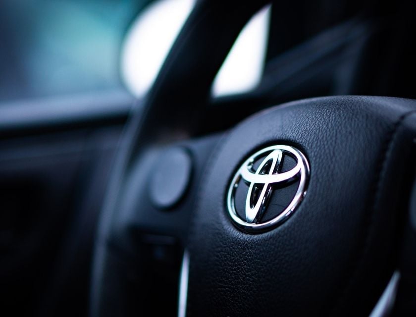
However, it actually depicts a stylized image of a needle’s eye with a thread running through it. This alludes to the brand’s former existence as a manufacturer of weaving machines, while the letters were written in the various components.
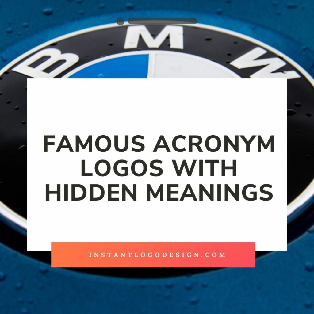
#6. BMW
Next up is BMW.
This acronym stands for Bayerische Motoren Werke AG, a German automobile manufacturer.
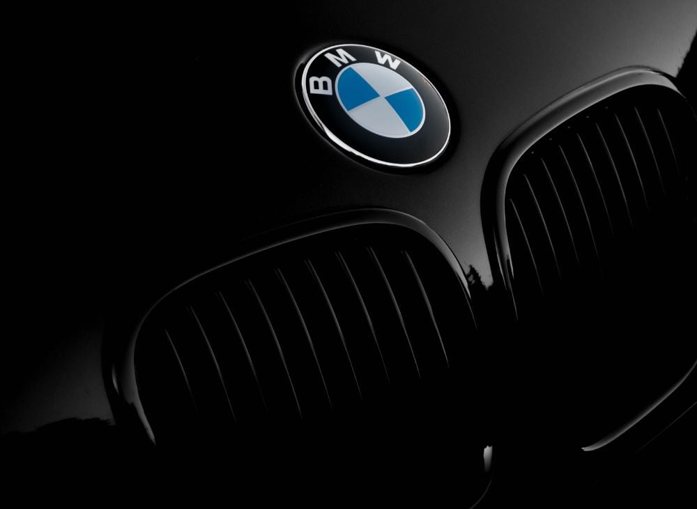
The logo includes a circle with two quadrants divided by a line, with the top half of the circle being white while the bottom half is blue. This represents Bavaria (the company’s home region) and the fact that they created aircraft engines, too.
BMW originally intended to incorporate the colors of the Bavarian Free State into their logo. Still, because doing so was prohibited, they accidentally created the propeller shape by reversing the colors.
#7. Coca-cola
If you’re a fan of Coca-Cola, then you know that its logo is one of the most recognizable in the world.
“Coke” stood for Coca-Cola Company and was designed by John Pemberton’s bookkeeper Frank Mason Robinson.
The name Coca-Cola was chosen because it sounded like something that would be found in a pharmacy, and the two C’s in the logo represent the company’s main ingredients: coca leaves and kola nuts.
#8. Mcdonald’s
Nearly all of us go through life assuming that the “M” in the McDonald’s logo represents the company’s name. The building plans for the restaurant chain included the original golden arches.

Customers ordering outside were protected from the rain by the arches’ connection to an overhang. The business realized that people could easily see those golden arches from the freeway, which attracted them to the restaurant.
This “M” also represents a pair of breasts, a symbol of nourishment for mammals.
#9. Pepsi
You might not know this, but Pepsi’s acronym stands for something different than you might think.
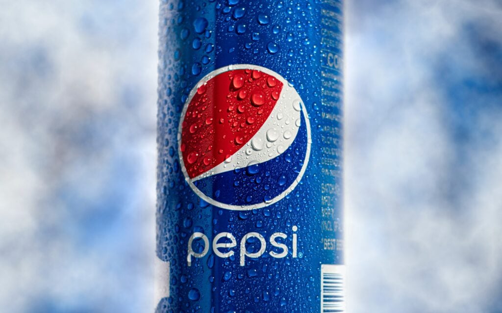
Pepsi’s full name is Pepsi-Cola Company, and the acronym was chosen to represent the company’s two main ingredients: pepsin and cola nuts. Caleb Bradham designed the logo in 1898, and it has undergone a few changes over the years. However, the basic design has remained the same.
#10. Adidas
Adidas has long been recognized for its iconic three-stripe design, first developed in its most basic form in 1976. The three Adidas stripes were simply three stripes back then —- the company merely wanted something distinctive that would look good on shoes.
The logo was modified again in the 1990s when the three stripes were turned diagonally to form a mountain peak. The new logo has the same concept as the old one, but the three stripes now have a deeper meaning as a symbol of the effort and dedication it takes to reach the highest levels of athletic achievement.
Design your logo today!
Logos are a powerful way to communicate an organization’s values and mission. Acronym logos take this a step further by condensing the meaning of the company into a memorable, easy-to-remember acronym.
By using an online logo maker like Logo Makerr AI, you can create a modern and professional-looking acronym logo in minutes. You can get ideas from the ready-made template handed out to you once you type in your brand name.
Our easy-to-use tools make it simple for startups and small businesses to get a logo that helps them succeed.
Ready to get started?
