Graphic design terms can be confusing, especially if you are new to the field. Of course, if you are using AI logo generators or other free graphic designing websites, learning these terms might not come in handy.
However, knowing some of the most commonly misused interchanged graphic design terms is important if you want clarity and communication between fellow designers and clients. So, from understanding the difference between serif and sans-serif fonts to knowing when to use RGB or CMYK as color modes, we’ve got you covered!
The importance of understanding basic graphic design terminology
Your knowledge of basic graphic design terms can make or break your skillset as a professional. After all, intellect comes first and leaves a long-lasting impression on clients, managers, and companies. But knowing basic graphic design terminologies is not just about making an impression; it’s also about communicating our design needs and ideas effectively to professionals or even executing our design projects with confidence.
If you are familiar with the right graphic design terms, you can have more productive conversations with individuals who share the same passion for designing as you. Moreover, knowing the correct terminology allows us to express our creative vision accurately and ensures that our design concepts are accurately translated into reality!
7 Graphic Design Terms That Commonly Get Wrong or Interchanged
At this point in the article, let’s illuminate the nuances between graphic design terms often used interchangeably and provide practical examples to help solidify our interpretation.
- Typography vs. Font: The big difference
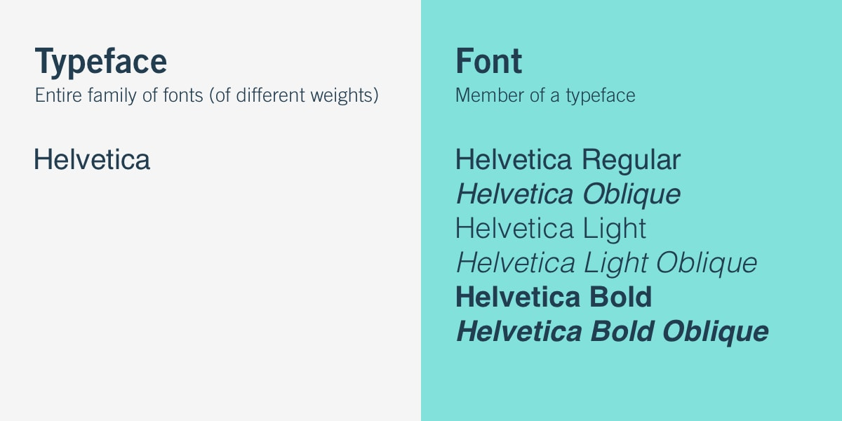
Photo Credit: CareerFoundry
While typography (or typeface) and font are related, there are a lot of differences between these two graphic design terms. Typography refers to the art and technique of arranging and designing type, including selecting typefaces, organizing text, and adjusting spacing, size, and alignment.
On the other hand, font refers to a specific set of characters and symbols within a typeface. So if we say Arial, Times New Roman, and Helvetica – these are all typography or typefaces. But if you were to define Arial Black, Arial Regular, Arial Italic, and so on, these are all fonts.
- RGB vs. CMYK: Knowing when to use each color mode
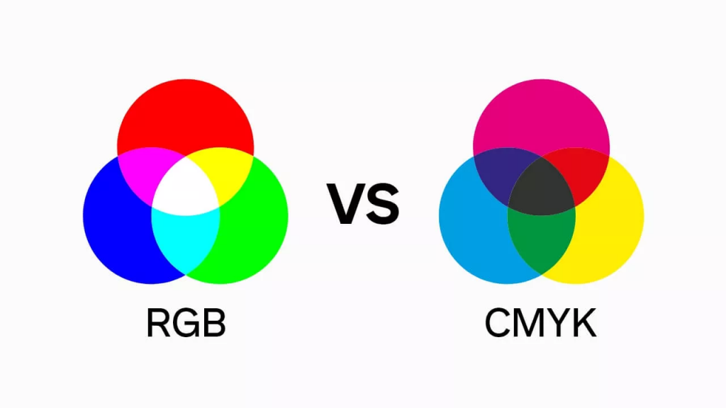
Photo Credit: Gelato
RGB, which stands for Red, Green, and Blue, is the color mode primarily used for digital design. It is an additive color model, meaning that different combinations of red, green, and blue light create a wide range of colors on electronic screens.
What you’ll like most about RGB is they’re perfect for online platforms, such as websites, social media graphics, or digital advertisements. This is because the colors appear vibrant and vivid on technological screens like mobile phones.
CMYK, however, refers to the color mode used for print design. CMYK stands for Cyan, Magenta, Yellow, and Key (black). This color mode is subtractive, meaning that ink is applied to paper, subtracting or absorbing certain wavelengths of light to create colors.
In a nutshell, RGB is for digital design and CMYK is for print design.
- Vector vs. Raster: The different formats
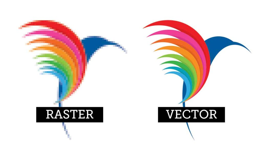
Photo Credit: BPI Color
Vector files are created using mathematical equations and are composed of points, lines, and curves. So that’s not a secret that every qualified graphic designer has to possess math skills or at least succeed in math classes in the past to handle vector files properly. Conversely, raster files are made up of a grid of pixels, each containing specific color information.
If you want an infinitely scalable file without losing quality, you should go for a vector file. Raster files are graphics resolution-dependent, meaning they have a fixed number of pixels that determine their level of detail and sharpness.
- Kerning vs. Tracking: Adjusting letter spaces
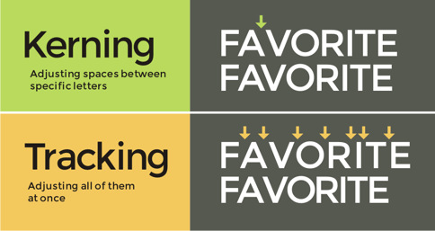
Photo Credit: LogoGround
Kerning refers to the adjustment of space between individual letter pairs, while Tracking refers to the adjustment of spacing uniformly across an entire block of text. To make matters more interesting, kerning focuses on improving the visual harmony of the letters. At the same time, tracking can be used to achieve different visual effects, such as creating a more open and airy feel or compacting the text for a denser look.
- Grid vs. Alignment: Achieving visual harmony in layouts
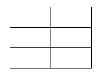
Photo Credit: AAMT Top Drawer
In a world where graphic design terms are more confusing than ever, confusion between the words grid and alignment is unavoidable. To clarify, let’s start with the grid. The grid provides a sense of order and balance and guides designers in positioning different elements and crafting a visual hierarchy.
Now, alignment refers to the placement of individual elements within the grid or layout. This is where graphic designers position elements in relation to each other or to the overall design.
- Serif vs. Sans-serif: Differentiating between font styles
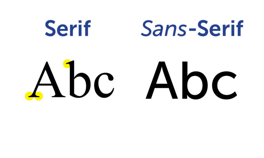
Photo Credit: New England Reprographics
Serif fonts, as the name suggests, are characterized by small decorative lines or strokes that extend from the ends of the letterforms. These little embellishments, known as serifs, give serif fonts a more traditional and formal appearance.
On the other hand, sans-serif fonts are clean and simple and do not have decorative strokes at the ends of the letters. The term “sans” means “without” in French, and that’s exactly what distinguishes sans-serif fonts from their serif counterparts.
- UI vs. UX: Roles of User Interface and User Experience in Design
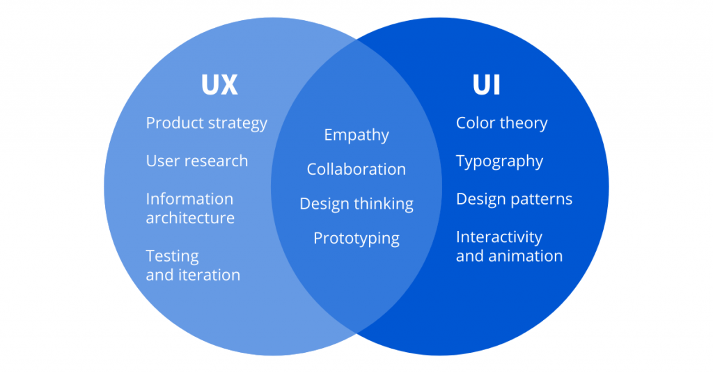
Photo Credit: Coursera
Last but not least are UI (user interface) and UX (user experience) design. But before we emphasize these important graphic design terms, keep in mind that they both play important and influential roles in digital products like websites.
User interface (UI) elements include the layout, colors, typography, buttons, icons, and other visual elements of a product. Conversely, user experience (UX) is a consumer’s overall experience while interacting with a product. Simply put, UI design is about how a product looks and feels, while UX design is about how it works and how users perceive it.
Final Thoughts
The thought of having to learn all these basic graphic design terms can be overwhelming, not to mention studying other major design principles you need to know as a beginner. But with Logomakerr.AI, you don’t need to worry about any of that. Logomakerr.AI is an innovative AI-powered logo-making tool that simplifies the logo design process for beginners and non-designers! Plus, it is totally free – making it perfect for startups and small business owners who want to cut the cost of hiring expensive graphic designers.